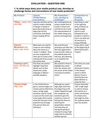
Our media product uses and challenges conventions of typical thriller/horror genres in the following ways:
1. We use a clinical font for the titles rather than a red font to create a cold, precise feel for the stalker character rather than signify danger.
2. We use a pan shot to track the main character down a hallway to establish setting rather than create an eerie feeling.
3. We use ECU shots to highlight words from articles and the stalker's actions rather than show facial expressions or body language.
4. We give the audience the stalker's perspective with shots rather than use high angles to prey on victims and low angles to show power over them.
5


![5G Explained! A High Level Overview [Introduction]](https://cdn.slidesharecdn.com/ss_thumbnails/5gexplainedahighleveloverview-260119165306-cc137a3e-thumbnail.jpg?width=640&height=640&fit=bounds)


