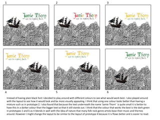
The document discusses different prototypes for a design layout, comparing different color schemes and layouts. It analyzes using a single color versus multiple colors, and finds that a single dark green color works best to evoke the folk rock genre while still allowing smaller text to stand out. While the dark green color of prototypes 1 and 6 is best, the layout of prototype 4 may be adopted for better readability and flow.