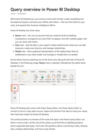
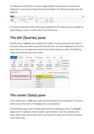
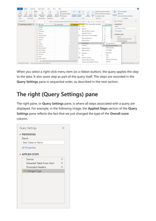
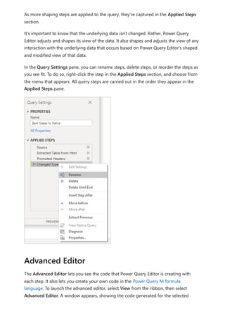
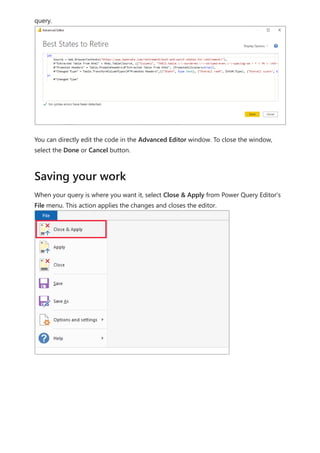
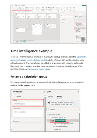
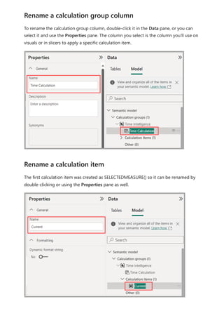
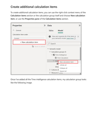
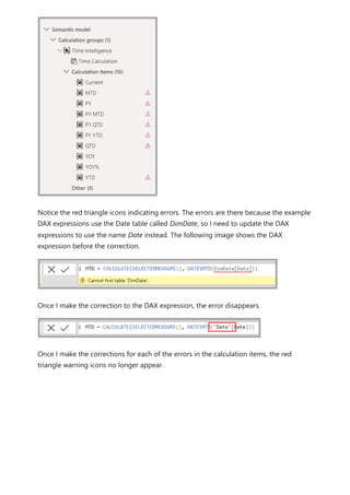
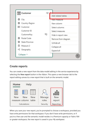
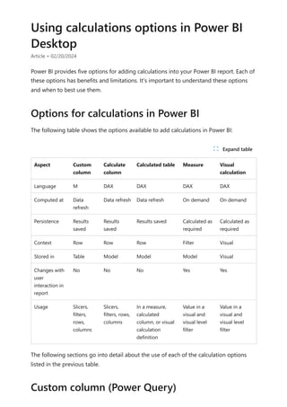
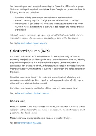
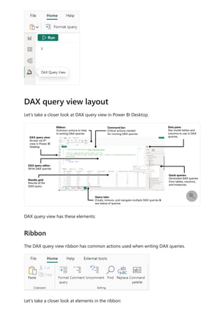
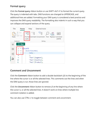
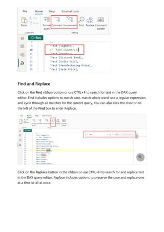
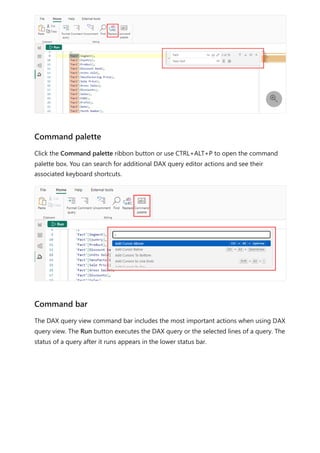
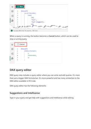
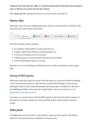
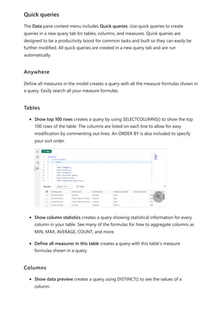
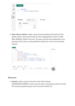
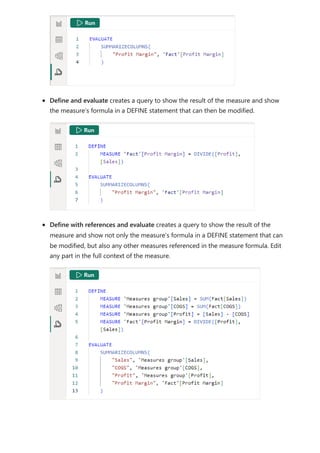
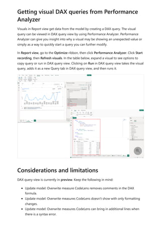
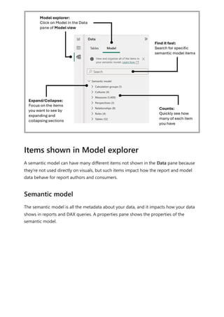
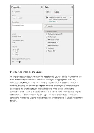
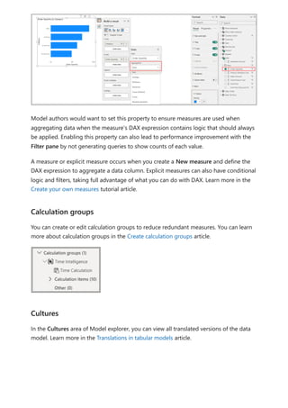
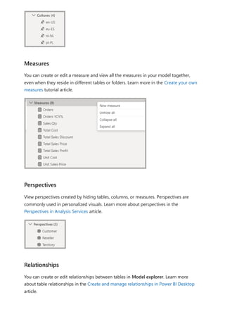
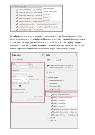
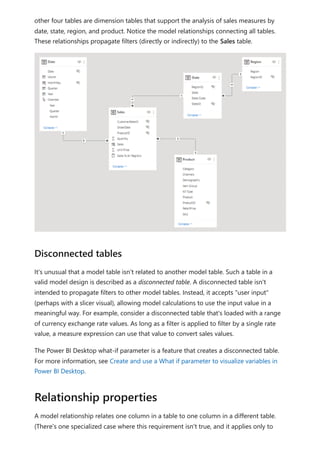
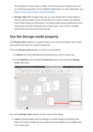
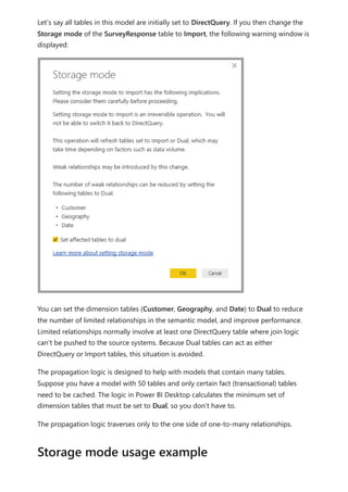
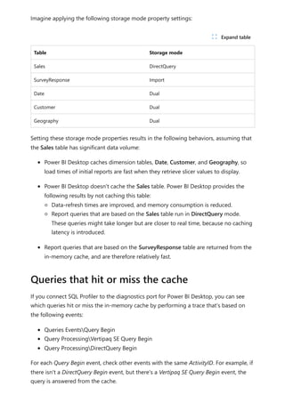
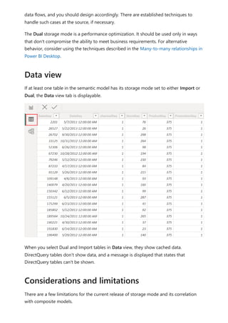
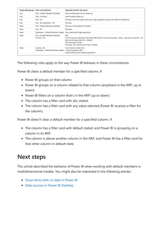
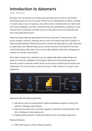
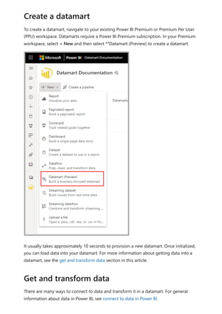
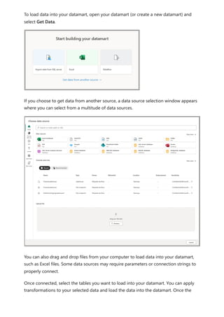
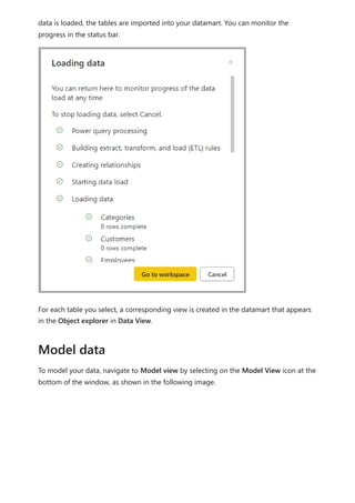
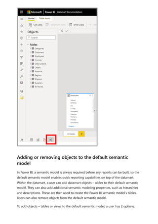
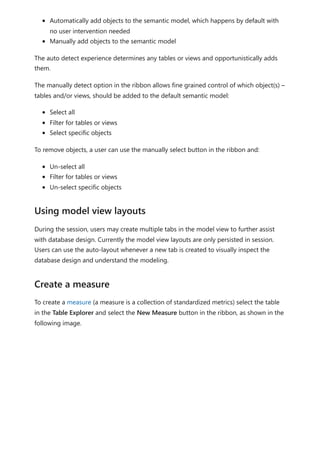
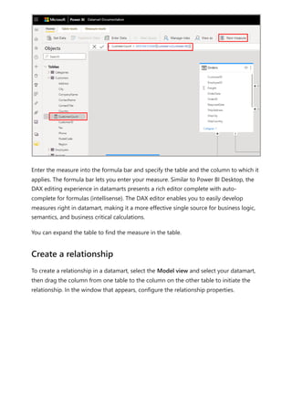
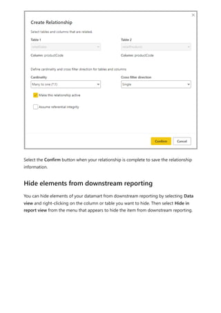
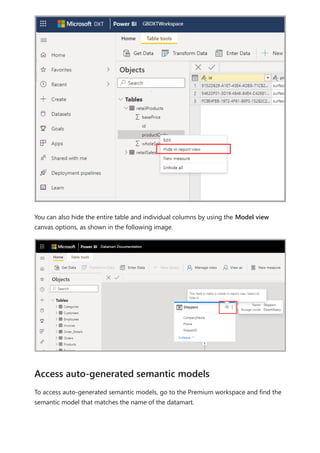
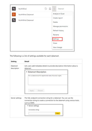
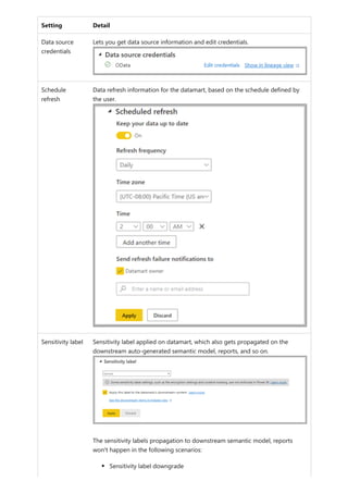
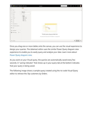
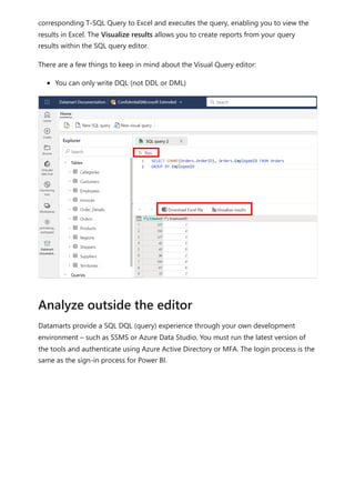
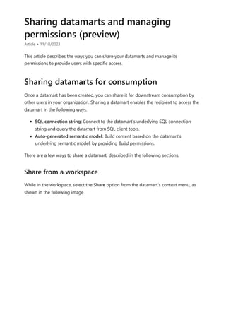
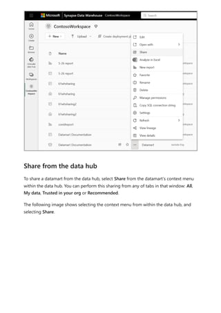
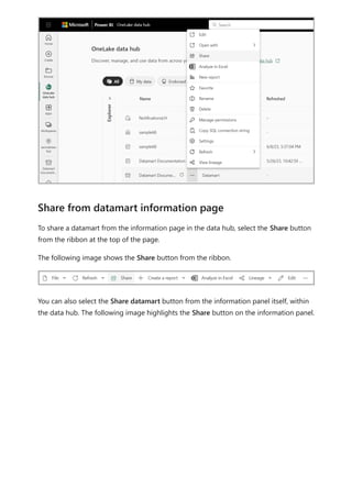
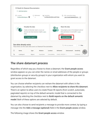
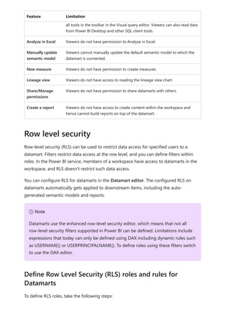
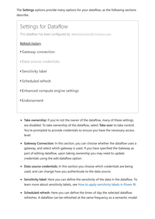
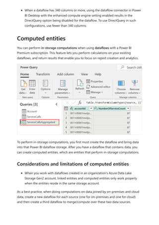
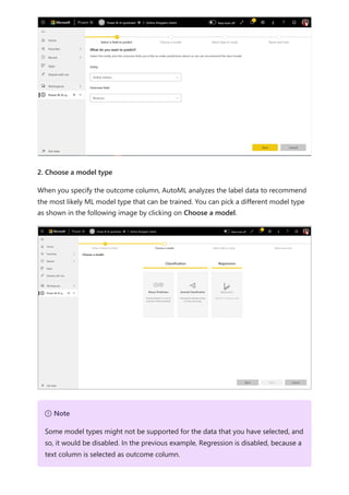
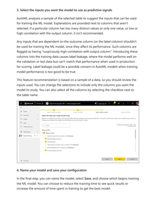
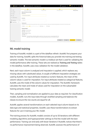
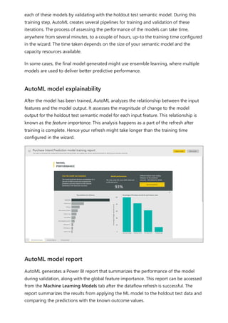
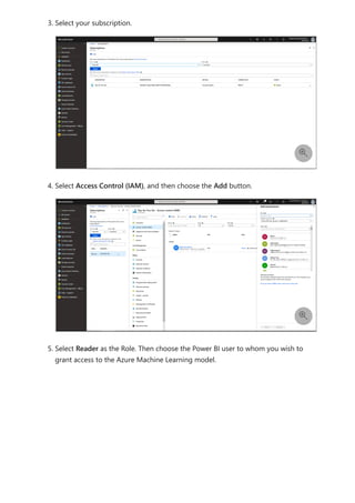
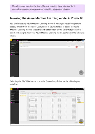
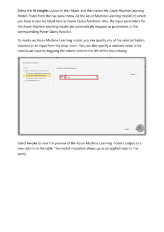
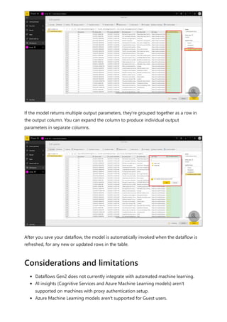
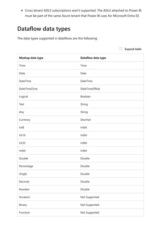
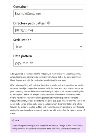
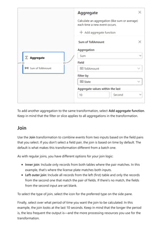
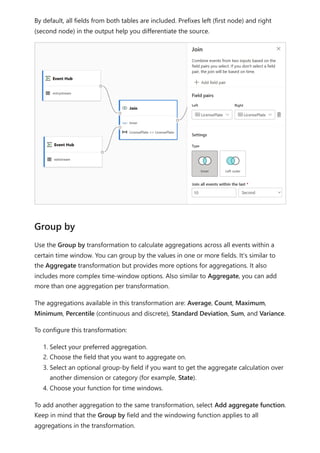
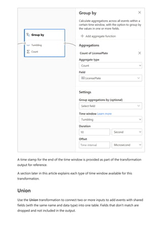
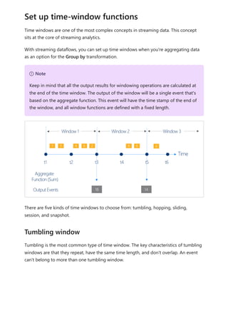
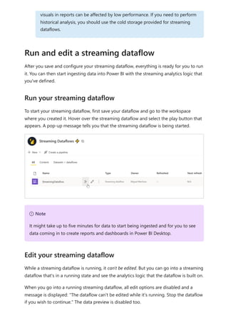
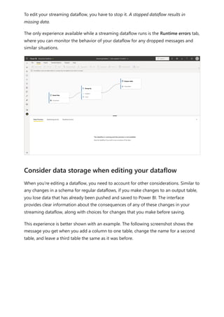
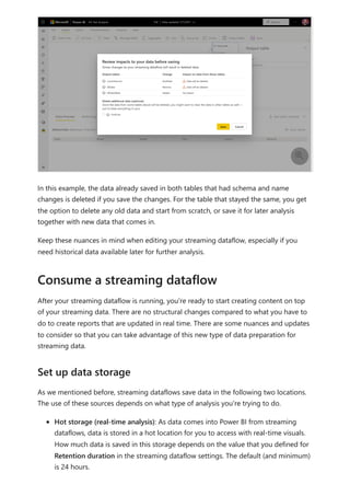
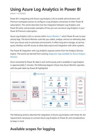
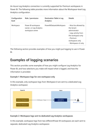
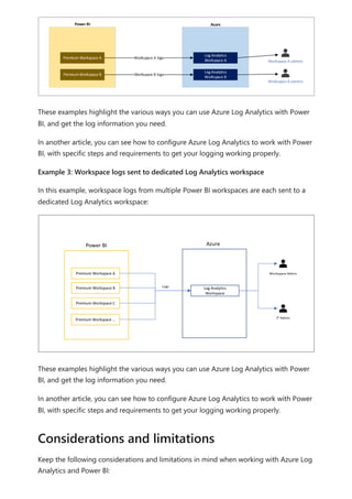
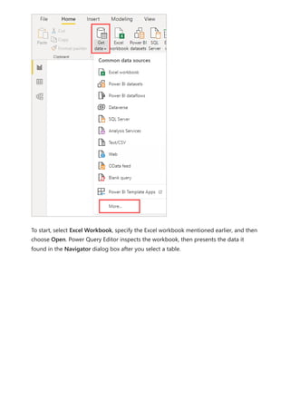
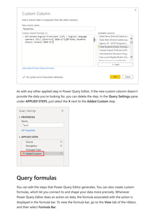
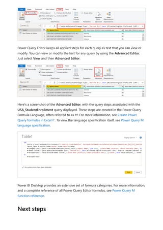
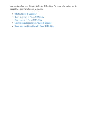
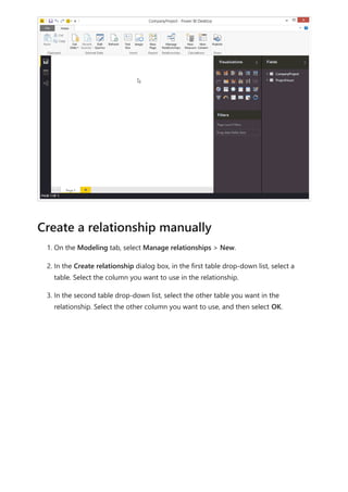
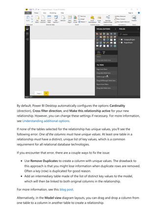
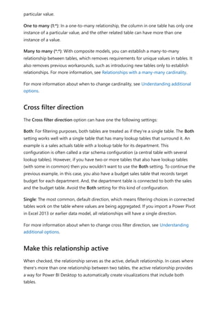
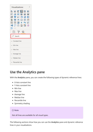
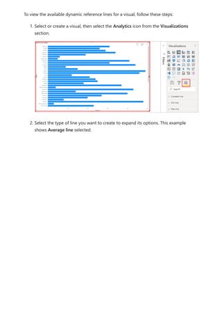
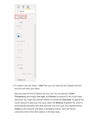
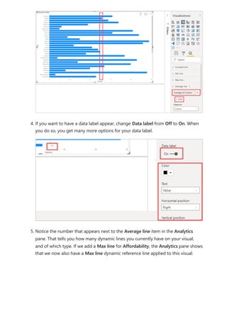
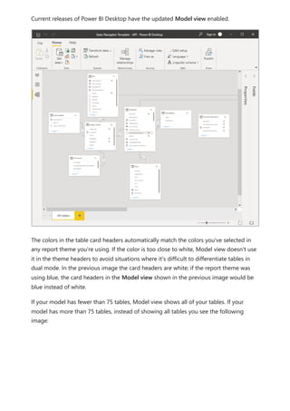
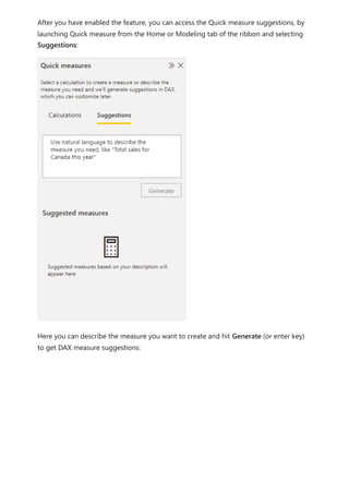
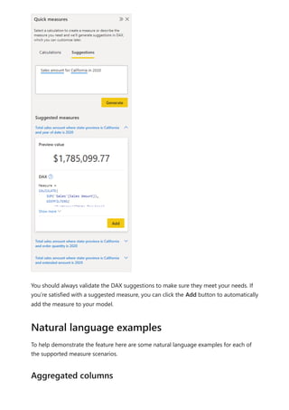
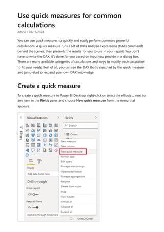
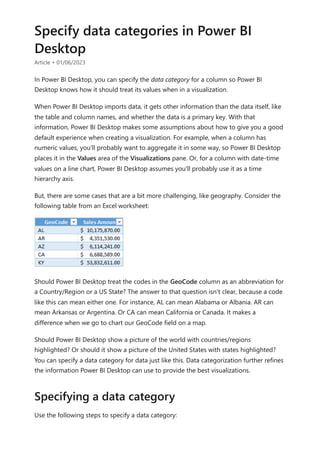
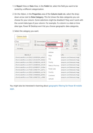
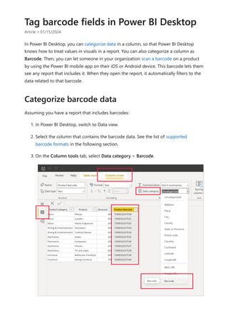
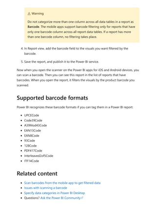
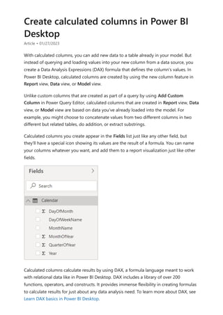
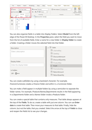
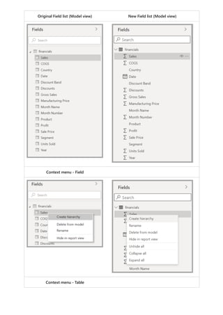
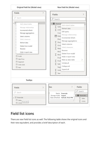
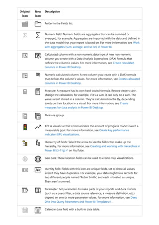
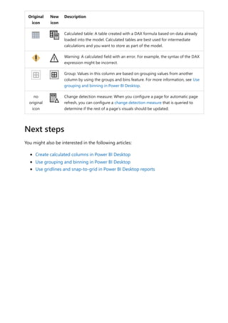
The document provides comprehensive instructions on using Power BI for data transformation, shaping, and modeling, focusing on features like the Power Query Editor and different views in Power BI Desktop. It guides users through creating reports, managing data relationships, performing calculations with DAX, and building custom measures. Additionally, the document includes tutorials on self-service data preparation and the use of dataflows and datamarts in Power BI.

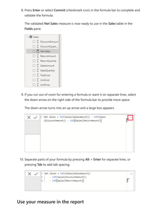
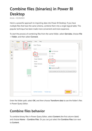
![5. Expressions always appear between opening and closing parentheses. For this
example, your expression contains a single argument to pass to the SUM function:
the SalesAmount column. Begin typing SalesAmount until Sales(SalesAmount) is
the only value left in the list.
The column name preceded by the table name is called the fully qualified name of
the column. Fully qualified column names make your formulas easier to read.
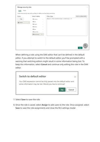
6. Select Sales[SalesAmount] from the list, and then enter a closing parenthesis.
7. Subtract the other two columns inside the formula:
a. After the closing parenthesis for the first expression, type a space, a minus
operator (-), and then another space.
b. Enter another SUM function, and start typing DiscountAmount until you can
choose the Sales[DiscountAmount] column as the argument. Add a closing
parenthesis.
c. Type a space, a minus operator, a space, another SUM function with
Sales[ReturnAmount] as the argument, and then a closing parenthesis.
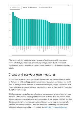
Tip
Syntax errors are most often caused by a missing or misplaced closing
parenthesis.](https://image.slidesharecdn.com/power-bi-transform-model-240816060942-392a4bd2/85/Pwer-BI-DAX-and-Model-Transformation-pdf-20-320.jpg)
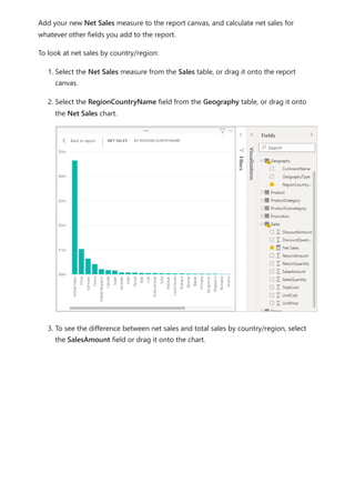
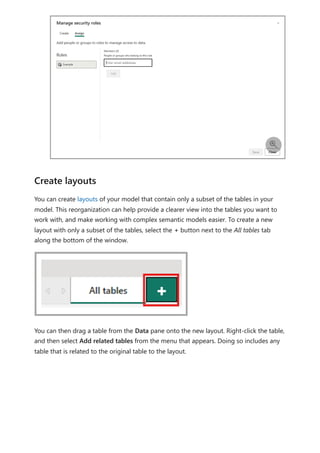
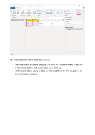
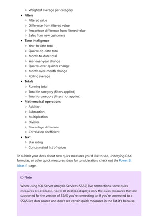
![5. Select any value in the Year slicer to filter the Net Sales and Sales Amount by
RegionCountryName chart accordingly. The Net Sales and SalesAmount
measures recalculate and display results in the context of the selected Year field.
Suppose you want to find out which products have the highest net sales amount per
unit sold. You'll need a measure that divides net sales by the quantity of units sold.
Create a new measure that divides the result of your Net Sales measure by the sum of
Sales[SalesQuantity].
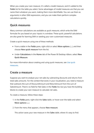
1. In the Fields pane, create a new measure named Net Sales per Unit in the Sales
table.
2. In the formula bar, begin typing Net Sales. The suggestion list shows what you can
add. Select [Net Sales].
Use your measure in another measure](https://image.slidesharecdn.com/power-bi-transform-model-240816060942-392a4bd2/85/Pwer-BI-DAX-and-Model-Transformation-pdf-25-320.jpg)
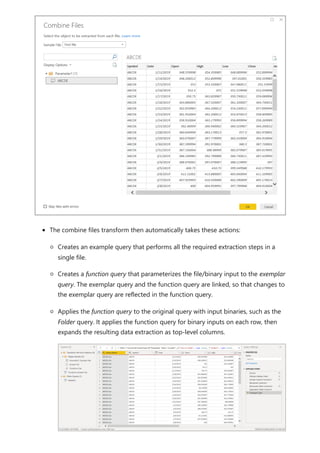
![3. You can also reference measures by just typing an opening bracket ([). The
suggestion list shows only measures to add to your formula.
4. Enter a space, a divide operator (/), another space, a SUM function, and then type
Quantity. The suggestion list shows all the columns with Quantity in the name.
Select Sales[SalesQuantity], type the closing parenthesis, and press ENTER or
choose Commit (checkmark icon) to validate your formula.
The resulting formula should appear as:
Net Sales per Unit = [Net Sales] / SUM(Sales[SalesQuantity])
5. Select the Net Sales per Unit measure from the Sales table, or drag it onto a blank
area in the report canvas.
The chart shows the net sales amount per unit over all products sold. This chart
isn't informative; we'll address it in the next step.](https://image.slidesharecdn.com/power-bi-transform-model-240816060942-392a4bd2/85/Pwer-BI-DAX-and-Model-Transformation-pdf-26-320.jpg)
![can use the RELATED function to help you get it.
After the equals sign, type r. A dropdown suggestion list shows all of the DAX
functions beginning with the letter R. Selecting each function shows a description
of its effect. As you type, the suggestion list scales closer to the function you need.
Select RELATED, and then press Enter.
An opening parenthesis appears, along with another suggestion list of the related
columns you can pass to the RELATED function, with descriptions and details of
expected parameters.
4. You want the ProductCategory column from the ProductCategory table. Select
ProductCategory[ProductCategory], press Enter, and then type a closing
parenthesis.
Tip](https://image.slidesharecdn.com/power-bi-transform-model-240816060942-392a4bd2/85/Pwer-BI-DAX-and-Model-Transformation-pdf-33-320.jpg)
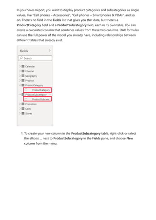
![5. You want dashes and spaces to separate the ProductCategories and
ProductSubcategories in the new values, so after the closing parenthesis of the
first expression, type a space, ampersand (&), double-quote ("), space, dash (-),
another space, another double-quote, and another ampersand. Your formula
should now look like this:
ProductFullCategory = RELATED(ProductCategory[ProductCategory]) & " - " &
6. Enter an opening bracket ([), and then select the [ProductSubcategory] column to
finish the formula.
You didn’t need to use another RELATED function to call the ProductSubcategory
table in the second expression, because you're creating the calculated column in
this table. You can enter [ProductSubcategory] with the table name prefix (fully
qualified) or without (non-qualified).
7. Complete the formula by pressing Enter or selecting the checkmark in the formula
bar. The formula validates, and the ProductFullCategory column name appears in
the ProductSubcategory table in the Fields pane.
Syntax errors are most often caused by a missing or misplaced closing
parenthesis, although sometimes Power BI Desktop will add it for you.
Tip
If you need more room, select the down chevron on the right side of the
formula bar to expand the formula editor. In the editor, press Alt + Enter to
move down a line, and Tab to move things over.](https://image.slidesharecdn.com/power-bi-transform-model-240816060942-392a4bd2/85/Pwer-BI-DAX-and-Model-Transformation-pdf-34-320.jpg)
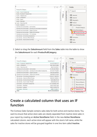
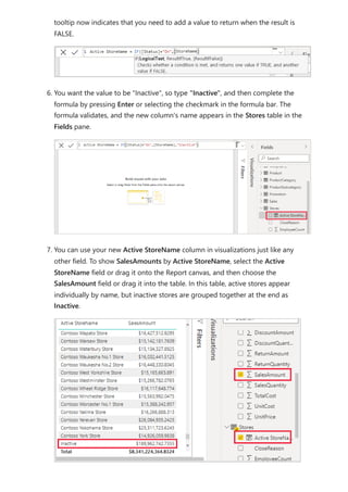
![Fortunately, the Stores table has a column named Status, with values of "On" for active
stores and "Off" for inactive stores, which we can use to create values for our new Active
StoreName column. Your DAX formula will use the logical IF function to test each store's
Status and return a particular value depending on the result. If a store's Status is "On",
the formula will return the store's name. If it’s "Off", the formula will assign an Active
StoreName of "Inactive".
1. Create a new calculated column in the Stores table and name it Active StoreName
in the formula bar.
2. After the = sign, begin typing IF. The suggestion list will show what you can add.
Select IF.
3. The first argument for IF is a logical test of whether a store's Status is "On". Type
an opening bracket [, which lists columns from the Stores table, and select [Status].
4. Right after [Status], type ="On", and then type a comma (,) to end the argument.
The tooltip suggests that you now need to add a value to return when the result is
TRUE.
5. If the store's status is "On", you want to show the store’s name. Type an opening
bracket ([) and select the [StoreName] column, and then type another comma. The](https://image.slidesharecdn.com/power-bi-transform-model-240816060942-392a4bd2/85/Pwer-BI-DAX-and-Model-Transformation-pdf-37-320.jpg)
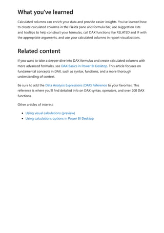
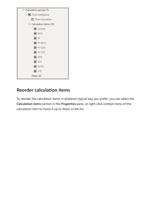
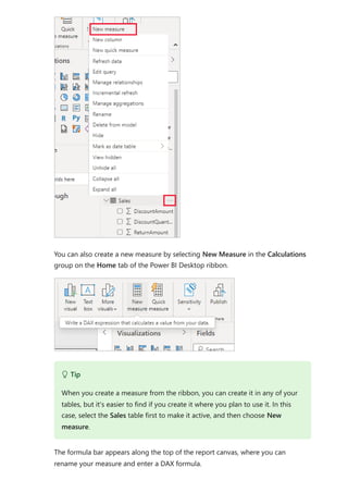
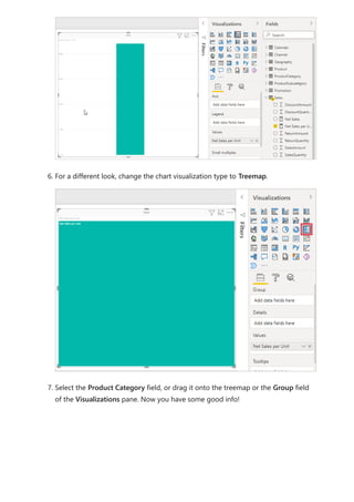
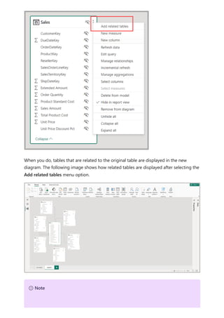
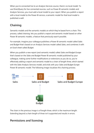
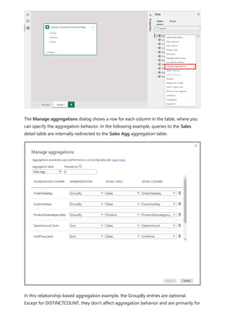
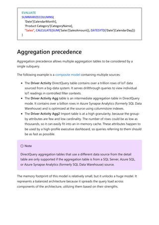
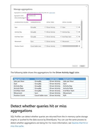
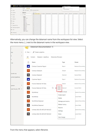
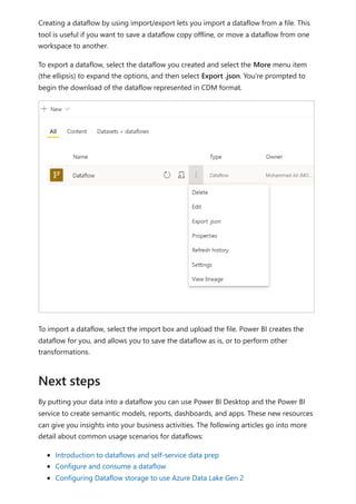
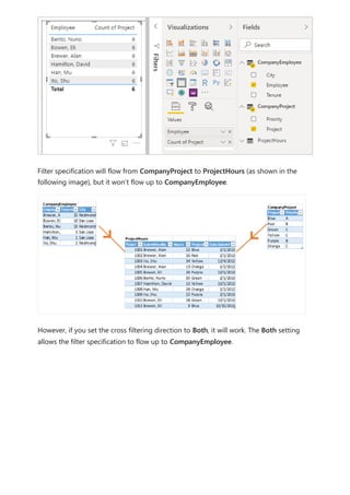
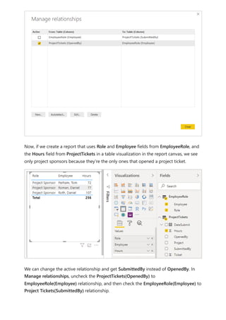
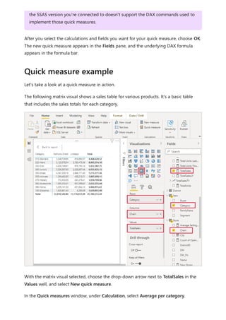
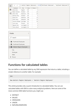
![To use your new calculation group in a Report, go to the Report view, create a Matrix
visual and add the following:
1. Month column from the Date table to the Rows
2. Time Calculation from the Time Intelligence calculation group to the Columns
3. Orders measure to the Values
Orders = DISTINCTCOUNT('Sales Order'[Sales Order])
The following image shows building a visual.
Using the calculation group in reports
7 Note
If the measure Orders is not created in the mode, you can use a different measure
or go to the ribbon and choose New Measure with this DAX expression.](https://image.slidesharecdn.com/power-bi-transform-model-240816060942-392a4bd2/85/Pwer-BI-DAX-and-Model-Transformation-pdf-48-320.jpg)
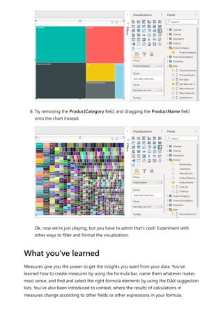
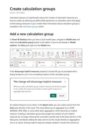
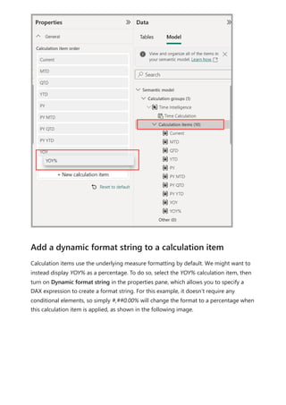
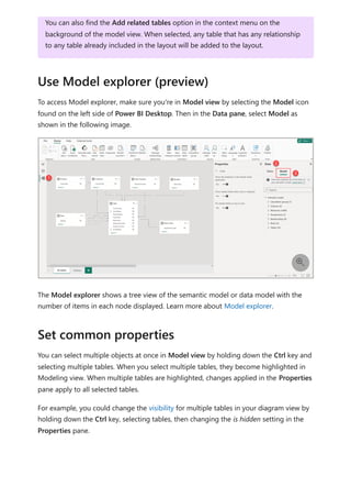
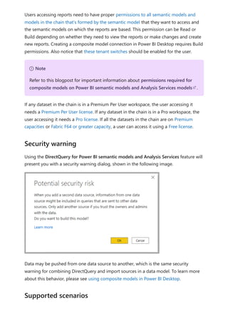
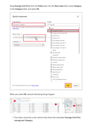
![Calculation items on the Columns in the Matrix visual are showing the measure Orders
grouped by each of the calculation items. You can also apply an individual calculation
item to multiple measures by adding the calculation group column to a Slicer visual.
You can create a new measure with a DAX expression that will utilize a calculation item
on a specific measure.
To create an [Orders YOY%] measure you can use the calculation item with CALCULATE.
DAX
Using the calculation item in measures](https://image.slidesharecdn.com/power-bi-transform-model-240816060942-392a4bd2/85/Pwer-BI-DAX-and-Model-Transformation-pdf-49-320.jpg)
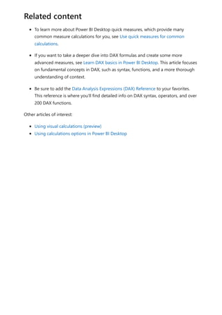
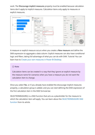
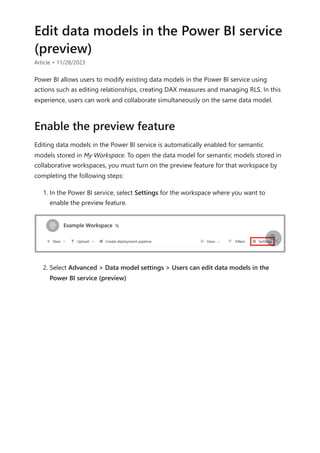
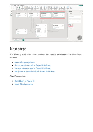
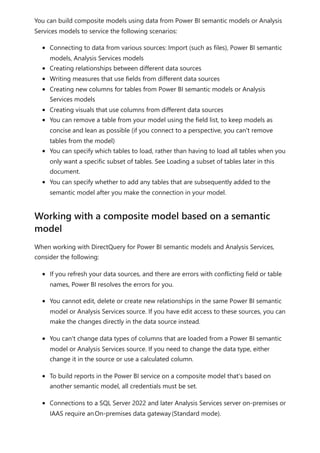
![Finally, if you add additional calculation groups to the model and you want to specify
the order in which they apply to measures, you can adjust the calculation group
precedence in the Calculation groups section properties pane, as shown in the
following image.
You can learn more about calculation groups precedence in the Calculation groups in
Analysis Services tabular models article.
The following articles describe more about data models, and also describe DirectQuery
in detail.
Work with Modeling view in Power BI Desktop
Automatic aggregations
Use composite models in Power BI Desktop
Manage storage mode in Power BI Desktop
Many-to-many relationships in Power BI Desktop
DirectQuery articles:
DirectQuery in Power BI
Orders YOY% =
CALCULATE(
[Orders],
'Time Intelligence'[Time Calculation] = "YOY%"
)
Setting calculation group precedence
Related content](https://image.slidesharecdn.com/power-bi-transform-model-240816060942-392a4bd2/85/Pwer-BI-DAX-and-Model-Transformation-pdf-50-320.jpg)

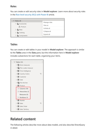
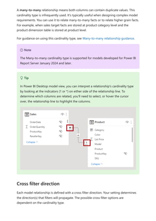

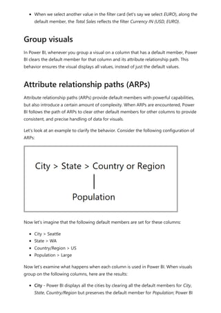
![Each relationship in a path has a weight. By default, each relationship weight is equal
unless the USERELATIONSHIP function is used. The path weight is the maximum of all
relationship weights along the path. Power BI uses the path weights to resolve
ambiguity between multiple paths in the same priority tier. It won't choose a path with a
lower priority but it will choose the path with the higher weight. The number of
relationships in the path doesn't affect the weight.
You can influence the weight of a relationship by using the USERELATIONSHIP function.
The weight is determined by the nesting level of the call to this function, where the
innermost call receives the highest weight.
Consider the following example. The Product Sales measure assigns a higher weight to
the relationship between Sales[ProductID] and Product[ProductID], followed by the
relationship between Inventory[ProductID] and Product[ProductID].
DAX
The following list orders filter propagation performance, from fastest to slowest
performance:
1. One-to-many intra source group relationships
2. Many-to-many model relationships achieved with an intermediary table and that
involve at least one bi-directional relationship
Weight
Product Sales =
CALCULATE(
CALCULATE(
SUM(Sales[SalesAmount]),
USERELATIONSHIP(Sales[ProductID], Product[ProductID])
),
USERELATIONSHIP(Inventory[ProductID], Product[ProductID])
)
7 Note
If Power BI detects multiple paths that have the same priority and the same weight,
it will return an ambiguous path error. In this case, you must resolve the ambiguity
by influencing the relationship weights by using the USERELATIONSHIP function,
or by removing or modifying model relationships.
Performance preference](https://image.slidesharecdn.com/power-bi-transform-model-240816060942-392a4bd2/85/Pwer-BI-DAX-and-Model-Transformation-pdf-119-320.jpg)

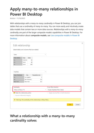
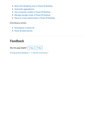
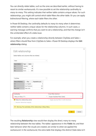
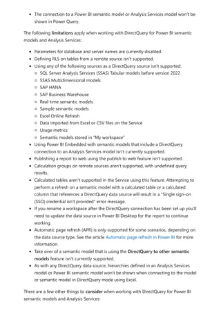
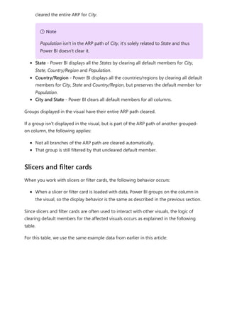
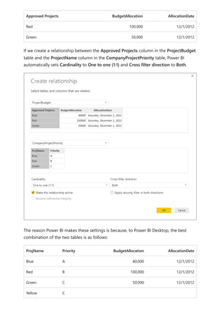
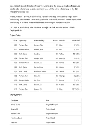
![Before relationships with a many-to-many cardinality became available, the relationship
between two tables was defined in Power BI. At least one of the table columns involved
in the relationship had to contain unique values. Often, though, no columns contained
unique values.
For example, two tables might have had a column labeled CountryRegion. The values of
CountryRegion weren't unique in either table, though. To join such tables, you had to
create a workaround. One workaround might be to introduce extra tables with the
needed unique values. With relationships with a many-to-many cardinality, you can join
such tables directly, if you use a relationship with a cardinality of many-to-many.
When you define a relationship between two tables in Power BI, you must define the
cardinality of the relationship. For example, the relationship between ProductSales and
Product—using columns ProductSales[ProductCode] and Product[ProductCode]—would
be defined as Many-1. We define the relationship in this way, because each product has
many sales, and the column in the Product table (ProductCode) is unique. When you
define a relationship cardinality as Many-1, 1-Many, or 1-1, Power BI validates it, so the
cardinality that you select matches the actual data.
For example, take a look at the simple model in this image:
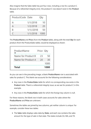
Now, imagine that the Product table displays just two rows, as shown:
Use relationships with a many-to-many
cardinality](https://image.slidesharecdn.com/power-bi-transform-model-240816060942-392a4bd2/85/Pwer-BI-DAX-and-Model-Transformation-pdf-122-320.jpg)
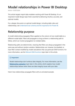
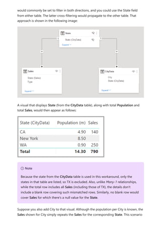
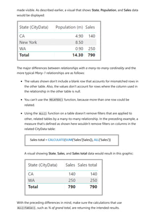
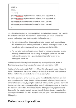
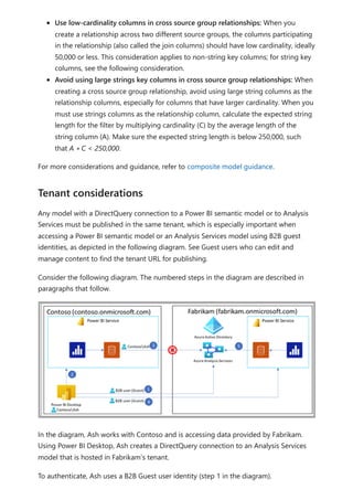
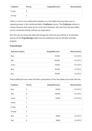
![The CityData table displays data on cities, including the population and state (such
as CA, WA, and New York).
A column for State is now in both tables. It's reasonable to want to report on both total
sales by state and total population of each state. However, a problem exists: the State
column isn't unique in either table.
Before the July 2018 release of Power BI Desktop, you couldn't create a direct
relationship between these tables. A common workaround was to:
Create a third table that contains only the unique State IDs. The table could be any
or all of:
A calculated table (defined by using Data Analysis Expressions [DAX]).
A table based on a query that's defined in Power Query Editor, which could
display the unique IDs drawn from one of the tables.
The combined full set.
Then relate the two original tables to that new table by using common Many-1
relationships.
You could leave the workaround table visible. Or you might hide the workaround table,
so it doesn't appear in the Fields list. If you hide the table, the Many-1 relationships
The previous workaround](https://image.slidesharecdn.com/power-bi-transform-model-240816060942-392a4bd2/85/Pwer-BI-DAX-and-Model-Transformation-pdf-124-320.jpg)
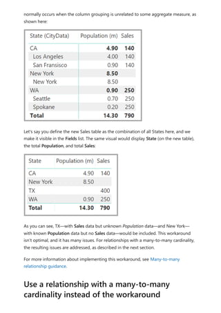

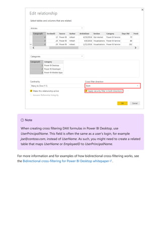
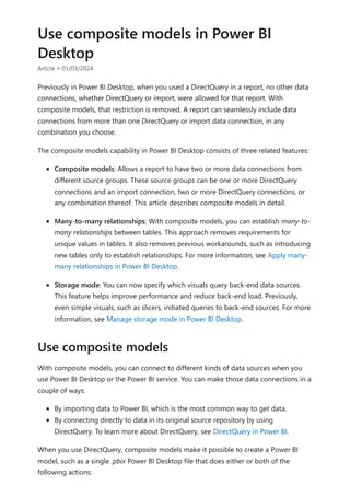
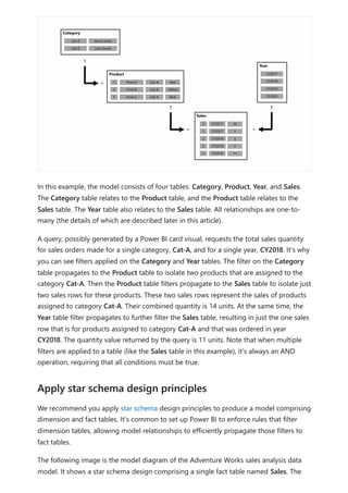
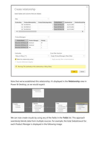
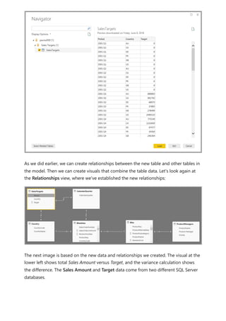
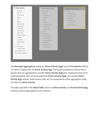
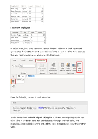
![Similarly, in the Relationship view in Power BI Desktop, we now see another table called
ProductManagers.
We now need to relate these tables to the other tables in the model. As always, we
create a relationship between the Bike table from SQL Server and the imported
ProductManagers table. That is, the relationship is between Bike[ProductName] and
ProductManagers[ProductName]. As discussed earlier, all relationships that go across
source default to many-to-many cardinality.](https://image.slidesharecdn.com/power-bi-transform-model-240816060942-392a4bd2/85/Pwer-BI-DAX-and-Model-Transformation-pdf-136-320.jpg)
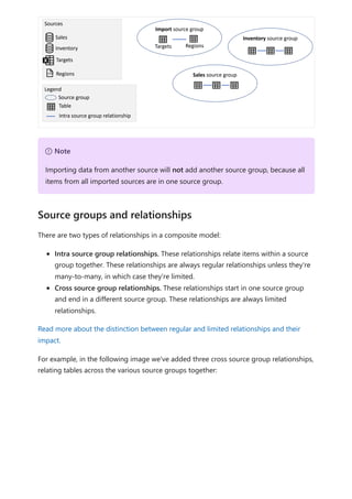
![Any item that is in a source group that is a DirectQuery source group is considered
remote, unless the item was defined locally as part of an extension or enrichment to the
DirectQuery source and isn't part of the remote source, such as a measure or a
calculated table. A calculated table based on a table from the DirectQuery source group
belongs to the “Import” source group and is considered local. Any item that is in the
“Import” source group is considered local. For example, if you define the following
measure in a composite model that uses a DirectQuery connection to the Inventory
source, the measure is considered local:
DAX
Calculation groups provide a way to reduce the number of redundant measures and
grouping common measure expressions together. Typical use cases are time-
intelligence calculations where you want to be able to switch from actuals to month-to-
date, quarter-to-date or year-to-date calculations. When working with composite
models, it's important to be aware of the interaction between calculation groups and
whether a measure only refers to items from a single remote source group. If a measure
only refers to items from a single remote source group and the remote model defines a
calculation group that impacts the measure, that calculation group will be applied, even
if the measure was defined in the remote model or in the local model. However, if a
measure doesn't refer to items from a single remote source group exclusively but refers
to items from a remote source group on which a remote calculation group is applied,
Local and remote
[Average Inventory Count] = Average(Inventory[Inventory Count])
Calculation groups, query and measure evaluation](https://image.slidesharecdn.com/power-bi-transform-model-240816060942-392a4bd2/85/Pwer-BI-DAX-and-Model-Transformation-pdf-146-320.jpg)
![the results of the measure might still be impacted by the remote calculation group.
Consider the following example:
Reseller Sales is a measure defined in the remote model.
The remote model contains a calculation group that changes the result of Reseller
Sales
Internet Sales is a measure defined in the local model.
Total Sales is a measure defined in the local model, and has the following
definition:
DAX
In this scenario, the Internet Sales measure isn't impacted by the calculation group
defined in the remote model because they aren't part of the same model. However, the
calculation group can change the result of the Reseller Sales measure, because they are
in the same model. This fact means that the results returned by the Total Sales measure
must be evaluated carefully. Imagine we use the calculation group in the remote model
to return year-to-date results. The result returned by Reseller Sales is now a year-to-
date value, while the result returned by Internet Sales is still an actual. The result of
Total Sales is now likely unexpected, as it adds an actual to a year-to-date result.
Using composite models with Power BI semantic models and Analysis Services, you can
build a composite model using a DirectQuery connection to connect to Power BI
semantic models, Azure Analysis Services (AAS), and SQL Server 2022 Analysis Services.
Using a composite model, you can combine the data in these sources with other
DirectQuery and imported data. Report authors who want to combine the data from
their enterprise semantic model with other data they own, such as an Excel spreadsheet,
or want to personalize or enrich the metadata from their enterprise semantic model, will
find this functionality especially useful.
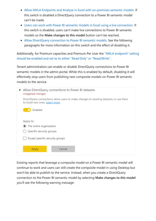
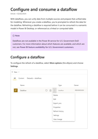
To enable the creation and consumption of composite models on Power BI semantic
models, your tenant needs to have the following switches enabled:
[Total Sales] = [Internet Sales] + [Reseller Sales]
Composite models on Power BI semantic
models and Analysis Services
Managing composite models on Power BI semantic
models](https://image.slidesharecdn.com/power-bi-transform-model-240816060942-392a4bd2/85/Pwer-BI-DAX-and-Model-Transformation-pdf-147-320.jpg)

![The extended property isSaaSMetadata added in the datamart lets you know that this
metadata is getting used for SaaS experience. You can query this extended property as
below:
SQL
The clients (such as the SQL connector) could read the relationships by querying the
table-valued function like the following:
SQL
Notice there are relationships and relationshipColumns named views under metadata
schema to maintain relationships in the datamart. The following tables provide a
description of each of them, in turn:
[metadata].[relationships]
Column name Data type Description
RelationshipId Bigint Unique identifier for a relationship
Name Nvarchar(128) Relationship's name
FromSchemaName Nvarchar(128) Schema name of source table "From" which
relationship is defined.
FromObjectName Nvarchar(128) Table/View name "From" which relationship is
defined
ToSchemaName Nvarchar(128) Schema name of sink table "To"which relationship is
defined
ToObjectName Nvarchar(128) Table/View name "To"which relationship is defined
TypeOfRelationship Tinyint Relationship cardinality, the possible values are: 0 –
None 1 – OneToOne 2 – OneToMany 3 –
ManyToOne 4 – ManyToMany
Relationships metadata
SELECT [name], [value]
FROM sys.extended_properties
WHERE [name] = N'isSaaSMetadata'
SELECT *
FROM [metadata].[fn_relationships]();](https://image.slidesharecdn.com/power-bi-transform-model-240816060942-392a4bd2/85/Pwer-BI-DAX-and-Model-Transformation-pdf-243-320.jpg)
![Column name Data type Description
SecurityFilteringBehavior Tinyint Indicates how relationships influence filtering of
data when evaluating row-level security expressions.
The possible values are 1 – OneDirection 2 –
BothDirections 3 – None
IsActive Bit A boolean value that indicates whether the
relationship is marked as Active or Inactive.
RelyOnReferentialIntegrity Bit A boolean value that indicates whether the
relationship can rely on referential integrity or not.
CrossFilteringBehavior Tinyint Indicates how relationships influence filtering of
data. The possible values are: 1 – OneDirection 2 –
BothDirections 3 – Automatic
CreatedAt Datetime Date the relationship was created.
UpdatedAt datetime Date the relationship was modified.
DatamartObjectId Navrchar(32) Unique identifier for datamart
[metadata].[relationshipColumns]
Column name Data type Description
RelationshipColumnId bigint Unique identifier for a relationship's column.
RelationshipId bigint Foreign key, reference the RelationshipId key in the
Relationships Table.
FromColumnName Navrchar(128) Name of the "From" column
ToColumnName Nvarchar(128) Name of the "To" column
CreatedAt datetime ate the relationship was created.
DatamartObjectId Navrchar(32) Unique identifier for datamart
You can join these two views to get relationships added in the datamart. The following
query will join these views:
SQL
SELECT
R.RelationshipId
,R.[Name]
,R.[FromSchemaName]](https://image.slidesharecdn.com/power-bi-transform-model-240816060942-392a4bd2/85/Pwer-BI-DAX-and-Model-Transformation-pdf-244-320.jpg)
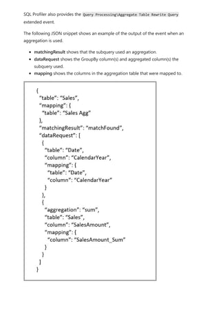
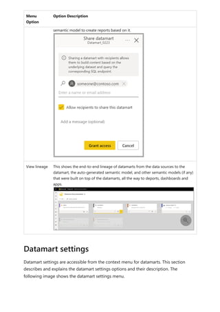
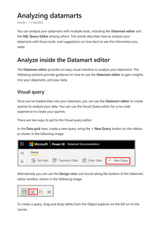
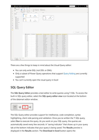
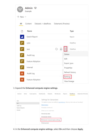
![Visualize results currently does not support SQL queries with an ORDER BY clause.
This article provided information about analyzing data in datamarts.
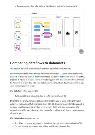
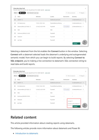
The following articles provide more information about datamarts and Power BI:
Introduction to datamarts
Understand datamarts
Get started with datamarts
Create reports with datamarts
Access control in datamarts
Datamart administration
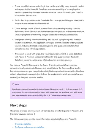
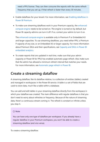
For more information about dataflows and transforming data, see the following articles:
Introduction to dataflows and self-service data prep
Tutorial: Shape and combine data in Power BI Desktop
,R.[FromObjectName]
,C.[FromColumnName]
,R.[ToSchemaName]
,R.[ToObjectName]
,C.[ToColumnName]
FROM [METADATA].[relationships] AS R
JOIN [metadata].[relationshipColumns] AS C
ON R.RelationshipId=C.RelationshipId
Limitations
Next steps](https://image.slidesharecdn.com/power-bi-transform-model-240816060942-392a4bd2/85/Pwer-BI-DAX-and-Model-Transformation-pdf-245-320.jpg)


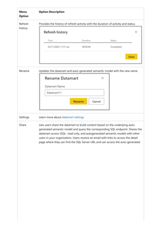
![select the download icon on the far right of the refresh description's row. The
downloaded CSV includes the attributes described in the following table. Premium
refreshes provide more information based on the extra compute and dataflows
capabilities, versus Pro based dataflows that reside on shared capacity. As such, some of
the following metrics are available only in Premium.
Item Description Pro Premium
Requested
on
Time refresh was scheduled or refresh now was clicked, in local
time.
✔ ✔
Dataflow
name
Name of your Dataflow. ✔ ✔
Dataflow
refresh
status
Completed, Failed, or Skipped (for an entity) are possible
statuses. Use cases like Linked Entities are reasons why one
might see skipped.
✔ ✔
Entity name Table name. ✔ ✔
Partition
name
This item is dependent on if the dataflow is premium or not, and
if Pro shows as NA because it doesn't support incremental
refreshes. Premium shows either FullRefreshPolicyPartition or
IncrementalRefreshPolicyPartition-[DateRange].
✔
Refresh
status
Refresh status of the individual entity or partition, which provides
status for that time slice of data being refreshed.
✔ ✔
Start time In Premium, this item is the time the dataflow was queued up for
processing for the entity or partition. This time can differ if
dataflows have dependencies and need to wait for the result set
of an upstream dataflow to begin processing.
✔ ✔
End time End time is the time the dataflow entity or partition completed, if
applicable.
✔ ✔
Duration Total elapsed time for the dataflow to refresh expressed in
HH:MM:SS.
✔ ✔
Rows
processed
For a given entity or partition, the number of rows scanned or
written by the dataflows engine. This item might not always
contain data based on the operation you performed. Data might
be omitted when the compute engine isn't used, or when you
use a gateway as the data is processed there.
✔
Bytes
processed
For a given entity or partition, Data written by the dataflows
engine, expressed in bytes.
When using a gateway on this particular dataflow, this
information isn't provided.
✔](https://image.slidesharecdn.com/power-bi-transform-model-240816060942-392a4bd2/85/Pwer-BI-DAX-and-Model-Transformation-pdf-351-320.jpg)


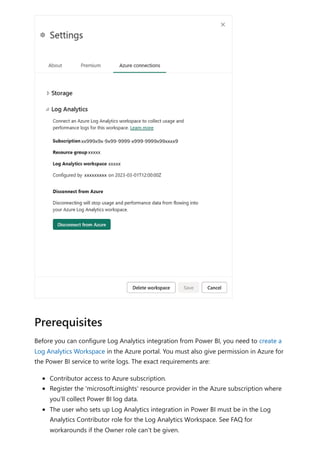
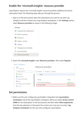
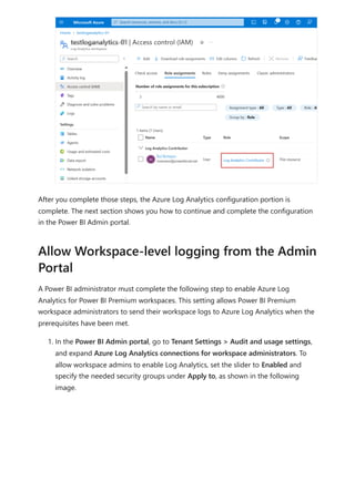
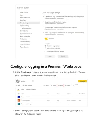
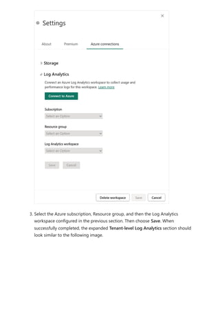
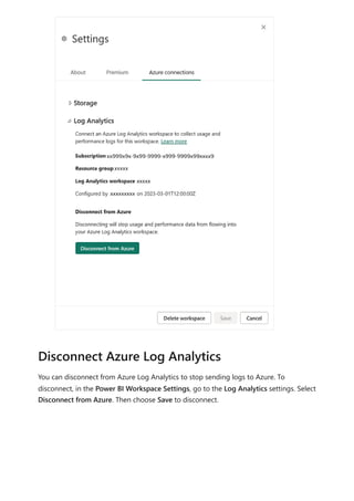
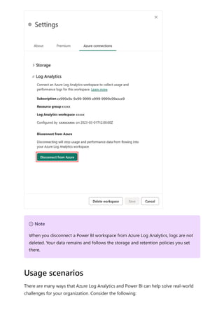
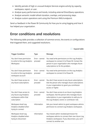
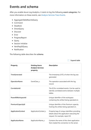
![Sovereign cloud support is currently limited to US Department of Defense and
US Government Community Cloud High.
Only Premium workspaces are supported.
Only Workspace v2 support Log Analytics connections.
Azure Log Analytics doesn't support tenant migration.
Activities are only captured for semantic models physically hosted within the
Premium workspace where you configure logging. For example, if you configure
logging for Premium workspace A, you won't see logs for any reports within that
use semantic models hosted in Azure Analysis Services . You also won't see any
logs for shared semantic models that aren't in Premium workspace A. To capture
activities for shared semantic models, configure logging on the workspace that
contains the shared semantic model, not the workspace that contains the report.
Semantic models created on the web by uploading a CSV file don't generate logs.
If you have Multi-Factor Auth (MFA) in place for Azure but not Power BI, the
configuration screens will give general Azure errors. A workaround is to first sign in
to the Azure portal , complete the MFA challenge and then log into Power BI in
the same browser session.
If you're using private links/VNets to isolate your Log Analytics workspaces, data
ingestion into Log Analytics is unaffected. However, the [Log Analytics Template
app(https://appsource.microsoft.com/product/power-
bi/pbi_pcmm.powerbiloganalyticsforasengine?tab=Overview)] won't work because
it relies on a public endpoint that is no longer accessible by the Power Service as a
private link. A workaround is to use the [.pbit report
template(https://github.com/microsoft/PowerBI-LogAnalytics-Template-Reports)]
and refresh the data from inside the private VNet. You must set up a custom DNS
mapping to ensure the public endpoint uses a private internal IP.
For the Log Analytics feature, Power BI only sends data to the
PowerBIDatasetsWorkspace table and doesn't send data to the to
PowerBIDatasetsTenant table. This avoids storing duplicate data about log analytics
in both locations.
The following articles provide more information about Power BI and its many features:
Configuring Azure Log Analytics for Power BI
Azure Log Analytics in Power BI FAQ
What is Power BI Premium?
Organize work in workspaces in Power BI
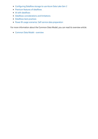
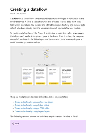
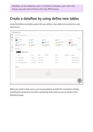
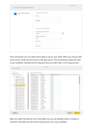
Creating a dataflow
Dataflows best practices
Next steps](https://image.slidesharecdn.com/power-bi-transform-model-240816060942-392a4bd2/85/Pwer-BI-DAX-and-Model-Transformation-pdf-418-320.jpg)

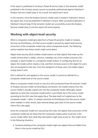
![To explain how Power BI determines whether fields are related, let's use an example
model to illustrate a few scenarios in the following sections. The following image shows
the sample model we'll use in the example scenarios.
Scenario 1: Traditional star schema and no measure constraint provided. Referring to
the sample model in the previous image, let's look first at the right half of the images
with the Vendor - Purchases - Product tables. This example is a traditional star schema
with the Fact table (Purchases) and two Dimension tables (Product and Vendor). The
relationship between the dimension tables and the fact table is 1 to Many (one product
corresponds to many purchases, one vendor corresponds to many purchases). In this
type of schema, we can answer questions like What sales do we have for product X? and
What sales do we have for Vendor Y? and What products does Vendor Y sell?
If we want to correlate Products and Vendors, we can do so by looking at the Purchases
table to see if there's an entry with the same product and vendor. A sample query might
look like the following example:
Correlate Product[Color] with Vendor[Name] where CountRows(Purchases)>0
The where CountRows(Purchases)>0 is an implicit constraint that Power BI would add to
ensure relevant data is returned. By doing this correlation through the Purchases table,
we can return pairings of Product-Vendor that have at least one entry in a fact table,
pairings that make sense from the data perspective. You can expect any nonsensical
combinations of Product-Vendor for which there has never been a sale (which would be
useless for analysis) won't be displayed.
Scenario 2: Traditional star schema and measure constraint provided. In the previous
example in Scenario 1, if the user provides a constraint in the form of summarized](https://image.slidesharecdn.com/power-bi-transform-model-240816060942-392a4bd2/85/Pwer-BI-DAX-and-Model-Transformation-pdf-472-320.jpg)
![column (Sum/Average/Count of Purchase Qty, for example) or a model measure
(Distinct Count of VendID), Power BI can generate a query in the form of the following
example:
Correlate Product[Color] with Vendor[Name] where MeasureConstraint is not blank
In such a case, Power BI attempts to return combinations that have meaningful values
for the constraint provided by the user (non-blank). Power BI doesn't need to also add
its own implicit constraint of CountRows(Purchases)>0, such as what was done like in the
previous Scenario 1, because the constraint provided by the user is sufficient.
Scenario 3: Non-star schema and no measure constraint provided. In this scenario, we
focus our attention to the center of the model, where we have the Sales - Product -
Purchases tables, where we have one dimension table (Product) and two Fact Tables
(Sales, Purchases). Since this example isn't a star schema, we can't answer the same kind
of questions as we had in Scenario 1. Let's say we try to correlate Purchases and Sales,
since Purchases has a Many to 1 relationship with Product, and Product has a 1 to Many
relationship with Sales. Sales and Purchases are indirectly Many to Many. We can link one
Product to many Purchases and one Product to many sales, but we can't link one Sale to
many Purchases or vice versa. We can only link many Purchases to many Sales.
In this situation, if we try to combine Purchase[VenID] and Sales[CustID] in a visual,
Power BI doesn't have a concrete constraint it can apply, due to the Many to Many
relationship between those tables. Though there might be custom constraints (not
necessarily stemming from the relationships established in the model) that can be
applied for various scenarios, Power BI can't infer a default constraint solely based on
the relationships. If Power BI attempted to return all combinations of the two tables, it
would create a large cross join and return non-relevant data. Instead of this, Power BI
raises an error in the visual, such as the following.
Scenario 4: Non-star schema and measure constraint provided. If we take the example
from Scenario 3, and add a user provided constraint in the form of a summarized
column (Count of Product[ProdID] for example) or a model measure (Sales[Total Qty]),](https://image.slidesharecdn.com/power-bi-transform-model-240816060942-392a4bd2/85/Pwer-BI-DAX-and-Model-Transformation-pdf-473-320.jpg)
![Power BI can generate a query in the form of Correlate Purchase[VenID] and
Sales[CustID] where MeasureConstraint isn't blank.
In this case, Power BI respects the user's constraint as being the sole constraint Power BI
needs to apply, and return the combinations that produce non-blank values for it. The
user has guided Power BI to the scenario it wants, and Power BI applies the guidance.
Scenario 5: When a measure constraint is provided but it is partially related to the
columns. There are cases where the measure constraint provided by the user isn't
entirely related to all the columns in the visual. A model measure always relates
everything. Power BI treats this scenario as a black box when attempting to find
relationships between columns in the visual, and it assumes the user knows what they're
doing by using it. However, summarized columns in the form of Sum, Average, and
similar summaries chosen from the user interface can be related to only a subset of the
columns/tables used in the visual based on the relationships of the table to which that
column belongs. As such, the constraint applies to some pairings of columns, but not to
all. In that case Power BI attempts to find default constraints it can apply for the columns
that aren't related by the user provided constraint (such as in Scenario 1). If Power BI
can't find any, the following error is returned.
When you see the Can't determine relationships between the fields error, you can take
the following steps to attempt to resolve the error:
1. Check your model. Is it set up appropriately for the types of questions you want
answered from your analysis? Can you change some of the relationships between
tables? Can you avoid creating an indirect Many to Many?
Consider converting your reversed V shape schema to two tables, and use a direct
Many to Many relationship between them as described in apply many-many
relationships in Power BI Desktop.
Resolving relationship errors](https://image.slidesharecdn.com/power-bi-transform-model-240816060942-392a4bd2/85/Pwer-BI-DAX-and-Model-Transformation-pdf-474-320.jpg)
![The best way to learn DAX is to create some basic formulas, use them with actual data,
and see the results for yourself. The examples and tasks here use the Contoso Sales
Sample for Power BI Desktop file . This sample file is the same one used in the Tutorial:
Create your own measures in Power BI Desktop article.
We'll frame our understanding of DAX around three fundamental concepts: Syntax,
Functions, and Context. There are other important concepts in DAX, but understanding
these three concepts will provide the best foundation on which to build your DAX skills.
Before you create your own formulas, let’s take a look at DAX formula syntax. Syntax
includes the various elements that make up a formula, or more simply, how the formula
is written. For example, here's a simple DAX formula for a measure:
This formula includes the following syntax elements:
A. The measure name, Total Sales.
B. The equals sign operator (=), which indicates the beginning of the formula. When
calculated, it will return a result.
C. The DAX function SUM, which adds up all of the numbers in the Sales[SalesAmount]
column. You’ll learn more about functions later.
D. Parenthesis (), which surround an expression that contains one or more arguments.
Most functions require at least one argument. An argument passes a value to a function.
E. The referenced table, Sales.
F. The referenced column, [SalesAmount], in the Sales table. With this argument, the
SUM function knows on which column to aggregate a SUM.
Example workbook
Let's begin
Syntax](https://image.slidesharecdn.com/power-bi-transform-model-240816060942-392a4bd2/85/Pwer-BI-DAX-and-Model-Transformation-pdf-489-320.jpg)
![When trying to understand a DAX formula, it's often helpful to break down each of the
elements into a language you think and speak every day. For example, you can read this
formula as:
For the measure named Total Sales, calculate (=) the SUM of values in the
[SalesAmount ] column in the Sales table.
When added to a report, this measure calculates and returns values by summing up
sales amounts for each of the other fields we include, for example, Cell Phones in the
USA.
You might be thinking, "Isn’t this measure doing the same thing as if I were to just add
the SalesAmount field to my report?" Well, yes. But, there’s a good reason to create our
own measure that sums up values from the SalesAmount field: We can use it as an
argument in other formulas. This solution might seem a little confusing now, but as your
DAX formula skills grow, knowing this measure will make your formulas and your model
more efficient. In fact, you’ll see the Total Sales measure showing up as an argument in
other formulas later on.
Let’s go over a few more things about this formula. In particular, we introduced a
function, SUM. Functions are pre-written formulas that make it easier to do complex
calculations and manipulations with numbers, dates, time, text, and more. You'll learn
more about functions later.
You also see that the column name [SalesAmount] was preceded by the Sales table in
which the column belongs. This name is known as a fully qualified column name in that
it includes the column name preceded by the table name. Columns referenced in the
same table don't require the table name be included in the formula, which can make
long formulas that reference many columns shorter and easier to read. However, it's a
good practice to include the table name in your measure formulas, even when in the
same table.
7 Note
If a table name contains spaces, reserved keywords, or disallowed characters, you
must enclose the table name in single quotation marks. You’ll also need to enclose
table names in quotation marks if the name contains any characters outside the
ANSI alphanumeric character range, regardless of whether your locale supports the
character set or not.](https://image.slidesharecdn.com/power-bi-transform-model-240816060942-392a4bd2/85/Pwer-BI-DAX-and-Model-Transformation-pdf-490-320.jpg)
![It’s important your formulas have the correct syntax. In most cases, if the syntax isn't
correct, a syntax error is returned. In other cases, the syntax might be correct, but the
values returned might not be what you're expecting. The DAX editor in Power BI
Desktop includes a suggestions feature, used to create syntactically correct formulas by
helping you select the correct elements.
Let’s create an example formula. This task will help you further understand formula
syntax and how the suggestions feature in the formula bar can help you.
1. Download and open the Contoso Sales Sample Power BI Desktop file.
2. In Report view, in the field list, right-click the Sales table, and then select New
Measure.
3. In the formula bar, replace Measure by entering a new measure name, Previous
Quarter Sales.
4. After the equals sign, type the first few letters CAL, and then double-click the
function you want to use. In this formula, you want to use the CALCULATE
function.
You’ll use the CALCULATE function to filter the amounts we want to sum by an
argument we pass to the CALCULATE function. This type of function is referred to
as nesting functions. The CALCULATE function has at least two arguments. The first
is the expression to be evaluated, and the second is a filter.
5. After the opening parenthesis ( for the CALCULATE function, type SUM followed by
another opening parenthesis (.
Next, we'll pass an argument to the SUM function.
6. Begin typing Sal, and then select Sales[SalesAmount], followed by a closing
parenthesis ).
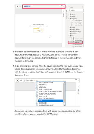
This step creates the first expression argument for our CALCULATE function.
7. Type a comma (,) followed by a space to specify the first filter, and then type
PREVIOUSQUARTER.
You’ll use the PREVIOUSQUARTER time intelligence function to filter SUM results
by the previous quarter.
Task: Create a measure formula](https://image.slidesharecdn.com/power-bi-transform-model-240816060942-392a4bd2/85/Pwer-BI-DAX-and-Model-Transformation-pdf-491-320.jpg)
![8. After the opening parenthesis ( for the PREVIOUSQUARTER function, type
Calendar[DateKey].
The PREVIOUSQUARTER function has one argument, a column containing a
contiguous range of dates. In our case, that's the DateKey column in the Calendar
table.
9. Close both the arguments being passed to the PREVIOUSQUARTER function and
the CALCULATE function by typing two closing parenthesis )).
Your formula should now look like this:
Previous Quarter Sales = CALCULATE(SUM(Sales[SalesAmount]),
PREVIOUSQUARTER(Calendar[DateKey]))
10. Select the checkmark in the formula bar or press Enter to validate the formula
and add it to the Sales table.
You did it! You just created a complex measure by using DAX. What this formula will do
is calculate the total sales for the previous quarter, depending on the filters applied in a
report. For example, we can put SalesAmount and our new Previous Quarter Sales
measure from the Sales table into a Clustered column chart. Then from the Calendar
table add Year as a slicer and select 2011. Then after, add QuarterOfYear as another
Slicer and select 4, and we get a chart like this:
Keep in mind, the sample model contains only a small amount of sales data from
1/1/2011 to 1/19/2013. If you select a year or quarter where SalesAmount can't be
summed, or your new measure can't calculate sales data for the current or previous
quarter, no data for that period is shown. For example, if you select 2011 for Year and 1](https://image.slidesharecdn.com/power-bi-transform-model-240816060942-392a4bd2/85/Pwer-BI-DAX-and-Model-Transformation-pdf-492-320.jpg)
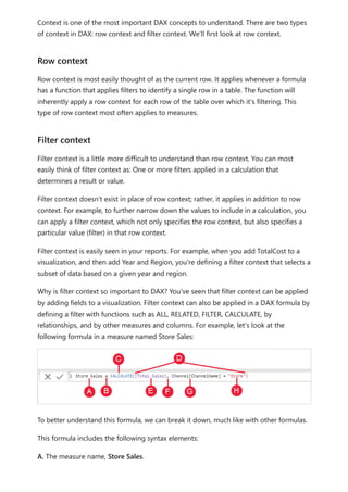
![B. The equals sign operator (=), which indicates the beginning of the formula.
C. The CALCULATE function, which evaluates an expression, as an argument, in a context
that is modified by the specified filters.
D. Parenthesis (), which surround an expression containing one or more arguments.
E. A measure [Total Sales] in the same table as an expression. The Total Sales measure
has the formula: =SUM(Sales[SalesAmount]).
F. A comma (,), which separates the first expression argument from the filter argument.
G. The fully qualified referenced column, Channel[ChannelName]. This is our row
context. Each row in this column specifies a channel, such as Store or Online.
H. The particular value, Store, as a filter. This is our filter context.
This formula ensures only sales values defined by the Total Sales measure are calculated
only for rows in the Channel[ChannelName] column, with the value Store used as a filter.
As you can imagine, being able to define filter context within a formula has immense
and powerful capabilities. The ability to reference only a particular value in a related
table is just one such example. Don’t worry if you don't completely understand context
right away. As you create your own formulas, you'll better understand context and why
it’s so important in DAX.
1. What are the two types of context?
2. What is filter context?
3. What is row context?
Answers are provided at the end of this article.
Now that you have a basic understanding of the most important concepts in DAX, you
can begin creating DAX formulas for measures on your own. DAX can indeed be a little
tricky to learn, but there are many resources available to you. After reading through this
article and experimenting with a few of your own formulas, you can learn more about
other DAX concepts and formulas that can help you solve your own business problems.
There are many DAX resources available to you; most important is the Data Analysis
Expressions (DAX) Reference.
Context QuickQuiz
Summary](https://image.slidesharecdn.com/power-bi-transform-model-240816060942-392a4bd2/85/Pwer-BI-DAX-and-Model-Transformation-pdf-496-320.jpg)
![Because DAX has been around for several years in other Microsoft BI tools such as
Power Pivot and Analysis Services Tabular models, there are many great sources
information out there. You can find more information in books, whitepapers, and blogs
from both Microsoft and leading BI professionals. The DAX Resource Center is also a
great place to start.
Syntax:
1. Validates and enters the measure into the model.
2. Brackets [].
Functions:
1. A table and a column.
2. Yes. A formula can contain up to 64 nested functions.
3. Text functions.
Context:
1. Row context and filter context.
2. One or more filters in a calculation that determines a single value.
3. The current row.
QuickQuiz answers](https://image.slidesharecdn.com/power-bi-transform-model-240816060942-392a4bd2/85/Pwer-BI-DAX-and-Model-Transformation-pdf-497-320.jpg)

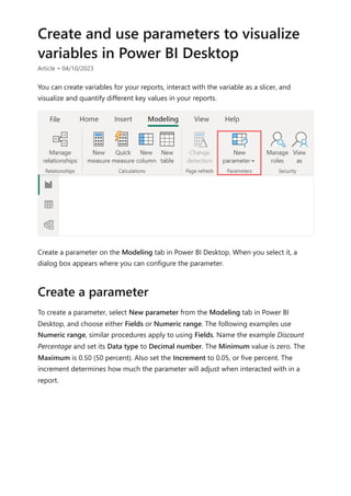
![visualize the variable of your parameter. For example, you could create a report that lets
sales people see their compensation if they meet certain sales goals or percentages, or
see the effect of increased sales to deeper discounts.
Enter the measure formula into the formula bar, and name the formula Sales after
Discount.
DAX
Then, create a column visual with OrderDate on the axis, and both SalesAmount and
the just-created measure, Sales after Discount as the values.
Then, as you move the slider, you'll see that the Sales after Discount column reflects the
discounted sales amount.
Sales after Discount = SUM(Sales[SalesAmount]) - (SUM(Sales[SalesAmount]) *
'Discount percentage' [Discount percentage Value])](https://image.slidesharecdn.com/power-bi-transform-model-240816060942-392a4bd2/85/Pwer-BI-DAX-and-Model-Transformation-pdf-539-320.jpg)
![DAX formulas are similar to Excel formulas. In fact, DAX has many of the same functions
as Excel. DAX functions, however, are meant to work over data interactively sliced or
filtered in a report, like in Power BI Desktop. In Excel, you can have a different formula
for each row in a table. In Power BI, when you create a DAX formula for a new column, it
will calculate a result for every row in the table. Column values are recalculated as
necessary, like when the underlying data is refreshed and values have changed.
Jeff is a shipping manager at Contoso, and wants to create a report showing the number
of shipments to different cities. Jeff has a Geography table with separate fields for city
and state. But, Jeff wants their reports to show the city and state values as a single value
on the same row. Right now, Jeff's Geography table doesn't have the wanted field.
But with a calculated column, Jeff can put together the cities from the City column with
the states from the State column.
Jeff right-clicks on the Geography table and then selects New Column. Jeff then enters
the following DAX formula into the formula bar:
DAX
This formula creates a new column named CityState. For each row in the Geography
table, it takes values from the City column, adds a comma and a space, and then
concatenates values from the State column.
Now Jeff has the wanted field.
Let's look at an example
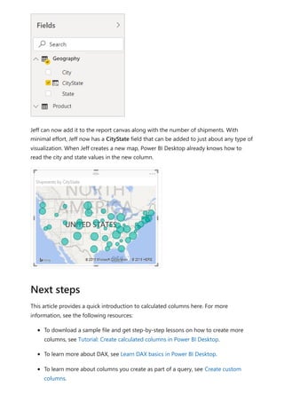
CityState = [City] & "," & [State]](https://image.slidesharecdn.com/power-bi-transform-model-240816060942-392a4bd2/85/Pwer-BI-DAX-and-Model-Transformation-pdf-550-320.jpg)

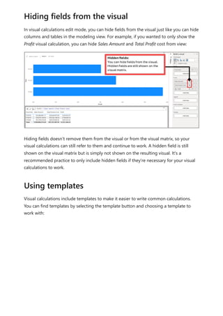
![Using visual calculations (preview)
Article • 02/20/2024
A visual calculation is a DAX calculation that's defined and executed directly on a visual.
Visual calculations make it easier to create calculations that were previously hard to
create, leading to simpler DAX, easier maintenance, and better performance.
Here's an example visual calculation that defines a running sum for Sales Amount.
Notice that the DAX required is straightforward:
Running sum = RUNNINGSUM([Sales Amount])
A calculation can refer to any data in the visual including columns, measures, or other
visual calculations, which removes the complexity of the semantic model and simplifies
the process of writing DAX. You can use visual calculations to complete common
business calculations such as running sums or moving averages.
Visual calculations differ from the other calculations options in DAX:
Visual calculations aren't stored in the model, and instead are stored on the visual,
which means visual calculations can only refer to what's on the visual. Anything in
the model must be added to the visual before the visual calculation can refer to it,
freeing visual calculations from being concerned with the complexity of filter
context and the model.
7 Note
Visual calculations are currently in preview.](https://image.slidesharecdn.com/power-bi-transform-model-240816060942-392a4bd2/85/Pwer-BI-DAX-and-Model-Transformation-pdf-556-320.jpg)
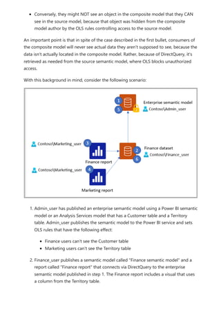
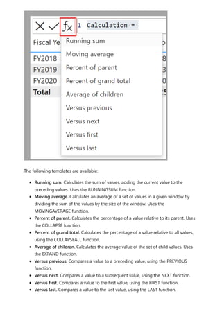
![The visual calculations window opens in Edit mode. The Edit mode screen consists of
three major sections, as shown from top to bottom in the following image:
The visual preview which shows the visual you're working with
A formula bar where you can add visual calculations
The visual matrix which shows the data in the visual, and displays the results of
visual calculations as you add them
To add a visual calculation, type the expression in the formula bar. For example, in a
visual that contains Sales Amount and Total Product Cost by Fiscal Year, you can add a
visual calculation that calculates the profit for each year by simply typing: Profit = [Sales
Amount] – [Total Product Cost].](https://image.slidesharecdn.com/power-bi-transform-model-240816060942-392a4bd2/85/Pwer-BI-DAX-and-Model-Transformation-pdf-558-320.jpg)
![multiple levels on the axis. If there's only one level on the axis, you can use
PARTITIONBY. The following list describes the only valid values for the Reset parameter:
NONE is the default value and doesn't reset the calculation.
HIGHESTPARENT resets the calculation when the value of the highest parent on
the axis changes.
LOWESTPARENT resets the calculations when the value of the lowest parent on the
axis changes.
A numerical value, referring to the fields on the axis, with the highest field being
one.
To understand HIGHESTPARENT and LOWESTPARENT, consider an axis that has three
fields on multiple levels: Year, Quarter, and Month. The HIGHESTPARENT is Year, while
the lowest parent is Quarter. For example, a visual calculation that is defined as
RUNNINGSUM([Sales Amount], HIGHESTPARENT) or RUNNINGSUM([Sales Amount], 1)
returns a running sum of Sales Amount that starts from 0 for every year. A visual
calculation defined as RUNNINGSUM([Sales Amount], LOWESTPARENT) or
RUNNINGSUM([Sales Amount], 2) returns a running sum of Sales Amount that starts
from 0 for every Quarter. Lastly, a visual calculation that is defined as
RUNNINGSUM([Sales Amount]) does not reset, and will continue adding the Sales
Amount value for each month to the previous values, without restarting.
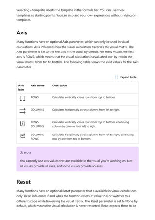
Axis, Reset, ORDERBY, and PARTITIONBY are four functions that can be used in pairs or
together to influence how a calculation is evaluated. They form two pairs that are often
used together:
Axis and Reset
ORDERBY and PARTITIONBY
Axis and Reset are only available for functions that can be used in visual calculations and
can only be used in a visual calculation, as they reference the visual structure. ORDERBY
and PARTITIONBY are functions that can be used in calculated columns, measures, and
visual calculations and refer to fields. While they perform the same function, they're
different in the level of abstraction provided; referring to the visual structure is more
flexible than the explicit referencing to fields using ORDERBY or PARTITIONBY.
Reset expects there to be multiple levels on the axis. In case you don't have multiple
levels on the axis, either because there's only one field or multiple fields in one single
level on the axis, you can use PARTITIONBY.
Axis and Reset vs ORDERBY and PARTITIONBY](https://image.slidesharecdn.com/power-bi-transform-model-240816060942-392a4bd2/85/Pwer-BI-DAX-and-Model-Transformation-pdf-564-320.jpg)
![Specifying either pair works well, but you can also specify Axis, ORDERBY and/or
PARTITIONBY together, in which case the values specified for ORDERBY and
PARTITIONBY override the values dictated by Axis. Reset can't be combined with
ORDERBY and PARTITIONBY.
You can think of the ORDERBY and PARTITIONBY pair as pinning field references down
by explicitly specifying fields, where Axis and Reset are field agnostic – they refer to the
structure and whatever field happens to be on the structure that is getting used.
You can use many of the existing DAX functions in visual calculations. Since visual
calculations work within the confines of the visual matrix, functions that rely on model
relationships such as USERELATIONSHIP, RELATED or RELATEDTABLE aren't available.
Visual calculations also introduce a set of functions specific to visual calculations. Many
of these functions are easier to use shortcuts to DAX window functions.
Function Description Example Shortcut
to
COLLAPSE Calculation is
evaluated at a higher
level of the axis.
Percent of parent = DIVIDE([Sales
Amount], COLLAPSE([Sales Amount],
ROWS))
N/A
COLLAPSEALL Calculation is
evaluated at the total
level of the axis.
Percent of grand total = DIVIDE([Sales
Amount], COLLAPSEALL([Sales
Amount], ROWS))
N/A
EXPAND Calculation is
evaluated at a lower
level of the axis.
Average of children =
EXPAND(AVERAGE([Sales Amount]),
ROWS)
N/A
EXPANDALL Calculation is
evaluated at the leaf
Average of leaf level =
EXPANDALL(AVERAGE([Sales Amount]),
N/A
Available functions
7 Note
Only use the visual calculations specific functions mentioned in the table below.
Other visual calculations specific functions are for internal use only at this time and
should not be used. Refer to the table below for any updates of the functions
available for use as this preview progresses.
ノ Expand table](https://image.slidesharecdn.com/power-bi-transform-model-240816060942-392a4bd2/85/Pwer-BI-DAX-and-Model-Transformation-pdf-565-320.jpg)
![Function Description Example Shortcut
to
level of the axis. ROWS)
FIRST Refers to the first row
of an axis.
ProfitVSFirst = [Profit] – FIRST([Profit]) INDEX(1)
ISATLEVEL Reports whether a
specified column is
present at the current
level.
IsFiscalYearAtLevel = ISATLEVEL([Fiscal
Year])
N/A
LAST Refers to the last row
of an axis.
ProfitVSLast = [Profit] – LAST([Profit]) INDEX(-1)
MOVINGAVERAGE Adds a moving
average on an axis.
MovingAverageSales =
MOVINGAVERAGE([Sales Amount], 2)
WINDOW
NEXT Refers to a next row
of an axis.
ProfitVSNext = [Profit] – NEXT([Profit]) OFFSET(1)
PREVIOUS Refers to a previous
row of an axis.
ProfitVSPrevious = [Profit] –
PREVIOUS([Profit])
OFFSET(-1)
RANGE Refers to a slice of
rows of an axis.
AverageSales = AVERAGEX(RANGE(1),
[Sales Amount])
WINDOW
RUNNINGSUM Adds a running sum
on an axis.
RunningSumSales =
RUNNINGSUM([Sales Amount])
WINDOW
Visual calculations are currently in preview, and during preview, you should be aware of
the following considerations and limitations:
Not all visual types are supported. Use the visual calculations edit mode to change
visual type. Also, custom visuals haven't been tested with visual calculations or
hidden fields.
The following visual types and visual properties have been tested and found not to
work with visual calculations or hidden fields:
Line and stacked column chart
Treemap
Map
Shape Map
Azure Map
Slicer
Considerations and limitations](https://image.slidesharecdn.com/power-bi-transform-model-240816060942-392a4bd2/85/Pwer-BI-DAX-and-Model-Transformation-pdf-566-320.jpg)
![DAX formulas are a lot like Excel formulas. DAX even has many of the same functions as
Excel, such like DATE , SUM , and LEFT . But the DAX functions are meant to work with
relational data like we have in Power BI Desktop.
Janice is a sales manager at Contoso. Janice has been asked to provide reseller sales
projections over the next fiscal year. Janice decides to base the estimates on last year's
sales amounts, with a six percent annual increase resulting from various promotions that
are scheduled over the next six months.
To report the estimates, Janice imports last year's sales data into Power BI Desktop.
Janice finds the SalesAmount field in the Reseller Sales table. Because the imported
data only contains sales amounts for last year, Janice renames the SalesAmount field to
Last Years Sales. Janice then drags Last Years Sales onto the report canvas. It appears in
a chart visualization as a single value that is the sum of all reseller sales from last year.
Janice notices that even without specifying a calculation, one has been provided
automatically. Power BI Desktop created its own measure by summing up all of the
values in Last Years Sales.
But Janice needs a measure to calculate sales projections for the coming year, which will
be based on last year's sales multiplied by 1.06 to account for the expected 6 percent
increase in business. For this calculation, Janice will create a measure. Janice creates a
new measure by using the New Measure feature, then enters the following DAX formula:
DAX
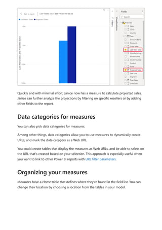
Janice then drags the new Projected Sales measure into the chart.
Let’s look at an example
Projected Sales = SUM('Reseller Sales'[Last Years Sales])*1.06](https://image.slidesharecdn.com/power-bi-transform-model-240816060942-392a4bd2/85/Pwer-BI-DAX-and-Model-Transformation-pdf-571-320.jpg)
![In Power BI Desktop, a valid measure expression could read:
DAX
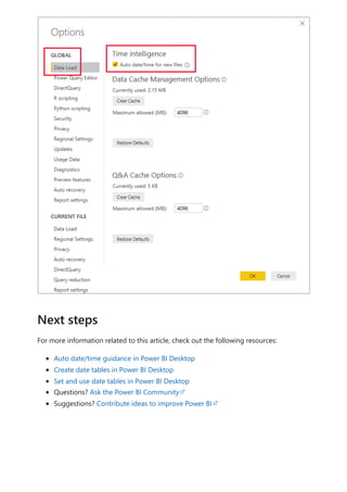
Auto date/time can be configured globally or for the current file. The global option
applies to new Power BI Desktop files, and it can be turned on or off at any time. For a
new installation of Power BI Desktop, both options default to on.
The current file option, too, can also be turned on or off at any time. When turned on,
auto date/time tables are created. When turned off, any auto date/time tables are
removed from the model.
In Power BI Desktop, you select File > Options and settings > Options, and then select
either the Global or Current File page. On either page, the option exists in the Time
intelligence section.
Date Count = COUNT(Sales[OrderDate].[Date])
7 Note
While this measure expression is valid in Power BI Desktop, it's not correct DAX
syntax. Internally, Power BI Desktop transposes your expression to reference the
true (hidden) auto date/time table column.
Configure auto date/time option
U Caution
Take care when you turn the current file option off, because this will remove the
auto date/time tables. Be sure to fix any broken report filters or visuals that had
been configured to use them.](https://image.slidesharecdn.com/power-bi-transform-model-240816060942-392a4bd2/85/Pwer-BI-DAX-and-Model-Transformation-pdf-580-320.jpg)

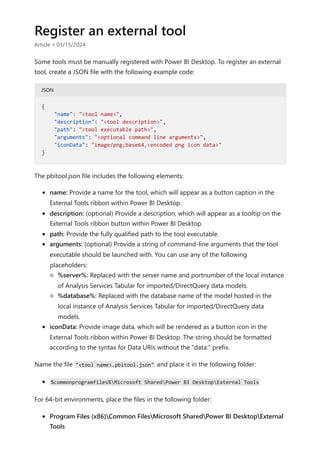
![Files in that specified location with the .pbitool.json extension are loaded by Power BI
Desktop upon startup.
The following *.pbitool.json file launches powershell.exe from the External Tools ribbon
and runs a script called pbiToolsDemo.ps1. The script passes the server name and port
number in the -Server parameter and the semantic model name in the -Database
parameter.
JSON
The corresponding pbiToolsDemo.ps1 script outputs the Server and Database
parameters to the console.
PowerShell
Example
{
"version": "1.0.0",
"name": "External Tools Demo",
"description": "Launches PowerShell and runs a script that outputs
server and database parameters. (Requires elevated PowerShell
permissions.)",
"path":
"C:WindowsSystem32WindowsPowerShellv1.0powershell.exe",
"arguments": "C:pbiToolsDemo.ps1 -Server "%server%" -Database
"%database%"",
"iconData":
"image/png;base64,iVBORw0KGgoAAAANSUhEUgAAAAEAAAABCAYAAAAfFcSJAAAAAXNSR0IArs
4c6QAAAARnQU1BAACxjwv8YQUAAAAJcEhZcwAADsEAAA7BAbiRa+0AAAANSURBVBhXY/jH9+8/AA
ciAwpql7QkAAAAAElFTkSuQmCC"
}
[CmdletBinding()]
param
(
[Parameter(Mandatory = $true)]
[string] $Server,
[Parameter(Mandatory = $true)]
[string] $Database
)
Write-Host ""
Write-Host "Analysis Services instance: " -NoNewline
Write-Host "$Server" -ForegroundColor Yellow
Write-Host "Dataset name: " -NoNewline
Write-Host "$Database" -ForegroundColor Green
Write-Host ""
Read-Host -Prompt 'Press [Enter] to close this window'](https://image.slidesharecdn.com/power-bi-transform-model-240816060942-392a4bd2/85/Pwer-BI-DAX-and-Model-Transformation-pdf-588-320.jpg)
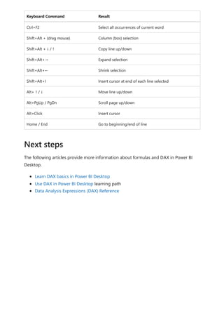
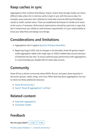
![Formula editor in Power BI Desktop
Article • 02/10/2023
The formula editor (often referred to as the DAX editor) includes robust editing and
shortcut enhancements to make authoring and editing formulas easy and intuitive.
You can use the following keyboard shortcuts to increase your productivity and
streamline creating formulas in the formula editor.
Keyboard Command Result
Ctrl+C Copy line (empty selection)
Ctrl+G Go to line…
Ctrl+L Select current line
Ctrl+M Toggle Tab moves focus
Ctrl+U Undo last cursor operation
Ctrl+X Cut line (empty selection)
Shift+Enter Insert line below
Ctrl+Shift+Enter Insert line above
Ctrl+Shift+ Jump to matching bracket
Ctrl+Shift+K Delete line
Ctrl+] / [ Indent/outdent line
Ctrl+Home Go to beginning of file
Ctrl+End Go to end of file
Ctrl+↑ / ↓ Scroll line up/down
Ctrl+Shift+Alt + (arrow key) Column (box) selection
Ctrl+Shift+Alt +PgUp/PgDn Column (box) selection page up/down
Ctrl+Shift+L Select all occurrences of current selection
Ctrl+Alt+ ↑ / ↓ Insert cursor above / below
Use the formula editor](https://image.slidesharecdn.com/power-bi-transform-model-240816060942-392a4bd2/85/Pwer-BI-DAX-and-Model-Transformation-pdf-596-320.jpg)