Production schedule call sheet
•Download as DOCX, PDF•
0 likes•51 views
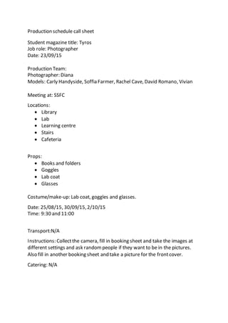
This has the information of who my models are, the location that we would take the pictures and the instructions I put in place for the pictures to be successful.
Report
Share
Report
Share
Recommended
Production schedule
The production schedule outlines a photoshoot for Student Weekly magazine to take place on September 30th and October 2nd. It lists the job role of photographer, models Ellie Cobbett, Hannah Brooker, Chris Mattison and Hiral Nathoo. Photos will be taken at the locations of the main reception, library, classroom and canteen of SFC college. Props include a college ID, water bottle, pencil case and book. Boots are required for the main reception shot on September 30th at 1:30pm and 2:00pm.
Production scehdule
The document is a production schedule listing activities, dates, descriptions, personnel, locations, and equipment needed for a studio shoot on November 20th. It includes a close-up shot of Gemma Nicholson's eyes in a photography studio using a camera and tripod for 10 minutes. Makeup will involve dark eyeshadow under the eyes.
Student risk assessment
This risk assessment document identifies hazards and control measures for students taking photos in the college library. Four hazards are identified: oncoming vehicles when crossing the road, foot traffic flow interfering with photography, rain damaging cameras, and dirty spray cans and bottles. Existing control measures include looking both ways before crossing, using different paths for foot traffic, using an umbrella in the rain, and washing hands after touching spray cans. Further action plans include finding a crossing guard, making more room for others to pass, taking photos later when not raining, and wearing gloves.
Questionnarie 3
This document contains questions from an audience research questionnaire about the design of a magazine, asking about the genre implied by the masthead, whether it looks like a real magazine, the quality of images, how it compares to a well-known hip-hop magazine, and opinions on the color scheme and any sections that could be improved.
How to use in design
The document provides instructions for using various tools and features in InDesign to lay out a research article in a double page spread. It explains how to import elements like mastheads, add and format text boxes, insert columns, page numbers and bylines. It also describes how to change font sizes and colors, add quotes and graphics, and how to select and remove backgrounds when editing images.
Questionnarie 1
The document summarizes feedback from a questionnaire about a magazine. Respondents indicated that the front cover represents a hip-hop and R&B genre. The masthead appeals to a teenage audience interested in rap music. Overall, it looks like a real magazine due to its colorful pages, pictures, and production quality, though the front cover photo could be improved. The color scheme draws attention to the bright masthead against a dull background. Suggested changes included adding more photos to the front cover.
Task 3b
This document provides an analysis of the contents page of a magazine. It summarizes that the contents page layout allows the audience to see a group having fun and laughing. It also notes that the main heading is in the same font as the masthead from the front page. Images on the page, such as a snake, beer bottle, and skull, suggest topics that the magazine may focus on. The main image uses direct address to portray the group in a positive light, having fun. The contents page follows the same color scheme as the front cover. It provides details on the editor's letter and columns on the right side of the page to engage readers without overwhelming them.
Task 2c
This double page spread from NME magazine profiles Dizzee Rascal. The page numbers are typically placed in the bottom corners. This spread fits magazine conventions through the use of a drop cap, a large main image on one page paired with text on the other. It also maintains the color scheme and style from the front cover. The bold headline uses simple words and imagery familiar to the teenage target audience. Dizzee Rascal's name is prominently displayed to represent him as the focus of the magazine spread. The main image depicts him spray painting to symbolize rebellion, while his body language suggests he does not care about getting in trouble. Small details like the masthead, captions and layout fill the space without overwhelming the reader
Task 4
Time Inc. has targeted different audiences over the years based on societal trends. In the late 1800s-early 1900s, their magazines targeted upper class men. From the 1920s-1940s, they shifted to targeting women as more men were at war. They branched into music magazines in the 1950s. Alternative publisher Bauer has consistently targeted both women and men over the decades with magazines related to lifestyle, cars, music and more. They have experience publishing established music titles like Kerrang, MOJO and Q across various genres that could help a new music magazine succeed.
Question 8
This magazine targets working class teenagers and young adults. The vocabulary and large coverlines are easy to understand to keep readers engaged. Bright colors and images of popular artists like Kanye West will attract younger audiences who likely listen to hip hop and recognize these figures. The magazine also seems aimed at African Americans and males, as the cover features Kanye West, a male African American rapper, and hip hop appeals more commonly to those demographics.
Task 2a
This document analyzes a music magazine called NME. It summarizes:
1) The magazine uses various techniques to attract its target audience of teenage males. This includes using buzzwords like "SPECIAL" in the header, a bold red masthead to draw readers in, and featuring prominent black male artists like Dizzee Rascal on the cover.
2) The main image of Dizzee Rascal connotes hip hop culture through his clothing, tattoos, and pose with graffiti in the background. This reinforces the stereotypes associated with rap music genres.
3) Visual elements like the placement of text and images follow standard magazine design conventions to guide the reader's eye to the most
Task 2d
The three parts of the magazine - the front cover, contents page, and double page spread - are connected through several common elements. These include using the same masthead, font, color scheme, and featuring Dizzee Rascal prominently. Additionally, all three parts include the date, page numbers, and main images that use body language and mise-en-scene to represent the music genre being featured.
Questionnarie 4
The document summarizes feedback from an audience research questionnaire about a magazine prototype. Respondents felt the front cover was simple compared to other magazines but the masthead looked like a hip-hop or rock magazine. It resembled a real magazine but was described as simple and not eye-catching. The images were seen as good because they represented the headlines and key parts of the magazine. Suggested changes included adding more appealing colors and pictures to make it less dark and dull.
Examples of artists
The document discusses potential artists to feature on the front cover of a hip-hop magazine, including their visual appeal and relevance to the target audience. Trey Songz, LL Cool J, Bryson Tiller, Beyonce, and Rihanna are all mentioned as options. Trey Songz would appeal to the primarily female target audience. LL Cool J represents hip-hop's origins. Bryson Tiller would attract younger audiences as a new, good-looking artist. Beyonce is a strong, beautiful woman that others aspire to emulate. Rihanna shows some rebellion through her image and makes familiar hip-hop music.
Task 3a
This magazine cover features a rock band called Bring Me The Horizon. The genre of the magazine is rock, as evidenced by the long-haired male model on the cover representing a stereotypical rock artist. Additional clues that this is a rock magazine include the shattered glass effect on the masthead, representing rebellion, and the use of the color purple, denoting mystery, which fits the themes often explored in rock lyrics. The target audience is described as mainly white, straight, working-class teenage males who fantasize about being like or being with the band members. Key elements on the cover include lightning bolts coming from the model's fists drawing attention to the main headline "Bring Me The Horizon" and representing the band's ability to
Introducing main coursework
The student will create their first issue of an original music magazine on a chosen genre, which will include a double page spread and contents page made on InDesign, as well as a front cover made on Photoshop, featuring all original images and text. Research and planning will be conducted first to ensure the magazine looks professional and fits the conventions of the genre, including researching similar products, target audiences, and using appropriate digital technologies and time management techniques.
Pictures of real people
The document discusses including diverse models and individuals in a hip hop magazine to appeal to a broader target audience and break conventions. It notes that including people of different ethnicities signals that non-black people also listen to hip hop. It also suggests that including attractive models of various ethnicities will increase sales by allowing different groups to see themselves represented and feel welcome. The models and individuals discussed would fit the aesthetic styles associated with hip hop music and artists.
Questionnarie
A questionnaire asks respondents for feedback on a magazine, inquiring about its perceived genre, whether it looks like a real magazine, the quality of images, differences from a well-known hip-hop magazine, and opinions on the color scheme and potential changes to sections.
Analysisof2magazinearticles
The document compares two hip-hop magazine articles. Both articles use a large drop cap at the start, a large main headline in a distinctive font, and a full-page main image of a black man facing the camera on a plain background. The same color scheme of black, white, and red is used. The main differences are the amount of typography, the type of shot used in the main image, whether the model is looking at the audience, and the font used for the main headline. The author also chose the second article because it features a full-page main image, uses multiple colors and columns, quotes are in red, and the main title font resembles traditional prison signs.
Formal proposal
This document outlines a proposal for a magazine called "Bling" targeting female hip-hop fans ages 17-18. The magazine will focus on hip-hop music and culture featuring photos of male artists. The front cover will feature a black male model against a gold, red, and black background. Interior pages will have a graffiti theme with images of male and female models in poses reflecting hip-hop styles and moods. Advertisements and information on concerts will also be included.
Final genre choice
The writer has chosen to create a hip-hop magazine because they are most familiar with that genre of music and feel they can best follow the conventions of existing hip-hop magazines. They have seen examples of hip-hop magazines and understand what they should look like. A hip-hop magazine would also be fun to design as it allows for more color than a rock magazine and may enable the use of lighting on the cover to make a darker-skinned model stand out against the background.
Task 3d
The three parts of the magazine - the front cover, contents page, and a double page spread - share several similarities in design elements. They all use the same color scheme of yellow, black, and white. Each part contains a main image featuring a group of people. The same serif font is used for typography throughout, though the amount varies depending on the page. The images also depict people wearing similar dark clothing and show groups giving direct address to the viewer. Additionally, the theme of sadness carried by an umbrella with rain and broken heart on the front cover is continued in the double page spread through symbols that may appeal to the target audience.
Task 2b
This content page from NME magazine uses design elements to reinforce the brand identity and target genre of rock music. A large image of a musician on a tour bus hints at stories of life on the road. The layout divides content into three columns with bold typography and fading fonts conveying the outgoing nature of rock. While unconventional, elements like the central image and pulled page numbers aim to engage readers in the stories and reviews within. Color, composition, and symbolic imagery throughout aim to attract and relate to the magazine's niche audience.
Task 3c
This document provides an analysis of a double page magazine spread. It notes several key aspects of the spread's design and content:
- The text and image are integrated, with dull black and white tones throughout.
- It follows conventions of double page spreads, including a large main image on one page and typography on the other. Drop caps are used to highlight important sections.
- The main headline uses different fonts and sizes for each word. A bone separates the words, linking to the genre.
- The spread remains fairly black, white, and yellow in color, contrasting the happy yellow with darker images.
- The main image gives a "bad boy" impression through facial expressions and
Production schedule call sheet
The document is a production schedule call sheet for a student magazine photoshoot. It lists the photographer Diana and four models to be photographed at various on-campus locations over three dates using props like gold chains and ripped jeans. The photographer is instructed to collect the camera, fill out booking sheets, take pictures at the scheduled times and locations, and return the camera.
More Related Content
Viewers also liked
Task 2c
This double page spread from NME magazine profiles Dizzee Rascal. The page numbers are typically placed in the bottom corners. This spread fits magazine conventions through the use of a drop cap, a large main image on one page paired with text on the other. It also maintains the color scheme and style from the front cover. The bold headline uses simple words and imagery familiar to the teenage target audience. Dizzee Rascal's name is prominently displayed to represent him as the focus of the magazine spread. The main image depicts him spray painting to symbolize rebellion, while his body language suggests he does not care about getting in trouble. Small details like the masthead, captions and layout fill the space without overwhelming the reader
Task 4
Time Inc. has targeted different audiences over the years based on societal trends. In the late 1800s-early 1900s, their magazines targeted upper class men. From the 1920s-1940s, they shifted to targeting women as more men were at war. They branched into music magazines in the 1950s. Alternative publisher Bauer has consistently targeted both women and men over the decades with magazines related to lifestyle, cars, music and more. They have experience publishing established music titles like Kerrang, MOJO and Q across various genres that could help a new music magazine succeed.
Question 8
This magazine targets working class teenagers and young adults. The vocabulary and large coverlines are easy to understand to keep readers engaged. Bright colors and images of popular artists like Kanye West will attract younger audiences who likely listen to hip hop and recognize these figures. The magazine also seems aimed at African Americans and males, as the cover features Kanye West, a male African American rapper, and hip hop appeals more commonly to those demographics.
Task 2a
This document analyzes a music magazine called NME. It summarizes:
1) The magazine uses various techniques to attract its target audience of teenage males. This includes using buzzwords like "SPECIAL" in the header, a bold red masthead to draw readers in, and featuring prominent black male artists like Dizzee Rascal on the cover.
2) The main image of Dizzee Rascal connotes hip hop culture through his clothing, tattoos, and pose with graffiti in the background. This reinforces the stereotypes associated with rap music genres.
3) Visual elements like the placement of text and images follow standard magazine design conventions to guide the reader's eye to the most
Task 2d
The three parts of the magazine - the front cover, contents page, and double page spread - are connected through several common elements. These include using the same masthead, font, color scheme, and featuring Dizzee Rascal prominently. Additionally, all three parts include the date, page numbers, and main images that use body language and mise-en-scene to represent the music genre being featured.
Questionnarie 4
The document summarizes feedback from an audience research questionnaire about a magazine prototype. Respondents felt the front cover was simple compared to other magazines but the masthead looked like a hip-hop or rock magazine. It resembled a real magazine but was described as simple and not eye-catching. The images were seen as good because they represented the headlines and key parts of the magazine. Suggested changes included adding more appealing colors and pictures to make it less dark and dull.
Examples of artists
The document discusses potential artists to feature on the front cover of a hip-hop magazine, including their visual appeal and relevance to the target audience. Trey Songz, LL Cool J, Bryson Tiller, Beyonce, and Rihanna are all mentioned as options. Trey Songz would appeal to the primarily female target audience. LL Cool J represents hip-hop's origins. Bryson Tiller would attract younger audiences as a new, good-looking artist. Beyonce is a strong, beautiful woman that others aspire to emulate. Rihanna shows some rebellion through her image and makes familiar hip-hop music.
Task 3a
This magazine cover features a rock band called Bring Me The Horizon. The genre of the magazine is rock, as evidenced by the long-haired male model on the cover representing a stereotypical rock artist. Additional clues that this is a rock magazine include the shattered glass effect on the masthead, representing rebellion, and the use of the color purple, denoting mystery, which fits the themes often explored in rock lyrics. The target audience is described as mainly white, straight, working-class teenage males who fantasize about being like or being with the band members. Key elements on the cover include lightning bolts coming from the model's fists drawing attention to the main headline "Bring Me The Horizon" and representing the band's ability to
Introducing main coursework
The student will create their first issue of an original music magazine on a chosen genre, which will include a double page spread and contents page made on InDesign, as well as a front cover made on Photoshop, featuring all original images and text. Research and planning will be conducted first to ensure the magazine looks professional and fits the conventions of the genre, including researching similar products, target audiences, and using appropriate digital technologies and time management techniques.
Pictures of real people
The document discusses including diverse models and individuals in a hip hop magazine to appeal to a broader target audience and break conventions. It notes that including people of different ethnicities signals that non-black people also listen to hip hop. It also suggests that including attractive models of various ethnicities will increase sales by allowing different groups to see themselves represented and feel welcome. The models and individuals discussed would fit the aesthetic styles associated with hip hop music and artists.
Questionnarie
A questionnaire asks respondents for feedback on a magazine, inquiring about its perceived genre, whether it looks like a real magazine, the quality of images, differences from a well-known hip-hop magazine, and opinions on the color scheme and potential changes to sections.
Analysisof2magazinearticles
The document compares two hip-hop magazine articles. Both articles use a large drop cap at the start, a large main headline in a distinctive font, and a full-page main image of a black man facing the camera on a plain background. The same color scheme of black, white, and red is used. The main differences are the amount of typography, the type of shot used in the main image, whether the model is looking at the audience, and the font used for the main headline. The author also chose the second article because it features a full-page main image, uses multiple colors and columns, quotes are in red, and the main title font resembles traditional prison signs.
Formal proposal
This document outlines a proposal for a magazine called "Bling" targeting female hip-hop fans ages 17-18. The magazine will focus on hip-hop music and culture featuring photos of male artists. The front cover will feature a black male model against a gold, red, and black background. Interior pages will have a graffiti theme with images of male and female models in poses reflecting hip-hop styles and moods. Advertisements and information on concerts will also be included.
Final genre choice
The writer has chosen to create a hip-hop magazine because they are most familiar with that genre of music and feel they can best follow the conventions of existing hip-hop magazines. They have seen examples of hip-hop magazines and understand what they should look like. A hip-hop magazine would also be fun to design as it allows for more color than a rock magazine and may enable the use of lighting on the cover to make a darker-skinned model stand out against the background.
Task 3d
The three parts of the magazine - the front cover, contents page, and a double page spread - share several similarities in design elements. They all use the same color scheme of yellow, black, and white. Each part contains a main image featuring a group of people. The same serif font is used for typography throughout, though the amount varies depending on the page. The images also depict people wearing similar dark clothing and show groups giving direct address to the viewer. Additionally, the theme of sadness carried by an umbrella with rain and broken heart on the front cover is continued in the double page spread through symbols that may appeal to the target audience.
Task 2b
This content page from NME magazine uses design elements to reinforce the brand identity and target genre of rock music. A large image of a musician on a tour bus hints at stories of life on the road. The layout divides content into three columns with bold typography and fading fonts conveying the outgoing nature of rock. While unconventional, elements like the central image and pulled page numbers aim to engage readers in the stories and reviews within. Color, composition, and symbolic imagery throughout aim to attract and relate to the magazine's niche audience.
Task 3c
This document provides an analysis of a double page magazine spread. It notes several key aspects of the spread's design and content:
- The text and image are integrated, with dull black and white tones throughout.
- It follows conventions of double page spreads, including a large main image on one page and typography on the other. Drop caps are used to highlight important sections.
- The main headline uses different fonts and sizes for each word. A bone separates the words, linking to the genre.
- The spread remains fairly black, white, and yellow in color, contrasting the happy yellow with darker images.
- The main image gives a "bad boy" impression through facial expressions and
Production schedule call sheet
The document is a production schedule call sheet for a student magazine photoshoot. It lists the photographer Diana and four models to be photographed at various on-campus locations over three dates using props like gold chains and ripped jeans. The photographer is instructed to collect the camera, fill out booking sheets, take pictures at the scheduled times and locations, and return the camera.
Viewers also liked (20)
Recently uploaded
Walmart Business+ and Spark Good for Nonprofits.pdf
"Learn about all the ways Walmart supports nonprofit organizations.
You will hear from Liz Willett, the Head of Nonprofits, and hear about what Walmart is doing to help nonprofits, including Walmart Business and Spark Good. Walmart Business+ is a new offer for nonprofits that offers discounts and also streamlines nonprofits order and expense tracking, saving time and money.
The webinar may also give some examples on how nonprofits can best leverage Walmart Business+.
The event will cover the following::
Walmart Business + (https://business.walmart.com/plus) is a new shopping experience for nonprofits, schools, and local business customers that connects an exclusive online shopping experience to stores. Benefits include free delivery and shipping, a 'Spend Analytics” feature, special discounts, deals and tax-exempt shopping.
Special TechSoup offer for a free 180 days membership, and up to $150 in discounts on eligible orders.
Spark Good (walmart.com/sparkgood) is a charitable platform that enables nonprofits to receive donations directly from customers and associates.
Answers about how you can do more with Walmart!"
How to Fix the Import Error in the Odoo 17
An import error occurs when a program fails to import a module or library, disrupting its execution. In languages like Python, this issue arises when the specified module cannot be found or accessed, hindering the program's functionality. Resolving import errors is crucial for maintaining smooth software operation and uninterrupted development processes.
How to Manage Your Lost Opportunities in Odoo 17 CRM
Odoo 17 CRM allows us to track why we lose sales opportunities with "Lost Reasons." This helps analyze our sales process and identify areas for improvement. Here's how to configure lost reasons in Odoo 17 CRM
clinical examination of hip joint (1).pdf
described clinical examination all orthopeadic conditions .
What is Digital Literacy? A guest blog from Andy McLaughlin, University of Ab...
What is Digital Literacy? A guest blog from Andy McLaughlin, University of Aberdeen
How to Make a Field Mandatory in Odoo 17
In Odoo, making a field required can be done through both Python code and XML views. When you set the required attribute to True in Python code, it makes the field required across all views where it's used. Conversely, when you set the required attribute in XML views, it makes the field required only in the context of that particular view.
ANATOMY AND BIOMECHANICS OF HIP JOINT.pdf
it describes the bony anatomy including the femoral head , acetabulum, labrum . also discusses the capsule , ligaments . muscle that act on the hip joint and the range of motion are outlined. factors affecting hip joint stability and weight transmission through the joint are summarized.
BÀI TẬP BỔ TRỢ TIẾNG ANH 8 CẢ NĂM - GLOBAL SUCCESS - NĂM HỌC 2023-2024 (CÓ FI...
BÀI TẬP BỔ TRỢ TIẾNG ANH 8 CẢ NĂM - GLOBAL SUCCESS - NĂM HỌC 2023-2024 (CÓ FI...Nguyen Thanh Tu Collection
https://app.box.com/s/y977uz6bpd3af4qsebv7r9b7s21935vdHow to Create a More Engaging and Human Online Learning Experience
How to Create a More Engaging and Human Online Learning Experience Wahiba Chair Training & Consulting
Wahiba Chair's Talk at the 2024 Learning Ideas Conference. How to deliver Powerpoint Presentations.pptx
"How to make and deliver dynamic presentations by making it more interactive to captivate your audience attention"
BÀI TẬP DẠY THÊM TIẾNG ANH LỚP 7 CẢ NĂM FRIENDS PLUS SÁCH CHÂN TRỜI SÁNG TẠO ...
BÀI TẬP DẠY THÊM TIẾNG ANH LỚP 7 CẢ NĂM FRIENDS PLUS SÁCH CHÂN TRỜI SÁNG TẠO ...Nguyen Thanh Tu Collection
https://app.box.com/s/qhtvq32h4ybf9t49ku85x0n3xl4jhr15The History of Stoke Newington Street Names
Presented at the Stoke Newington Literary Festival on 9th June 2024
www.StokeNewingtonHistory.com
Pengantar Penggunaan Flutter - Dart programming language1.pptx
Pengantar Penggunaan Flutter - Dart programming language1.pptx
RHEOLOGY Physical pharmaceutics-II notes for B.pharm 4th sem students
Physical pharmaceutics notes for B.pharm students
Recently uploaded (20)
spot a liar (Haiqa 146).pptx Technical writhing and presentation skills
spot a liar (Haiqa 146).pptx Technical writhing and presentation skills
Walmart Business+ and Spark Good for Nonprofits.pdf
Walmart Business+ and Spark Good for Nonprofits.pdf
How to Manage Your Lost Opportunities in Odoo 17 CRM
How to Manage Your Lost Opportunities in Odoo 17 CRM
Liberal Approach to the Study of Indian Politics.pdf
Liberal Approach to the Study of Indian Politics.pdf
What is Digital Literacy? A guest blog from Andy McLaughlin, University of Ab...
What is Digital Literacy? A guest blog from Andy McLaughlin, University of Ab...
BÀI TẬP BỔ TRỢ TIẾNG ANH 8 CẢ NĂM - GLOBAL SUCCESS - NĂM HỌC 2023-2024 (CÓ FI...
BÀI TẬP BỔ TRỢ TIẾNG ANH 8 CẢ NĂM - GLOBAL SUCCESS - NĂM HỌC 2023-2024 (CÓ FI...
How to Create a More Engaging and Human Online Learning Experience
How to Create a More Engaging and Human Online Learning Experience
BÀI TẬP DẠY THÊM TIẾNG ANH LỚP 7 CẢ NĂM FRIENDS PLUS SÁCH CHÂN TRỜI SÁNG TẠO ...
BÀI TẬP DẠY THÊM TIẾNG ANH LỚP 7 CẢ NĂM FRIENDS PLUS SÁCH CHÂN TRỜI SÁNG TẠO ...
Pengantar Penggunaan Flutter - Dart programming language1.pptx
Pengantar Penggunaan Flutter - Dart programming language1.pptx
RHEOLOGY Physical pharmaceutics-II notes for B.pharm 4th sem students
RHEOLOGY Physical pharmaceutics-II notes for B.pharm 4th sem students
Production schedule call sheet
- 1. Production schedule call sheet Student magazine title: Tyros Job role: Photographer Date: 23/09/15 Production Team: Photographer: Diana Models: Carly Handyside, Soffia Farmer, Rachel Cave, David Romano, Vivian Meeting at: SSFC Locations: Library Lab Learning centre Stairs Cafeteria Props: Books and folders Goggles Lab coat Glasses Costume/make-up: Lab coat, goggles and glasses. Date: 25/08/15, 30/09/15,2/10/15 Time: 9:30 and 11:00 Transport:N/A Instructions: Collectthe camera, fill in booking sheet and take the images at different settings and ask randompeople if they want to be in the pictures. Also fill in another booking sheet and take a picture for the frontcover. Catering: N/A