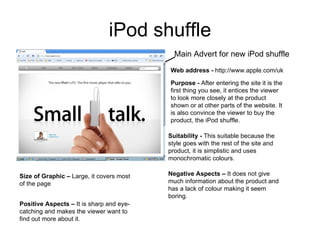
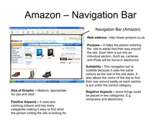
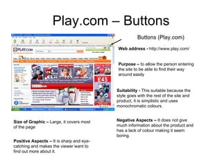
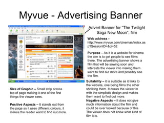
2. iPod shuffle Main Advert for new iPod shuffle Web address - http://www.apple.com/uk Purpose - After entering the site it is the first thing you see, it entices the viewer to look more closely at the product shown or at other parts of the website. It is also convince the viewer to buy the product, the iPod shuffle. Suitability - This suitable because the style goes with the rest of the site and product, it is simplistic and uses monochromatic colours. Size of Graphic – Large, it covers most of the page Positive Aspects – It is sharp and eye-catching and makes the viewer want to find out more about it. Negative Aspects – It does not give much information about the product and has a lack of colour making it seem boring.
3. Amazon – Navigation Bar Navigation Bar (Amazon) Web address - http://www.amazon.co.uk Purpose – it helps the person entering the site to easily find their way around the site. Each item is put into an individual section. Such as, cameras and iPods will be found in electronics Suitability - This navigation bar is suitable because it uses the same colours as the rest of the site does. It also allows the visitor of the site to find their way around easily as each section is put under the correct category Size of Graphic – Medium, appropriate for use and clear Positive Aspects – it uses eye-catching colours and has many categories making it easy to find what the person visiting the site is looking for Negative Aspects – some things could be placed in two categories. E.g. computers and electronics
4. Play.com – Buttons Buttons (Play.com) Web address - http://www.play.com/ Purpose – to allow the person entering the site to be able to find their way around easily Suitability - This suitable because the style goes with the rest of the site and product, it is simplistic and uses monochromatic colours. Size of Graphic – Large, it covers most of the page Positive Aspects – It is sharp and eye-catching and makes the viewer want to find out more about it. Negative Aspects – It does not give much information about the product and has a lack of colour making it seem boring.
5. Myvue - Advertising Banner Advert Banner for “The Twilight Saga New Moon”, film Web address - http://www.myvue.com/cinemas/index.asp?SessionID=&ci=52 Purpose – As it is a website for cinema the aim is to get people to see films there. The advertising banner shows a film that will be sowing soon and interests the viewer into making them want to find out more and possibly see the film. Suitability – it is suitable as it links to the website, one being films the other showing them. It draws the viewer in with the simplistic design and makes them want to find out more. Size of Graphic – Small strip across top of page making it one of the first things the viewer sees. Positive Aspects – It stands out from the page as it uses different colours, it makes the reader want to find out more. Negative Aspects – It does not give much information about the film and could be over looked because of this. The viewer does not know what kind of film it is.