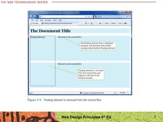
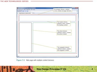
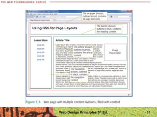
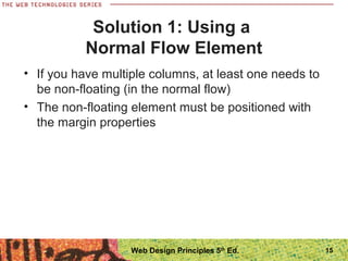
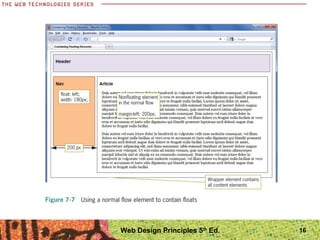
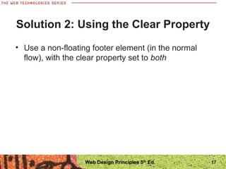
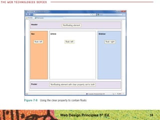
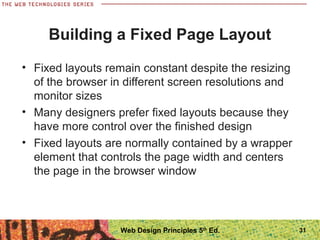
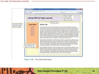
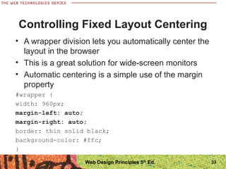
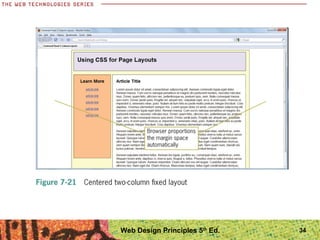
Web Design Principles
5th
Edition
Chapter Seven
Designing Page Layouts
Objectives
When you complete this chapter, you will be able to:
• Understand the normal flow of elements
• Use the division element to create content
containers
• Create floating layouts
• Build a flexible page layout
• Build a fixed page layout
2Web Design Principles 5th
Ed.
Understanding the Normal Flow
of Elements
Understanding the Normal Flow
• The normal flow determines the sequence of
element display
• Boxes are laid out vertically one after the other,
beginning at the top of the containing
• Each box horizontally fills the browser window
Web Design Principles 5th
Ed. 4
5Web Design Principles 5th
Ed.
Understanding the Normal Flow
• In the normal flow for inline elements, boxes are
laid out horizontally beginning at the top left of the
containing block
• The inline boxes comprise the lines of text within,
for example, a <p> element
• When you float an element, you take it out of the
normal flow
• Check the results frequently as you are designing
your layout using floats
6Web Design Principles 5th
Ed.
7Web Design Principles 5th
Ed.
Using the Division Element to
Create Content Containers
• The <div> element is your primary tool for creating
content sections
• Use the box properties to create divisions in the
shape you need
• You can create columns and control the space
between them
• Use a container division, often called a wrapper, to
contain a page layout
8Web Design Principles 5th
Ed.
9Web Design Principles 5th
Ed.
10Web Design Principles 5th
Ed.
Creating Floating Layouts
• The float property lets you build columnar layouts
• You can align content elements to either the right or
left side of the browser window
• A typical Web page design can contain both
floating and non-floating elements
• Remember to always use a width property for
floating elements
11Web Design Principles 5th
Ed.
Web Design Principles 5th
Ed. 12
Creating Floating Layouts
• Building floating layouts requires that you choose a
method for containing the floating elements
• You will often see that the floating elements extend
beyond their containing elements, which will result
in a “broken” layout
13Web Design Principles 5th
Ed.
Web Design Principles 5th
Ed. 14
Solution 1: Using a
Normal Flow Element
• If you have multiple columns, at least one needs to
be non-floating (in the normal flow)
• The non-floating element must be positioned with
the margin properties
15Web Design Principles 5th
Ed.
16Web Design Principles 5th
Ed.
Solution 2: Using the Clear Property
• Use a non-floating footer element (in the normal
flow), with the clear property set to both
17Web Design Principles 5th
Ed.
18Web Design Principles 5th
Ed.
Floating Elements within Floats
• Floating elements give you a wide variety of
options for building interesting page layouts
• If you are floating an element within another
element, the order of the elements is important
19Web Design Principles 5th
Ed.
Web Design Principles 5th
Ed. 20
Web Design Principles 5th
Ed. 21
Web Design Principles 5th
Ed. 22
Fixing Column Drops
• Column drops occur when the total width of the
columnar elements in a page layout exceeds the
width of their containing element
23Web Design Principles 5th
Ed.
24Web Design Principles 5th
Ed.
Clearing Problem Floats
• Floats occasionally do not appear exactly where
you want them to appear
• The clear property can solve this problem
25Web Design Principles 5th
Ed.
Web Design Principles 5th
Ed. 26
Building a Flexible Page Layout
• Flexible layouts adapt to the size of the browser
window
• With a flexible layout, your content has to adapt
and look good at a wide range of layout sizes
27Web Design Principles 5th
Ed.
28Web Design Principles 5th
Ed.
29Web Design Principles 5th
Ed.
Controlling Flexible Layout Width
• You can control the compression and expansion of
your content in a flexible layout by setting minimum
and maximum widths
div.wrapper {
width: 100%;
min-width: 750px;
max-width: 1220px;
}
30Web Design Principles 5th
Ed.
Building a Fixed Page Layout
• Fixed layouts remain constant despite the resizing
of the browser in different screen resolutions and
monitor sizes
• Many designers prefer fixed layouts because they
have more control over the finished design
• Fixed layouts are normally contained by a wrapper
element that controls the page width and centers
the page in the browser window
31Web Design Principles 5th
Ed.
32Web Design Principles 5th
Ed.
Controlling Fixed Layout Centering
• A wrapper division lets you automatically center the
layout in the browser
• This is a great solution for wide-screen monitors
• Automatic centering is a simple use of the margin
property
#wrapper {
width: 960px;
margin-left: auto;
margin-right: auto;
border: thin solid black;
background-color: #ffc;
}
33Web Design Principles 5th
Ed.
34Web Design Principles 5th
Ed.
Summary
• The normal flow dictates the way in which elements
normally are displayed in the browser window
• When you remove an element from the normal
flow, you may see unexpected behavior from other
elements
• Remember to always use a width property for
floating elements
• Remember to avoid using the height property
• For fixed layouts, content elements are usually
contained with a wrapper element that sets the
width for the page layout
35Web Design Principles 5th
Ed.

Ppt ch07

  • 1.
    Web Design Principles 5th Edition ChapterSeven Designing Page Layouts
  • 2.
    Objectives When you completethis chapter, you will be able to: • Understand the normal flow of elements • Use the division element to create content containers • Create floating layouts • Build a flexible page layout • Build a fixed page layout 2Web Design Principles 5th Ed.
  • 3.
    Understanding the NormalFlow of Elements
  • 4.
    Understanding the NormalFlow • The normal flow determines the sequence of element display • Boxes are laid out vertically one after the other, beginning at the top of the containing • Each box horizontally fills the browser window Web Design Principles 5th Ed. 4
  • 5.
  • 6.
    Understanding the NormalFlow • In the normal flow for inline elements, boxes are laid out horizontally beginning at the top left of the containing block • The inline boxes comprise the lines of text within, for example, a <p> element • When you float an element, you take it out of the normal flow • Check the results frequently as you are designing your layout using floats 6Web Design Principles 5th Ed.
  • 7.
  • 8.
    Using the DivisionElement to Create Content Containers • The <div> element is your primary tool for creating content sections • Use the box properties to create divisions in the shape you need • You can create columns and control the space between them • Use a container division, often called a wrapper, to contain a page layout 8Web Design Principles 5th Ed.
  • 9.
  • 10.
  • 11.
    Creating Floating Layouts •The float property lets you build columnar layouts • You can align content elements to either the right or left side of the browser window • A typical Web page design can contain both floating and non-floating elements • Remember to always use a width property for floating elements 11Web Design Principles 5th Ed.
  • 12.
  • 13.
    Creating Floating Layouts •Building floating layouts requires that you choose a method for containing the floating elements • You will often see that the floating elements extend beyond their containing elements, which will result in a “broken” layout 13Web Design Principles 5th Ed.
  • 14.
  • 15.
    Solution 1: Usinga Normal Flow Element • If you have multiple columns, at least one needs to be non-floating (in the normal flow) • The non-floating element must be positioned with the margin properties 15Web Design Principles 5th Ed.
  • 16.
  • 17.
    Solution 2: Usingthe Clear Property • Use a non-floating footer element (in the normal flow), with the clear property set to both 17Web Design Principles 5th Ed.
  • 18.
  • 19.
    Floating Elements withinFloats • Floating elements give you a wide variety of options for building interesting page layouts • If you are floating an element within another element, the order of the elements is important 19Web Design Principles 5th Ed.
  • 20.
  • 21.
  • 22.
  • 23.
    Fixing Column Drops •Column drops occur when the total width of the columnar elements in a page layout exceeds the width of their containing element 23Web Design Principles 5th Ed.
  • 24.
  • 25.
    Clearing Problem Floats •Floats occasionally do not appear exactly where you want them to appear • The clear property can solve this problem 25Web Design Principles 5th Ed.
  • 26.
  • 27.
    Building a FlexiblePage Layout • Flexible layouts adapt to the size of the browser window • With a flexible layout, your content has to adapt and look good at a wide range of layout sizes 27Web Design Principles 5th Ed.
  • 28.
  • 29.
  • 30.
    Controlling Flexible LayoutWidth • You can control the compression and expansion of your content in a flexible layout by setting minimum and maximum widths div.wrapper { width: 100%; min-width: 750px; max-width: 1220px; } 30Web Design Principles 5th Ed.
  • 31.
    Building a FixedPage Layout • Fixed layouts remain constant despite the resizing of the browser in different screen resolutions and monitor sizes • Many designers prefer fixed layouts because they have more control over the finished design • Fixed layouts are normally contained by a wrapper element that controls the page width and centers the page in the browser window 31Web Design Principles 5th Ed.
  • 32.
  • 33.
    Controlling Fixed LayoutCentering • A wrapper division lets you automatically center the layout in the browser • This is a great solution for wide-screen monitors • Automatic centering is a simple use of the margin property #wrapper { width: 960px; margin-left: auto; margin-right: auto; border: thin solid black; background-color: #ffc; } 33Web Design Principles 5th Ed.
  • 34.
  • 35.
    Summary • The normalflow dictates the way in which elements normally are displayed in the browser window • When you remove an element from the normal flow, you may see unexpected behavior from other elements • Remember to always use a width property for floating elements • Remember to avoid using the height property • For fixed layouts, content elements are usually contained with a wrapper element that sets the width for the page layout 35Web Design Principles 5th Ed.