Power of Design Principles in a Connected World
•Download as PPTX, PDF•
7 likes•1,455 views

The document discusses how design can positively impact opportunities and challenges in our connected world. It explores how design can help brands reach global audiences while maintaining a unified identity, bring clarity to communications in a distracting environment, and foster innovation by taking a collaborative, problem-solving approach. The presentation provides examples of how principles like cultural awareness, strong branding foundations, visual hierarchy and storytelling can help brands navigate our complex digital landscape.

Recommended
Recommended
More Related Content
Similar to Power of Design Principles in a Connected World
Similar to Power of Design Principles in a Connected World (20)
Recently uploaded
Recently uploaded (13)
Power of Design Principles in a Connected World
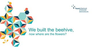
- 1. #TDISXSW #DESIGNCAN We built the beehive, now where are the flowers?
- 2. #TDISXSW #DESIGNCAN The Power of Design Principles in our Connected World Michele Silvestri, EVP – Global Design Director, Team Detroit Christine Jones, VP – Associate Design Director, Team Detroit
- 6. Our Connected World Reach Our ability to connect to anyone or anything at anytime, naturally globalizes brands. It gives them reach. And scale. #TDISXSW #DESIGNCAN
- 7. Our Connected World Fragmentation As opportunities for interaction with brands become even more multi-faceted and exponential, the pressures of disintegration become stronger. #TDISXSW #DESIGNCAN
- 8. Our Connected World #TDISXSW #DESIGNCAN Distraction In this world of hyper-connectivity, everything is fighting for our attention and our focus: Our work. Our play. Our news feeds. Our families. Our brands.
- 10. Our Connected World Distraction This tug for our attention drives a need for clarity. Messages must be simply conveyed, well-crafted and engaging. #TDISXSW #DESIGNCAN
- 11. Our Connected World #TDISXSW #DESIGNCAN Opportunity “So where are the flowers?” Opportunities for hybrid thinkers, visual problem solvers and expert craftsman await.
- 12. #TDISXSW #DESIGNCAN So how can Design positively impact the realities of our Connected World?
- 13. Our Connected World Reach > #TDISXSW #DESIGNCAN Think with a culturally diverse perspective
- 14. Our Connected World #TDISXSW #DESIGNCAN Reach > Think with a culturally diverse perspective Fragmentation > Protect the brand
- 15. Our Connected World #TDISXSW #DESIGNCAN Reach > Think with a culturally diverse perspective Fragmentation > Protect the brand Distraction > Bring clarity to communications
- 16. Our Connected World #TDISXSW #DESIGNCAN Reach > Think with a culturally diverse perspective Fragmentation > Protect the brand Distraction > Bring clarity to communications Opportunity > Use a Design-Minded approach to solve new problems
- 17. #TDISXSW #DESIGNCAN The Power of Design
- 18. (even our pets) Source: Quote: Massimo Vignelli. Design: Anthony Neil Dart
- 19. The Power of Design #TDISXSW #DESIGNCAN Inform Locate Persuade Identify Organize Attract attention Stimulate Engage
- 20. The Power of Design #TDISXSW #DESIGNCAN Designers are experts in: Branding Typography Visual storytelling Color Information design Lettering Spatial organization Iconography Hierarchy of information Illustration
- 21. The Power of Design Create. Craft. Nurture. Protect. Assist consumer engagement, clarity of message and consistency #TDISXSW #DESIGNCAN
- 22. #TDISXSW #DESIGNCAN Our Connected World Reach The Power of Design > Think with a culturally diverse perspective
- 23. #TDISXSW #DESIGNCAN What impact or associations does color have across cultures? How could that impact the choices we make for brands?
- 27. #TDISXSW #DESIGNCAN Pantone now has over 5,000 colors in its libraries.
- 37. #TDISXSW #DESIGNCAN How can the use of symbols and iconography transcend culture to most effectively communicate a message universally?
- 38. Source: AIGA Design Archives
- 42. #TDISXSW #DESIGNCAN Our Connected World Fragmentation The Power of Design > Protect the brand
- 47. #TDISXSW #DESIGNCAN How can defining a brand world – the space a brand can play in authentically – protect itself from fragmentation?
- 48. #TDISXSW #DESIGNCAN Two ways: Foundation + Framework
- 51. College For Creative Studies: Relentless Creation
- 53. Ford Global Look + Style – Before
- 54. Ford Global Look + Style – After
- 56. When Entrepreneur magazine wrote an article on the “Secrets of the 10 MostTrusted Brands”, Ford was hailed for brand consistency, “Ford’s consistent branding has established the company as a beacon of reliability.” #TDISXSW #DESIGNCAN
- 57. #TDISXSW #DESIGNCAN Our Connected World Distraction The Power of Design > Bring clarity to communications
- 58. #TDISXSW #DESIGNCAN Which design principles can best foster clarity to protect a brand from distraction?
- 63. Source: Noodior
- 66. CURRENT Source: FDA, Brand New PROPOSED
- 70. #TDISXSW #DESIGNCAN Clarity doesn’t always = Simplicity
- 74. #TDISXSW #DESIGNCAN But often, less is more
- 76. #TDISXSW #DESIGNCAN But, not reductive to the point of damaging
- 77. Source: FastCo, Roberto Manzari
- 78. #TDISXSW #DESIGNCAN Our Connected World Opportunity The Power of Design > Use a Design-Minded approach to solve new problems
- 79. #TDISXSW #DESIGNCAN How can the way designers solve problems help create pathways for innovation ?
- 83. Opportunity #TDISXSW #DESIGNCAN Analysts + Strategists + Designers Journalists + Art Directors + Technologists Brand Strategists + Social Strategists + Mobile Strategists + Cross-Channel Strategists
- 84. #TDISXSW #DESIGNCAN Have a problem-solving process
- 85. Opportunity #TDISXSW #DESIGNCAN Divergent Thinking – ideate a range of design solutions (possible or impossible) to any given problem Convergent Thinking – narrow down and hone the best, most feasible solution
- 86. #TDISXSW #DESIGNCAN Be a Visual Storyteller
- 90. #TDISXSW #DESIGNCAN Authorship < Successful Outcome
Editor's Notes
- INTRODUCTIONSMICHELECHRISTINE
- MICHELENOTE ABOUT QUESTIONS + HASHTAGSWere going to share a lot of our thoughts and experience … and we don’t want to only drone on talking at you… so please feel free to share with us as well throughout by asking questions… Or tweating questions to @teamdetroit #TDISXSW #DESIGNCAN and we can answer those questions in real time or at the endCHRISTINESO, BEFORE WE START, HOW MANY DESIGNERS DO WE HAVE IN THE AUDIENCE? (keep hands up)CREATIVES? ADVERTISING/MARKETING/PR PROFESSIONALS? NON-CREATIVES?
- MICHELE:As we all know, we live in a world of hyper-connectivity. We are always ”on”. Multiple screens, which are only multiplying. Augmented reality. Wearable technology. Any of the technologies you experienced in our tech lounge. And new technologies and apps introduced weekly.Our ability to connect with anyone or anything, anywhere, at anytime has become our new normal.So how does this connected world impact brands and their consumers? And how can the power of Design principles benefit a brand’s interaction with consumers in a memorable and impactful way.
- MICHELE:Our connected world creates the following four realities that Brands need to think about:Reach, Fragmentation, Distraction and Opportunity
- MICHELE:Our ability to connect to anyone or anything at anytime, naturally globalizes brands. It opens up a world of opportunity for them. It gives them reach. And scale. Ever growing social media channels have created a culturally-diverse, interconnected world. This creates the opportunity for brands to speak in both a bespoke way to individuals as well as at scale witha universal language connected to universal truths. To be elasticand be relevant either way.
- MICHELE:As opportunities for interaction with brands continue to grow and further diversify … brandtouchpointsbecome multi-faceted and exponential. Therefore, the pressures of disintegration become stronger. If we’re not conscious of consistency, consumers will question a brands authenticity.A flexible but consistent framework to surround a brand, and protect it, has become profoundly important.
- MICHELE:With all of those screens and devices…. In this world of hyper-connectivity, everything is fighting for our attention and our focus: Our work. Our play. Our news feeds.Ourfamilites.Our brands.
- MICHELE:That’s ellie.
- MICHELE:With all of those screens and constant flow of content … This tug for our attention drives a need for clarity.If any message, no matter how complex, is going to break through, it needs to be simply conveyed, well-crafted and engaging.
- MICHELE:“So where are the flowers?”With such vast connectivity and rapid-fire emerging tech … new ways to make connections and share stories are just waiting to be crafted and told.The course has yet to be charted. Which means opportunities for hybrid thinkers, visual problem solvers and expert craftsman await.
- MICHELE:When we think about connections with brands, we know we need to think about technology and the digital space …. There is a reason we’re all here at SXSW Interactive as they are our reality and where our consumers consume most of their information …. but we also need to think beyond it. And think about where a brand experience makes the most sense for the message. A brand’s power to connect in relevant, authentic ways is limitless. So how can Design .... a problem-solving discipline that is both strategic and aesthetic in nature …. positively impact the realities of our Connected World?
- MICHELE:The Four How’s: We can address Reach by Thinking and articulating with a culturally diverse perspective
- MICHELE:We can address Brand Fragmentation by Protecting the brand
- MICHELE:We can address Consumer Distraction by bringing clarity to our communications
- MICHELE:We can take advantage of the opportunity our connected world has created by using a Design-Minded approach to solve new problems
- CHRISTINE:So let’s talk specifically about the role of design in this connected world ….. What IS the power of Design? What do Designers do, and how can you harness their approach?
- CHRISTINE: PAUSEYes …. part of being a designer is your role as a taste fairy. But it isn’t just about fighting ugly, there’s much more to this battle.
- CHRISTINE:Design can be used to do all of these things:inform, persuade,engage.These are things that can truly have a positive effect on communications and consumer action.
- CHRISTINE:As strategic thinkers, visual problem solvers, cross-functional collaborators, and brand guardians, Designers are experts in all of these categories:PAUSE
- CHRISTINEDesigners not only create and protect the visual expression of a brand, they use art and technology tocraft beautiful communications that assist consumer engagement, clarity of message and consistency across every media channel.
- MICHELE:So as we think about our connected world and the Reach it provides, it drives our need to think and respond with a culturally diverse perspective. One Design area of significant cultural and brand influence is … Color
- MICHELE:What impact or associations does color have across cultures? How could that impact the choices we make for brands?
- CHRISTINE: Here’s a sample of a color chart we pulled from Information is Beautiful.It references a span of colors and their cultural meanings across the globe. There are tons of these charts out there that you can reference for color theory …. Lengthy books on the subject ….. And of course, widely varied opinions on color.So, for a global branding assignment,our team studied charts and tables like this oneusing a range of sources to craft our own chart.
- CHRISTINE: We categorized this into Western Cultures, Eastern Cultures as well as Latin America and the Middle East. And we simplified the color list into the basic values of the rainbow plus some neutrals. You can see some threads of consistency in color meaning here.Blue as a beacon of trustpurple representing wealthand white, not surprisingly representing purity.
- CHRISTINE: But perhaps more interesting than those threads of consistency, is the inconsistency in these color meanings. Highlighted here is our finding that every color of the rainbow as well as our neutral black, white and brown actually represents mourning (as in grieving) in at least one culture, globally.With the exception of red ….. which signifies danger to most of the globe.As designers we can throw our hands up and say ‘no color is safe’ …. Or we can lean on the truths of our brand to choose a palette and begin to own it. Being cognizant of course, about what color will say about your brand and what it might mean to those you’re speaking to.
- CHRISTINE: Color choices are not easy. And I’m not sure if we’re better or worse for the fact that Pantone now has over 5,000 colors in its libraries. But what this breadth does do, is open up opportunities for brands to truly own a differentiating color palette.
- CHRISTINEI worked at a bookstore in highschool, and I can’t tell you how many people would come in asking for a book, by color, having no memory of the actual title.In general, people remember color.
- MICHELE:Some brands do this very well. Over time, color can become a part of cultural vernacular, and singularly represent a brand.~ Audience participation time. ~What brand is this?
- MICHELEYep. FedEx. Do we remember this because we’re pumped every time one of those white boxes with the purple and orange logo lands on our doorstep? The joy that the brand came through for you again? Or …. Is it because orange and purple are vibrant color choices? Odd color choices? And a distinct and ownable pairing?
- MICHELEHere’s another one, little trickier. As it might not be as distinct in the current landscape.What do you think?
- MICHELEIn this case, it is the eBay palette, but big brands like Microsoft and Google could be interchanged here. There’s where those 5,000 Pantone choices come in handy to support differentiation.
- CHRISTINEOkay two more. Some brands go so far as to trademark their signature color. Recognize this one?
- CHRISTINEYes, this is T-Mobile. And they own this color by using it in a 360 degree approach. From their logo to their span of communication touchpoints to their in-store experience with magenta entryways and point of sale.
- CHRISTINEAlright, last one.Gentlemen? Ladies?
- CHRISTINETiffany blue.No one owns this color except Tiffanyand I would challenge us to deny that this color is actually a stronger brand signifier than the Tiffany logo itself.
- MICHELEIn addition to color, how can the use of symbols and iconography provide an opportunity to transcend culture and effectively communicate a message universally?
- MICHELEThere is a reason the international symbol system has been utilized since the 70s. It’s the same reason we’ve experienced the trend toward simplified, flat iconography in the digital space. It crosses cultures and clearly communicates at a glance. In a time when we’re flooded with content, often in small spaces, with limited time to digest.
- CHRISTINE: Here’s an example of iconography at its finest.Says the same thing to everyone, everywhere without the burden of the written word and the barriers of language.
- CHRISTINE: And here’s an example of what we’ve dubbed “Behavioral Iconography”.The message is pretty clear. : )
- CHRISTINE: This is a small snapshot of a program we work on for Ford and their fight against breast cancer. It’s called Warriors in Pink.We found that a series of symbols like the dove, angel wings, heart, feathers (shown above in the form of embroidered patches) spoke to our audience by allowing them to assign meaning based on their personal fight against the disease or alongside a loved one.We gave our suggested meaning for these symbols and used them to create art for merchandise, communications, events … but ultimately it’s up to those we reach with this iconography to bring it to life. And they do. By telling us their stories, which symbol they relate to, and often wearing it proudly in support of the cause.
- MICHELESo as we think about our connected world and the Fragmentation it creates it is imperative that we never lose sight of a Brand’s DNA. A strong brand is a powerful force that resonates with consumers.... Creating emotional connections that drive actionThe more a consumer loves your brand, the higher the favorable opinion and the more your brand is worth.
- MICHELEThis is someone who loves one of my favorite brands.
- CHRISTINE:And then there’s this guy, who really, reallllly loves the brand.
- MICHELEAnd we’re not sure about this guy. Whether he actually helps or hurts the brand.
- CHRISTINEAnd remember those Warriors in Pink symbols we shared? When brand symbols are crafted with deep, resonating meaning they leave an impactHere are some posts from our facebook fans, … bringing to life their emotional connection to the brand.
- MICHELESo as we talk about brand … How can defining a brand world protect itself from fragmentation?And by Brand World…. I’m talking about the visual and tonal space a brand can play in authentically
- MICHELETwo ways: we need to look at both the Foundation and the Framework.
- MICHELEThe Foundation - is to define the story of a brand. To bring a brand’s positioning, customer(s) and product/service essence to life in a strategically informational and inspirational way. In communications, you can utilize the latest technology, or the wittiest, engaging piece ofcontent, but if it isn't woven from the DNA threads of a brand…… if it isn’t driven from a core foundational truth…. it isn’t going to resonate as authentic. It may entertain but it won't bememorable in a way that makes someone love your brand that much more, and act upon that perception.We’ve laid the foundation and defined the story of a brand for many clients, bringing the essence of what they stand for, who they are, who they speak to and how they express themselves tonally and visually.
- MICHELEWe did this in the Brand Story we created for Carhartt, who’s brand promise is “Stand True”. We captured and expressed the brand essence in an informational and inspirational way… Highlighting legacy. Shared moments. And going above and beyond in the support of the everyman.
- MICHELEWe also did this for a highly regarded art school, the College For Creative Studies, we celebrated their promise of “Relentless Creation” with a book that unfolds into a poster celebrating the work of students and alumnae alike.Using physical construction and interaction to bring to life the transformational effect the school has on it’s students and their creative process and approach.
- CHRISTINEBoth of those Brand Stories act as visual and tonal sandboxesThey are true to the promise of the brand they were created for. Their contents provide a filter for whether a communication is on brand or off.But the other necessary component is The Framework.The Look + Style guide of branding elements that act as a visual, unifying net, to simply and consistently reinforce your brand and connect it across multiple and varied channels. It is another component that is key to countering brand fragmentation.
- CHRISTINE:Before the unification of “One Ford” globally , these samples show the visualization of the Ford brand throughout different parts of the world, before implementing a Global Look + Style framework we crafted with them.
- CHRISTINE:And after.To the consumer, these pieces will “Feel like Ford,” regardless of whether they can pinpoint why,It’s the consistent branding elements: One global font, Consistent use of the Ford Oval with the “Go Further” brand promise, and a unifying color palette, that drive that feeling.From the creation of a logo, how a tagline is set, to the color palette and font, Designers craft the world that defines the space a brand can play in.
- MICHELE Brand is a sum of everything … the additive effect of every positive connection it makes with a consumer. To build trust and connection …. consistency is key.
- MICHELEWhen Entrepreneur magazine wrote an article on the “Secrets of the 10 Most-Trusted Brands”, Ford was hailed for brand consistency, “Ford’s consistent branding has established the company as a beacon of reliability.”a client with a singular visiona brand promise crafted around the truths of a branda consistent brand expression and the framework to envelope itCan be quite a powerful combination.
- MICHELESo we’ve talked about the use of color and iconography to support cultural diversity, and the use of brand stories and a look + style framework to drive consistency and protect the brand.Now we’ll focus on addressing Distraction, by using the power of design to bring clarity to our communications
- MICHELESo as we talk about clarity…. Which design principles can best foster clarity to protect a brand from distraction?
- MICHELESorry … we got distracted there for a moment…. The interwebs is full of some funny shit
- CHRISTINE:Back to clarity of message …. The wide range of offerings in the typography landscape allow us to convey the tone of a message with a simple font choice. Here’s a nice sample of what font styles may convey.- A script font can connote elegance, unless it’s handwritten, which conveys a more casual vibe- Bold, when used sparingly, can draw attention to key phrases- And Comic Sans …. as noted here in the FAUX PAS “OH GOD PLEASE DON’T” category …. should never be used.
- CHRISTINE; )Comic Sans Aside, it’s how we USE that type, and our hierarchy of weight, proportion and placement that brings clarity to our message.And although a font might be tonally correct, if it hinders readability, a new option needs to be explored.
- CHRISTINEAnd let us not forget type kerning and word spacing which are key in any communication. As seen in this KIDS EXHANGE logo
- CHRISTINE:Maybe you’ve seen the newly proposed Nutrition Label from the FDA. Simple shifts in scale, placement and hierarchy assign importance and clarify content.So that consumers can easily and quickly scan for the most relevant information at a glance.And notice they’ve kept with Helvetica. The universal font king of readability.
- CHRISTINE:Here’s what you see when you don the Google glasses available for testing in our tech lab today.Clarity being essential here as this screen will integrate with your normal line of sight.Type choice: simple.Color contrast: high.
- CHRISTINE:Butin something as simple yetessential as the nutrition label or the women’s bathroom icon, what does the average person not see? The heavy hand of design. In fact, good design is invisible.(and if because of the screen you can’t see the copy in the visual, it states “DESIGN IS OFTEN UNNOTICED”, as it should be)MICHELEAnd Bad Design?
- MICHELE…. well … that shit screams …
- MICHELEDoes all of this setup mean we’re here to tell you simplicity is the way? The ONLY way?Nope.Because clarity doesn’t always equal simplicity.
- MICHELEIn fact, sometimes more is more.
- CHRISTINE:Jack White allowed us to borrow this lyric for a recent poster we did for the Detroit-based D-Show, a celebration of the creative communication arts in our city.“Well in every complicated situation of human relation, making sense of it all takes a whole lot of concentration.”Here, the typography is both the vehicle for, and celebration of, the message itself.
- CHRISTINE:And for a standout on Ford’s Tumblr page, to support the brand concept of And Not Or … MORE was definitely more.More hand-lettered type, more color, more eyeballs, more snakes.A beautiful celebration of craft, to strategically and artfully bring to life the message that And is better.
- MICHELEBut often, less is more.
- CHRISTINE:Here’s the evolution of the Firefox logo with the most recent on the end there. There’s a strategic removal and reassignment of detail to both simplify for the sake of the mark … and to beautify to capitalize on the opportunity high resolution screens have created.There’s balance in the “less” and “more” in this mark.
- MICHELEAnd balance is really the key, as drastic reduction can be damaging.
- CHRISTINE:When there’s simplification at the expense of brand, you’ve gone too far.(and Don’t get all twitty, this is just a proposal from designer RobertoManzari)Anyone from Twitter in the audience?
- MICHELE:Beyond culture, brand and clarity… our connected world also provides a wide-open space for innovation. …. where a Design-minded approach can have a significant impactWe’re living in a culture of opportunity for hybrid thinkers, visual problem solvers and expert craftsman.
- MICHELE:How can the way designers solve problems help create pathways for innovation ?
- MICHELEDesigners are problem solvers by trade. As designers are tasked with figuring out the best way to communicate a message to an audience. Often with problem solving, collaborative efforts at different stages of a process, can yield a stronger solution.
- CHRISTINEDesigners often prefer to work together …. over competing against eachother…. to deliver the best solution to a problem. And they love to work with many different types of thinkers and disciplines to bring communications to life.Now, more than ever, our connectivity necessitates this level of collaboration.Specialized knowledge is spread out among disciplines that can’t do their best work without each other.
- MICHELEWe’re seeing a beautiful collection of non-traditional pairings working together to solve a problem. Analysts + Strategists + DesignersJournalists + Art Directors + TechnologistsBrand Strategists + Social Strategists + Mobile Strategists + Cross-Channel Strategists
- MICHELEDesigners typically use two types of thinking throughout the design process. Thinking that supports most-effective problem solving.Tobest communicate a message to an audience.
- MICHELEDesigners, whether they realize it or not, us Divergent and Convergent thinking … First… ideating a range of conceptual design solutions (possible or impossible) to solve any given problem. Anything is fair game. Gather inspiration from everywhere. Sky’s the limit. Ask what if?And once ideation is exhausted…. Culling down the ideas, interrogating them, honing and refining to land on the best and most feasible solution. The solution that is most tightly connected to the strategy, the solution that will have the strongest emotional impact and the solution that is most beautifully crafted.
- MICHELEWhen we think about the amount of information we process daily in our connected world, and the exponential production of big data, there is a reason we’ve seen an explosion in Information Design and Visual Storytelling.
- CHRISTINEHere’s a few excerpts from a funinfographic on why infographics work.The use of visualized information on the internet alonehas increased almost 10,000% since 2007. As information increases, as does the need to digest it.
- CHRISTINEThe reason we’ve talked about iconography, symbols and visualization, is because our brains often process symbols much quicker than the written word. Understanding is achieved instantly with the image on the left, vs the paragraph to the right.
- CHRISTINEData Visualization and Infographics counter information overload because they are simply more engaging, and if done well, provide instant visual clarification.
- MICHELEAnd with all of these Design-minded opportunities for collaboration, problem solving and storytelling…. It is becoming less and less about authorship and more about achieving a successful outcome together. And then going on … and sharing those solutions and outcomes … so that our connected culture can continue to grow and evolve for the greatergood of brands everywhere.
- You can also find us on LinkedIn, Twitter, Instagram and Pinterest.Any questions?