1.
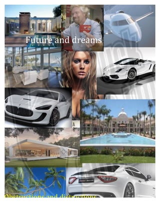
Future
and
dreams
Obstructions
and
distractions
2.
3.
Ambitions
4.
5.
Suits
Soldiers
Be
yourself
6.
Branded hedonism – for successful living
(hedonism - the pursuit of pleasure; sensual self-indulgence.)
Diesel does not really compare them selves with anyone.
Through the years their message have been constant, stating
the difference and the quirkiness but changing the background
topics that framed this difference, evolving from more global and
sociopolitical issues to more hedonistic and youth-worries-
centered.
The Diesel brand is based on edgy design that stands out (but
not too obviously). It encourages customers to be happy, worry
free and enjoy life but without being too superficial and
conscious about the world they live in.
By having their brand inside the rectangle, Diesel logo can be
applied anywhere perfectly, specially in top of multicolored
photographs, which is what they do in their campaigns. From the
early days of the brand when they were already using collages of
pictures or very colorful photographs for their advertisements
7.
Investigative
Research
8.
History
Skop is a traditional South African dish, which has been
enjoyed as a delicacy by African men for centuries. The
main ingredient of the dish is the head of a cow, pig or goat
and is heavily spiced and served with vegetables and mielie
pap or bread.
Preparation
Skop is traditionally prepared by the woman in a metal pot
over an open flame.
All unwanted flesh is removed (nose and ears)
The head is spiced and heavily salted and then left to boil for
three to four hours.
The dish is then served with vegetables and mielie pap or
bread
Most commonly bought at a tavern (R40), uncommonly
cooked at home pre boiled Skop is available at selected
local butcheries.
Traditionally the man would eat the head and the family the
body however – there is no restrictions from women eating
the dish.
The head is a delicacy as cattle is a symbol of wealth.
Would commonly be eaten on occasions such as weddings
and funerals.
v The recipe itself is quite traditional.
11.
Layout
and
visual
Communication
Creative development rationale
In this brief we were asked to select an advert then improve the layout so that the
advert read clearly and looked inviting.
When we started we had 5 individual concepts, each involving aspects that would
communicate the values of the Romney park hotel and day spa.
Through extensively understanding and indulging in the culture of the Romney,
spa we came to the conclusion that the main appeals are to be pampered, to be
comfortable and to be free in the mind and in the heart so we found an image of a
woman dancing in nature enjoying the freedom, purity and grace of the natural
beauty both inside her and around her. This illustrated the core value of our
brand. We then labeled it modestly and added the text that too helped to make
the message clear and concise. The colors go with the theme of the brand and
have calming and healing connotations.
For the final product, I decided to take the image of the expression in the models
face that encompasses the feeling the Romney Park would like you to feel when
being treated at the Romney Spa.
The text reads from left to right and the layout guides your eye through the advert
so that the message is clearly communicated.
In conclusion the magazine advert, billboard or brochure cover, clearly
communicates the values of the Romney park and appeals to their chosen
market.