
Recommended
More Related Content
Similar to Herefordshire Brand Guidelines
Similar to Herefordshire Brand Guidelines (20)
Herefordshire Brand Guidelines
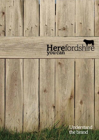
- 1. 1 Understand the brand
- 2. 3 Before you jump in. Our brand is controlled and managed by the Herefordshire brand management group. This group of companies include Visit Herefordshire, the local authority and the Herefordshire Business Board. It is their job to ensure that those using the brand use it properly and that quality standards are maintained for the good of all. Being able to use the brand is on application. We have an online brand toolkit giving you access to a whole range of assets within these guidelines. On the site we have 3 different partnership options for you to choose from, one which offers a taste of the brand, one which offers a wider selection of brand assets and another which offers everything we have available. Three simple steps:- 1. Visit www.hereyoucan.co.uk 2. Fill in the sign up form and select suitable partnership 3. Await email with username and password and away you go. Your application will be reviewed initially by our brand guardian Rachel Jones and if necessary by the brand management group. Brand Guardian Rachel Jones, Brand Manager, Herefordshire Council PO Box 4, Plough Lane, Hereford, HR4 OLE T: 01432 261784 E: rejones@herefordshire.gov.uk
- 3. 4 5 The Herefordshire What are we trying visual identity to achieve? This is a guide to using the basic elements of our visual Our brand is much bigger than this visual identity. identity. We have worked really hard to create something It has a key role to play in our present and our future. which is exciting, relevant to us and of which we all can The brand’s agenda:- be proud. So, please take care of it! Position Protect ‘Where’ Character & proposition Agenda Push Promote Position ‘change’* as Herefordshire acceptable Attraction *But it must be aligned with our character & values Tourism Business Community
- 4. 6 7 Behind the visual identity Brand characters They say that a great logotype draws its strength from what We also worked hard to define a series of words and statements it symbolises. Whoever “they” are, we think they’re right. which define our character. Stop and think of Herefordshire as a So before we designed anything we did a lot of work to person: this is how we would describe them. In everything we do understand our proposition. we must stay in character, otherwise we will start confusing our Our core proposition is: where things grow. Herefordshire friends and that won’t do at all. has the conditions to choose and grow a balanced pace of life. The heart of this proposition is that Herefordshire Beautiful provides visitors, the community and business with unique We are beautiful but not over the top glamorous opportunities for discovery and fulfilment. English with a twist A little quirky, a bit surprising and not always what you’d expect Motion We are vibrant and rich in colour, there’s choice and things going on around us Working Scrumpy Behind beauty there is always purpose, there’s things going on & oysters... and success being built Why not?
- 5. 8 9 These are our values. Herefordshire They capture our beliefs. HEREFORDSHIRE Respectful This is the core of our identity. It’s simply our name. But because Respect for people, the landscape and the retention of the first four letters spell the word HERE we have the opportunity a true community. to let the identity come to life and do more than simply identify us. It helps us build an identity which works hard for us. It can Balanced identify things, it’s an invitation, it captures our aspirations and Keeping a balanced perspective and a time rich pace of life. tells our story... Of course we planned it this way when we named the County – clever eh! Aspirational Achieving our aspirations by balancing the best of tradition with the latest in new ways of thinking. Here is an example of how the Here fordshire you can identity works Balance life work and
- 6. 10 11 Our core mark The core mark can be used in two ways. Herefordshire Describe Identify Visit Live and inspire and instruct Here Here We use this structure when We add short words we are talking about the which either identify county as a whole, this is or instruct. because it represents an The use of this will Invest Made Here Here Here aspirational positioning. be limited to the four We also use this mark main constituencies in our campaigns where you can of the brand (tourism, it is supported with an community and additional message. business). In addition, Create Grown E.g. special applications such as major events Here Here can use this structure Herefordshire (subject to approval). you can Big Chill See the stars Here Please refer to p20 for guidance on how the brands messaging works
- 7. 12 13 The county wide logo Endorsing logos This is our master logo. We add the Herefordshire bull because The bull also forms the core mark for endorsing our constituencies. it is an icon of the County and his story is a big part of us and our Depending on the type of business you are, you may want to use history. one or more. It is the lead logo that is used in county wide campaigns and Tourism Community activities. For example a tourism campaign on road signs or to promote the county at a trade show. We affectionately call him Visit Live Bully, but don’t try to change his shape or proportions otherwise it’s well, red rag to a bull.... Here Here Business Product Invest Made You can’t ‘ beat a bit Here Here of bully Creating Produce Grown Here Create Here Here you can Special application Big Chill Here In addition, special applications such as major events can use this structure (subject to approval).
- 8. 14 15 A bull with personality The bull also forms the core mark for each of the constituencies and in the process can take on different character, tone and texture. As long as they How we treat the logo with colour and texture. remain relevant, the possibilities are endless. Master logo Colours Tourism Community Pantone 490 C Black Pantone 726 C C0 M74 Y100 K72 C0 M0 Y0 K100 C100 M0 Y60 K72 R100 G34 B0 R35 G31 B32 R0 G72 B58 Business Product Black and white White and black Creating Produce Single colour White out on imagery Special application Adding personality Adding personality In addition, special applications such as major events can use this structure (subject to approval).
- 9. 16 17 Bully on backgrounds Be nice to bully Here are some examples of how the logos work on To ensure consistency and recognition of our brand there are some different backgrounds basic rules for using the logos. The good, the bad and the ugly. Core logos on Images Good: Do use any core logo on white Good: Do use any core logo on colour Do use any core logo on photography Core logos on colour Bad: Do not place any core logos onto colour Bad: Do not place any core logos onto backgrounds which make it illegible photography which make it illegible Ugly: Do not scale our Ugly: Do not colour any part of our logo disproportionately logotype. Bull can be with approval. Using our logo on colour Using our logo on photography File formats: EPS/AI When using colour logos When to use our mono logo Any of our core logos may be placed onto Any of our core logos may be placed onto Our EPS and AI files should be used to Always ensure there is adequate contrast The master mono logo should only be colours from our palette. Take care to photography. Always ensure there is plenty reproduce the logo wherever possible. when using core logos on colour used when printing in black and white. ensure the colours are complementary and of contrast and the logotype is clearly This ensures the correct colouring of the backgrounds. Take care to ensure the logo There are no other exceptions the logotype is legible. legible. logo. Our logos are available in all industry colour complements the background. standard formats and can be downloaded from toolkit
- 10. 18 19 ‘Here you can’ messaging The ‘Here you can’ part of the logo is an invitation to express There are two ways of structuring the ‘Here you can’ messaging. ourselves with a whole range of messages. It is important when The first is with the county wide logo & campaign logos. creating messaging that we remember our values especially english with a twist. Below are a few examples of how we can Logo with project our messages in an interesting way. Here you can Invitation Good examples of Here you can messaging:- Balance Here you can... Our valued work &life message go full throttle grow young minds wake up late and not worry grow a business balance work and life relax and not worry see the stars fly like a bird Our way of connect take advantage of incentives contact Herefordshire.co.uk access customers fight mother nature taste natures goodness Do’s and don’ts Bad examples of Here you can messaging:- Don’t attach any kind of message to the logo. Do use messaging in adverts and other The logo must always stand alone promotion materials. Here you can... go to sleep canoe down a river fordshire walk around drive around the countryside eat out buy ironing boards work all day Grow young buy ironing boards minds Herefordshire.co.uk Why? Because they don’t capture our values
- 11. 20 21 ‘Here you can’ messaging The second way of structuring the ‘Here you can’ messaging is Guidance on how to use the Here you can copy line with the endorsing logos Don’t overpower the valued message by over Do let the valued message be the star of the sizing the Here you can copy. show and use Here you can with discretion. Your logo here Here Here you can Your business you can fight fight logo mother nature Our Here you can copy line mother Here you can nature These guidelines are for guidance and certain situations will require different applications. In all instances use your professional judgement. Your valued message fight mother Do’s and don’ts nature Don’t attach any kind of message to the logo. The logo must always stand alone Do use messaging in adverts and other promotion materials. Your logo here www.yourwebaddress.co.uk relax & In association with Herefordshire Tourism Board Here you can not worry Your business Endorsing logo to buy ironing boards www.yourwebaddress.co.uk web address In association with Herefordshire Tourism Board
- 12. 22 23 Bully with scale A4 A3 How we treat the logo identity on different applications. A5 Breathing space The logo requires space around it to maximise its visual presence. Recommended sizes Above shows how we have used the ‘H’ from ‘Here’ as our guide. A5 (portrait & landscape) Leave at least this area clear around the brand mark, preventing - 45mm wide any other graphic elements such as images or type interfering. A4 (portrait & landscape) 70mm - 55mm wide A3 (portrait & landscape) - 70mm wide In all instances, consider legibility when using different print techniques or on different substrates. Positioning the logo 45mm The preferred position of the logo is top left although it has been Minimum size designed to work in every alignment - The smallest size the logo can top, bottom, left and right with the logo appear is 20mm wide. equidistant from the edges.
- 13. 24 25 Friends of bully There will be occasions when we work in partnership with other organisations and our logo will appear alongside other brands. To ensure we all work well together we have created some basic rules for application. Working with someone else Unless one partner is playing a major supporting role, we consider working with someone else to be a joint partnership. Such a partnership means joint prominence on communication materials; always ensure that each logo is visually equal. Our preferred position is to the left of the other brand. Working with a few people When working alongside a number of other brands, all logos can be divided with a simple key line to equal prominence. This forms a visual hierarchy and aligns other brands with the official tourism brand. Our preferred position is to the left of the other brand. Working with others When sizing logos make sure our brand logo is not overshadowed by others. Always adhere to our exclusion zone and minimum size (see p20).
- 14. 26 27 Campaign logos Community: Education Community To bring the logo to life in campaigns, we can overlay the ‘Here you can’ element of the core logotype. The bull is replaced Here fordshire Here fordshire you can with a unique texture, colour or symbol which is relevant to the you can activity or subject matter of the campaign. For guidance on how messaging works with campaign logos go to p18. An example of how the Business Community/Tourism: Arts/Crafts campaign marks work Here fordshire you can Here fordshire Here fordshire you can you can Fly like a bird Rolling hills await Tourism: Summer fun Tourism: Outdoor/Recreation afternoons of fun for all friends and family Here fordshire Here fordshire you can you can Herefordshire Outdoors VisitHerefordshire.co.uk
- 15. 28 29 Using our campaign marks Correct Campaign mark use on backgrounds To ensure consistency and recognition of our brand there are some basic rules for using campaign marks. The good, the bad Here are some examples of how the campaign marks work on and the ugly. different backgrounds Campaign marks on Images Good: Do use any campaign Good: Do use any campaign mark Bad: Do not place any campaign mark on white on colour backgrounds mark onto colour backgrounds which make it illegible Here fordshire you can Here fordshire you can Here fordshire you can Here fordshire you can Campaign marks on colour Bad: Do not place any Ugly: Do not scale Ugly: Do not use inappropriate campaign mark onto our campaign marks colours or images for a campaign photography which disproportionately mark. All campaign marks have make it illegible to be signed off by the brand guardian before use Here fordshire Here fordshire you can you can Here fordshire you can Here fordshire you can Using our logo on colour Using our logo on photography File formats: EPS/AI When using colour logos Any of our campaign marks may be placed Any of our campaign marks may be placed Our EPS and AI files should be used to Always ensure there is adequate contrast onto colours from our palette. Take care to onto photography. Always ensure there reproduce the logo wherever possible. when using campaign marks on colour ensure the colours are complementary and is plenty of contrast and the logotype is This ensures the correct colouring of the backgrounds. Take care to ensure the mark the logotype is legible. clearly legible. logo. Our logos are available in all industry colour complements the background. standard formats and can be downloaded from toolkit
- 16. 30 31 Our colours Our typography Our colour palette consists of twenty four colours to reflect Our typefaces are a common thread which link our the landscape, personality and spirit of Herefordshire. communications: Amasis and Avenir. Both these typefaces sit comfortably together though it’s Herefordshire Red Pantone 485 C Black C0 M0 Y0 K100 White C0 M0 Y0 K0 Chocolate Pantone 490 C Twilight Pantone 3308 C Cream Pantone 726 C important to take note of the role they play. C0 M95 Y100 K0 R35 G31 B32 R225 G225 B225 C0 M74 Y100 K72 C100 M0 Y60 K72 C0 M8 Y23 K2 R226 G22 B26 R100 G34 B0 R0 G72 B58 R249 G228 B194 Our typefaces Rust Berry Sunset Mustard Midnight Wild Berry Our headline, title and feature typeface: Our headline, title and feature typeface: Herefordshire Pantone 180 C Pantone 1805 C Pantone 138 C Pantone 123 C Pantone 432 C Pantone 5115 C C0 M79 Y100 K11 C0 M91 Y100 K23 C0 M42 Y100 K1 C0 M24 Y94 K0 C23 M2 Y0 K77 C75 M100 Y70 K15 R217 G84 B30 R191 G49 B26 R245 G160 B26 R225 G196 B37 R54 G67 B77 R92 G41 B70 Amasis Light PL Amasis PL Herefordshire Amasis Medium PL Herefordshire Meadow Royal Green Young Grass Lawn Stone Deep River Pantone 346 C Pantone 562 C Pantone 382 C Pantone 355 C Pantone 7529 C Pantone 5483 C And for everything else:- And for everything else:- C55 M0 Y47 K0 C85 M0 Y50 K31 C29 M0 Y100 K0 C94 M0 Y100 K0 C0 M4 Y12 K17 C82 M0 Y28 K52 R104 G188 B143 R0 G133 B118 R193 G216 B47 R0 G169 B79 R207 G196 B178 R0 G106 B113 Avenir 35 Light Behind beauty there is Avenir 35 Light Oblique always purpose. In simple Avenir 45 Book terms, it works beautifully. Avenir 55 Roman Example of body copy:- Taupe Pantone Deli Pantone 4735 C Valley Pantone 450 C Sky Pantone 571 C Olive Pantone 399 C Strong Blue Pantone 638 C Avenir 55 Oblique The county is famous for its apple and pear Warm Grey 10 C C0 M22 Y23 K15 C60 M50 Y100 K22 C32 M0 Y19 K0 C0 M0 Y100 K43 C83 M0 Y10 K0 C0 M14 Y28 K55 R218 G180 B163 R103 G101 B47 R171 G220 B212 R148 G138 B0 R0 G182 B221 Avenir 85 Heavy orchards, and its cider. There are many orchards around the county but not as many R138 G121 B103 Avenir 85 Heavy Oblique as there once were. In the last few years, soft fruits such as strawberries have become a new and rapidly expanding area of the agricultural economy of the county. Using colours Here is a structured set of colours for the County. To be as flexible as possible, you can use tints of any of these colours, as long as they are complimentary to the brand.
- 17. 32 33 Our typographic hierarchy Our typographic rules When there’s a lot of information to communicate its important It is important we represent ourselves consistently across our to employ hierarchy to help readers understand messages simply communications. This projects a clear, cohesive message to our and clearly. This means that whether you have one minute or one audience and strengthens our brand. hour you still get the gist of the message. Using our name in copy Style and grammar Herefordshire is our county; it is • Don’t use underlines beautiful, quirky, vibrant and with purpose. Our name, Herefordshire, • Avoid too many hyphenations addresses the county and should in any paragraph never be abbreviated or be mixed Level 1 • The first time you use an with the city Hereford as this Our headline, title and acronym always use the full indicates an entirely different thing. feature typeface name first Amasis Light PL Using our strapline in copy English Amasis PL • Use capital letters in all Herefordshire you can is part of Amasis Medium PL acronyms and abbreviations our registered trademarked logo and consequently should not be • To emphasise specific words use ith a twist! Level 2 a used in copy. If you are one of our the next heaviest font weight w Standfirst and Sub headings (Avenir 65 registered Campaign Partners, only • Use italics when crediting a Medium) then can you use our strapline – photographer in captions however, its usage will require the Level 2 b relevant authorisation. • Write the numbers one to nine chards, and apple and pear or Body copy (Avenir 45 in words, and numerical figures The coun ty is famous for its the county but Writing our web and email address orchards around Book) As a rule, the for number 10 and above its cider . There are many Web and email addresses in should ere once were. body copy size on an A4 not as many as th ve both be emphasised by using a • Never list complicated websites, as strawberries ha document is 9/11.5pt. s, soft fruits such keep them to the home page or In the last few year expanding area of the agricult ural heavier font weight. Our website a new and rapidly This can vary depending should be written without the www first level page become unty. on the amount of copy economy of the co (see below). • Be consistent and the purpose of the e.co.uk VisitHerefordshir piece, so should be VisitHerefordshire.co.uk • Spell check everything judged on an individual LiveHerefordshire.co.uk basis. InvestHerefordshire.co.uk Level 3 The sign off or call to MadeHerefordshire.co.uk action. Here we are ‘ You can’t using the website as beat a bit an example. Notice we have a capital ‘V’ and ‘H’ of bully to reinforce our brand character.
- 18. 34 35 Our typographic style How we sound How we sound is very important to us and our brand. We want our voice to be unique to us and therefore a strong reflection of Cluster headings Our headings use size, placement and us and what is important to us. spacing to express parts of our message and their relative importance. So before you write anything, ‘respectful’. What this means is think about how you can get in being polite and courteous, not Your check list. to character. And, if appropriate taking things for granted. So Start with the right attitude – which of our characteristics is when you write about us, think I’m going to enjoy expressing most important to the message how you would like to be myself. relax & Here you can or the person you want to spoken to. Get in to character – receive it. dress up if you want to! Within our brand character is not worry To begin with we should always be friendly and personable something called English with a twist. What this means is that I’m going to sound... • Friendly and personable so use personal pronouns; I, we shouldn’t be afraid to be a we, you, rather than the third bit quirky, a little bit eccentric, • Real and straightforward person. This creates a strong even slightly cheeky. We want • Confident but down to earth overall tone and makes the things to have some wit to our • Polite and courteous Simple headings reader or listener feel welcome. language, but don’t try and be • I won’t be afraid to be a bit Sometimes keeping it simple can be the funny for the sake of it. Only quirky and witty but only Support this welcome by best option. Here are some examples. try it when the subject matter is keeping things real and when the circumstances are right. The circumstances have right. straightforward. There is no to be right. It means putting need to use jargon and buzz Grow words even in our business things together that might not Brand characters normally go. e.g. scrumpy and Fly like language. Herefordshire is a young oysters. The real trick is to add Beautiful great place and should have We are beautiful but not over the confident attitude to it. a bird the confidence to be down to the top glamorous minds earth – keep things simple, short Scrumpy and Oysters – why not! English with a twist Rolling hills await and to the point, flowery and What this creates is surprises A little quirky, a bit surprising afternoons of fun for romantic works for Paris but it’s all friends and family (not shocks). Expressing this is and not always what you’d not really us! The confidence best achieved through headlines expect thing is really important, we or as breaks in longer copy – Motion have life in the right balance but break things up a bit, it’ll make We are vibrant and rich in there’s no need to show off – we things interesting. Most of all colour, there’s choice and can leave that to others. start with the right attitude. things going on around us Whatever else we do, one thing Writing about Herefordshire These guidelines are for guidance and is really important to how we should be like living there Working certain situation will require different sound, and it’s called manners. – rewarding and full of self Behind beauty there is always applications. In all instances use your One of our key brand values is expression. purpose, there’s things going professional judgement. on and success being built
- 19. 36 37 Our style Our bully boilerplate A short paragraph about the county Made by the people nse of Our style is to evoke that se ’. Using Remember, our style is being ‘Made by the people Our Social Media made by the people! cts to icons are made by flexible but interesting obje the people! e’re in the get our message across. W Herefordshire is a place where you can watch at with country so give a sense of th things grow, where you can kick back and relax in a balanced pace of life. It is about the n’t be to torn edges or texture but do people, the community and the distinctive character. Let the natural and wholesome ds of May! rustic, we’re not Darling Bu beauty of Herefordshire speak for itself in its beautiful, but not over the top glamorous, way. Herefordshire is a place where You tube you can watch things grow, where you can kick back and Use different relax in a balanced pace of holding devices life. It is about the people, the community and the distinctive character. Let the natural and wholesome beauty of English Herefordshire speak for itself in its beautiful, but not over the with a twist! top glamorous, way. Herefordshire is a place where you can watch things grow, where you can kick back and relax in a balanced pace of life. It is e.co.uk about the people, the community and the Herefordshire InvestHerefordshir Business distinctive character. Let the natural and wholesome beauty of Herefordshire speak for itself in its beautiful, but not over the We can apply top glamorous, way. different coloured/ When applying the boiler tor n paper styles plate lets think about how to and holding devices present it, for example, if it’s in an education piece let’s where we can. give it that flavour. If we’re Our boilerplate promoting an Our boilerplate may be created using any colours from our palette, art fair, let’s incompassing our full colour, Single colour, and white out versions Size and get messy format is flexible and care should be taken to ensure text is legible and included word for word. Minimum point size for copy is 6pt using Avenir 45 Book.
- 20. 38 39 Our photography Photography is an important part of our brand, reflecting our Using photography We want to express personality and demonstrating our offer as a destination. our Brand characters. Within this let’s make sure we start off with an interesting shot. Have a People * Experience * focus in the shot which demonstrates one of our values and is true to the piece it is accompanying. Avoid using stock photography where possible. Motion We are vibrant and rich in colour, there’s choice and things going on around us Events * Landscape Location * English with a twist * Beautiful * Working * A little quirky, a bit surprising We are beautiful but not over Behind beauty there is always purpose, there’s things and not always what you’d the top glamorous going on and success being built expect Structure and texture * The photography indicated here is for reference purposes only. Images should be purchased from gettyimages.com or taken from our online Flickr library. * *
- 21. 40 41 Our bully textures We have an online library of bully textures to use to create your own logo. Please see P14 for details of application.
- 22. 42 43 Our framework How we look Our framework provides a structural foundation for consistent on Letterhead, Continuation and Business cards organisation of our elements. It’s a highly flexible system designed to encourage creativity, rather than restrict it. Our Letterhead Our Continuation page 9 columns Our page may be divided into 3,6 or 9 columns depending on requirement 3 columns 10mm margin Preferred Position of logo 6 columns LiveHerefordshire T: (44) 01432 268430 Hereford HR4 9BW E: tourism@visitherefordshire.co.uk Herefordshire, UK E: groups@visitherefordshire.co.uk Our Business cards 5mm gutter 35 Hafod Road Hereford LiveHerefordshire John Smith HR1 1SH Hereford HR4 9BW Marketing Assistant T: 01432 261784 Herefordshire, UK E: rejones@herefordshire.gov.uk T: (44) 01432 268430 E: john@visitherefordshire.co.uk Columns Margins Logo placement Rachel Jones Our page may be divided into columns Our ideal page margin is 10mm, though Our logo should sit top right but can move Brand Manager Herefordshire with a multiple of three – up to 9 columns. this will change depending on document to any corner for flexibility. See p17 for County Council This allows a high degree of flexibility, size, thickness and binding. more information. Particularly for text heavy documents.
- 23. 44 45 How we look How we look on county wide logo advertising on endorsing logo advertising Balance work locally Grown &life eaten Herefordshire.co.uk MadeHerefordshire.co.uk Core Brand advertising Connect Advertising When to use Core Brand advertising Here are examples of core brand Use core brands when advertising the a advertising. constituency as a whole. For example, InvestHerefordshire.co.uk when we are advertising a County Business conference. See p11 for details of how to use the core brand.
- 24. 46 47 How we look on campaign logo advertising fordshire Here fordshire fordshire fordshire Accommodation Guide you can Our market is Japan e.co.uk Herefordshire Business InvestHerefordshir * Enjoy fine food Everything on this plat e fordshire is grown 5 miles from this restaurant MadeHerefordshire.co.uk * Join our weekly Go full Wake up book club LiveHerefordshire.co.uk fordshire late and * throttle Here fordshire you can Grow young minds not worry VisitHerefordshire.co.uk Herefordshire.co.uk VisitHerefordshire.co.uk * * The photography indicated here is for reference purposes only. Images should be purchased from gettyimages.com or taken from our online Flickr library.