1. George Sheer Hosiery
Previous George Hosiery Look
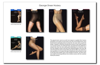
The apparel team came to us with one request: to update their hosiery
packaging. The quality of the hosiery was that of the department store
brands, but the packaging did not convey this. Our team came up with this
design. A design to showcase the particular function of each type of hosiery
in an upscale manner. An embossed logo, and watermark were added for a
sharper look. Also, the color coding was scaled down to a minimum since
this only needed to show at the top of the waterfall display in the store. We
went through three photo shoots before the desired effect was achieved. It
Previous George Hosiery Look
was important to us to capture the type of lighting we were aiming for as well
as the look of the models used. In the examples to the left, we chose a plus
size model for the George Woman line to better connect with the customer
buying the product.
2. George Shapers, Foot Solutions, and Tights
The George Sheer program was such a success that the new look was used for
the George Shapers program.
The Merchandising Team also wanted
the George Tights program to coordinate
with the new upscale look. This time our
team decided for lifestyle photography.
The same photo studio was chosen for
consistency. Again, I chose the model,
assisted in the styling of the model, set
design and propping, and assisted in the
To complete the modular, the new look was then implemented into the George general art direction of the shoot.
Foot Solutions program. I created the adaptations for the new templates. Also,
I chose the model for the images and assisted in art direction of the photo shoot.
3. Ol’ Roy Dog Treats
The Ol’ Roy Dog Food brand had recently been updated. It was
up to our team to match the new look to the dog treats line. The
old look conveyed a cheap and unappetizing look. For the largest
selling dog food brand in the country we wanted packaging
that matched the quality of the product. We worked with the
Marketing team to come up with the right dog images for each
type of treat. I assisted in the Art Direction of the photo shoot for
the actual treat images. It was important to show correct color,
texture, size, quantity, and add interest to the layout of the product.
The result, a successful addition to the Ol’ Roy Dog Food brand.
Previous Ol’ Roy Treat Packaging Updated Ol’ Roy Food Packaging
4. DD&F Consulting Website Redesign
DD&F Consulting came to our company wanting a redesign of their exsisting website. They
wanted a design that would compete nationally and would be modern, exciting, and easy for
the user to navigate. I was given their logo and photographs supplied by the client.
5. Paintings
“Abstract #2”
Not long ago I began painting on a larger scale, and laying the painting surface down. This invited
me to paint around it and look at the image from all angles equally, not static with one direction
always being on top or bottom. This allowed for the paintings to be more fluid and full of motion.
The eye should dance around, through, and off of the picture.
“Abstract #1”