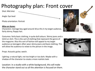
Photography
plan
Photography plan: Front cover
Shot: Mid shot
Angle: Eye level
Photo orientation: Portrait
Mise-en-Scene:
Characters: teenage boy aged around 18 as this it my target audience,
fairly skinny, floppy hair.
Costumes: fairly basic clothing, in quite dull colours. Skinny jeans and a
tshirt or shirt. This is the sort of clothing that represent the genre of
the magazine. Also this sort of fashion will appeal to my target
audience as teenagers often wear skinny jeans and basic clothing. This
will allow the audience to relate to the person in the image.
Props: Acoustic guitar, watch.
Lighting: a natural light, not too bright or too dark. Maybe with a
shadow of the character to create a more realistic look.
Location: in a studio with a white background, this will make
the character stand out so all the attention is focused on them.
Photography plan: double page spread
Shot: medium close up
Angle: low angle
Photo orientation: landscape. I want the text to be
written over the white space of the image, therefore
my image will take up all of my double page spread,
with just the character on the left/right hand side
page.
Mise-en-Scene:
Characters: same character as on the double page
spread, as they will be my main story. However it will
be a different photo of them that I have taken.
Costume: same as on the front cover, basic clothing,
skinny jeans, top/shirt.
Props: microphone, watch.
Lighting: fairly bright
Location: in a studio like in the front cover, to make
the character stand out.
Photography plan: contents page
Shot: I will have a variety of different images on the contents page
therefore there will be a variety of shots. However as there will be
quite a few photos, the images will be small so therefore I will use
close ups/ medium close ups to really show the expression on the
characters faces.
Angle: again, I will be using a variety of different angles as I will have
many images on this page. I will mainly use eye level, high angle and
low angle.
Photo orientation: the majority of the images will be portrait on the
contents page as they will be small so therefore need to be focused
on the main image.
Mise-en-Scene:
Characters: I will have a variety of characters on the contents page.
The majority of characters will be men as they are the main gender
in my genre. They will all be around the 20 year old age as this is
similar to my target audience.
Costumes: variety of costumes to suit each different band. Some
different colours, some dull and others bright to show different
genres.
Props: a variety of props may be used, e.g. guitars, microphones,
chairs, to make it realistic.
Lighting: a variety of different lighting will be used this shows it is
realistic as it makes it look like all images were taken at different
times.
Location: I will use the studio but edit backgrounds to make it look
like the photos were taken in different places, this makes it look
more realistic.

Photography plan

  • 1.
  • 2.
    Photography plan: Frontcover Shot: Mid shot Angle: Eye level Photo orientation: Portrait Mise-en-Scene: Characters: teenage boy aged around 18 as this it my target audience, fairly skinny, floppy hair. Costumes: fairly basic clothing, in quite dull colours. Skinny jeans and a tshirt or shirt. This is the sort of clothing that represent the genre of the magazine. Also this sort of fashion will appeal to my target audience as teenagers often wear skinny jeans and basic clothing. This will allow the audience to relate to the person in the image. Props: Acoustic guitar, watch. Lighting: a natural light, not too bright or too dark. Maybe with a shadow of the character to create a more realistic look. Location: in a studio with a white background, this will make the character stand out so all the attention is focused on them.
  • 3.
    Photography plan: doublepage spread Shot: medium close up Angle: low angle Photo orientation: landscape. I want the text to be written over the white space of the image, therefore my image will take up all of my double page spread, with just the character on the left/right hand side page. Mise-en-Scene: Characters: same character as on the double page spread, as they will be my main story. However it will be a different photo of them that I have taken. Costume: same as on the front cover, basic clothing, skinny jeans, top/shirt. Props: microphone, watch. Lighting: fairly bright Location: in a studio like in the front cover, to make the character stand out.
  • 4.
    Photography plan: contentspage Shot: I will have a variety of different images on the contents page therefore there will be a variety of shots. However as there will be quite a few photos, the images will be small so therefore I will use close ups/ medium close ups to really show the expression on the characters faces. Angle: again, I will be using a variety of different angles as I will have many images on this page. I will mainly use eye level, high angle and low angle. Photo orientation: the majority of the images will be portrait on the contents page as they will be small so therefore need to be focused on the main image. Mise-en-Scene: Characters: I will have a variety of characters on the contents page. The majority of characters will be men as they are the main gender in my genre. They will all be around the 20 year old age as this is similar to my target audience. Costumes: variety of costumes to suit each different band. Some different colours, some dull and others bright to show different genres. Props: a variety of props may be used, e.g. guitars, microphones, chairs, to make it realistic. Lighting: a variety of different lighting will be used this shows it is realistic as it makes it look like all images were taken at different times. Location: I will use the studio but edit backgrounds to make it look like the photos were taken in different places, this makes it look more realistic.