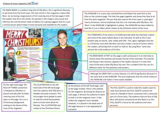
1. Analysis of music magazine 2 WE
POP’
The MAIN IMAGE is a medium-long shot of Olly Murs; this is significant because,
as we know from the front cover, the main article in this magazine is about Olly
Murs. So, by having a large picture of him covering one of the two pages it tells
the readers that this is the article. His position in the image is very casual and
informal, this and the direct mode of address he is giving suggests that he is just
a normal person which makes it more personal and relatable for the readers.
The HEADLINE is in a very clear and bold font and follows the same font as the
titles on the contents page. This links the pages together and shows that they’re all
from the same magazine. The pun that was used on the front cover is used again
‘merry christmurs’ and to emphasise that this is an interview with Olly Murs, the
‘Murs’ in the HEADLINE is highlighted in yellow. The HEADLINE has been edited to
look like it is on a ribbon which relates to the Christmas theme of this issue.
The STANDFIRST of the article is to briefly describe what the interview is about
and some of the topics talked about in the interview. As well as this it uses
another play-on-words; ‘jolly ‘oliday with Olly’. This, again, highlights that this
is a Christmas issue with Olly Murs and also creates a sense of humour within
the readers, attracting them to want to read on. By using Murs’ name also
attracts the niche audience of his fans.
The MAIN BODY of TEXT on this page is split up because it is an interview so
clearly shows the question and answer format of the interview. This and the
text being in two columns, appeals to the readers because it is clear that
most of the text is what Olly Murs has said. This is evident from the use of a
different colour for the questions and answers.
Although the DROP CAP is a minor feature, it is still of significance because it is
the same font as the HEADLINE. This just emphasises that the article relates to
the HEADLINE and makes it more easily readable.
On the right hand page, the
RULE OF THIRDS convention
is followed as Olly Murs is
placed centrally with his body
covering most of the hot
spots on the page. He is on a
Christmassy background
relating to the theme of this
issue of the magazine.
The ILLUSTRATION on the left
hand side of the left hand page
tells the audience that Olly Murs is
likeable and quite innocent. This
encourages more people to want
to read the article becausethey
want to know more about his
lifestyle. The ILLUSTRATION also
relates to the Christmas theme.
At the bottom of the left hand page, next
to the page number, there is the website
for the magazine. By having this feature on
each page, it attracts the audience to want
to look in to the magazine more. It also
makes the magazine more saleable.
However, it is placed in the dead area of
the page because it is not appealing for
everyone.
The PULL-QUOTE is used to make the readers want to
read more because the PULL-QUOTE contains the
name of a likeable X-Factor contestant that is obviously
part of a funny story. The audience that are fans of Olly
Murs will almost certainly know who Rylan is so this
PULL-QUOTE is funny for the audience and more
personal.