


![I am not making
this up!
The Weibull Hazard Function
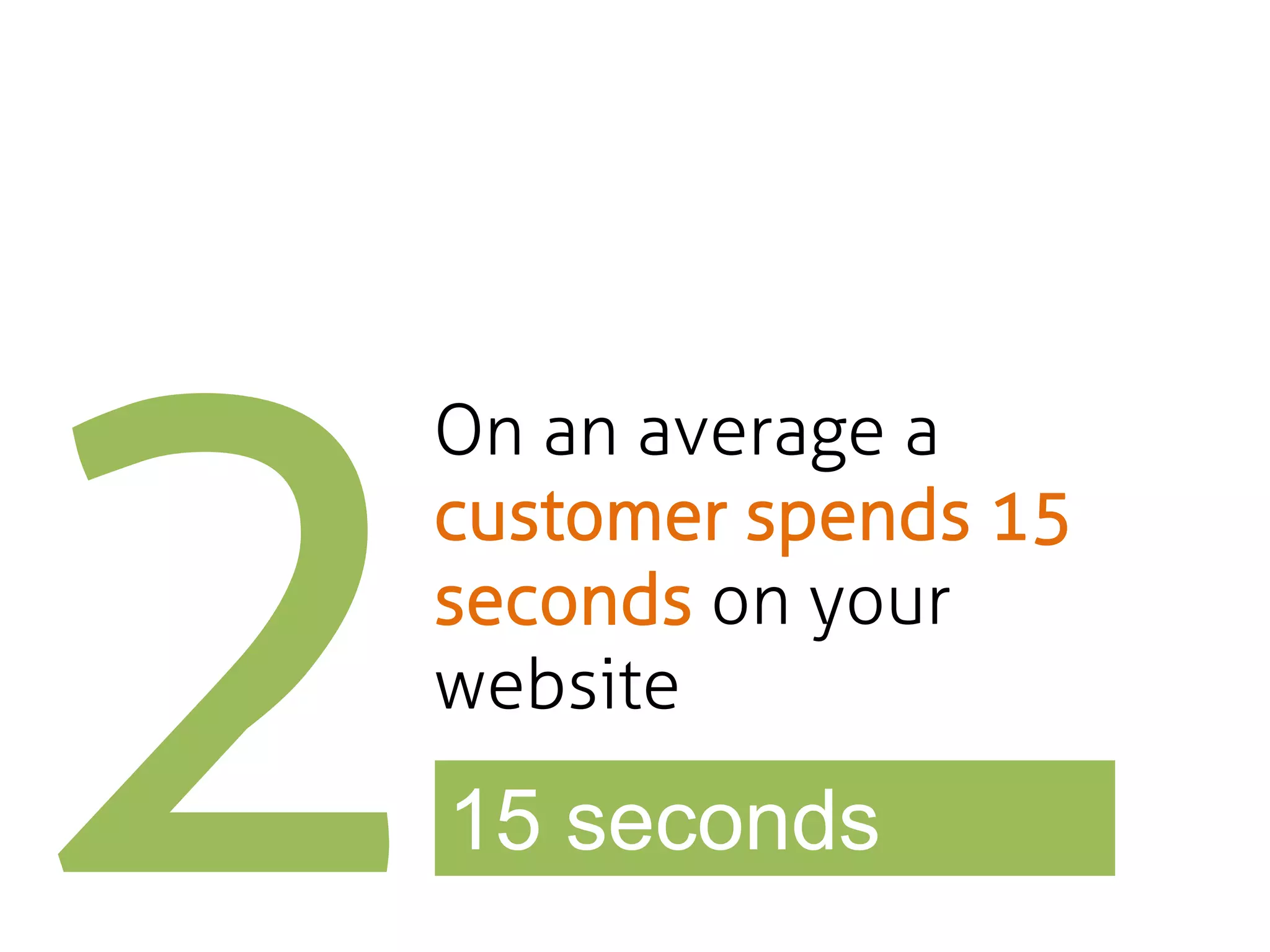
“Researchers discovered that 99% of Web pages have a negative aging effect. Users spend their
initial time on a page in ruthless triage to abandon the dross ASAP.
The probability of leaving is very high during these first few seconds because users are extremely
skeptical, having suffered countless poorly designed Web pages in the past” [1]](https://image.slidesharecdn.com/muhivewebsiteoptimizations-131019013957-phpapp01/75/Website-optimization-for-SaaS-conversions-muHive-11-2048.jpg)

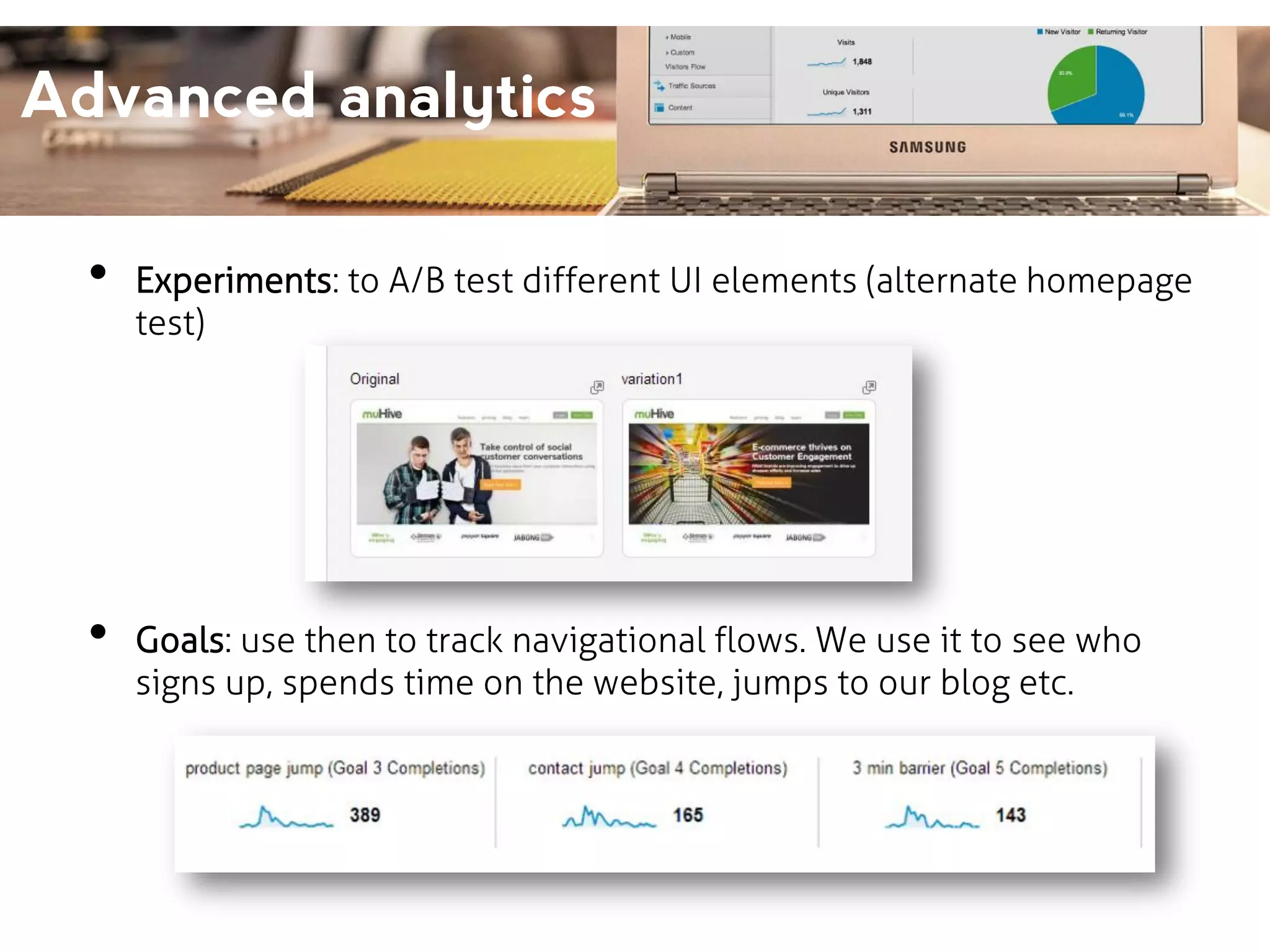
![Advanced analytics
Three must use features of Google Analytics: Events, Experiments,
Goals
•
Events: to track how users use website elements. For e.g.: we add
the code
onClick="_gaq.push(['_trackEvent', ‘Scroll Depth', ’100%']);"
tells us, how many people scrolled to the bottom of a page.](https://image.slidesharecdn.com/muhivewebsiteoptimizations-131019013957-phpapp01/75/Website-optimization-for-SaaS-conversions-muHive-35-2048.jpg)


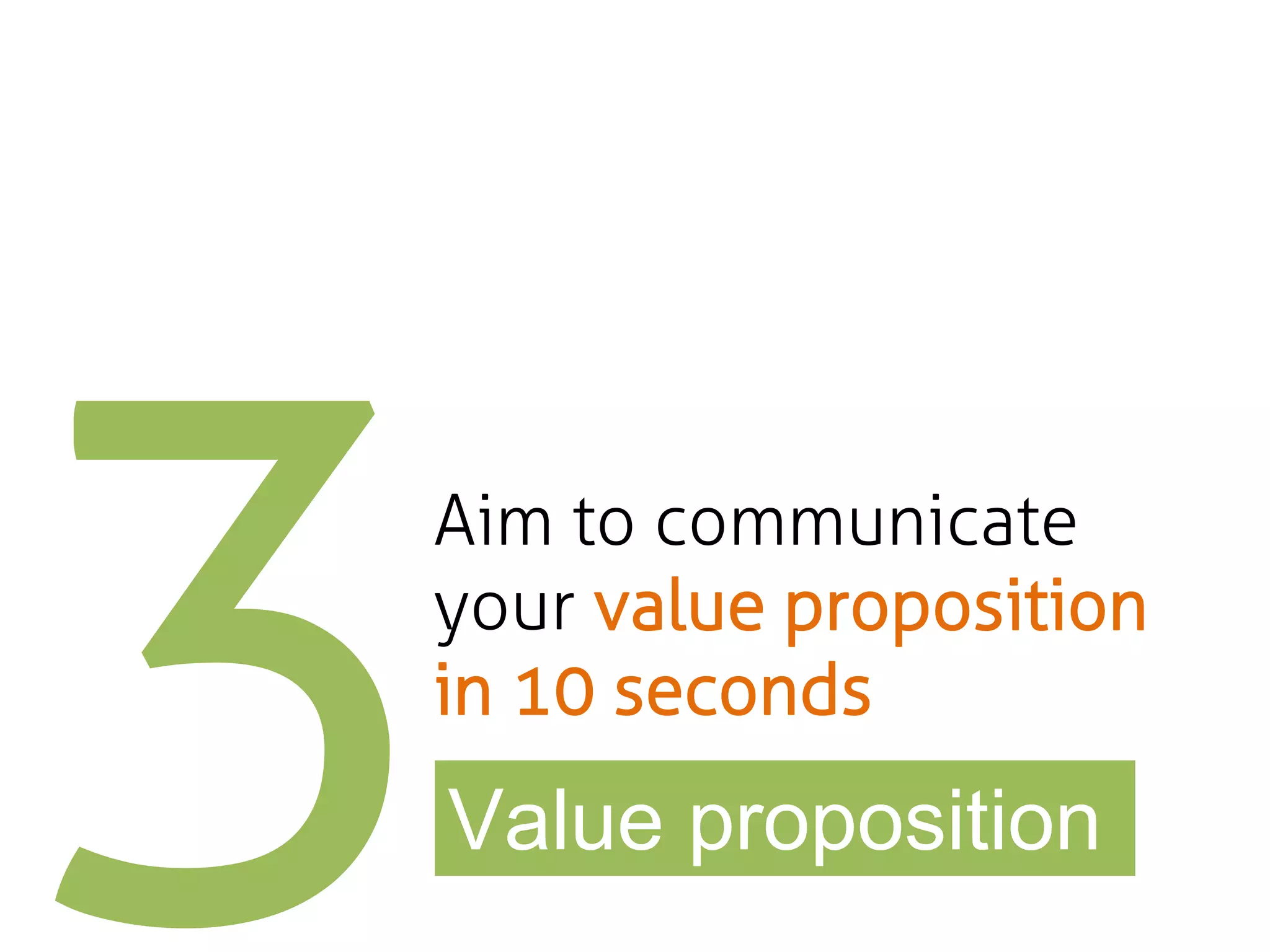
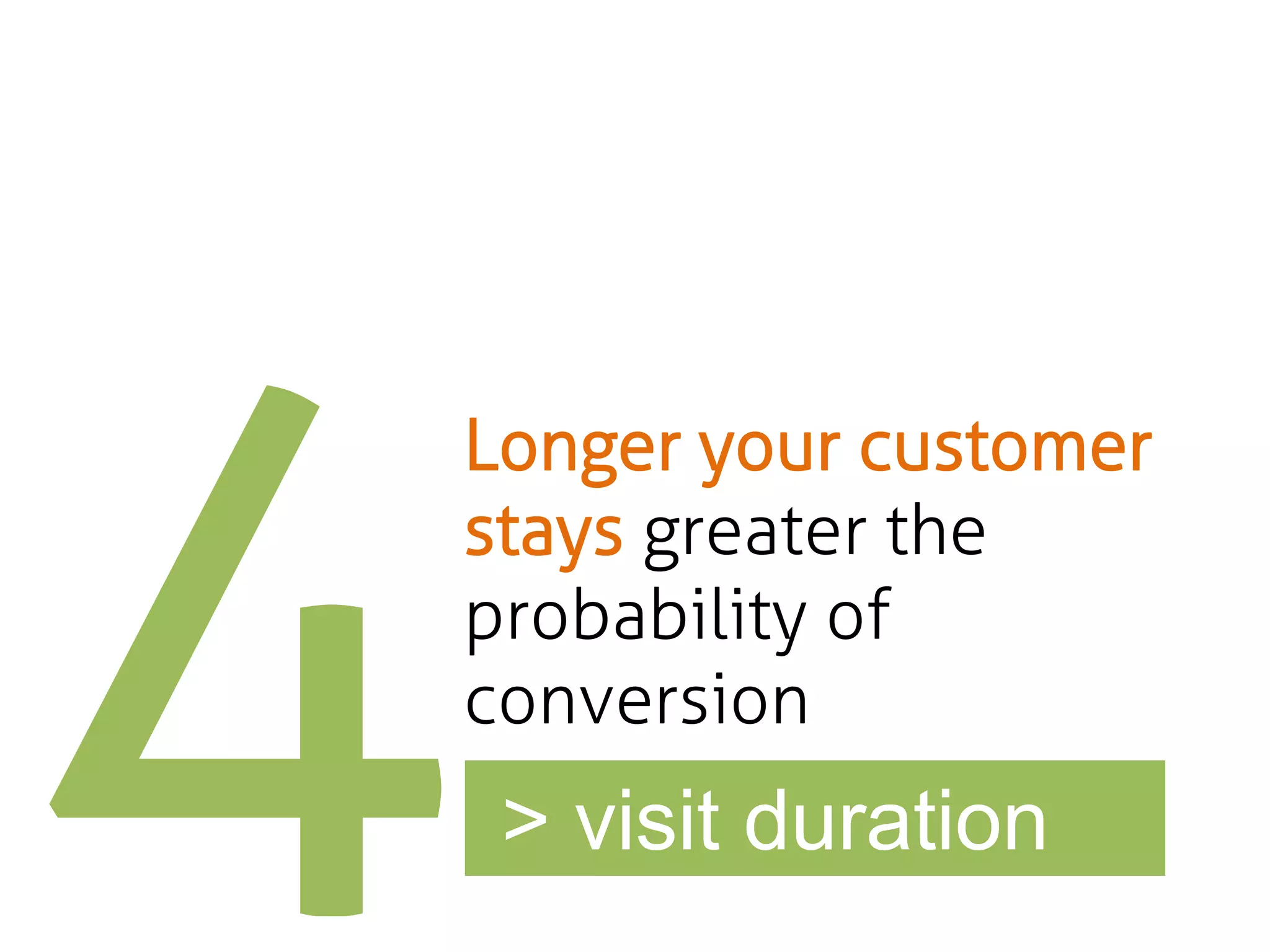
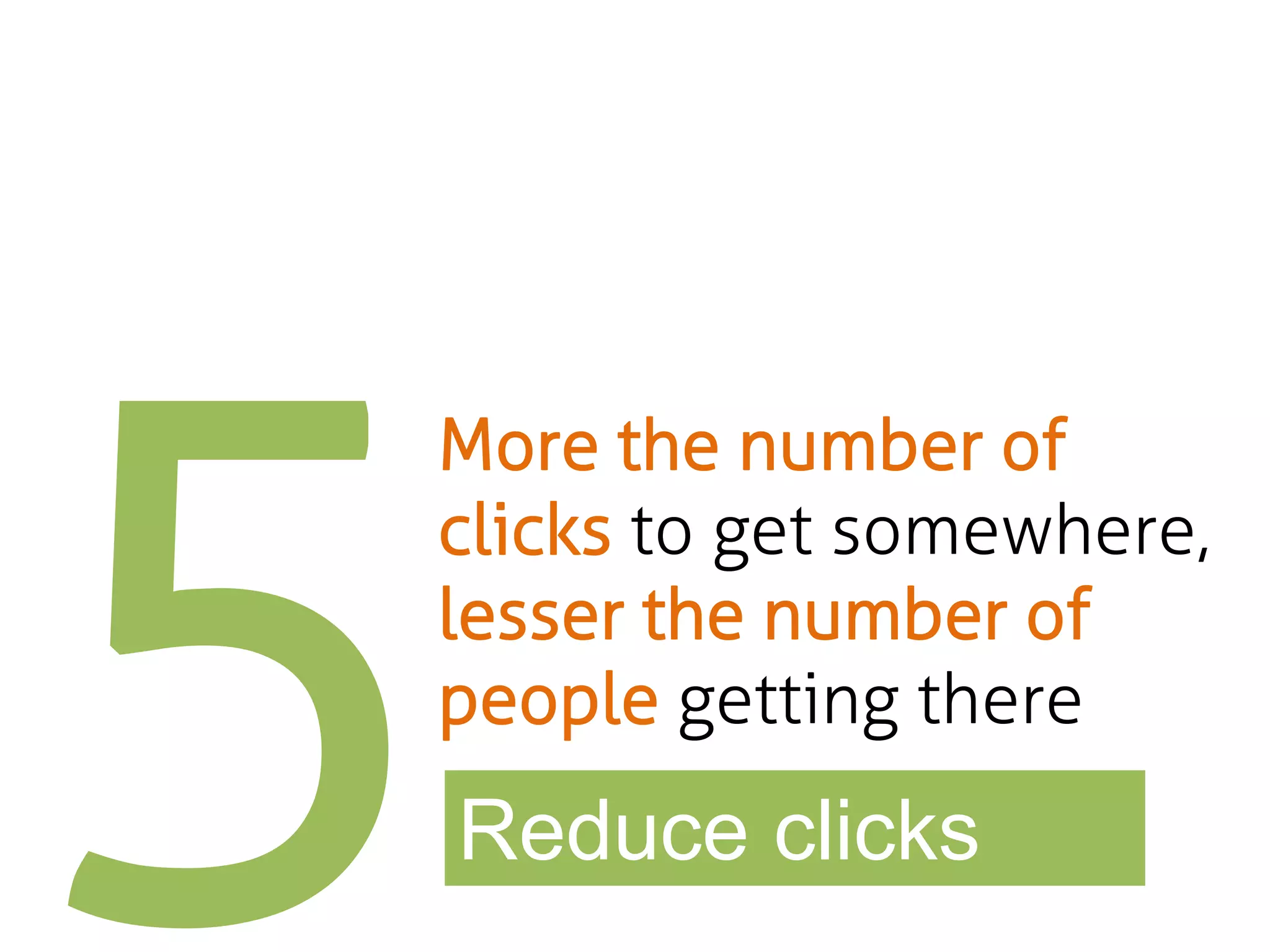
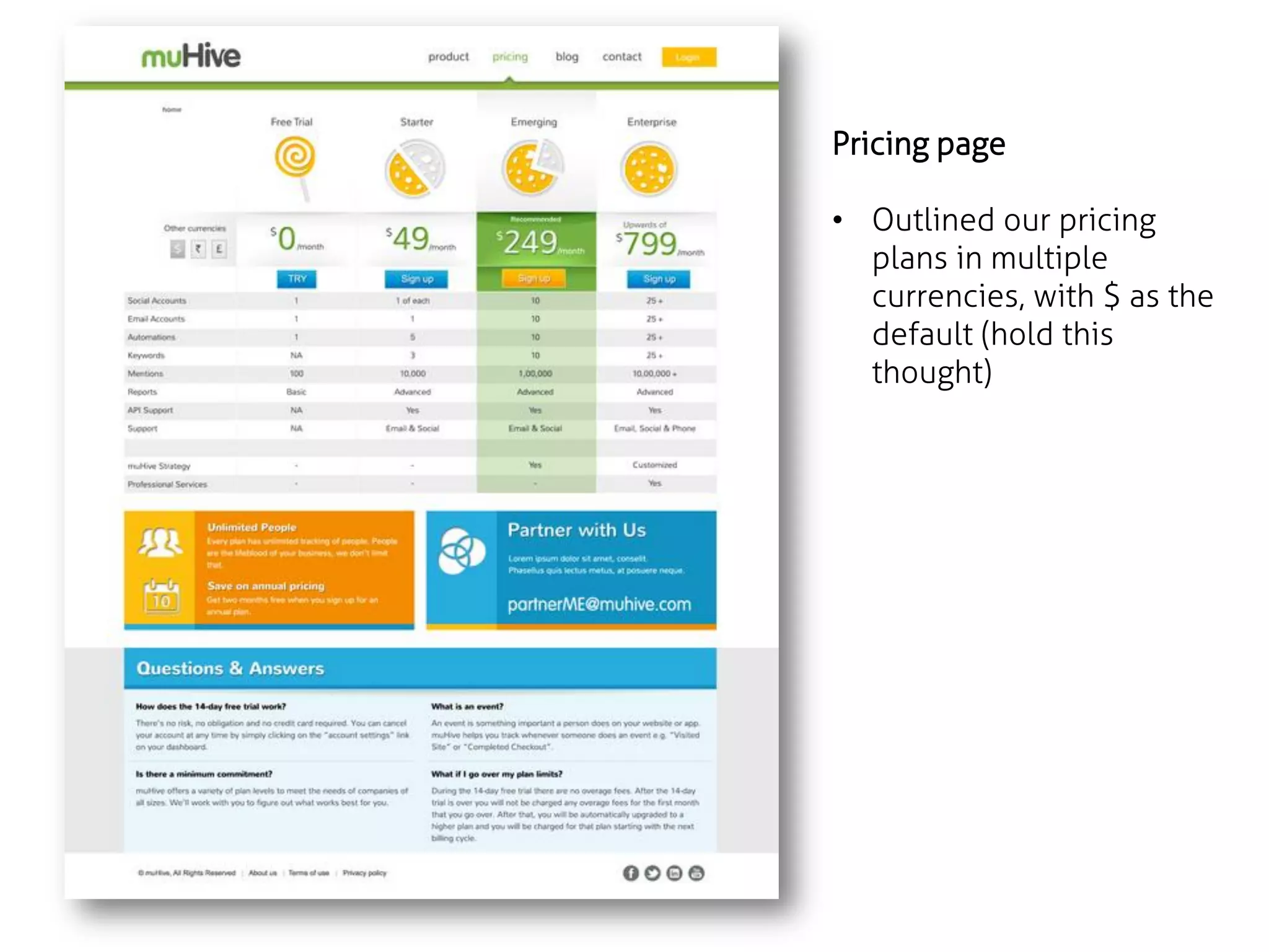
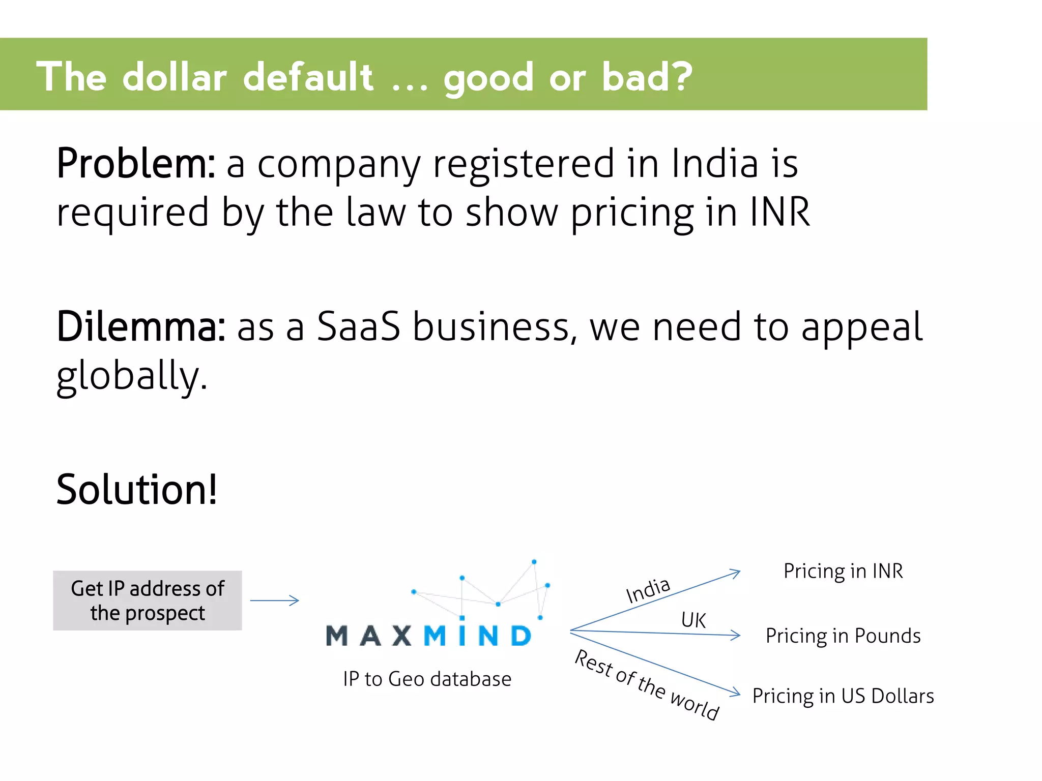
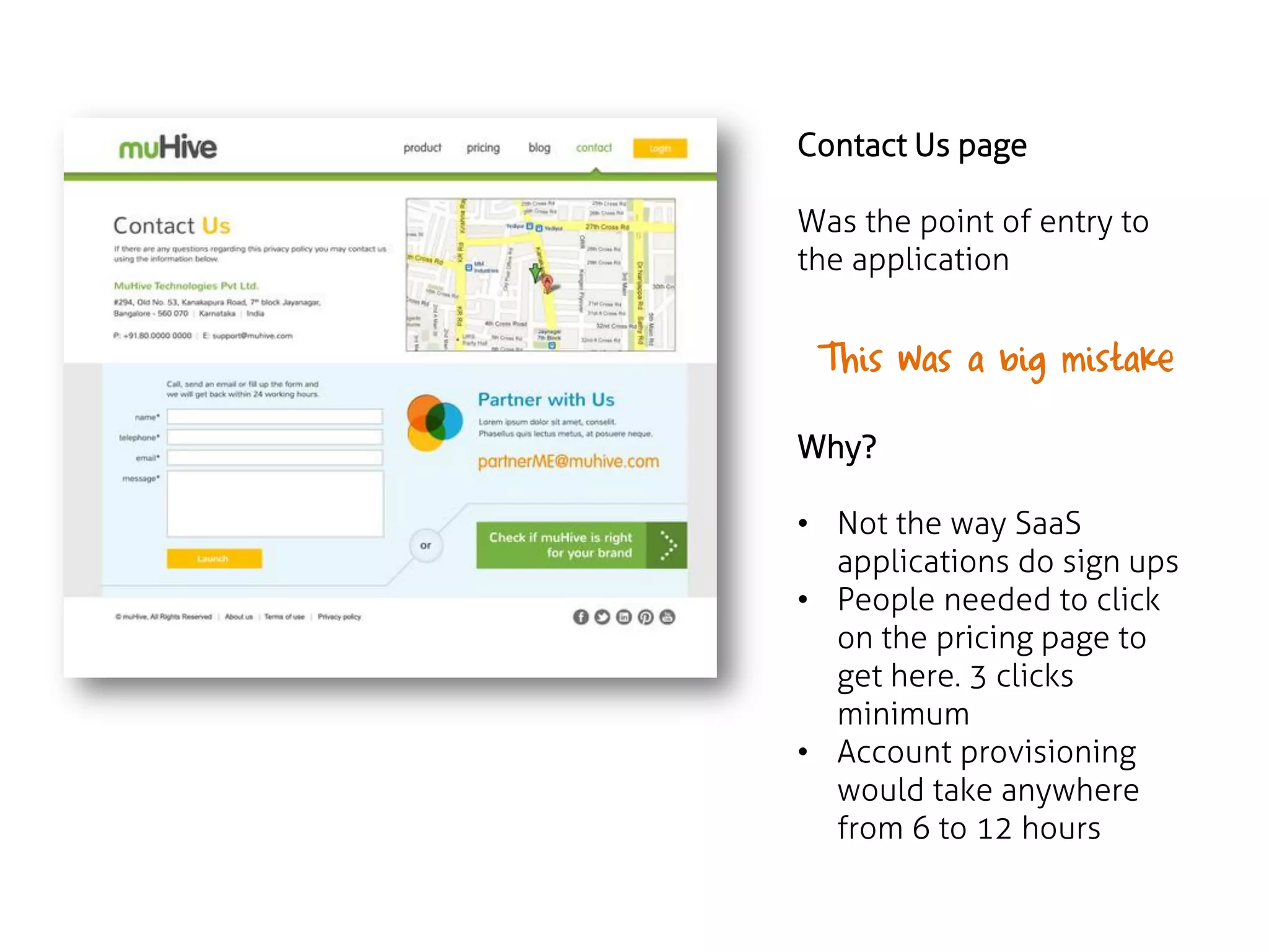
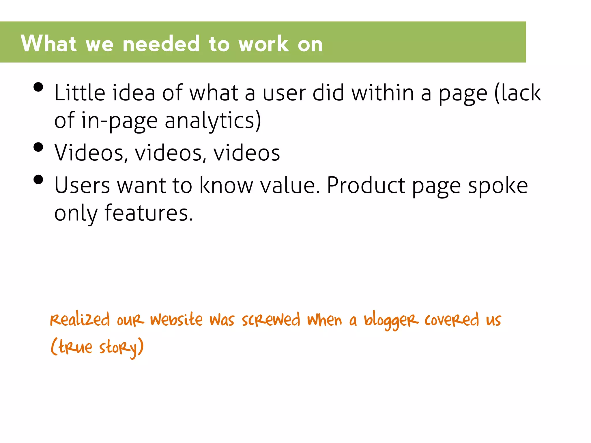
The document outlines the strategies implemented to optimize a SaaS website for better conversion rates, emphasizing the importance of design and user experience. Key changes included reducing clicks to information, enhancing the clarity of value propositions, and leveraging analytics to refine website effectiveness. Ultimately, these iterative design improvements led to increased user engagement and sign-ups for the service.


![[#GHConf17] PPC Growth — 7 Hacks You Need to Test](https://cdn.slidesharecdn.com/ss_thumbnails/johnathandanefinal-170602224843-thumbnail.jpg?width=640&height=640&fit=bounds)


![[GrowthHacker Conference '16] Willix Halim, SVP Growth at Freelancer.com: Cre...](https://cdn.slidesharecdn.com/ss_thumbnails/willixslidesfinalwithlinks-160402000055-thumbnail.jpg?width=640&height=640&fit=bounds)


![Driver Easy Pro Key 7.1.0.2641 Full Mac Crack Free Activated Download [2026]....](https://cdn.slidesharecdn.com/ss_thumbnails/software-251207185324-b2fb71b4-thumbnail.jpg?width=640&height=640&fit=bounds)

![Wondershare Filmora 15.0.11 Crack for Mac Key Full Download [Latest] pptx](https://cdn.slidesharecdn.com/ss_thumbnails/software-251207184836-1d16ba16-thumbnail.jpg?width=640&height=640&fit=bounds)
![Soundtoys Mac v5.5.5.0 Crack for MacOS Full Version [Latest] pptx](https://cdn.slidesharecdn.com/ss_thumbnails/softwareoverview-251207193711-91d8ae6b-thumbnail.jpg?width=640&height=640&fit=bounds)
![iStat Menus 7.20 Crack for MacOS 2026 Full Version [Latest] pptx](https://cdn.slidesharecdn.com/ss_thumbnails/softwareoverview-251207191544-22b737dc-thumbnail.jpg?width=640&height=640&fit=bounds)
![Moho Pro 14.4 Crack for MacOS Works Until 2050 [Latest] pptx](https://cdn.slidesharecdn.com/ss_thumbnails/softwareoverview-251207192639-797289c4-thumbnail.jpg?width=640&height=640&fit=bounds)


