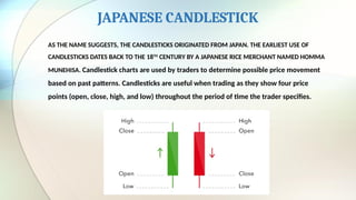
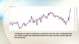
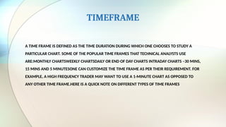
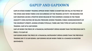
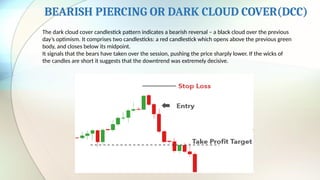
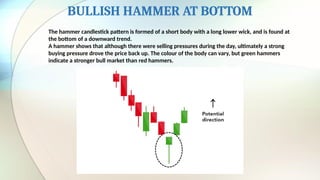
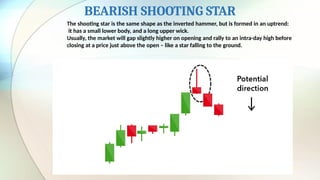
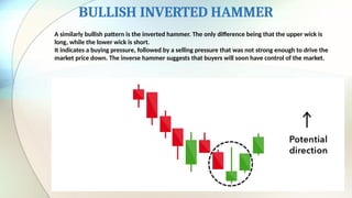
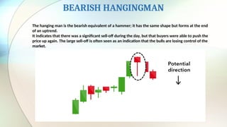
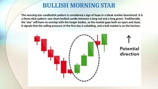
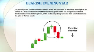
TECHNICAL ANALYSIS
TECHNICAL ANALYSIS IS THE ATTEMPT TO FORECAST STOCK PRICES ON THE
BASIS OF MARKET-DERIVED DATA.
TECHNICIANS(ALSO KNOWN AS QUANTATIVE ANALYSTS OR CHARTISTS)
USUALLY LOOK AT THE PRICE,VOLUME AND PSYCHOLOGICAL INDICATORS OVER
TIME.
TECHNICAL ANALYSIS IS A METHOD TO PREDICT THE FUTURE BEHAVIOUR OF
SECURITIES WITH THE USE OF PAST DATA.
IMPORTANCE OF TECHNICAL ANALYSIS
TECHNICAL ANALYSTS USE PROBABILITY TO PICK STOCKS. BY USING PROBABILITY,
THEY ARE ABLE TO PREDICT THE OUTCOME OF AN ACTION WITHOUT NECESSARILY
NEEDING TO SCRUTINIZE IT IN GREAT DETAIL. SO, TECHNICAL ANALYSIS TELLS YOU
HOW PRICES ARE GOING TO MOVE WITHOUT REQUIRING YOU TO BOTHER ABOUT
THE NITTY-GRITTIES THAT WILL CAUSE THE PRICE TO MOVE. IT IS MUCH QUICKER
AND LESS LABORIOUS THAN FUNDAMENTAL ANALYSIS.
TYPES OF CHARTS
AS YOU MAY HAVE GUESSED, THE REGULAR CHARTS THAT WE ARE GENERALLY USED
TO –LIKE THE COLUMN CHART, PIE CHART, AREA CHART ETC DOES NOT WORK FOR
TECHNICAL ANALYSIS. THE ONLY EXCEPTION TO THIS IS THE LINE CHART.THE
REGULAR CHARTS DON’T WORK MAINLY BECAUSE THEY DISPLAY ONE DATA POINT
AT A GIVENPOINT IN TIME. HOWEVER TECHNICAL ANALYSIS REQUIRES FOUR DATA
POINTS TO BE DISPLAYED AT THE SAME TIME.
BELOW ARE SOME OF THE CHART TYPES:
1. LINE CHART.
2. BAR CHART.
3. JAPANESE CANDLESTICK.
THE LINE CHART
THE LINE CHART IS THE MOST BASIC CHART TYPE AND IT USES ONLY ONE DATA POINT TO
FORM THECHART. WHEN IT COMES TO TECHNICAL ANALYSIS, A LINE CHART IS FORMED BY
PLOTTING THE CLOSING PRICES OF A STOCK OR AN INDEX. A DOT IS PLACED FOR EACH
CLOSING PRICE AND THE VARIOUS DOTSARE THEN CONNECTED BY A LINE.
THE LINE CHARTS CAN BE PLOTTED FOR VARIOUS TIME FRAMES NAMELY MONTHLY, WEEKLY,
HOURLY ETC. SO ,IF YOU WISH TO DRAW A WEEKLY LINE CHART, YOU CAN USE WEEKLY
CLOSING PRICES OF SECURITIES AND LIKEWISE FOR THE OTHER TIME FRAMES AS WELL.
THE BAR CHART
THE BAR CHART ON THE OTHER HAND IS A BIT MORE VERSATILE. A BAR
CHART DISPLAYS ALL THE FOUR PRICE VARIABLES NAMELY OPEN, HIGH, LOW, AND CLOSE.
A BAR HAS THREE COMPONENTS.THE CENTRAL LINE –THE TOP OF THE BAR
INDICATES THE HIGHEST PRICE THE SECURITY HAS REACHED. THE BOTTOM
END OF THE BAR INDICATES THE LOWEST PRICE FOR THE SAME PERIOD.
THE LEFT MARK/TICK –INDICATES THE OPENTHE RIGHT MARK/TICK –
INDICATES THE CLOSEFOR EXAMPLE, ASSUME THE OHLC DATA FOR A STOCK
AS FOLLOWS:OPEN –65HIGH –70LOW –60CLOSE –68
FOR THE ABOVE DATA, THE BAR CHART WOULD LOOK LIKE THIS:
AS YOU CAN SEE, IN A SINGLE BAR, WE CAN PLOT FOUR DIFFERENT PRICE POINTS. IF YOU
WISH TO VIEW 5 DAYS CHART, AS YOU WOULD IMAGINE WE WILL HAVE 5 VERTICAL BARS. SO
ON AND SO FORTH.
NOTE THE POSITION OF THE LEFT AND RIGHT MARK ON THE BAR CHART VARIES BASED ON
HOW THE MARKET HAS MOVED FOR THE GIVEN DAY.IF THE LEFT MARK, WHICH REPRESENTS
THE OPENING PRICE IS PLACED LOWER THAN THE RIGHT MARK, IT INDICATES THAT THE
CLOSE IS HIGHER THAN THE OPEN (CLOSE > OPEN), HENCE A POSITIVE DAY FOR THE
MARKETS. FOR EXAMPLE CONSIDER THIS: O = 46, H = 51, L = 45, C = 49. TO INDICATE IT IS A
BULLISH DAY, THE BAR IS REPRESENTED IN BLUE COLOR
JAPANESE CANDLESTICK
AS THE NAME SUGGESTS, THE CANDLESTICKS ORIGINATED FROM JAPAN. THE EARLIEST USE OF
CANDLESTICKS DATES BACK TO THE 18TH
CENTURY BY A JAPANESE RICE MERCHANT NAMED HOMMA
MUNEHISA. Candlestick charts are used by traders to determine possible price movement
based on past patterns. Candlesticks are useful when trading as they show four price
points (open, close, high, and low) throughout the period of time the trader specifies.
candlesticks are easier to interpret in comparison to the bar chart. Candlesticks help
you quickly visualize the relationship between the open and close and the high and
low price points.
TIMEFRAME
A TIME FRAME IS DEFINED AS THE TIME DURATION DURING WHICH ONE CHOOSES TO STUDY A
PARTICULAR CHART. SOME OF THE POPULAR TIME FRAMES THAT TECHNICAL ANALYSTS USE
ARE:MONTHLY CHARTSWEEKLY CHARTSDAILY OR END OF DAY CHARTS INTRADAY CHARTS –30 MINS,
15 MINS AND 5 MINUTESONE CAN CUSTOMIZE THE TIME FRAME AS PER THEIR REQUIREMENT. FOR
EXAMPLE, A HIGH FREQUENCY TRADER MAY WANT TO USE A 1-MINUTE CHART AS OPPOSED TO
ANY OTHER TIME FRAME.HERE IS A QUICK NOTE ON DIFFERENT TYPES OF TIME FRAMES
GAPUP AND GAPDOWN
GAPS IN STOCK MARKET TRADING APPEAR WHEN THERE IS SHARP RISE OR FALL IN THE PRICE OF
THE STOCK AND WHEN THERE IS NO OCCURRENCE OF THE TRADING ACTIVITY. THE REASONS FOR
GAP CREATION CAN BE A POSITIVE NEWS RELEASE BY THE COMPANY, CHANGE IN THE TRADE
ANALYST’S VIEW, BUYING OR SELLING PRESSURE AMONG TRADERS, PUBLIC ANNOUNCEMENTS OF
THE COMPANY’S PROFIT, AMONG OTHERS.TYPICALLY, THERE ARE TWO TYPES OF GAPS IN STOCK
TRADING: GAP-UP & GAP-DOWN
GAP-UP:WHEN THE PRICE OF A FINANCIAL INSTRUMENT OPENS HIGHER THAN THE PREVIOUS DAY’S
PRICE, IT IS GAP-UP.
GAP-DOWN:WHEN THE PRICE OF A FINANCIAL INSTRUMENT OPENS LOWER THAN THE PREVIOUS
TRADING DAY IT IS GAP-DOWN. GAP-DOWNS OCCUR WHEN THERE IS A CHANGE IN INVESTOR
SENTIMENTS.
INTRODUCTION TO CANDLESTICK PATTERN
OVER TIME, INDIVIDUAL CANDLESTICKS FORM PATTERNS THAT TRADERS CAN USE TO
RECOGNIZE MAJOR SUPPORT AND RESISTANCE LEVELS. THERE ARE A GREAT MANY
CANDLESTICK PATTERNS THAT INDICATE AN OPPORTUNITY WITHIN A MARKET – SOME
PROVIDE INSIGHT INTO THE BALANCE BETWEEN BUYING AND SELLING PRESSURES, WHILE
OTHERS IDENTIFY CONTINUATION PATTERNS OR MARKET INDECISION. CANDLESTICK
CHARTS ARE MORE VISUAL, DUE TO THE COLOR CODING OF THE PRICE BARS AND THICKER
REAL BODIES, WHICH ARE BETTER AT HIGHLIGHTING THE DIFFERENCE BETWEEN THE
OPEN AND THE CLOSE.
BULLISH ENGULFING
The bullish engulfing pattern is formed of two candlesticks. The first candle is a short red
body that is completely engulfed by a larger green candle.
Though the second day opens lower than the first, the bullish market pushes the price up,
culminating in an obvious win for buyers
BEARISH ENGULFING
A bearish engulfing pattern occurs at the end of an uptrend. The first candle has a small green body
that is engulfed by a subsequent long red candle.
It signifies a peak or slowdown of price movement, and is a sign of an impending market downturn.
The lower the second candle goes, the more significant the trend is likely to be.
BULLISH PIERCING
The piercing line is also a two-stick pattern, made up of a long red candle, followed by a long green
candle.
There is usually a significant gap down between the first candlestick’s closing price, and the green
candlestick’s opening. It indicates a strong buying pressure, as the price is pushed up to or above the
mid-price of the previous day.
BEARISH PIERCING OR DARK CLOUD COVER(DCC)
The dark cloud cover candlestick pattern indicates a bearish reversal – a black cloud over the previous
day’s optimism. It comprises two candlesticks: a red candlestick which opens above the previous green
body, and closes below its midpoint.
It signals that the bears have taken over the session, pushing the price sharply lower. If the wicks of
the candles are short it suggests that the downtrend was extremely decisive.
BULLISH HAMMER AT BOTTOM
The hammer candlestick pattern is formed of a short body with a long lower wick, and is found at
the bottom of a downward trend.
A hammer shows that although there were selling pressures during the day, ultimately a strong
buying pressure drove the price back up. The colour of the body can vary, but green hammers
indicate a stronger bull market than red hammers.
BEARISH SHOOTING STAR
The shooting star is the same shape as the inverted hammer, but is formed in an uptrend:
it has a small lower body, and a long upper wick.
Usually, the market will gap slightly higher on opening and rally to an intra-day high before
closing at a price just above the open – like a star falling to the ground.
BULLISH INVERTED HAMMER
A similarly bullish pattern is the inverted hammer. The only difference being that the upper wick is
long, while the lower wick is short.
It indicates a buying pressure, followed by a selling pressure that was not strong enough to drive the
market price down. The inverse hammer suggests that buyers will soon have control of the market.
BEARISH HANGINGMAN
The hanging man is the bearish equivalent of a hammer; it has the same shape but forms at the end
of an uptrend.
It indicates that there was a significant sell-off during the day, but that buyers were able to push the
price up again. The large sell-off is often seen as an indication that the bulls are losing control of the
market.
BULLISH MORNING STAR
The morning star candlestick pattern is considered a sign of hope in a bleak market downtrend. It is
a three-stick pattern: one short-bodied candle between a long red and a long green. Traditionally,
the ‘star’ will have no overlap with the longer bodies, as the market gaps both on open and close.
It signals that the selling pressure of the first day is subsiding, and a bull market is on the horizon.
BEARISH EVENING STAR
The evening star is a three-candlestick pattern that is the equivalent of the bullish morning star. It is
formed of a short candle sandwiched between a long green candle and a large red candlestick.
It indicates the reversal of an uptrend, and is particularly strong when the third candlestick erases
the gains of the first candle.
Thank you

MODULE 6 TEnnnnnnnnnCHNICAL ANALYSIS.pptx

  • 1.
    TECHNICAL ANALYSIS TECHNICAL ANALYSISIS THE ATTEMPT TO FORECAST STOCK PRICES ON THE BASIS OF MARKET-DERIVED DATA. TECHNICIANS(ALSO KNOWN AS QUANTATIVE ANALYSTS OR CHARTISTS) USUALLY LOOK AT THE PRICE,VOLUME AND PSYCHOLOGICAL INDICATORS OVER TIME. TECHNICAL ANALYSIS IS A METHOD TO PREDICT THE FUTURE BEHAVIOUR OF SECURITIES WITH THE USE OF PAST DATA.
  • 2.
    IMPORTANCE OF TECHNICALANALYSIS TECHNICAL ANALYSTS USE PROBABILITY TO PICK STOCKS. BY USING PROBABILITY, THEY ARE ABLE TO PREDICT THE OUTCOME OF AN ACTION WITHOUT NECESSARILY NEEDING TO SCRUTINIZE IT IN GREAT DETAIL. SO, TECHNICAL ANALYSIS TELLS YOU HOW PRICES ARE GOING TO MOVE WITHOUT REQUIRING YOU TO BOTHER ABOUT THE NITTY-GRITTIES THAT WILL CAUSE THE PRICE TO MOVE. IT IS MUCH QUICKER AND LESS LABORIOUS THAN FUNDAMENTAL ANALYSIS.
  • 3.
    TYPES OF CHARTS ASYOU MAY HAVE GUESSED, THE REGULAR CHARTS THAT WE ARE GENERALLY USED TO –LIKE THE COLUMN CHART, PIE CHART, AREA CHART ETC DOES NOT WORK FOR TECHNICAL ANALYSIS. THE ONLY EXCEPTION TO THIS IS THE LINE CHART.THE REGULAR CHARTS DON’T WORK MAINLY BECAUSE THEY DISPLAY ONE DATA POINT AT A GIVENPOINT IN TIME. HOWEVER TECHNICAL ANALYSIS REQUIRES FOUR DATA POINTS TO BE DISPLAYED AT THE SAME TIME. BELOW ARE SOME OF THE CHART TYPES: 1. LINE CHART. 2. BAR CHART. 3. JAPANESE CANDLESTICK.
  • 4.
    THE LINE CHART THELINE CHART IS THE MOST BASIC CHART TYPE AND IT USES ONLY ONE DATA POINT TO FORM THECHART. WHEN IT COMES TO TECHNICAL ANALYSIS, A LINE CHART IS FORMED BY PLOTTING THE CLOSING PRICES OF A STOCK OR AN INDEX. A DOT IS PLACED FOR EACH CLOSING PRICE AND THE VARIOUS DOTSARE THEN CONNECTED BY A LINE.
  • 5.
    THE LINE CHARTSCAN BE PLOTTED FOR VARIOUS TIME FRAMES NAMELY MONTHLY, WEEKLY, HOURLY ETC. SO ,IF YOU WISH TO DRAW A WEEKLY LINE CHART, YOU CAN USE WEEKLY CLOSING PRICES OF SECURITIES AND LIKEWISE FOR THE OTHER TIME FRAMES AS WELL.
  • 6.
    THE BAR CHART THEBAR CHART ON THE OTHER HAND IS A BIT MORE VERSATILE. A BAR CHART DISPLAYS ALL THE FOUR PRICE VARIABLES NAMELY OPEN, HIGH, LOW, AND CLOSE. A BAR HAS THREE COMPONENTS.THE CENTRAL LINE –THE TOP OF THE BAR INDICATES THE HIGHEST PRICE THE SECURITY HAS REACHED. THE BOTTOM END OF THE BAR INDICATES THE LOWEST PRICE FOR THE SAME PERIOD. THE LEFT MARK/TICK –INDICATES THE OPENTHE RIGHT MARK/TICK – INDICATES THE CLOSEFOR EXAMPLE, ASSUME THE OHLC DATA FOR A STOCK AS FOLLOWS:OPEN –65HIGH –70LOW –60CLOSE –68 FOR THE ABOVE DATA, THE BAR CHART WOULD LOOK LIKE THIS:
  • 7.
    AS YOU CANSEE, IN A SINGLE BAR, WE CAN PLOT FOUR DIFFERENT PRICE POINTS. IF YOU WISH TO VIEW 5 DAYS CHART, AS YOU WOULD IMAGINE WE WILL HAVE 5 VERTICAL BARS. SO ON AND SO FORTH.
  • 8.
    NOTE THE POSITIONOF THE LEFT AND RIGHT MARK ON THE BAR CHART VARIES BASED ON HOW THE MARKET HAS MOVED FOR THE GIVEN DAY.IF THE LEFT MARK, WHICH REPRESENTS THE OPENING PRICE IS PLACED LOWER THAN THE RIGHT MARK, IT INDICATES THAT THE CLOSE IS HIGHER THAN THE OPEN (CLOSE > OPEN), HENCE A POSITIVE DAY FOR THE MARKETS. FOR EXAMPLE CONSIDER THIS: O = 46, H = 51, L = 45, C = 49. TO INDICATE IT IS A BULLISH DAY, THE BAR IS REPRESENTED IN BLUE COLOR
  • 9.
    JAPANESE CANDLESTICK AS THENAME SUGGESTS, THE CANDLESTICKS ORIGINATED FROM JAPAN. THE EARLIEST USE OF CANDLESTICKS DATES BACK TO THE 18TH CENTURY BY A JAPANESE RICE MERCHANT NAMED HOMMA MUNEHISA. Candlestick charts are used by traders to determine possible price movement based on past patterns. Candlesticks are useful when trading as they show four price points (open, close, high, and low) throughout the period of time the trader specifies.
  • 10.
    candlesticks are easierto interpret in comparison to the bar chart. Candlesticks help you quickly visualize the relationship between the open and close and the high and low price points.
  • 11.
    TIMEFRAME A TIME FRAMEIS DEFINED AS THE TIME DURATION DURING WHICH ONE CHOOSES TO STUDY A PARTICULAR CHART. SOME OF THE POPULAR TIME FRAMES THAT TECHNICAL ANALYSTS USE ARE:MONTHLY CHARTSWEEKLY CHARTSDAILY OR END OF DAY CHARTS INTRADAY CHARTS –30 MINS, 15 MINS AND 5 MINUTESONE CAN CUSTOMIZE THE TIME FRAME AS PER THEIR REQUIREMENT. FOR EXAMPLE, A HIGH FREQUENCY TRADER MAY WANT TO USE A 1-MINUTE CHART AS OPPOSED TO ANY OTHER TIME FRAME.HERE IS A QUICK NOTE ON DIFFERENT TYPES OF TIME FRAMES
  • 12.
    GAPUP AND GAPDOWN GAPSIN STOCK MARKET TRADING APPEAR WHEN THERE IS SHARP RISE OR FALL IN THE PRICE OF THE STOCK AND WHEN THERE IS NO OCCURRENCE OF THE TRADING ACTIVITY. THE REASONS FOR GAP CREATION CAN BE A POSITIVE NEWS RELEASE BY THE COMPANY, CHANGE IN THE TRADE ANALYST’S VIEW, BUYING OR SELLING PRESSURE AMONG TRADERS, PUBLIC ANNOUNCEMENTS OF THE COMPANY’S PROFIT, AMONG OTHERS.TYPICALLY, THERE ARE TWO TYPES OF GAPS IN STOCK TRADING: GAP-UP & GAP-DOWN GAP-UP:WHEN THE PRICE OF A FINANCIAL INSTRUMENT OPENS HIGHER THAN THE PREVIOUS DAY’S PRICE, IT IS GAP-UP. GAP-DOWN:WHEN THE PRICE OF A FINANCIAL INSTRUMENT OPENS LOWER THAN THE PREVIOUS TRADING DAY IT IS GAP-DOWN. GAP-DOWNS OCCUR WHEN THERE IS A CHANGE IN INVESTOR SENTIMENTS.
  • 13.
    INTRODUCTION TO CANDLESTICKPATTERN OVER TIME, INDIVIDUAL CANDLESTICKS FORM PATTERNS THAT TRADERS CAN USE TO RECOGNIZE MAJOR SUPPORT AND RESISTANCE LEVELS. THERE ARE A GREAT MANY CANDLESTICK PATTERNS THAT INDICATE AN OPPORTUNITY WITHIN A MARKET – SOME PROVIDE INSIGHT INTO THE BALANCE BETWEEN BUYING AND SELLING PRESSURES, WHILE OTHERS IDENTIFY CONTINUATION PATTERNS OR MARKET INDECISION. CANDLESTICK CHARTS ARE MORE VISUAL, DUE TO THE COLOR CODING OF THE PRICE BARS AND THICKER REAL BODIES, WHICH ARE BETTER AT HIGHLIGHTING THE DIFFERENCE BETWEEN THE OPEN AND THE CLOSE.
  • 14.
    BULLISH ENGULFING The bullishengulfing pattern is formed of two candlesticks. The first candle is a short red body that is completely engulfed by a larger green candle. Though the second day opens lower than the first, the bullish market pushes the price up, culminating in an obvious win for buyers
  • 15.
    BEARISH ENGULFING A bearishengulfing pattern occurs at the end of an uptrend. The first candle has a small green body that is engulfed by a subsequent long red candle. It signifies a peak or slowdown of price movement, and is a sign of an impending market downturn. The lower the second candle goes, the more significant the trend is likely to be.
  • 16.
    BULLISH PIERCING The piercingline is also a two-stick pattern, made up of a long red candle, followed by a long green candle. There is usually a significant gap down between the first candlestick’s closing price, and the green candlestick’s opening. It indicates a strong buying pressure, as the price is pushed up to or above the mid-price of the previous day.
  • 17.
    BEARISH PIERCING ORDARK CLOUD COVER(DCC) The dark cloud cover candlestick pattern indicates a bearish reversal – a black cloud over the previous day’s optimism. It comprises two candlesticks: a red candlestick which opens above the previous green body, and closes below its midpoint. It signals that the bears have taken over the session, pushing the price sharply lower. If the wicks of the candles are short it suggests that the downtrend was extremely decisive.
  • 18.
    BULLISH HAMMER ATBOTTOM The hammer candlestick pattern is formed of a short body with a long lower wick, and is found at the bottom of a downward trend. A hammer shows that although there were selling pressures during the day, ultimately a strong buying pressure drove the price back up. The colour of the body can vary, but green hammers indicate a stronger bull market than red hammers.
  • 19.
    BEARISH SHOOTING STAR Theshooting star is the same shape as the inverted hammer, but is formed in an uptrend: it has a small lower body, and a long upper wick. Usually, the market will gap slightly higher on opening and rally to an intra-day high before closing at a price just above the open – like a star falling to the ground.
  • 20.
    BULLISH INVERTED HAMMER Asimilarly bullish pattern is the inverted hammer. The only difference being that the upper wick is long, while the lower wick is short. It indicates a buying pressure, followed by a selling pressure that was not strong enough to drive the market price down. The inverse hammer suggests that buyers will soon have control of the market.
  • 21.
    BEARISH HANGINGMAN The hangingman is the bearish equivalent of a hammer; it has the same shape but forms at the end of an uptrend. It indicates that there was a significant sell-off during the day, but that buyers were able to push the price up again. The large sell-off is often seen as an indication that the bulls are losing control of the market.
  • 22.
    BULLISH MORNING STAR Themorning star candlestick pattern is considered a sign of hope in a bleak market downtrend. It is a three-stick pattern: one short-bodied candle between a long red and a long green. Traditionally, the ‘star’ will have no overlap with the longer bodies, as the market gaps both on open and close. It signals that the selling pressure of the first day is subsiding, and a bull market is on the horizon.
  • 23.
    BEARISH EVENING STAR Theevening star is a three-candlestick pattern that is the equivalent of the bullish morning star. It is formed of a short candle sandwiched between a long green candle and a large red candlestick. It indicates the reversal of an uptrend, and is particularly strong when the third candlestick erases the gains of the first candle.
  • 24.