Download to read offline

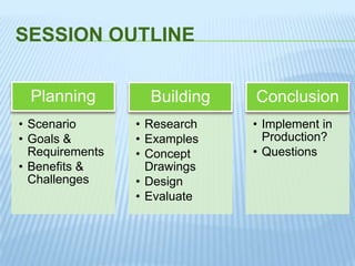

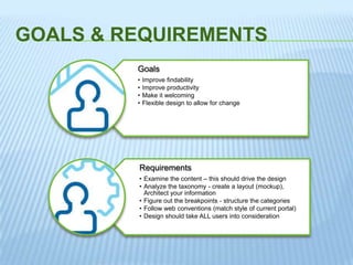

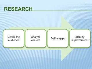
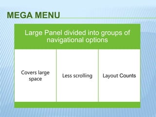

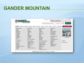
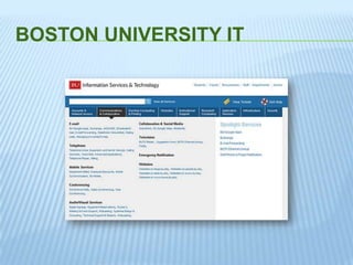
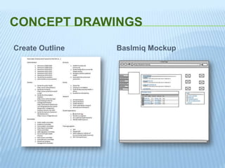
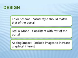
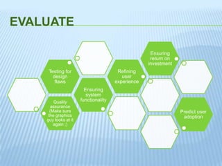


The document provides an overview of building mega menus for internal team site navigation in SharePoint. It outlines the planning, research, design, and building process for mega menus. The key steps include: 1) Planning by examining content, analyzing taxonomy, and creating mockups to define the information architecture and structure. 2) Researching examples of mega menus from companies like Sears, Gander Mountain, and Boston University IT to inform the design. 3) Creating concept drawings and designing the menu layout, color scheme, and visual style to match the portal while adding graphical interest. 4) Evaluating the design for quality, functionality, and user experience before implementation.


![[AIIM16] Don't Make Us Think: Getting SharePoint to Be Useful, Usable, and Used](https://cdn.slidesharecdn.com/ss_thumbnails/dontmakeusthink-160502162212-thumbnail.jpg?width=640&height=640&fit=bounds)