Download as PDF, PPTX


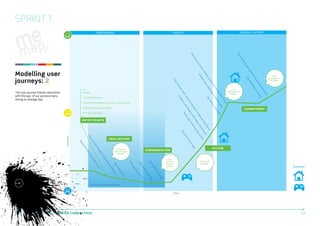
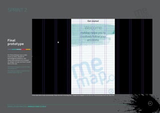
![ON-BOARDING
CREATE
REVIEW / REPORT
SPRINT 1
START / END
Download app
PAGE
Open app
MULTIPLE PAGES
Select symptoms
Homepage
TIME
USERS’ MOOD STATE
Create new [instance]
Review
Set current state
Confirm symptoms
Select review period
Instance view
Export report
Generate spider graph
View spider graph
Calendar view
Customise colours
Animate spider graph
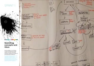
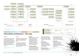
Planning
task flows
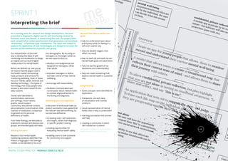
This task model shows the flow of
interactions within vertical swim
lanes to distinguish the three
phases of the user journey; from
initial log-in during on-boarding, to
exporting a meMap report.
http://kingstonux.blogspot.co.uk/2013/11/takeaways-from-tue-29-oct-workshop.html http://
kingstonux.blogspot.co.uk/2013/11/task-flowand-user-journey-vs-2.html
Email to Doctor / friend
DIGITAL STUDIO PRACTICE | MODULE CODE C17810
14](https://image.slidesharecdn.com/dsp-memap-report-140130134512-phpapp02/85/meMap-App-Design-Project-14-320.jpg)
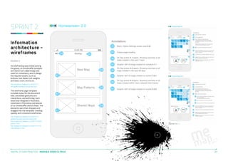
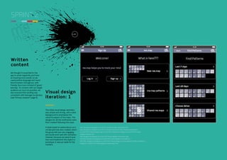

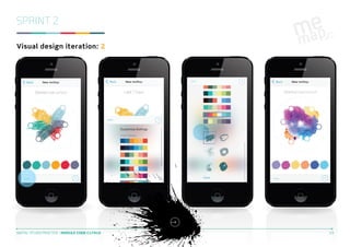

This document summarizes the first sprint of a student project team's work developing a mental health monitoring mobile app called meMap. The team conducted research on mental health tools, technologies, and their target user group of teenagers. They interpreted the project brief, defined goals for a non-judgmental, creativity-focused app. Primary research included a student questionnaire and concept testing with teens. Secondary research informed personas and needs. The team explored monitoring concepts and began planning prototypes and testing to communicate their design vision.