Media the font research
•Download as DOCX, PDF•
0 likes•24 views
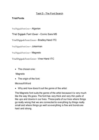
The document discusses selecting a font for a digipak cover. It lists several trial fonts, and then identifies Magneto as the chosen font. Magneto originated in Microsoft Word. It suits the genre of the artist because the thick and thin strokes resemble the ups and downs of life, with connections between people represented by thin parts and strength during good times represented by thick parts.
Report
Share
Report
Share
Recommended
Production schedule
The document contains a schedule for a job from 12/09/17 to 12/12/17 involving pre-production, production, filming, and post-production tasks for creating a cover at Ringwood School. It lists the dates, tasks, locations needed, and required equipment such as computers, cameras, and Photoshop software.
Evaluation
The filmmaker successfully created a short horror film that engages its target teenage and young adult audience. The film introduces horror through footage of a character finding a phone at night and running from a chasing monster. While some footage is unfocused or dark, the filmmaker was pleased with scenes using different shots. Sound quality in some scenes was also an issue. Overall, the filmmaker learned about their strengths in planning and ideas but weaknesses in filming and editing through making the short film.
Editing evidence
The document provides evidence of editing a movie by adding visual effects, transitions, and audio, then exporting the finished product. It shows screenshots at different stages of editing - halfway through organizing footage, cropping a clip, importing additional footage, adding sound effects, and having the full movie completed and in the export process.
Production schedule
This document outlines the production and post-production schedule for a short film, including 5 days of filming scenes of the character Erdem in and around Ringwood and Hightown. It also details the 9 post-production tasks of uploading footage, editing over 6 weeks using Premier Pro software, adding music and credits, creating rushers logs, and finishing editing to upload the completed movie. The document provides the date, location, needed crew, costumes/props, and equipment for each task.
Rushes log
This rushes log from editor Eren Celik contains details of 44 video clips filmed for the production "Custom Growth Studios". Each clip is listed with its file name, duration, brief description and file location. The clips depict scenes of the character Erdem cycling, walking around his house and garden, interacting with his phone, and being attacked by a monster. Many of the clips will need to be trimmed or cut to shorten their duration for the final edited video.
Evidence of my filming
These images document the filmmaker setting up equipment, planning shots from storyboards, and filming at their house. The top images show the filmmaker holding a camera and lens, storyboards and script, and the camera. The bottom images depict putting on a lens, reading materials, and shooting a night scene. The photos provide evidence of preparing for and conducting a shoot.
Risk assessment
All employers must conduct a risk assessment to identify potential hazards in their workplace. The document provides a sample risk assessment for a common hazard to illustrate what should be included. It identifies cars, motorbikes, pedestrians and bad weather as potential hazards for a film production and lists control measures already in place as well as additional actions needed. Employers are advised to review and update their risk assessment as needed to ensure it remains valid.
Legal and etchial issues
The document discusses several legal and ethical issues related to filmmaking, including copyright, intellectual property rights, slander/libel, filming permissions, royalties, offensive content, public interest, and performance rights. The author indicates that they have obtained permission forms from actors, will only use free music, and will film in public areas, so they believe many of the issues, such as permits, royalties, and performance rights, do not apply to their student film project.
Recce
This document provides a recce for filming locations and identifies potential hazards. It analyzes two streets that the actor Erdem will walk and cycle through, noting vehicles, bicycles, and pedestrians as main dangers. Images show the entrance to Erdem's house and garden, identifying bricks around planters and cars as hazards. Final images of Erdem's room find few risks besides potentially tripping on cables or furniture. The recce scouted various outdoor and indoor locations to ensure the actor's safety during filming.
Production schedule
This document outlines the production and post-production schedule for a short film, including 5 days of filming scenes of the character Erdem in and around Ringwood and Hightown. It also details the 9 post-production tasks of uploading footage, editing over 6 weeks using Premier Pro software, adding music and credits, creating rushers logs, and finishing editing to upload the completed movie. The document provides the date, location, needed crew, costumes/props, and equipment for each task.
Costumes and Props
The document discusses costumes and props for a movie about teenagers. The characters will wear jeans, t-shirts, sneakers and hoodies to reflect current teen fashion trends. The clothes will be purchased from affordable stores like Sports Direct, JD Sports, and Primark, since expensive luxury brands would not fit the characters' portrayals as teenagers. The costumes will use common blue jeans and colorful t-shirts and shoes to allow the actors to blend in, without any strong color connotations.
Casting details
Character 1 chose himself for the role because he could act in the way he imagined his character and bring out the quality of the movie, as a 17-year-old teenager he fits the role by looks and behavior. Character 2 chose his brother because he lives in the same house and could come to film whenever needed, and as a young adult he will also fit the role well, though he has no acting experience he will learn easily with Character 1's guidance. Both characters wear medium shirts, size 32 waist and length trousers, and size 10 shoes.
Evaluation
The client enjoyed how the story started with action and built to horror over time, but felt some language could be easier to understand. Based on her feedback, the writer changed errors, clarified characters' names, added continuity indicators and location transitions. They believe the revised script now meets the client's expectations by implementing all her suggested changes to improve comprehension, while still fulfilling the original brief and targeting the intended audience professionally.
Draft script for idea 2 family feud
A family is arguing about lies they have told each other when a mysterious voice reveals the true things they have done. The mother asks her son Eren what he did that day and he claims he just went to school. However, the voice says he actually skipped school to meet his girlfriend at her house, as he has done every week for the past year. The family is shocked to learn of Eren's deception that has been going on for a long time.
Draft script for idea 1 lurking movie
Eren is running from a monster in the dark streets of Ringwood Town Centre at night. He gets stuck in an alley with no escape from the approaching monster. Eren calls his friend Eddie to warn him about the monster and urges Eddie to call the authorities. As the monster's roar gets closer, Eren tells Eddie the monster is too close and that he doesn't think he can escape. Eren stops talking as the monster appears next to him and starts screaming.
Client email
I emailed the client my final draft of the script and asked two questions about improvements. The client replied with her thoughts and said that the script was ready for submission.
Evaluation and swot analysis
The client provided feedback on the story, suggesting changes to make the language more understandable. The writer implemented all the suggested changes, such as replacing vague words with clearer alternatives and indicating continuity of dialogue. As a result, the script now meets the client's expectations and target audience needs. Additionally, the script and shooting script are properly formatted according to industry standards and legal/ethical guidelines. In a self-evaluation, the writer identifies being creative and fast working as strengths, but notes English as a secondary language caused some difficulties requiring revisions. Opportunities exist through high-quality, standard-aligned documents, though language differences still pose a minor threat to full comprehension.
Client feedback log
The client feedback log documents improvements made to a script over two dates. On the first date, the client suggested typo fixes, changing characters' names, replacing pronouns with character names, and scenario changes where needed. After applying these changes, on the second date the client said the script looked better but needed industry standard formatting of bracketed "COND'T" to show continued dialogue and "NEXT DAY" to show location changes. Those final changes were then implemented, completing the script.
Evaluation and swot analysis
The client provided feedback on the story, suggesting changes to make the language more understandable. The author made revisions like changing vague words and adding context for dialogue and locations. They believe the updated script now meets the client's expectations and industry standards.
In a SWOT analysis, the author identifies their creative thinking and fast work as strengths. Their second language poses weaknesses and opportunities for improvement. Potential threats include parts of the script still sounding unnatural in English.
Client feedback log
The client feedback log documents improvements made to a script over two dates. On the first date, the client suggested typo fixes, changing characters' names, replacing pronouns with character names, and scenario changes where needed. After applying these changes, on the second date the client said the script looked better but needed industry standard formatting of bracketed "COND'T" to show continued dialogue and "NEXT DAY" to show location changes. Those final changes were then implemented, completing the script.
Finished Script
1) A young boy named Eren films a video of himself in which he claims there is a monster in the town of Ringwood chasing him. He sends the video to his friend Erdem.
2) The next day, Erdem receives the video and other messages from Eren. He does not believe Eren and thinks it is a joke.
3) Erdem goes to the locations from the video to prove it is fake but finds blood stains instead. He then hears a roar behind him from the real monster and tries to run away but becomes trapped in an alley.
How to Setup Default Value for a Field in Odoo 17
In Odoo, we can set a default value for a field during the creation of a record for a model. We have many methods in odoo for setting a default value to the field.
CHUYÊN ĐỀ ÔN TẬP VÀ PHÁT TRIỂN CÂU HỎI TRONG ĐỀ MINH HỌA THI TỐT NGHIỆP THPT ...
CHUYÊN ĐỀ ÔN TẬP VÀ PHÁT TRIỂN CÂU HỎI TRONG ĐỀ MINH HỌA THI TỐT NGHIỆP THPT ...Nguyen Thanh Tu Collection
https://app.box.com/s/qspvswamcohjtbvbbhjad04lg65waylfMore Related Content
More from Erenboi
Legal and etchial issues
The document discusses several legal and ethical issues related to filmmaking, including copyright, intellectual property rights, slander/libel, filming permissions, royalties, offensive content, public interest, and performance rights. The author indicates that they have obtained permission forms from actors, will only use free music, and will film in public areas, so they believe many of the issues, such as permits, royalties, and performance rights, do not apply to their student film project.
Recce
This document provides a recce for filming locations and identifies potential hazards. It analyzes two streets that the actor Erdem will walk and cycle through, noting vehicles, bicycles, and pedestrians as main dangers. Images show the entrance to Erdem's house and garden, identifying bricks around planters and cars as hazards. Final images of Erdem's room find few risks besides potentially tripping on cables or furniture. The recce scouted various outdoor and indoor locations to ensure the actor's safety during filming.
Production schedule
This document outlines the production and post-production schedule for a short film, including 5 days of filming scenes of the character Erdem in and around Ringwood and Hightown. It also details the 9 post-production tasks of uploading footage, editing over 6 weeks using Premier Pro software, adding music and credits, creating rushers logs, and finishing editing to upload the completed movie. The document provides the date, location, needed crew, costumes/props, and equipment for each task.
Costumes and Props
The document discusses costumes and props for a movie about teenagers. The characters will wear jeans, t-shirts, sneakers and hoodies to reflect current teen fashion trends. The clothes will be purchased from affordable stores like Sports Direct, JD Sports, and Primark, since expensive luxury brands would not fit the characters' portrayals as teenagers. The costumes will use common blue jeans and colorful t-shirts and shoes to allow the actors to blend in, without any strong color connotations.
Casting details
Character 1 chose himself for the role because he could act in the way he imagined his character and bring out the quality of the movie, as a 17-year-old teenager he fits the role by looks and behavior. Character 2 chose his brother because he lives in the same house and could come to film whenever needed, and as a young adult he will also fit the role well, though he has no acting experience he will learn easily with Character 1's guidance. Both characters wear medium shirts, size 32 waist and length trousers, and size 10 shoes.
Evaluation
The client enjoyed how the story started with action and built to horror over time, but felt some language could be easier to understand. Based on her feedback, the writer changed errors, clarified characters' names, added continuity indicators and location transitions. They believe the revised script now meets the client's expectations by implementing all her suggested changes to improve comprehension, while still fulfilling the original brief and targeting the intended audience professionally.
Draft script for idea 2 family feud
A family is arguing about lies they have told each other when a mysterious voice reveals the true things they have done. The mother asks her son Eren what he did that day and he claims he just went to school. However, the voice says he actually skipped school to meet his girlfriend at her house, as he has done every week for the past year. The family is shocked to learn of Eren's deception that has been going on for a long time.
Draft script for idea 1 lurking movie
Eren is running from a monster in the dark streets of Ringwood Town Centre at night. He gets stuck in an alley with no escape from the approaching monster. Eren calls his friend Eddie to warn him about the monster and urges Eddie to call the authorities. As the monster's roar gets closer, Eren tells Eddie the monster is too close and that he doesn't think he can escape. Eren stops talking as the monster appears next to him and starts screaming.
Client email
I emailed the client my final draft of the script and asked two questions about improvements. The client replied with her thoughts and said that the script was ready for submission.
Evaluation and swot analysis
The client provided feedback on the story, suggesting changes to make the language more understandable. The writer implemented all the suggested changes, such as replacing vague words with clearer alternatives and indicating continuity of dialogue. As a result, the script now meets the client's expectations and target audience needs. Additionally, the script and shooting script are properly formatted according to industry standards and legal/ethical guidelines. In a self-evaluation, the writer identifies being creative and fast working as strengths, but notes English as a secondary language caused some difficulties requiring revisions. Opportunities exist through high-quality, standard-aligned documents, though language differences still pose a minor threat to full comprehension.
Client feedback log
The client feedback log documents improvements made to a script over two dates. On the first date, the client suggested typo fixes, changing characters' names, replacing pronouns with character names, and scenario changes where needed. After applying these changes, on the second date the client said the script looked better but needed industry standard formatting of bracketed "COND'T" to show continued dialogue and "NEXT DAY" to show location changes. Those final changes were then implemented, completing the script.
Evaluation and swot analysis
The client provided feedback on the story, suggesting changes to make the language more understandable. The author made revisions like changing vague words and adding context for dialogue and locations. They believe the updated script now meets the client's expectations and industry standards.
In a SWOT analysis, the author identifies their creative thinking and fast work as strengths. Their second language poses weaknesses and opportunities for improvement. Potential threats include parts of the script still sounding unnatural in English.
Client feedback log
The client feedback log documents improvements made to a script over two dates. On the first date, the client suggested typo fixes, changing characters' names, replacing pronouns with character names, and scenario changes where needed. After applying these changes, on the second date the client said the script looked better but needed industry standard formatting of bracketed "COND'T" to show continued dialogue and "NEXT DAY" to show location changes. Those final changes were then implemented, completing the script.
Finished Script
1) A young boy named Eren films a video of himself in which he claims there is a monster in the town of Ringwood chasing him. He sends the video to his friend Erdem.
2) The next day, Erdem receives the video and other messages from Eren. He does not believe Eren and thinks it is a joke.
3) Erdem goes to the locations from the video to prove it is fake but finds blood stains instead. He then hears a roar behind him from the real monster and tries to run away but becomes trapped in an alley.
More from Erenboi (20)
Recently uploaded
How to Setup Default Value for a Field in Odoo 17
In Odoo, we can set a default value for a field during the creation of a record for a model. We have many methods in odoo for setting a default value to the field.
CHUYÊN ĐỀ ÔN TẬP VÀ PHÁT TRIỂN CÂU HỎI TRONG ĐỀ MINH HỌA THI TỐT NGHIỆP THPT ...
CHUYÊN ĐỀ ÔN TẬP VÀ PHÁT TRIỂN CÂU HỎI TRONG ĐỀ MINH HỌA THI TỐT NGHIỆP THPT ...Nguyen Thanh Tu Collection
https://app.box.com/s/qspvswamcohjtbvbbhjad04lg65waylfLevel 3 NCEA - NZ: A Nation In the Making 1872 - 1900 SML.ppt
The History of NZ 1870-1900.
Making of a Nation.
From the NZ Wars to Liberals,
Richard Seddon, George Grey,
Social Laboratory, New Zealand,
Confiscations, Kotahitanga, Kingitanga, Parliament, Suffrage, Repudiation, Economic Change, Agriculture, Gold Mining, Timber, Flax, Sheep, Dairying,
HYPERTENSION - SLIDE SHARE PRESENTATION.
IT WILL BE HELPFULL FOR THE NUSING STUDENTS
IT FOCUSED ON MEDICAL MANAGEMENT AND NURSING MANAGEMENT.
HIGHLIGHTS ON HEALTH EDUCATION.
BÀI TẬP BỔ TRỢ TIẾNG ANH LỚP 8 - CẢ NĂM - FRIENDS PLUS - NĂM HỌC 2023-2024 (B...
BÀI TẬP BỔ TRỢ TIẾNG ANH LỚP 8 - CẢ NĂM - FRIENDS PLUS - NĂM HỌC 2023-2024 (B...Nguyen Thanh Tu Collection
https://app.box.com/s/nrwz52lilmrw6m5kqeqn83q6vbdp8yzpGeography as a Discipline Chapter 1 __ Class 11 Geography NCERT _ Class Notes...
Geography as discipline
skeleton System.pdf (skeleton system wow)
🔥🔥🔥🔥🔥🔥🔥🔥🔥
إضغ بين إيديكم من أقوى الملازم التي صممتها
ملزمة تشريح الجهاز الهيكلي (نظري 3)
💀💀💀💀💀💀💀💀💀💀
تتميز هذهِ الملزمة بعِدة مُميزات :
1- مُترجمة ترجمة تُناسب جميع المستويات
2- تحتوي على 78 رسم توضيحي لكل كلمة موجودة بالملزمة (لكل كلمة !!!!)
#فهم_ماكو_درخ
3- دقة الكتابة والصور عالية جداً جداً جداً
4- هُنالك بعض المعلومات تم توضيحها بشكل تفصيلي جداً (تُعتبر لدى الطالب أو الطالبة بإنها معلومات مُبهمة ومع ذلك تم توضيح هذهِ المعلومات المُبهمة بشكل تفصيلي جداً
5- الملزمة تشرح نفسها ب نفسها بس تكلك تعال اقراني
6- تحتوي الملزمة في اول سلايد على خارطة تتضمن جميع تفرُعات معلومات الجهاز الهيكلي المذكورة في هذهِ الملزمة
واخيراً هذهِ الملزمة حلالٌ عليكم وإتمنى منكم إن تدعولي بالخير والصحة والعافية فقط
كل التوفيق زملائي وزميلاتي ، زميلكم محمد الذهبي 💊💊
🔥🔥🔥🔥🔥🔥🔥🔥🔥
NIPER 2024 MEMORY BASED QUESTIONS.ANSWERS TO NIPER 2024 QUESTIONS.NIPER JEE 2...
NIPER JEE PYQ
NIPER JEE QUESTIONS
MOST FREQUENTLY ASK QUESTIONS
NIPER MEMORY BASED QUWSTIONS
BIOLOGY NATIONAL EXAMINATION COUNCIL (NECO) 2024 PRACTICAL MANUAL.pptx
Practical manual for National Examination Council, Nigeria.
Contains guides on answering questions on the specimens provided
THE SACRIFICE HOW PRO-PALESTINE PROTESTS STUDENTS ARE SACRIFICING TO CHANGE T...
The recent surge in pro-Palestine student activism has prompted significant responses from universities, ranging from negotiations and divestment commitments to increased transparency about investments in companies supporting the war on Gaza. This activism has led to the cessation of student encampments but also highlighted the substantial sacrifices made by students, including academic disruptions and personal risks. The primary drivers of these protests are poor university administration, lack of transparency, and inadequate communication between officials and students. This study examines the profound emotional, psychological, and professional impacts on students engaged in pro-Palestine protests, focusing on Generation Z's (Gen-Z) activism dynamics. This paper explores the significant sacrifices made by these students and even the professors supporting the pro-Palestine movement, with a focus on recent global movements. Through an in-depth analysis of printed and electronic media, the study examines the impacts of these sacrifices on the academic and personal lives of those involved. The paper highlights examples from various universities, demonstrating student activism's long-term and short-term effects, including disciplinary actions, social backlash, and career implications. The researchers also explore the broader implications of student sacrifices. The findings reveal that these sacrifices are driven by a profound commitment to justice and human rights, and are influenced by the increasing availability of information, peer interactions, and personal convictions. The study also discusses the broader implications of this activism, comparing it to historical precedents and assessing its potential to influence policy and public opinion. The emotional and psychological toll on student activists is significant, but their sense of purpose and community support mitigates some of these challenges. However, the researchers call for acknowledging the broader Impact of these sacrifices on the future global movement of FreePalestine.
Gender and Mental Health - Counselling and Family Therapy Applications and In...
A proprietary approach developed by bringing together the best of learning theories from Psychology, design principles from the world of visualization, and pedagogical methods from over a decade of training experience, that enables you to: Learn better, faster!
Wound healing PPT
This document provides an overview of wound healing, its functions, stages, mechanisms, factors affecting it, and complications.
A wound is a break in the integrity of the skin or tissues, which may be associated with disruption of the structure and function.
Healing is the body’s response to injury in an attempt to restore normal structure and functions.
Healing can occur in two ways: Regeneration and Repair
There are 4 phases of wound healing: hemostasis, inflammation, proliferation, and remodeling. This document also describes the mechanism of wound healing. Factors that affect healing include infection, uncontrolled diabetes, poor nutrition, age, anemia, the presence of foreign bodies, etc.
Complications of wound healing like infection, hyperpigmentation of scar, contractures, and keloid formation.
A Free 200-Page eBook ~ Brain and Mind Exercise.pptx
(A Free eBook comprising 3 Sets of Presentation of a selection of Puzzles, Brain Teasers and Thinking Problems to exercise both the mind and the Right and Left Brain. To help keep the mind and brain fit and healthy. Good for both the young and old alike.
Answers are given for all the puzzles and problems.)
With Metta,
Bro. Oh Teik Bin 🙏🤓🤔🥰
Recently uploaded (20)
CHUYÊN ĐỀ ÔN TẬP VÀ PHÁT TRIỂN CÂU HỎI TRONG ĐỀ MINH HỌA THI TỐT NGHIỆP THPT ...
CHUYÊN ĐỀ ÔN TẬP VÀ PHÁT TRIỂN CÂU HỎI TRONG ĐỀ MINH HỌA THI TỐT NGHIỆP THPT ...
SWOT analysis in the project Keeping the Memory @live.pptx
SWOT analysis in the project Keeping the Memory @live.pptx
Level 3 NCEA - NZ: A Nation In the Making 1872 - 1900 SML.ppt
Level 3 NCEA - NZ: A Nation In the Making 1872 - 1900 SML.ppt
BÀI TẬP BỔ TRỢ TIẾNG ANH LỚP 8 - CẢ NĂM - FRIENDS PLUS - NĂM HỌC 2023-2024 (B...
BÀI TẬP BỔ TRỢ TIẾNG ANH LỚP 8 - CẢ NĂM - FRIENDS PLUS - NĂM HỌC 2023-2024 (B...
Geography as a Discipline Chapter 1 __ Class 11 Geography NCERT _ Class Notes...
Geography as a Discipline Chapter 1 __ Class 11 Geography NCERT _ Class Notes...
NIPER 2024 MEMORY BASED QUESTIONS.ANSWERS TO NIPER 2024 QUESTIONS.NIPER JEE 2...
NIPER 2024 MEMORY BASED QUESTIONS.ANSWERS TO NIPER 2024 QUESTIONS.NIPER JEE 2...
BIOLOGY NATIONAL EXAMINATION COUNCIL (NECO) 2024 PRACTICAL MANUAL.pptx
BIOLOGY NATIONAL EXAMINATION COUNCIL (NECO) 2024 PRACTICAL MANUAL.pptx
THE SACRIFICE HOW PRO-PALESTINE PROTESTS STUDENTS ARE SACRIFICING TO CHANGE T...
THE SACRIFICE HOW PRO-PALESTINE PROTESTS STUDENTS ARE SACRIFICING TO CHANGE T...
220711130088 Sumi Basak Virtual University EPC 3.pptx
220711130088 Sumi Basak Virtual University EPC 3.pptx
Gender and Mental Health - Counselling and Family Therapy Applications and In...
Gender and Mental Health - Counselling and Family Therapy Applications and In...
A Free 200-Page eBook ~ Brain and Mind Exercise.pptx
A Free 200-Page eBook ~ Brain and Mind Exercise.pptx
Media the font research
- 1. Task D - The Font Search TrialFonts TrialDigipakFontCover - Algerian Trial Digipak Font Cover - Comic Sans MS TrialDigipakFontCover - Bradley Hand ITC TrialDigipakFontCover - Jokerman TrialDigipakFontCover - Magneto TrialDigipakFontCover - Viner Hand ITC The chosen one: Magneto The origin of the font: MicrosoftWord Why and how does It suit the genre of the artist: The Magneto font suits the genre of the artist because it is very much like the way life goes.The font has very thick and very thin parts of like ups and downs in our lives. These parts of our lives where things go really wrong that we are connected to everything by things really small and where things go well so everything is fine and bonds are hard and strong.