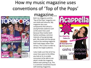
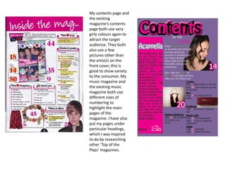
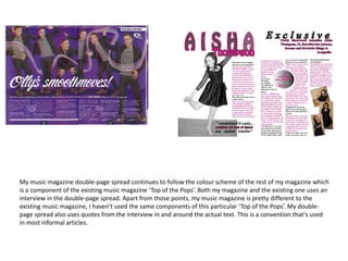
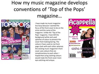
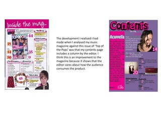
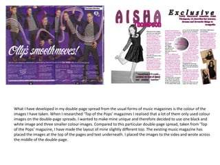
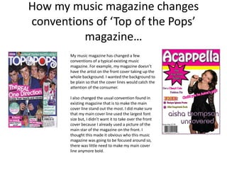
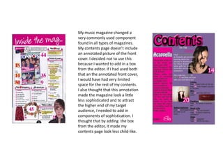
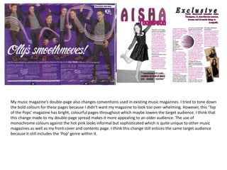
The document discusses how the student's music magazine both uses and develops conventions from the existing "Top of the Pops" magazine, while also changing some conventions. It describes using bold colors, cover lines about fashion and boys, and left-justified text like "Top of the Pops". Developments include a less busy front cover with clashing colors, and a contents page including an editor's column. Conventions that are changed include not filling the front cover with an image and including monochrome photos on the double-page spread to seem more sophisticated.