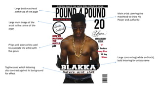
1. Main artist covering the
masthead to show his
Power and authority
Large contrasting (white on black),
bold lettering for artists name
Large bold masthead
at the top of the page
Large main image of the
artist in the centre of the
page
Props and accessories used
to associate the artist with
the genre
Tagline used which lettering
also contrast against its background
for effect
2. I have mainly chosen to follow the conventions of real magazine products through
several aspects of my front page. However how some magazines choose to have a
close up of their main artist making an intimidating eye contact with the reader,
I have chosen to have challenge this approach by taking a medium shot of
my main artist to incorporate into the picture his muscular physique with the desired
effect of showing creating animposing sense of power to the reader.
3. Date of the magazine
clear to the reader
Artist showing a gang
gesture which may initiate
a connection with target
audience
Colour scheme is
maintained throughout
Clear headings
Page numbers for
each of the articles
Ways in which the reader
can contact the magazine
On different formats
Page number
4. Symbol signalling
the end of the article
Quote from the artist setting
the scene for the article
Article in the form
of three columns
The large ‘T’ allows
for an eye-catching start
to the article
Large image of the main
artist covering half of the
spread