The document discusses the effectiveness of combining the author's main product and ancillary tasks.
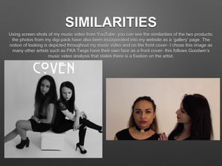
The author used consistent typography, fonts, and photos across their music video, CD cover, and website to visually link the products and give a unified brand. Screenshots from the music video were used on the CD cover and website gallery page.
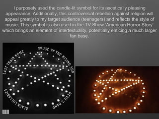
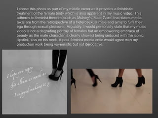
Symbols and imagery from the music video, like a candle and the artist's face, were also featured on the CD cover and tied to the song's themes and target audience. While some images could be seen as exploiting the female gaze, the author argues their work empowers rather than degrades women.
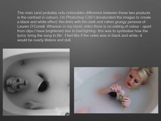
Color contrasts were used between the desaturated black and white CD cover