Download as PDF, PPTX

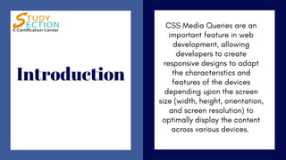
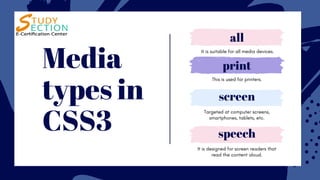
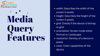
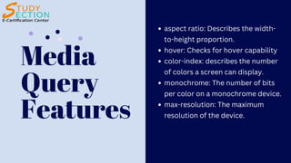


CSS3 media queries enable developers to create responsive designs by adapting content based on device characteristics like screen size, orientation, and resolution. They support various media types, including screens and printers, and include features such as width, height, resolution, and color capabilities. This allows for optimal content display across devices ranging from computer screens to smartphones.