Download to read offline


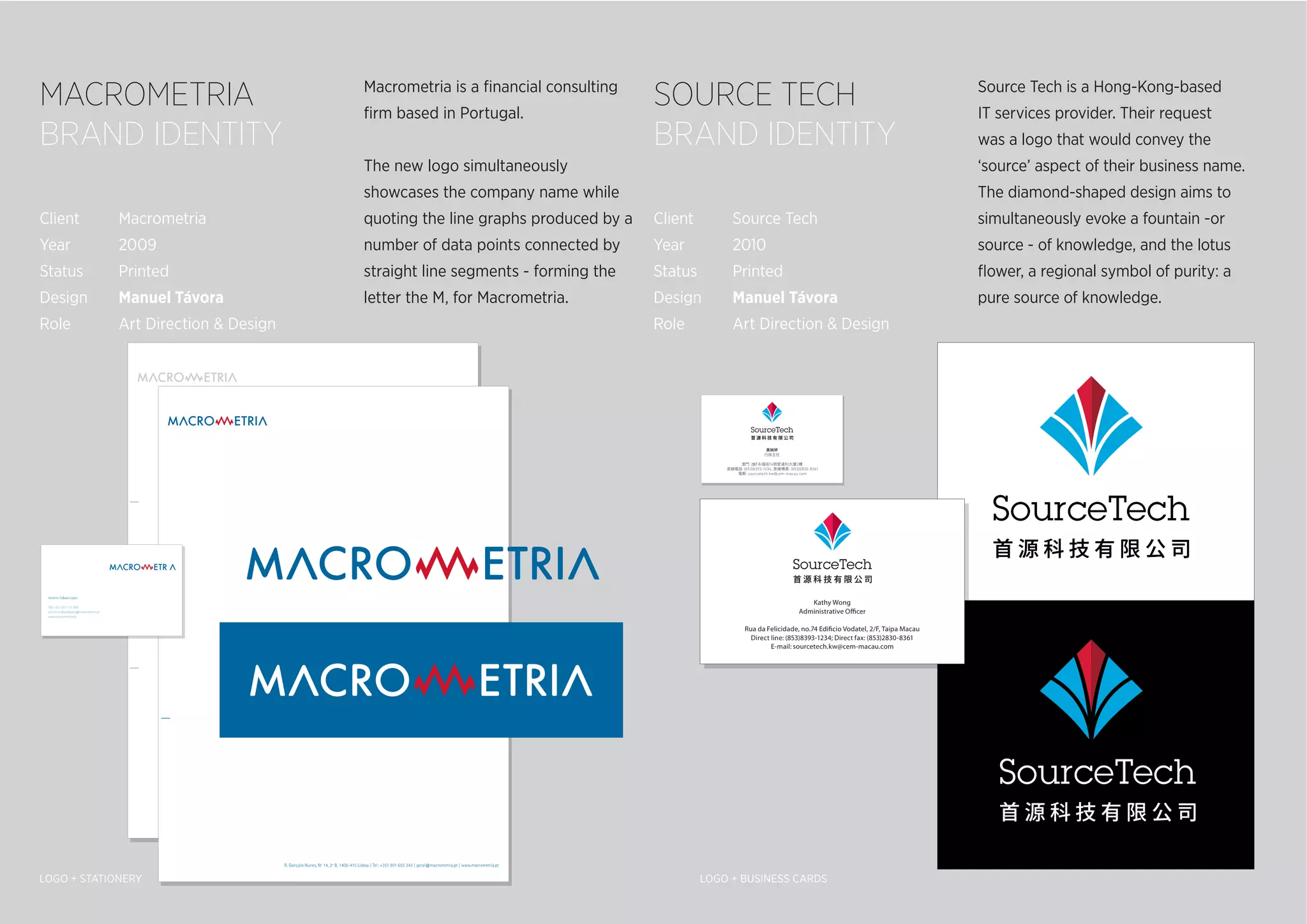
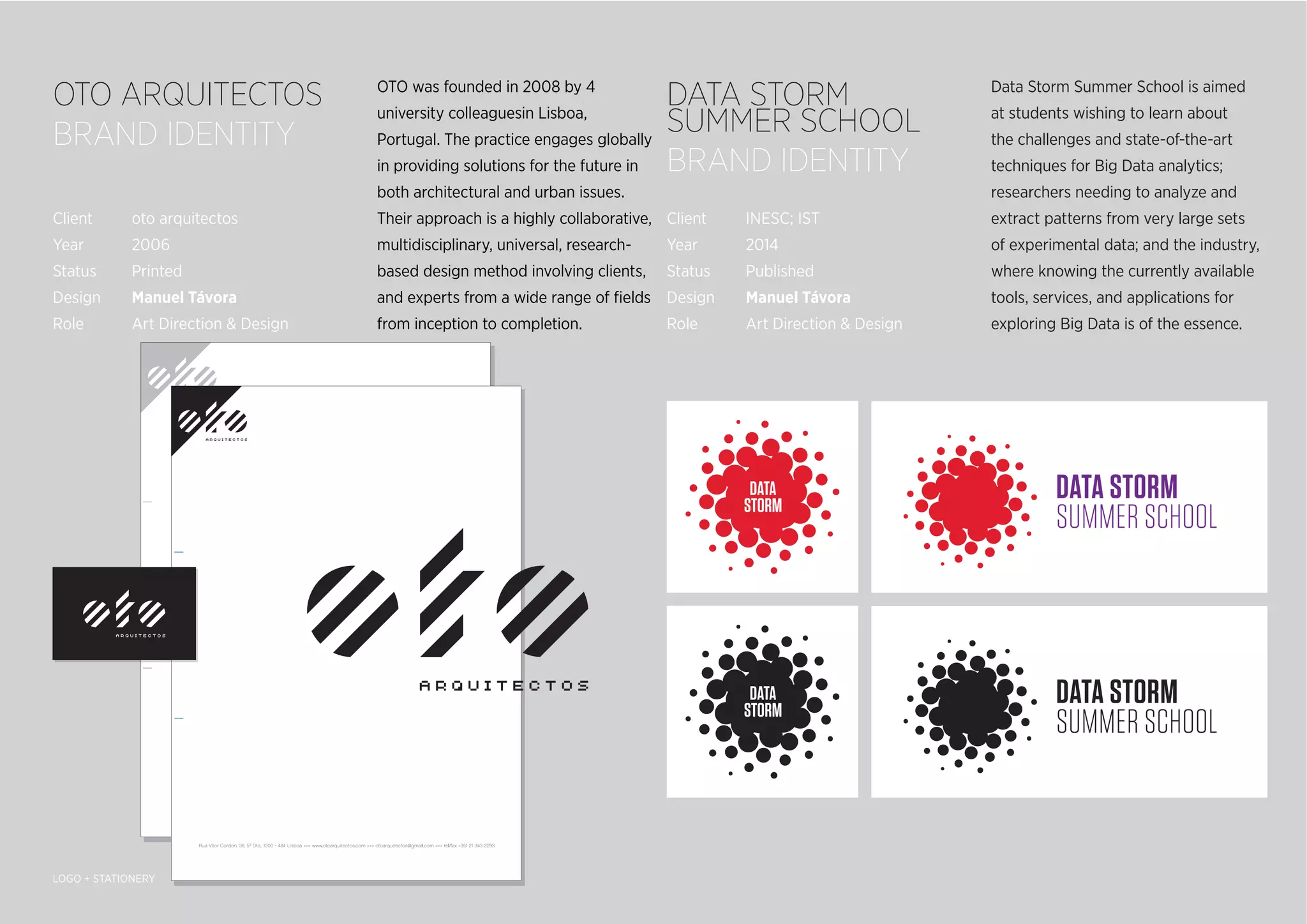


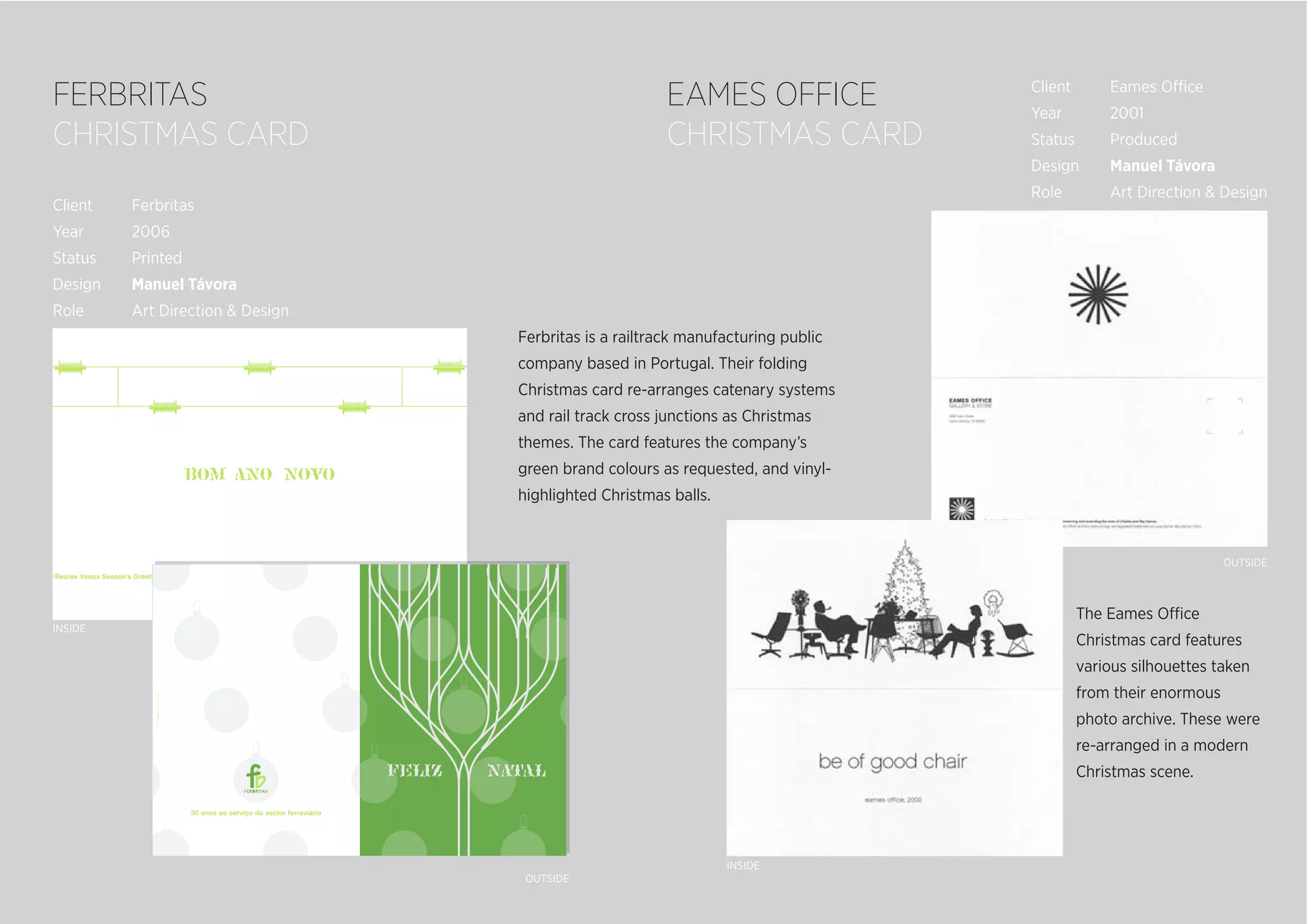


This document contains summaries of graphic design projects by Manuel Távora. It includes summaries of brand identities, logos, stationery, flyers, posters, and catalogs created for various clients. Highlights include logos and branding for Macrometria, Source Tech, OTO Arquitetos, and Deli Delux. It also includes summaries of promotional materials created for events like Dubscover Techscover DJ nights and the Eames Office catalog.