Download to read offline
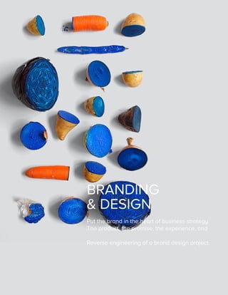

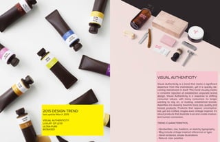
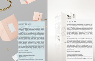
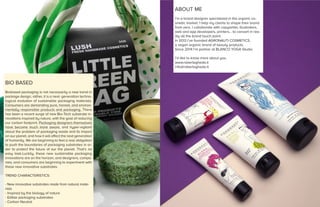

This document discusses branding and design trends, including visual authenticity, luxury of less, ultra-pure, and biobased packaging. It notes that visual authenticity features handwritten elements and natural colors. Luxury of less represents understated luxury goods with subtle textures and soft colors. Ultra-pure takes minimalism to the extreme with stark, abstract designs using only basic shapes and typography. Biobased packaging involves innovative, sustainable materials inspired by nature. The document provides characteristics and examples of each trend.


