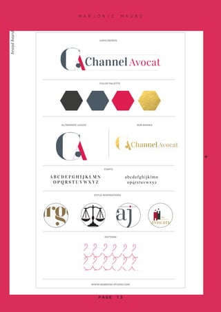
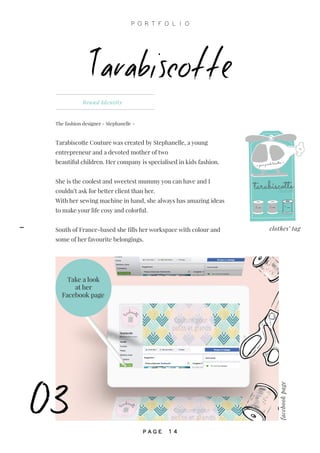
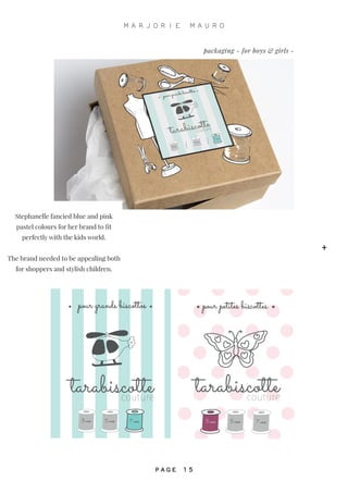
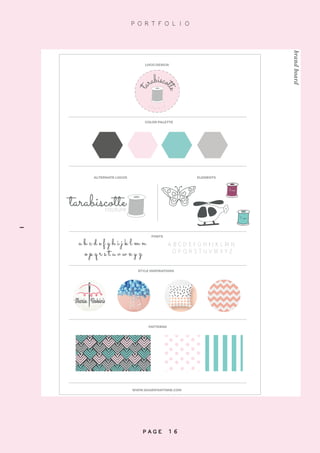
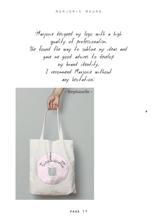
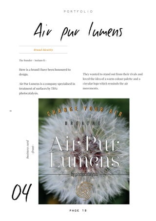
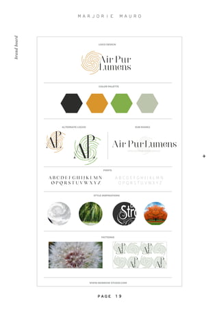
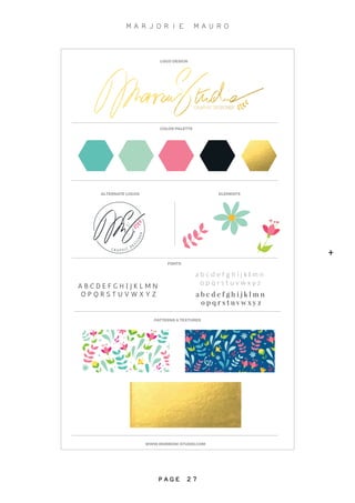
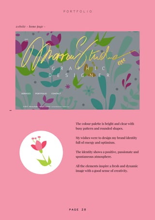
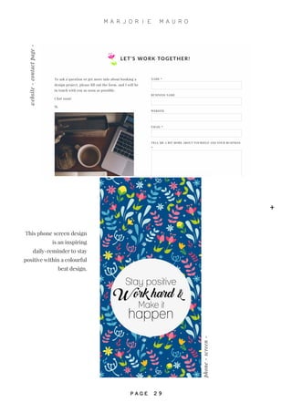
G R A P H I C D E S I G N E R
2 0 1 7
PORT
FO
LIO
A N D W E L C O M E !
HELLO
Marjorie Mauro - 2015
P O R T F O L I O
P A G E 2
-
ABOUT ME				PAGES 4-5
BRAND IDENTITY AND LOGO DESIGN
WORLD LAND DESIGN		 PAGES 8-11
CHANNEL AVOCAT			PAGES 12-13
TARABISCOTTE COUTURE	 PAGES 14-17
AIR PUR LUMENS			 PAGES 18-21
URBAN MARKET			PAGES 22-23
MARIANNA CARDENIO		 PAGES 24-25
MORROW STUDIO			PAGES 26-29
content
+
M A R J O R I E M A U R O
P A G E 3
about myself
P O R T F O L I O
P A G E 4
-
WWW.MORROW-STUDIO.COM
SKILLSWEBSITE
ADOBEILLUSTRATOR
ADOBEPHOTOSHOP
ADOBEINDESIGN
PHOTOGRAPHY
TYPOGRAPHY
WORDPRESS
‘‘Design is so simple.
That’s why it’s so complicated’’
-Paul Rand-
+
M A R J O R I E M A U R O
P A G E 5
- S T U D E N T -
PORTFOLIO
Marjorie Mauro - 2015
logo and
brand identity
SAMPLES OF
‘‘I strive to make each project exceptional
with a unique design and create a final
product that reflects a personal
style for every business’’.
-M-
P R O J E C T S
S T A R T T H E T O U R . . .
+
M A R J O R I E M A U R O
P A G E 7
Brand Identity - Posters Design
The founder - Maxime Gouret -
In 2016, Maxime has decided to spread
his art of outdoor design by extending his
business to London following his many
projects around the world.
I am really proud to meet creative people
and I have enjoyed working on this project.
The bright colour palette shows the
creativity of Maxime’s creations.
Maxime is an approachable,
communicative and open minded person.
World land design
01
Design
main logo
He takes care of his clients and
likes meeting new people.
He is dynamic, creative and
welcoming.
We wanted a fresh and
energetic image for his brand.
P O R T F O L I O
P A G E 8
-
WWW.MORROW-STUDIO.COM
Design
PATTERNS
STYLE INSPIRATIONS
FONTS
A B C D E F G H I J K L M N
O P Q R S T U V W X Y Z
abcdefghijklmn
opqrstuvwxyz
ALTERNATE LOGOS SUB MARKS
COLOR PALETTE
Design
W
O R L D L A N D D E S I
GN
-
l a n d s c a p i n G
-
W
O R L D L A N D D E S I
GN
-
l a n d s c a p i n G
-
LOGO DESIGN
brandboard
+
M A R J O R I E M A U R O
P A G E 9
WLD@emailaddress.com
07901000000
facebookWLD
MaximeGouret
businesscard-back-
businesscard-front-
pattern The idea of palm leaf
design was developed
after having a look
through his portfolio.
Worldlanddesign
landscaping
P O R T F O L I O
P A G E 1 0
-
‘I was very happy to work with
Marjorie. She has found exactly what
I wanted to represent my company’’s
identity. She is very professional and
I will collaborate
with her for future works. Thank you.’
- Maxime -
+
M A R J O R I E M A U R O
P A G E 1 1
+
P A G E 1 1
Brand Identity
The founder - Heloïse Bendjebbar -
I’ve had the privilege to work with a strong
and talented young lawyer based in London, to
create a bold image for her Law firm company
founded in 2016.
Channel Avocat
As a lawyer she needed a feminine,
classic, sophisticated and a timeless
brand identity.
02
P O R T F O L I O
P A G E 1 2
-
WWW.MORROW-STUDIO.COM
PATTERN
STYLE INSPIRATIONS
FONTS
A B C D E F G H I J K L M N
O P Q R S T U V W X Y Z
abcdefghijklmn
opqrstuvwxyz
ALTERNATE LOGOS SUB MARKS
COLOR PALETTE
LOGO DESIGN
brandboard
+
M A R J O R I E M A U R O
P A G E 1 3
Tarabiscotte
The fashion designer - Stephanelle -
Tarabiscotte Couture was created by Stephanelle, a young
entrepreneur and a devoted mother of two
beautiful children. Her company is specialised in kids fashion.
She is the coolest and sweetest mummy you can have and I
couldn’t ask for better client than her.
With her sewing machine in hand, she always has amazing ideas
to make your life cosy and colorful.
South of France-based she fills her workspace with colour and
some of her favourite belongings.
Brand Identity
clothes’ tag
3 ans 5 ans
tarabiscottecouture
7 ans
pour grands biscottos
facebookpage
Take a look
at her
Facebook page
03
P O R T F O L I O
P A G E 1 4
-
pour grands biscottos
tarabiscottecouture
3 ans 5 ans 7 ans
tarabiscottecouture
pour petites biscottes
3 ans 5 ans 7 ans
Stephanelle fancied blue and pink
pastel colours for her brand to fit
perfectly with the kids world.
The brand needed to be appealing both
for shoppers and stylish children.
packaging - for boys & girls -
+
M A R J O R I E M A U R O
P A G E 1 5
WWW.SHARIFAWYNNE.COM
PATTERNS
STYLE INSPIRATIONS
FONTS
a b c d e f g h i j k l m n
o p q r s t u v w x y z
A B C D E F G H I J K L M N
O P Q R S T U V W X Y Z
ALTERNATE LOGOS ELEMENTS
3 ans
7 ans
COLOR PALETTE
tarabiscottecouture
LOGO DESIGN
t
arabisco
tte
C
o u t u r e
brandboard
P O R T F O L I O
P A G E 1 6
-
‘Marjorie designed my logo with a high
quality of professionalism.
She found the way to sublime my ideas and
gave me good advices to develop
my brand identity.
I recommend Marjorie without
any hesitation.’
- Stephanelle -
+
M A R J O R I E M A U R O
P A G E 1 7
+
P A G E 1 7
The founder - Soriano R -
Here is a brand I have been honoured to
design.
Air Pur Lumens is a company specialised in
treatment of surfaces by TIO2
photocatalysis.
Brand Identity
04
Air pur Lumens
byphotocatalysis
C H A N G E Y O U R A I RC H A N G E Y O U R A I R
B R E A T H E
businesscard
-front-
They wanted to stand out from their rivals and
loved the idea of a warm colour palette and a
circular logo which reminds the air
movements.
P O R T F O L I O
P A G E 1 8
-
WWW.MORROW-STUDIO.COM
PATTERNS
STYLE INSPIRATIONS
FONTS
A B C D E F G H I J K L M N
O P Q R S T U V W X Y Z
A B C D E F G H I J K L M N
O P Q R S T U V W X Y Z
ALTERNATE LOGOS SUB MARKS
COLOR PALETTE
LOGO DESIGN
- DEPOLLUTION BY PHOTOCATALYSIS -
brandboard
+
M A R J O R I E M A U R O
P A G E 1 9
B R E A T H E
C H A N G E Y O U R A I R
phase destructionofbacterias
treatmentby
photocatalysis
1
labels
P O R T F O L I O
P A G E 2 0
-
The colours are warm, natural and intense.
The shapes and textures are created
with rounded corners.
They choose a recycled paper texture
for their business card to intensify the idea
of an earthy life and a friendly
& helpful team.
Their brand personality reflects a great
respect for the natural world and
a strong ethic.
+
M A R J O R I E M A U R O
P A G E 2 1
05
Urban Market
Poster Design & Brand identity redesign
The owner - Alexandre -
Urban Market is a mens fashion store in South
of France.
Alexandre desiderated a masculine and urban
character with refined style.
The choice of the colour palette is synonym of
elegance and facing an avant-garde image and a
perfectionist personality full of ambition.
The identity evokes a sophisticted and minimalism
brand.
P O R T F O L I O
P A G E 2 2
-
+
M A R J O R I E M A U R O
P A G E 2 3
Marianna is an artist
photographer.
Currently based in
London, she has been
working in various genres
which were influenced by her
development and style.
Marianna Cardenio
06
Logo design
mockupdesign
We have chosen a pared-back
color palette to suit with her
universe, with an handwriting
font.
She likes modern minimal style
and her logo is as simple as
timeless.
P O R T F O L I O
P A G E 2 4
-
WWW.MORROW-STUDIO.COM
Thank
YOU
LOGOS CONCEPT
THANK YOU CARD
COLOR PALETTE
LOGO DESIGN
brandboard
+
M A R J O R I E M A U R O
P A G E 2 5
07
I founded Morrow Studio in 2016.
I have aspired to personalise the logo with my own handwriting and share
my story through the different art & design elements.
I grew up in South France as a part of Laurel’s childhood home.
The alternative logo represents my time living there; the gold texture
alludes to the sun which is omnipresent in this region.
Brand Identity
Morrow Studio
translucent business card
07
P O R T F O L I O
P A G E 2 6
-
WWW.MORROW-STUDIO.COM
PATTERNS & TEXTURES
FONTS
A B C D E F G H I J K L M N
O P Q R S T U V W X Y Z
a b c d e f g h i j k l m n
o p q r s t u v w x y z
a b c d e f g h i j k l m n
o p q r s t u v w x y z
ALTERNATE LOGOS ELEMENTS
COLOR PALETTE
LOGO DESIGN
+
M A R J O R I E M A U R O
P A G E 2 7
website - home page -
The colour palette is bright and clear with
busy pattern and rounded shapes.
My wishes were to design my brand identity
full of energy and optimism.
The identity shows a positive, passionate and
spontaneous atmosphere.
All the elements inspire a fresh and dynamic
image with a good sense of creativity.
P O R T F O L I O
P A G E 2 8
-
Stay positive
Work hard &
Make it
happen
phone-screen-
website-contactpage-
This phone screen design
is an inspiring
daily-reminder to stay
positive within a colourful
beat design.
+
M A R J O R I E M A U R O
P A G E 2 9
NOT THE END
C E R T A I N L Y
Marjorie Mauro - 2015
www.morrow-studio.com
Thank you +
M A R J O R I E M A U R O
P A G E 3 1
B Y M A R J O R I E M A U R O

Portfolio MM

  • 1.
    G R AP H I C D E S I G N E R 2 0 1 7 PORT FO LIO
  • 2.
    A N DW E L C O M E ! HELLO Marjorie Mauro - 2015 P O R T F O L I O P A G E 2 -
  • 3.
    ABOUT ME PAGES 4-5 BRANDIDENTITY AND LOGO DESIGN WORLD LAND DESIGN PAGES 8-11 CHANNEL AVOCAT PAGES 12-13 TARABISCOTTE COUTURE PAGES 14-17 AIR PUR LUMENS PAGES 18-21 URBAN MARKET PAGES 22-23 MARIANNA CARDENIO PAGES 24-25 MORROW STUDIO PAGES 26-29 content + M A R J O R I E M A U R O P A G E 3
  • 4.
    about myself P OR T F O L I O P A G E 4 -
  • 5.
    WWW.MORROW-STUDIO.COM SKILLSWEBSITE ADOBEILLUSTRATOR ADOBEPHOTOSHOP ADOBEINDESIGN PHOTOGRAPHY TYPOGRAPHY WORDPRESS ‘‘Design is sosimple. That’s why it’s so complicated’’ -Paul Rand- + M A R J O R I E M A U R O P A G E 5
  • 6.
    - S TU D E N T - PORTFOLIO Marjorie Mauro - 2015
  • 7.
    logo and brand identity SAMPLESOF ‘‘I strive to make each project exceptional with a unique design and create a final product that reflects a personal style for every business’’. -M- P R O J E C T S S T A R T T H E T O U R . . . + M A R J O R I E M A U R O P A G E 7
  • 8.
    Brand Identity -Posters Design The founder - Maxime Gouret - In 2016, Maxime has decided to spread his art of outdoor design by extending his business to London following his many projects around the world. I am really proud to meet creative people and I have enjoyed working on this project. The bright colour palette shows the creativity of Maxime’s creations. Maxime is an approachable, communicative and open minded person. World land design 01 Design main logo He takes care of his clients and likes meeting new people. He is dynamic, creative and welcoming. We wanted a fresh and energetic image for his brand. P O R T F O L I O P A G E 8 -
  • 9.
    WWW.MORROW-STUDIO.COM Design PATTERNS STYLE INSPIRATIONS FONTS A BC D E F G H I J K L M N O P Q R S T U V W X Y Z abcdefghijklmn opqrstuvwxyz ALTERNATE LOGOS SUB MARKS COLOR PALETTE Design W O R L D L A N D D E S I GN - l a n d s c a p i n G - W O R L D L A N D D E S I GN - l a n d s c a p i n G - LOGO DESIGN brandboard + M A R J O R I E M A U R O P A G E 9
  • 10.
    WLD@emailaddress.com 07901000000 facebookWLD MaximeGouret businesscard-back- businesscard-front- pattern The ideaof palm leaf design was developed after having a look through his portfolio. Worldlanddesign landscaping P O R T F O L I O P A G E 1 0 -
  • 11.
    ‘I was veryhappy to work with Marjorie. She has found exactly what I wanted to represent my company’’s identity. She is very professional and I will collaborate with her for future works. Thank you.’ - Maxime - + M A R J O R I E M A U R O P A G E 1 1 + P A G E 1 1
  • 12.
    Brand Identity The founder- Heloïse Bendjebbar - I’ve had the privilege to work with a strong and talented young lawyer based in London, to create a bold image for her Law firm company founded in 2016. Channel Avocat As a lawyer she needed a feminine, classic, sophisticated and a timeless brand identity. 02 P O R T F O L I O P A G E 1 2 -
  • 13.
    WWW.MORROW-STUDIO.COM PATTERN STYLE INSPIRATIONS FONTS A BC D E F G H I J K L M N O P Q R S T U V W X Y Z abcdefghijklmn opqrstuvwxyz ALTERNATE LOGOS SUB MARKS COLOR PALETTE LOGO DESIGN brandboard + M A R J O R I E M A U R O P A G E 1 3
  • 14.
    Tarabiscotte The fashion designer- Stephanelle - Tarabiscotte Couture was created by Stephanelle, a young entrepreneur and a devoted mother of two beautiful children. Her company is specialised in kids fashion. She is the coolest and sweetest mummy you can have and I couldn’t ask for better client than her. With her sewing machine in hand, she always has amazing ideas to make your life cosy and colorful. South of France-based she fills her workspace with colour and some of her favourite belongings. Brand Identity clothes’ tag 3 ans 5 ans tarabiscottecouture 7 ans pour grands biscottos facebookpage Take a look at her Facebook page 03 P O R T F O L I O P A G E 1 4 -
  • 15.
    pour grands biscottos tarabiscottecouture 3ans 5 ans 7 ans tarabiscottecouture pour petites biscottes 3 ans 5 ans 7 ans Stephanelle fancied blue and pink pastel colours for her brand to fit perfectly with the kids world. The brand needed to be appealing both for shoppers and stylish children. packaging - for boys & girls - + M A R J O R I E M A U R O P A G E 1 5
  • 16.
    WWW.SHARIFAWYNNE.COM PATTERNS STYLE INSPIRATIONS FONTS a bc d e f g h i j k l m n o p q r s t u v w x y z A B C D E F G H I J K L M N O P Q R S T U V W X Y Z ALTERNATE LOGOS ELEMENTS 3 ans 7 ans COLOR PALETTE tarabiscottecouture LOGO DESIGN t arabisco tte C o u t u r e brandboard P O R T F O L I O P A G E 1 6 -
  • 17.
    ‘Marjorie designed mylogo with a high quality of professionalism. She found the way to sublime my ideas and gave me good advices to develop my brand identity. I recommend Marjorie without any hesitation.’ - Stephanelle - + M A R J O R I E M A U R O P A G E 1 7 + P A G E 1 7
  • 18.
    The founder -Soriano R - Here is a brand I have been honoured to design. Air Pur Lumens is a company specialised in treatment of surfaces by TIO2 photocatalysis. Brand Identity 04 Air pur Lumens byphotocatalysis C H A N G E Y O U R A I RC H A N G E Y O U R A I R B R E A T H E businesscard -front- They wanted to stand out from their rivals and loved the idea of a warm colour palette and a circular logo which reminds the air movements. P O R T F O L I O P A G E 1 8 -
  • 19.
    WWW.MORROW-STUDIO.COM PATTERNS STYLE INSPIRATIONS FONTS A BC D E F G H I J K L M N O P Q R S T U V W X Y Z A B C D E F G H I J K L M N O P Q R S T U V W X Y Z ALTERNATE LOGOS SUB MARKS COLOR PALETTE LOGO DESIGN - DEPOLLUTION BY PHOTOCATALYSIS - brandboard + M A R J O R I E M A U R O P A G E 1 9
  • 20.
    B R EA T H E C H A N G E Y O U R A I R phase destructionofbacterias treatmentby photocatalysis 1 labels P O R T F O L I O P A G E 2 0 -
  • 21.
    The colours arewarm, natural and intense. The shapes and textures are created with rounded corners. They choose a recycled paper texture for their business card to intensify the idea of an earthy life and a friendly & helpful team. Their brand personality reflects a great respect for the natural world and a strong ethic. + M A R J O R I E M A U R O P A G E 2 1
  • 22.
    05 Urban Market Poster Design& Brand identity redesign The owner - Alexandre - Urban Market is a mens fashion store in South of France. Alexandre desiderated a masculine and urban character with refined style. The choice of the colour palette is synonym of elegance and facing an avant-garde image and a perfectionist personality full of ambition. The identity evokes a sophisticted and minimalism brand. P O R T F O L I O P A G E 2 2 -
  • 23.
    + M A RJ O R I E M A U R O P A G E 2 3
  • 24.
    Marianna is anartist photographer. Currently based in London, she has been working in various genres which were influenced by her development and style. Marianna Cardenio 06 Logo design mockupdesign We have chosen a pared-back color palette to suit with her universe, with an handwriting font. She likes modern minimal style and her logo is as simple as timeless. P O R T F O L I O P A G E 2 4 -
  • 25.
    WWW.MORROW-STUDIO.COM Thank YOU LOGOS CONCEPT THANK YOUCARD COLOR PALETTE LOGO DESIGN brandboard + M A R J O R I E M A U R O P A G E 2 5
  • 26.
    07 I founded MorrowStudio in 2016. I have aspired to personalise the logo with my own handwriting and share my story through the different art & design elements. I grew up in South France as a part of Laurel’s childhood home. The alternative logo represents my time living there; the gold texture alludes to the sun which is omnipresent in this region. Brand Identity Morrow Studio translucent business card 07 P O R T F O L I O P A G E 2 6 -
  • 27.
    WWW.MORROW-STUDIO.COM PATTERNS & TEXTURES FONTS AB C D E F G H I J K L M N O P Q R S T U V W X Y Z a b c d e f g h i j k l m n o p q r s t u v w x y z a b c d e f g h i j k l m n o p q r s t u v w x y z ALTERNATE LOGOS ELEMENTS COLOR PALETTE LOGO DESIGN + M A R J O R I E M A U R O P A G E 2 7
  • 28.
    website - homepage - The colour palette is bright and clear with busy pattern and rounded shapes. My wishes were to design my brand identity full of energy and optimism. The identity shows a positive, passionate and spontaneous atmosphere. All the elements inspire a fresh and dynamic image with a good sense of creativity. P O R T F O L I O P A G E 2 8 -
  • 29.
    Stay positive Work hard& Make it happen phone-screen- website-contactpage- This phone screen design is an inspiring daily-reminder to stay positive within a colourful beat design. + M A R J O R I E M A U R O P A G E 2 9
  • 30.
    NOT THE END CE R T A I N L Y Marjorie Mauro - 2015
  • 31.
    www.morrow-studio.com Thank you + MA R J O R I E M A U R O P A G E 3 1
  • 32.
    B Y MA R J O R I E M A U R O