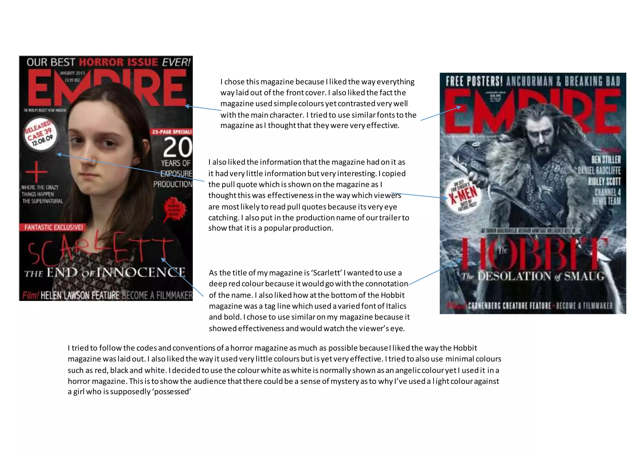
The document discusses the design choices made for a magazine cover. It summarizes that the creator chose a deep red color for the magazine title "Scarlett" to match the connotation of the name. Fonts and layout elements were selected based on what was effective in another magazine called "The Hobbit." Minimal colors like red, black, and white were used to follow horror magazine conventions while still creating a sense of mystery with the light color white.