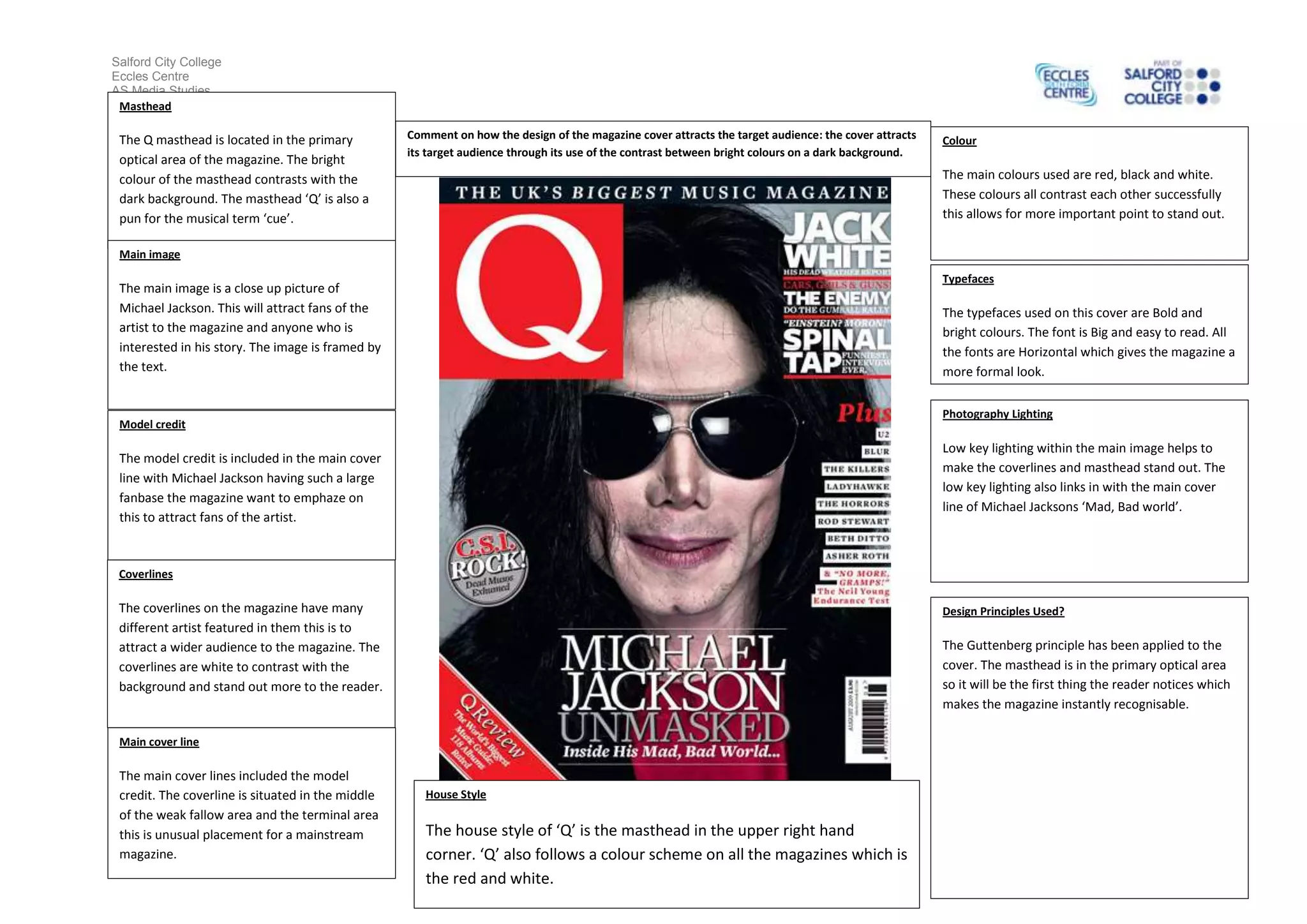
The document summarizes the design elements of a magazine cover featuring Michael Jackson. It notes that the large masthead contrasts with the dark background to stand out. The main image is a close-up of Michael Jackson to attract his fans. The coverlines feature different artists to appeal to a wide audience and are in white for visibility. The main cover line includes the model credit in an unusual middle placement. Red, black and white are the main contrasting colors used. Bold, bright fonts are used for readability. Low key lighting makes the text stand out and ties into the cover story on Michael Jackson. Design principles like the Gutenberg principle are applied to guide the reader's eyes.