Logos ken
•
1 like•221 views
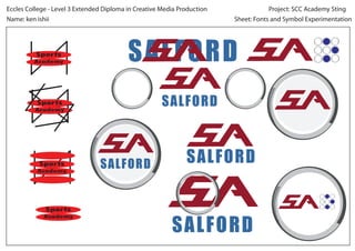
This document experiments with different fonts and symbols to represent the words "Sports Academy" and "Salford". It repeats "Sports Academy" and "Salford" multiple times in different fonts and styles with the goal of exploring typographic design.
Report
Share
Report
Share
Recommended
Fonts symbol experimentation
This document appears to be an experimentation sheet for a student named Ken Ishii exploring different fonts and symbols for the phrases "Sports Academy". The sheet contains repetitions of the phrases "Sports Academy" in different stylized fonts and symbols to test out various design options.
Fonts symbol experimentation
This document experiments with different fonts and symbols to represent "Salford Academy". It repeats "Salford Academy" and its components in varying fonts and arrangements to test visual styles for a project logo or branding.
Fonts symbol experimentation
This document is about an experimentation sheet for fonts and symbols as part of a Level 3 Extended Diploma in Creative Media Production for Eccles College. The sheet is for a project called "SCC Academy Sting" and relates to Eccles Sports Academy.
Fonts symbol experimentation
This document discusses an experimentation project for a creative media production diploma. It involves creating a sting for a sports academy using different fonts and symbols. The project sheet tests displaying the sports academy name repeatedly in various styles to find an effective design for the academy.
Fonts symbol experimentation
This document is an experimentation sheet for fonts and symbols for a project creating a sting for SCC Academy. It tests out different font styles and sizes for displaying the words "SPORTS ACADEMY" to see which looks best and clearly conveys the name of the organization.
Academy sting storyboard 210313 p1
The motion graphic first shows lines slowly appearing from the left side of the screen that center and stop moving. A running man then gradually appears in the center and is zoomed in on by a circular mask to create the emblem of a man running on a track. The word "Sports" then speeds underneath the emblem and rotates twice.
Technical comments research_sheet[1]
The document discusses various technical aspects of video format including:
- Video format refers to different file types for storing and transmitting video with varying codecs, display standards, and physical connectors.
- Aspect ratio is the size and shape of an image, expressed as a ratio such as 16:9. Higher resolutions mean more pixels and higher quality but require more bandwidth.
- Frame rate measures the number of frames per second, with higher rates creating smoother motion but larger file sizes.
- A codec compresses video files to reduce size but can loss quality, so choosing the right codec is important.
Motion graphics worksheet web banners
This document summarizes techniques used in web banners, including:
- The dominant use of animated text like captions and stings to quickly convey information in limited banner space.
- Techniques like bright colors, moving text and images, and animation are used to draw attention to banners that drop into internet pages.
- Some color rendering and graphics are used, along with minimal advanced techniques like blur, distortion, rotation and opacity due to time and space constraints of web banners.
- Technical specifications for web banners depend on requirements specified by the companies using them.
Andyfallon 131210032837-phpapp02
Andy Fallon is a renowned music photographer and art director known for his intimate portraits of famous musicians. His striking photos capture the essence of his subjects through atmospheric lighting and framing that highlights both the artists and their natural backgrounds. This particular image of an unnamed artist stands out for its bright, contrasting colors that draw the eye. The photographer framed and shot the scene from a low angle to prominently feature the artist against trees and buildings in the colorful background landscape, using natural lighting to an dramatic effect.
Manualcamerasettings 131210045048-phpapp02
The document discusses aperture, shutter speed, and ISO in photography. It defines aperture as the opening in a camera lens that controls the amount of light reaching the sensor or film. Shutter speed determines how long the shutter remains open when a photo is taken, with slower speeds allowing more light. ISO measures the sensitivity of the image sensor, with higher numbers allowing photos in darker conditions but resulting in grainier images. The document explains how aperture, shutter speed, and ISO work together to control the overall light and exposure of photographs.
Needforspeedmarketingcampaign 140522080439-phpapp01
The document discusses Aaron Paul's promotion of the film Need for Speed through appearances on Top Gear and WWE Raw to appeal to different audience demographics. It describes how Paul educated viewers about cars on Top Gear and got involved in a wrestling match to promote the film on WWE Raw. The document also discusses the importance of marketing campaigns in the film industry through various media platforms and analyzing audience research to effectively promote films.
Needforspeedmarketingcampaign 140522080439-phpapp01
This document discusses the marketing campaign for the 2014 film Need for Speed, focusing on star Aaron Paul's promotional appearances. It describes Paul's appearances on Top Gear, a British car show, to promote the film to automotive audiences, and his appearance on WWE Raw to appeal to younger viewers. The document analyzes how Paul promoted the film across different media platforms and age groups to maximize the audience. It also discusses the film's source material as a popular video game and the importance of synergy and unique selling points in marketing films.
REC AND QUARENTINE
REC and Quarantine are horror films released in 2007 and 2008 respectively that were filmed in a documentary style using handheld cameras. While REC was a low-budget Spanish film, Quarantine was the American remake produced by Screen Gems. Screen Gems rushed the production of Quarantine to capitalize on the popularity and cult following of REC. By releasing two versions of the same story, the film companies were able to maximize profits from audiences who saw both films and related merchandise.
120 bmp magazine
The document summarizes the process of creating a double page spread for a magazine article. It describes choosing a close-up photo for the spread because it fits with the Q&A format. It then discusses editing the photo by increasing exposure and reducing noise. While not sticking strictly to the magazine's color theme, a black and gray scheme was used for a darker, more personal feel. Font choices were made to mimic professional magazines and emphasize the "Q&A" title. Research on other magazine spreads informed decisions like adding larger quote text to fill space.
120 bmp magazines
The document summarizes the process of creating a double page spread for a magazine. It discusses choosing a close-up photo for the spread because it fits with the Q&A article topic. It then describes editing the photo by increasing exposure and reducing noise. While not matching the cover colors, black and gray were used for a darker, more personal feel. Fonts similar to other magazines were selected to look professional. The text was organized into columns based on research of other effective magazine layouts to make the reading experience personal yet clear.
Front cover process
This document summarizes the process for designing the front cover of a magazine. The designer chose a photo they took and experimented with adjustments to contrast, saturation, and sharpness to refine it. They centered the photo and used leading lines for composition. Text and a logo were added in navy blue and white to match the color scheme. Additional elements like a competition ad and barcode were included to complete the cover design.
Needforspeedmarketingcampaign 140522080439-phpapp01
The document discusses Aaron Paul's promotional appearances for the film Need for Speed, including an interview on Top Gear and a surprise appearance on WWE Raw. It explains how these appearances targeted different audience demographics - Top Gear appeals more to mature audiences interested in cars, while WWE Raw attracts younger viewers. The document also discusses the film studio's overall marketing strategy, which involved promoting the film across multiple media platforms to reach as wide an audience as possible and maximize profits.
Needforspeedmarketingcampaign 140522080439-phpapp01
The document discusses Aaron Paul promoting the film Need for Speed through appearances on Top Gear and WWE Raw. It notes that Top Gear appeals more to mature audiences interested in cars, while WWE Raw attracts a younger audience. The goal of Paul's promotional efforts on different media platforms was to appeal to as many potential viewers as possible. Talk shows are highlighted as particularly effective at promoting films by allowing persuasive explanations of the film and appeal of the actor to their fans. Paul was well-suited to promote Need for Speed due to his leading role and popularity from Breaking Bad.
Ownresearchtaskcarrie2 140313060924-phpapp02
The document provides information about the 1976 film Carrie and the 2013 remake, including directors, budgets, box office earnings, and plot summaries. It also lists tasks for analyzing the relationship between the two films and their production studios, the role of synergy and soundtrack in the remake's marketing, and factors that influenced the decision to remake Carrie. Students are asked to continue an article on remakes using details from both versions of Carrie and addressing their production context and financial relationship.
Pr4 me my_movies
The document provides summaries of four films: Superbad, This Is The End, Knocked Up, and an overview of the comedy genre. Superbad is about three teenage boys trying to get alcohol for a party. This Is The End is about celebrities like Seth Rogen and James Franco sheltering during the biblical apocalypse. Knocked Up is about a one night stand that results in an unexpected pregnancy. The overview discusses how comedy films often involve relatable characters facing problems and achieving goals in humorous ways, and are enjoyable due to stars like Jonah Hill and relatable storylines.
Front cover process
The document describes the process for creating a magazine front cover using a selected photo. The photo was edited to adjust contrast, saturation, and other qualities. A navy blue logo and white header text were added to the top left corner. Additional text boxes in navy blue and white were positioned on the cover to complete the design while adhering to the color scheme. Final touches included adding a competition graphic and barcode with publishing details.
Questions
Ken is a highly skilled underground DJ known for his vast musical knowledge and ability to play across many genres. He has played alongside notable artists like Seth Troxler, Eats Everything, and Theo Parrish. Ken is also becoming renowned for his remixing talents and has upcoming remixes of artists such as Michael Jackson, Redlight, and Lana Del Rey. He has new solo material coming out soon in addition to an increasingly busy international touring schedule.
120 bmp magazine
The document summarizes the process of creating a double page spread for a magazine article. It describes choosing a close-up photo for the spread because it fits with the Q&A style article. It then discusses developing questions and answers for an interview with a DJ. The editing process involved increasing the photo exposure and removing noise. Black and grey were used instead of the cover colors to give a darker, more personal feel. Fonts similar to other magazines were selected to make the spread feel more professional.
Fmp evaulation.docx
Ken Ishii created a music video for his final major project to promote the message that Manchester is not as grim as residents think despite bad weather. He developed his skills in camera angles and editing software. While he faced challenges like equipment issues and scheduling, he was able to complete the project independently. He received mostly positive feedback, though some suggested a narrative style instead of his conceptual approach. In the future, he would film more footage and learn additional editing effects. Overall, he is pleased with the independent work and feels capable of creating more music videos.
Survey monkey
The document summarizes the results of a survey conducted to gather audience preferences for a music video. The survey was distributed through social media and to college students, targeting those aged 16-21. Most respondents were male. The majority preferred settings of a warehouse or house party. They also indicated they normally watch music videos on YouTube and enjoy live performances or storytelling elements. Favorite music video recommendations provided ideas for editing, camera work, and clip length.
Final major project production diary
This document contains production notes and schedules for a BTEC student's final major project creating a music video. It outlines the student's progress over multiple weeks, including selecting a song, writing a script, storyboarding, filming scenes both inside and outside, and editing the video together in Adobe Premiere Pro. The student films additional footage as needed to fill gaps. By the final weeks, the student has completed the video, uploaded it to YouTube, and written a evaluation of the project.
Task 1 photograph research
Photography is used in various industries for advertising and promotion. In the advertising industry, photography is used to showcase products and attract customers. It promotes awareness for organizations like the police and government. In fashion, photography displays new materials and styles while defining brands through chosen models and shots. Music uses photography to promote artists, concerts, and festivals online and in magazines. Sports photography advertises brands and sports in newspapers, magazines, and online through iconic shots of moments. Photojournalism documents historical and current events to increase awareness of situations around the world. Fine art photography fulfills the creative vision of photographers and can have personal meanings.
Evaluation
The document discusses magazine layout and design choices such as using a Stussy T-shirt graphic and location images that relate to deep and tech house music genres and locations like Ibiza in order to appeal to the target audience. Text is chosen to give the magazine a digital look fitting its electronic music focus. Headlines are placed on the left third of pages to follow natural reading patterns. Pricing and layout are influenced by similar music magazine Mixmag to compete in the genre.
More Related Content
More from k_ishii_
Andyfallon 131210032837-phpapp02
Andy Fallon is a renowned music photographer and art director known for his intimate portraits of famous musicians. His striking photos capture the essence of his subjects through atmospheric lighting and framing that highlights both the artists and their natural backgrounds. This particular image of an unnamed artist stands out for its bright, contrasting colors that draw the eye. The photographer framed and shot the scene from a low angle to prominently feature the artist against trees and buildings in the colorful background landscape, using natural lighting to an dramatic effect.
Manualcamerasettings 131210045048-phpapp02
The document discusses aperture, shutter speed, and ISO in photography. It defines aperture as the opening in a camera lens that controls the amount of light reaching the sensor or film. Shutter speed determines how long the shutter remains open when a photo is taken, with slower speeds allowing more light. ISO measures the sensitivity of the image sensor, with higher numbers allowing photos in darker conditions but resulting in grainier images. The document explains how aperture, shutter speed, and ISO work together to control the overall light and exposure of photographs.
Needforspeedmarketingcampaign 140522080439-phpapp01
The document discusses Aaron Paul's promotion of the film Need for Speed through appearances on Top Gear and WWE Raw to appeal to different audience demographics. It describes how Paul educated viewers about cars on Top Gear and got involved in a wrestling match to promote the film on WWE Raw. The document also discusses the importance of marketing campaigns in the film industry through various media platforms and analyzing audience research to effectively promote films.
Needforspeedmarketingcampaign 140522080439-phpapp01
This document discusses the marketing campaign for the 2014 film Need for Speed, focusing on star Aaron Paul's promotional appearances. It describes Paul's appearances on Top Gear, a British car show, to promote the film to automotive audiences, and his appearance on WWE Raw to appeal to younger viewers. The document analyzes how Paul promoted the film across different media platforms and age groups to maximize the audience. It also discusses the film's source material as a popular video game and the importance of synergy and unique selling points in marketing films.
REC AND QUARENTINE
REC and Quarantine are horror films released in 2007 and 2008 respectively that were filmed in a documentary style using handheld cameras. While REC was a low-budget Spanish film, Quarantine was the American remake produced by Screen Gems. Screen Gems rushed the production of Quarantine to capitalize on the popularity and cult following of REC. By releasing two versions of the same story, the film companies were able to maximize profits from audiences who saw both films and related merchandise.
120 bmp magazine
The document summarizes the process of creating a double page spread for a magazine article. It describes choosing a close-up photo for the spread because it fits with the Q&A format. It then discusses editing the photo by increasing exposure and reducing noise. While not sticking strictly to the magazine's color theme, a black and gray scheme was used for a darker, more personal feel. Font choices were made to mimic professional magazines and emphasize the "Q&A" title. Research on other magazine spreads informed decisions like adding larger quote text to fill space.
120 bmp magazines
The document summarizes the process of creating a double page spread for a magazine. It discusses choosing a close-up photo for the spread because it fits with the Q&A article topic. It then describes editing the photo by increasing exposure and reducing noise. While not matching the cover colors, black and gray were used for a darker, more personal feel. Fonts similar to other magazines were selected to look professional. The text was organized into columns based on research of other effective magazine layouts to make the reading experience personal yet clear.
Front cover process
This document summarizes the process for designing the front cover of a magazine. The designer chose a photo they took and experimented with adjustments to contrast, saturation, and sharpness to refine it. They centered the photo and used leading lines for composition. Text and a logo were added in navy blue and white to match the color scheme. Additional elements like a competition ad and barcode were included to complete the cover design.
Needforspeedmarketingcampaign 140522080439-phpapp01
The document discusses Aaron Paul's promotional appearances for the film Need for Speed, including an interview on Top Gear and a surprise appearance on WWE Raw. It explains how these appearances targeted different audience demographics - Top Gear appeals more to mature audiences interested in cars, while WWE Raw attracts younger viewers. The document also discusses the film studio's overall marketing strategy, which involved promoting the film across multiple media platforms to reach as wide an audience as possible and maximize profits.
Needforspeedmarketingcampaign 140522080439-phpapp01
The document discusses Aaron Paul promoting the film Need for Speed through appearances on Top Gear and WWE Raw. It notes that Top Gear appeals more to mature audiences interested in cars, while WWE Raw attracts a younger audience. The goal of Paul's promotional efforts on different media platforms was to appeal to as many potential viewers as possible. Talk shows are highlighted as particularly effective at promoting films by allowing persuasive explanations of the film and appeal of the actor to their fans. Paul was well-suited to promote Need for Speed due to his leading role and popularity from Breaking Bad.
Ownresearchtaskcarrie2 140313060924-phpapp02
The document provides information about the 1976 film Carrie and the 2013 remake, including directors, budgets, box office earnings, and plot summaries. It also lists tasks for analyzing the relationship between the two films and their production studios, the role of synergy and soundtrack in the remake's marketing, and factors that influenced the decision to remake Carrie. Students are asked to continue an article on remakes using details from both versions of Carrie and addressing their production context and financial relationship.
Pr4 me my_movies
The document provides summaries of four films: Superbad, This Is The End, Knocked Up, and an overview of the comedy genre. Superbad is about three teenage boys trying to get alcohol for a party. This Is The End is about celebrities like Seth Rogen and James Franco sheltering during the biblical apocalypse. Knocked Up is about a one night stand that results in an unexpected pregnancy. The overview discusses how comedy films often involve relatable characters facing problems and achieving goals in humorous ways, and are enjoyable due to stars like Jonah Hill and relatable storylines.
Front cover process
The document describes the process for creating a magazine front cover using a selected photo. The photo was edited to adjust contrast, saturation, and other qualities. A navy blue logo and white header text were added to the top left corner. Additional text boxes in navy blue and white were positioned on the cover to complete the design while adhering to the color scheme. Final touches included adding a competition graphic and barcode with publishing details.
Questions
Ken is a highly skilled underground DJ known for his vast musical knowledge and ability to play across many genres. He has played alongside notable artists like Seth Troxler, Eats Everything, and Theo Parrish. Ken is also becoming renowned for his remixing talents and has upcoming remixes of artists such as Michael Jackson, Redlight, and Lana Del Rey. He has new solo material coming out soon in addition to an increasingly busy international touring schedule.
120 bmp magazine
The document summarizes the process of creating a double page spread for a magazine article. It describes choosing a close-up photo for the spread because it fits with the Q&A style article. It then discusses developing questions and answers for an interview with a DJ. The editing process involved increasing the photo exposure and removing noise. Black and grey were used instead of the cover colors to give a darker, more personal feel. Fonts similar to other magazines were selected to make the spread feel more professional.
Fmp evaulation.docx
Ken Ishii created a music video for his final major project to promote the message that Manchester is not as grim as residents think despite bad weather. He developed his skills in camera angles and editing software. While he faced challenges like equipment issues and scheduling, he was able to complete the project independently. He received mostly positive feedback, though some suggested a narrative style instead of his conceptual approach. In the future, he would film more footage and learn additional editing effects. Overall, he is pleased with the independent work and feels capable of creating more music videos.
Survey monkey
The document summarizes the results of a survey conducted to gather audience preferences for a music video. The survey was distributed through social media and to college students, targeting those aged 16-21. Most respondents were male. The majority preferred settings of a warehouse or house party. They also indicated they normally watch music videos on YouTube and enjoy live performances or storytelling elements. Favorite music video recommendations provided ideas for editing, camera work, and clip length.
Final major project production diary
This document contains production notes and schedules for a BTEC student's final major project creating a music video. It outlines the student's progress over multiple weeks, including selecting a song, writing a script, storyboarding, filming scenes both inside and outside, and editing the video together in Adobe Premiere Pro. The student films additional footage as needed to fill gaps. By the final weeks, the student has completed the video, uploaded it to YouTube, and written a evaluation of the project.
Task 1 photograph research
Photography is used in various industries for advertising and promotion. In the advertising industry, photography is used to showcase products and attract customers. It promotes awareness for organizations like the police and government. In fashion, photography displays new materials and styles while defining brands through chosen models and shots. Music uses photography to promote artists, concerts, and festivals online and in magazines. Sports photography advertises brands and sports in newspapers, magazines, and online through iconic shots of moments. Photojournalism documents historical and current events to increase awareness of situations around the world. Fine art photography fulfills the creative vision of photographers and can have personal meanings.
Evaluation
The document discusses magazine layout and design choices such as using a Stussy T-shirt graphic and location images that relate to deep and tech house music genres and locations like Ibiza in order to appeal to the target audience. Text is chosen to give the magazine a digital look fitting its electronic music focus. Headlines are placed on the left third of pages to follow natural reading patterns. Pricing and layout are influenced by similar music magazine Mixmag to compete in the genre.
More from k_ishii_ (20)
Needforspeedmarketingcampaign 140522080439-phpapp01
Needforspeedmarketingcampaign 140522080439-phpapp01
Needforspeedmarketingcampaign 140522080439-phpapp01
Needforspeedmarketingcampaign 140522080439-phpapp01
Needforspeedmarketingcampaign 140522080439-phpapp01
Needforspeedmarketingcampaign 140522080439-phpapp01
Needforspeedmarketingcampaign 140522080439-phpapp01
Needforspeedmarketingcampaign 140522080439-phpapp01
Logos ken
- 1. Project: SCC Academy StingEccles College - Level 3 Extended Diploma in Creative Media Production Sheet: Fonts and Symbol ExperimentationName: ken ishii Sports Academy Sports Academy Sports Academy Sports Academy SALFORD SALFORD SALFORD SALFORD SALFORD