
Recommended
More Related Content
Similar to Letterwork - Creative letterforms in graphic design (Art Ebook).pdf
Similar to Letterwork - Creative letterforms in graphic design (Art Ebook).pdf (20)
Recently uploaded
Recently uploaded (20)
Letterwork - Creative letterforms in graphic design (Art Ebook).pdf
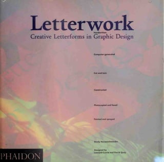
- 1. Letterwork Handwritten Creative Letterforms in Graphic Design Computer-generated Cut and torn Constructed Photocopied and faxed Painted and sprayed PHAIDON Brody Neuenschwander Designed by Leonard Currie and David Quay
- 2. Letterwork Here for the first time is a book that brings the interests of the graphic designer and the lettering artist together by detailing the enormous potential of original lettering in graphic design. With the proliferation of computer manipulation techniques and the widespread growth of interest in typography, designers are increasingly aware that letter design is one of the basic skills of their profession as well as a source of original and striking forms. Letterwork draws on packaging, posters, signage systems, television sequences, book jackets and more to show how professionals from around the world are commissioning, inventing and adapting new letterforms to create outstanding designs. Their sources are as diverse as Arabic and Japanese culture, the street, the fine arts and the world of 'high-tech'. The book illustrates letter-making techniques such as painting, cutting, tearing, collage, stamping, drawing, photocopving, faxing, airbrush and computer generation. The author also gives important information on basic tools and techniques, the principles of letterform and useful contact addresses. Here at last is invaluable guidance and inspiration to strengthen the connections between the professions of graphic design, typography and calligraphy, for this book has been long awaited by designers and lettering artists alike. Brody Neuenschwander Designed by Leonard Currie and David Quay
- 3. Letterwork
- 4. 1 *.
- 5. Letterwork Creative Letterforms in Graphic Design Brody Neuenschwander
- 6. Phaidon Press Ltd 140 Kensington Church Street London w8 4BN First published in hardback 1993 First published in paperback 1993 ©1993 Phaidon Press Ltd ISBN 7148 2801 7 (hardback) 7148 2909 9 (paperback) A CIP catalogue record for this book is available from the British Library All rights reserved. No part of this publication may be reproduced, stored in a retrieval system or transmitted, in any form or by any means, electronic, mechanical, photocopying, recording or otherwise, without the prior permission of Phaidon Press. Printed in Singapore. Typeset in Foundry Old Style and Foundry Sans. Photographic acknowledgement: Pictures page 114, page 149 (from Fuse 1, 'Intervention') and page 120 (from Fuse 2, 'Runes' ©Fontshop International.
- 9. If Contents Pi you to y jovt ^ - Jeb mi Sijfrv *f^"> ' "net i. "Wl1 ** •••""•'•'' •'*>'•.>.:•« ., hoi*. «• to. Introduction Conveying the Message Lettering as Image Lettering and Typography The Design of Letters New Directions Directory Further Reading Index 9 22 66 96 122 138 150 156 158
- 12. ^ •y ^V v ^ V u Experimental Lettering An image composed of dry transfer lettering and found typography was transformed on a Canon colour copier over many generations to create the image seen on the preceding page The image was moved on the glass between each colour scan, thus separating the yellow, cyan and magenta colour printings. This process was repreated several times with the addition of new artwork at later stages LETTERING AND DESIGN Leonard Currie, London *-•-«=****, f^&M ^v<*
- 13. Introduction Many graphic designers refer to all letters, including written, drawn and computer-generated letters, as 'typography'. This term tends to suggest that letters come from catalogues and only need be inserted into artwork before printing. But many designs require specially made letterforms to achieve the right effect. This book is about the making of letters for specific purposes. Compiling it has been like conducting a market survey on the graphic design profession. Designers from around the world were asked to send examples of 'hand-lettering' for possible inclusion. But before requests for transparencies of hand-lettering could be sent out, the term itself had to be defined. Clearly calligraphy, drawn letterforms and letters produced by other hand techniques were well within the scope of the book. But modern graphic design also relies heavily on manipulated type and on letterforms designed on the computer. These could not be left out. The term hand-lettering has therefore been used here in the widest possible sense: virtually any kind of letter specially designed for graphics - with the most rigorous exception of type used straight from catalogues or software - is included. The theme uniting all the letters found here is that they were made for specific purposes and applied to particular designs. The book has two aims. The first is to show the remarkably high standard being set by the best lettering artists and designers in the world today. From the classical and elegant calligraphic forms of Julian Waters to the sculptural purity of the work of Takenobu Igarashi to the dynamic television sequences of Morgan Sendall, letterforms of the highest quality are being produced for graphic design. The strength and variety of the work illustrated here will provide inspiration for those with a passion for letters and for those who may not yet realize fully what letters can do. The second aim of this book is to help create a new partnership between graphic designers and lettering artists. In the past, art directors and graphic designers have not been entirely aware of the many talented lettering artists working around the world. This book not only provides an analysis of the most important lettering styles and techniques, it gives a world directory of lettering artists and a simple method for commissioning hand-lettering when it cannot be produced in the graphic design studio. Problems of style, emotional impact and
- 14. Television Title Sequence The title sequence for Horizon, which received the Bronze Medal at the British Design Awards in 1991. was designed to introduce the world's longest-running science documentary series Specially commissioned models were developed from storyboards and carefully arranged over two days for a shoot using 35mm film on a motion control rig. The sequence depicts a journey through science-related objects which finally resolve themselves into the word 'Horizon' Though a Quantel Harry was used in post-production to integrate a series of shoots, the designer was at pains to avoid the dominance of a computer graphics style in the final version. The result is an example of letterforms which contain a narrative meaning and are full of visual excitement. DESIGN Liz Friedman, London model making Alan Kemp. London CAMERA AND LIGHTING Doug Foster HARRY OPERATION Rob Harvey Produced at the BBC Television Studios, London 12
- 15. Introduction composition are analysed. Using the simple guidelines given here, the designer can identify the right style of tailor-made lettering for a particular job and describe his or her requirements to the lettering artist. The forms presented here range from spontaneous calligraphic marks to highly refined letters produced on the personal computer. They may have originated with the designer or have been received as type and manipulated in some way. Not all manipulations are dramatic. Included here is the full range: both logos involving very subtle adjustments to type and compositions in which typographic forms have been cut, squeezed, filled with texture and colour and integrated into complex multimedia images. The letters may be legible or illegible, the principle elements in a design or partners for photographs or illustrations. They appear on record sleeves, posters and packaging, in film and television sequences and in a variety of three-dimensional applications. Their effects can vary from the sophisticated to the nostalgic, from the warm and intimate to the crude and violent. And they communicate on other levels as well, using symbols, references, humour, irony, illustrations and codes. Hand-lettering is a fully developed medium of expression with an essential role in graphic design today. The premise of this book is that specially made letterforms can do things that type cannot do without manipulation. Hand-lettering can provide a sense of movement that is alien to type. It can be tailor- made to fill spaces in layouts that type could never satisfactorily occupy. Letters can be designed and made to suit the style of a particular image, whether photograph or illustration; and they can be carefully conceived to contrast in style, weight and texture with any typeface. Where legibility is not an important consideration, letterforms can create dramatic compositions of shapes and spaces with far more visual interest than the highly legible forms of type. Moreover, hand-lettering powerfully conveys emotions, associations and subliminal information that the restrained forms of type can communicate only in a limited way. Recent technological developments have made the use of hand- lettering in designs for print a very simple matter. The personal computer allows any hand-made image to be scanned and included in Exhibition Poster Koichi Sato is one of the leading proponents of hand-lettering in the world of Japanese graphic design This poster undertaken for the National Museum of Modern Art. Tokyo in 1990 achieves a powerful and yet sophisticated impact by placing Koichi Sato's own elegant brush-made calligraphy within a geometrically precise composition. The words Graphic design today' appear at the top in Latin characters written in the style of the Japanese grass script. The same letters are then scattered over the slopes of Mount Fuji below, symbolizing the meeting of East and West in the world of contemporary graphic design The contrast between the freely written letterforms and the geometric background is softened by means of textures and airbrushed 'haloes' LETTERING AND DESIGN Koichi Sato, Tokyo client National Museum of Modern Art. Tokyo
- 16. Poster for the 1988 Olympics Unlike Ott + Stein's 'Berlin. Berlin' poster, which depends entirely on the forms of the letters. Ahn Chung-Un's design advertising the 1988 Olympics in Seoul uses lettering as a secondary decorative feature to provide a softly coloured border around the photographic image of whirling dancers in traditional Korean dress. The Korean characters are a modernized version of the ancient seal script, and roughnesses in their outlines suggest a stamped or sealed quality Above and below the dancers, the characters gradually merge into the space of the photograph. A traditional design with a restrained high-tech quality, this poster announces Korea's entrance into the modern industrial world with its ancient traditions intact. LETTERING AND DESIGN Ahn Chung-Un. Seoul, S Korea client International Olympic Committee SE0UL1988 JBRKU EMBfflK nam mm 14
- 17. Introduction a layout. It is even possible now to go straight from the screen to film and avoid paste-up altogether. The designing of letters on the screen or for scanning will therefore be increasingly important in the next few years. But while the computer has facilitated the designer's access to hand-lettering, it must not be forgotten that more basic layout techniques can also take full advantage of tailor-made letters. Each stage in the development of print technology in the nineteenth and twentieth centuries (lithography, photo-gravure, photo-lithography, four-colour process) has increased our ability to reproduce the ephemeral qualities of hand-made marks. The only thing that is often missing is the designer's ability to create and manipulate letters. Insufficient educational opportunities are often to blame for this deficiency on the part of many designers. The detailed study of letterforms and the principles of their construction have been increasingly marginalized in the curriculum of many schools of graphic design since the 1960s. Until this time the study of callig- raphy, drawn letters, classical inscriptions and other historical material formed an integral part of the training of typographers and designers and gave a firm formal foundation for the design of letters. Experimental studies could then be based on a sound knowledge of underlying form. These foundations have been eroded over many years, partly because subjects such as calligraphy have been viewed by many typographers as irrelevant to their discipline. A curriculum increas- ingly crowded with subjects of a technical nature has left less and less time for such apparent luxuries as the careful copying of ancient inscriptions or the study of the formal characteristics of the broad pen. Experimentation has continued, but often without the formal background that could guide it and give it purpose. According to one German teacher of typography, experiments carried out in this void often yielded interesting results at first; but students with no formal training were incapable of taking their tentative work further through informed self-criticism. While there are now encouraging signs that the need for formal study is again being recognized, one is mindful of the fact that the desktop revolution has placed type-designing software into the hands MARTIN ZUR GROPIUS GESCHICHTE BAU DER STADT Exhibition Poster Nicolaus Ott and Bernard Stein produced this highly refined design in 1987 using the simplest of techniques. The mam words were drawn and tinted and combined with Univers and Futura to produce camera-ready artwork. The composition is classic, with the words 'Berlin. Berlin' placed at optical centre. Both the style of the lettering and the black background refer frankly to Berlin's troubled place in twentieth-century history. The tinted lettering, which can be read either as emerging from darkness or descending into it. points to the fact that the city has for years been at the edge of light and darkness, peace and war. LETTERING AND DESIGN Ott + Stem, Berlin client Berliner Festspiel GmbH
- 18. Poster for a Poetry Reading If Italo Lupi's design for Dada Cucma displays a sophisticated eccentricity. Suzi Godson's simple poster advertising readings of Irish love poetry in Trinity College, Dublin in 1990 evokes the home-spun intimacy of much Irish literature. Godson was attempting to capture the feeling of traditional Celtic type and imagery Both the rough-cut letterforms and the silkscreen process used to print the poster contribute to a feeling of warmth and intimacy. LETTERING AND DESIGN Suzi Godson. London client Trinity College. Dublin IRISH LOVE PDETRT LuNchfcirvie readings by Darragh Welly THNifcy MalLl2-30pm., From Nov/lst-^tb 16
- 19. Introduction of a generation many of whom do not possess this educational background. The prospect of a rising tide of badly designed type threatens from this direction. An ideal course of study for those interested in the design of letters would be a two-track system, assigning equal importance to the formal foundations of the alphabet (both written and typographic) and to free, experimental work using a variety of tools and techniques. This experimentation should follow the compositional principles of the fine arts such as painting and drawing. If pursued together, each of these areas, formal and experimental, would provide a sort of running commentary on the other. We are entering a period in which increasing attention is being paid to the forms and arrangements of letters. The personal computer has put kerning and leading options at the fingertips of many people who have never recognized the design potential of letterforms. The esoteric freemasonry of the typographer is gradually being eroded, and this should raise standards all around - particularly as certain sectors of the public are beginning to see that graphic designers, like architects, are in some measure responsible for a great deal of ugliness in the world. The place of lettering in graphic design needs reassesssing by every designer, with a corresponding, urgent review of the place of the study of letterforms in the design schools. Is it possible to be a good designer and a bad typographer? Can one be a good typographer without being aware of the principles of letter design and spacing? One of the aims of this book is to demonstrate that an understanding of the principles of letter design is an excellent foundation for all aspects of graphic design. In the first section of the book, letters are considered for their emotional impact. The forms are grouped broadly into eight themes according to the emotional message they convey. Examples chosen for this section are generally quite legible and play an important role in conveying verbal information; thus they must balance the requirements of legibility with the need to communicate emotions and associations such as excitement, violence, humour, nostalgia, history and elegance. It emerges that particular emotions can be created by a fairly wide range of lettering styles. The character of line, colour, scale and the context of the letters all contribute to this DADA. la ricetta di cucina preferita dai palati piu esigenti. donne o architetti che siano. badando -. Mjiro el voglto def gusto Catalogue Cover This fresh, humorous and elegant design of 1 978 was. and seems, almost effortless. Italo Lupi has simply spelt out the name of the client with the fresh cherries, beans, celery and radishes likely to be found in any enlightened kitchen The result reads easily, of course. It might also be seen to refer to the concept of Dadaism in twentieth- century art, which argued that all is nonsense by making surreal and silly compositions of found objects. LETTERING AND DESICN Italo Lupi, Milan client Dada Cucina f.loa
- 20. Self-Portrait in Type The eccentricities of Suzi Godson's poster and Italo Lupi's catalogue cover (pages 16 and 17) are complemented by this 1990 self-portrait in type by the London designer Peter Grundy. The design, produced as a self- promotional print, bears the warning. An Apple Mac was not used for this drawing'. Yet its precision, and indeed certain shapes and elements, are drawn di'ectly from the world of Mac design. Grundy's is a wry commentary on the sometimes misplaced zeal for digital design that 'S currently apparent in the design world design Peter Grundy of Grundy and Northedge
- 21. Introduction non-verbal impact. The principles of legibility are considered in some detail in order to show how lettering can be manipulated without losing its ability to communicate verbal information. In section two, letterforms are considered as elements in compositions. Legibility plays less of a role in the work illustrated here, and it is therefore possible to develop shape and line more freely. The problem of choosing the appropriate style of letter is addressed through a range of examples: logos, posters, book? and magazines, designs for the music industry, and lettering for film and television. Hand-lettering plays a vital role in all of these areas, from the subtle manipulation of type often required in the design of a logo to the construction of complex mechanized models that are filmed with computer-tracked video cameras. The interaction of hand-lettering and type is considered in the third part of the book. By analysing the formal and aesthetic characteristics of the major type familes, approaches for pairing hand- lettering and type are considered. The manipulation of type is also shown as an aspect of hand-lettering; and the use of calligraphy and the compositional principles of the fine arts in the development of typefaces is addressed. The next section ties together the different elements of the first three in an effort to identify general principles that can be applied to the design of letters. The structured and legible foundations of typography, which produce even textures and a minimum of formal contrast, are shown to be inadequate for the creation of hand- lettering with strong compositional and emotional impact. This section also contains a detailed catalogue of the techniques used to produce the various letterforms featured in the book, which range from the simple hand techniques available in any studio to unusual and innovative uses of the photocopier and process camera, from special print finishing techniques to computer-generated lettering. It is hoped that these examples may prove useful in a creative crisis. The brief final section points the way towards the future of lettering. At the end of the book a directory gives the names and studio addresses of the lettering artists and graphic designers whose work is featured here, as well as many others around the world who specialize in the design of letters. This first global listing of lettering Bicycle Transfers Despite Peter Grundy's witty renunciation of the Apple Mac in his self- portrait (left), the machine does of course have its uses, the application of hand-lettering and type to three-dimensional objects being one of them Checkland Kindleysides were able to roll out the shapes of the frames and forks of twelve Saracen mountain bikes using the Mac in order to produce and refine letterforms that would wrap around the forms in the right way. Flat camera-ready artwork for the printing of transfer patterns could be produced in the full knowledge of what the final effect would . be Designed in 1991 LETTERING AND DESIGN Checkland Kindleysides. Rothley. Leicestershire client Saracen Bikes
- 22. Television Title Sequence The most sophisticated technology can be brought to bear in the design and production of hand- lettering. The 1990 identity and title sequence for the BBC programme BFT2 is a case in point. BFT2 is the central character of the programme. The designers wanted to produce a programme identity that integrated the person of BFT2 with the lettering rather than separating the live-action imagery from the type. As the sequence proceeds and BFT2 is confronted by letters emerging from different directions, he strains backwards to pull on a mask in the shape of the letter T. thus resolving both his own identity and the logo or title of the programme. Finally, the number '2' slices into the scheme. The sequence was produced by integrating live-action film and computer graphics on Paintbox. design Jane Wyatt and MaylinLeeoftheBBC Presentation Design Croup, London 20
- 23. Introduction artists is intended for designers and art directors who seek to place special commissions. However, it should be noted that many whose work is shown are not limited to the styles illustrated; nor was it possible to include everyone whose work merits attention. Any additional information will be welcomed by the publishers. A list of national and regional typography and design societies has also been included, as well as the few societies of calligraphers and lettering artists of a professional kind that exist. The secretaries of these organizations can often help to locate individuals who have specialist skills. The artists and designers represented in this book work in a variety of professional situations. Many of them are freelance special- ists in one form of lettering or another; others are type designers or graphic designers with a special interest in hand-lettering. All share an enthusiasm for letterforms that goes well beyond the financial rewards that good design can bring. Every effort has been made to gather contributions from the best lettering artists and graphic designers working in the world today. Particularly exciting material is available from Japan, where graphic designers seem able to take a fresh and highly abstract view of the Latin alphabet. The Western world has a great' deal to learn from a culture which for over a thousand years has seen its own written forms not only as vehicles for verbal information but also as abstract shapes with powerful emotional qualities. The example of Japan also shows that adequate resources are necessary for real innovation. An artist only asks for the opportunity to do his best. This book must convince many that recent developments in Western calligraphy and lettering for graphic design show a new sense of the formal potential of the Latin alphabet, and it is hoped that in time the importance of these developments will also be realized by a wider public. Sculpture Some of the most astonishing applications of technology to the design and production of letters occur in the work of Takenobu Igarashi. who makes purely sculptural forms on the theme of individual letters. This magnificently crafted sculpture of brushed steel (1990) takes the form of a stack of thick metal plates of various shapes. The three- dimensional form resembles the letter 'A'. But Igarashi is playing here on the relationship between the two-dimensional world of letterforms and the three-dimensional world of sculpture: it is in the step pattern formed by the ascending plates that the intended letter F' is revealed. LETTERING AND DESIGN Takenobu Igarashi, Tokyo
- 24. 22
- 26. Experimental Lettering This piece began as a sculpture of cut and rolled white paper set up in the design studio. Green, red and blue light was cast onto the sculpture using slide projectors with coloured filters. The projector with the red filter also contained a 35mm transparency of the typography The illuminated sculpture was then photographed using a hand-held camera LETTERING AND DESIGN Leonard Currie, London
- 27. Conveying the Message Letterforms are the most important means of communication available to the graphic designer. They serve the essential function of conveying verbal information; they also carry emotional and aesthetic information that has an impact on how the verbal message is read; and they play a part in the design itself and must relate to the other elements of the composition. Lettering and typography are therefore central to the design process and cannot be treated as mechanical operations to be con- sidered in relation to the design at the last stage. The question of letterforms must be considered at the beginning; and a lettering style which conveys the appropriate emotional and aesthetic information must be selected (in the case of type) or produced (in the case of lettering) as the design takes shape. This chapter will celebrate and examine how lettering that conveys essential verbal information in a legible way can, if successful, at the same time be read on other, more intuitive levels. Legibility Legibility has been described as a 'certainty of deciphering'. The question is, deciphering of what? Most designers will have argued with a client over the legibility of a proposed approach. The client, who may have in mind the clarity of text type, claims that the design is not instantly legible. The designer may counter that, in the context, it is legible and that it conveys the appropriate non-literal messages as well. The designer and his client are in fact differing over the definition of legibility. Legibility in its most basic sense does indeed consist of the deciphering of verbal and numerical information without ambiguity. There is a large specialist literature on the physiology, psychology and sociology of reading (see Further Reading for further details). Much of what needs saying on the subject is common sense. All writing systems, to be legible, must observe two laws. First, the letterforms within a system must show sufficient formal contrast to allow efficient recognition of the individual characters. Second, they must show sufficient formal harmony to allow efficient eye travel. In various times and places these two laws have been observed in different ways.
- 28. Sculptural Street Address Letters (and indeed numbers) carry information on many levels below the literal surface. This magnificent sculpture, undertaken in 1990, serves as a street address at the offices of Nike; the number '180' has acquired a power and solidity that inspires feelings of awe. The forms have been built up with layers of brushed-steel plates, perfectly engineered and bolted together. The sculpture bears a striking similarity to the inside of a bank vault door. LETTERING AND DESIGN Takenobu Igarashi, Tokyo client Nike 26
- 29. Conveying the Message Western alphabets, which include the Latin, Greek, Hebrew and Cyrillic traditions, as well as modern efforts to record aboriginal languages in Africa and the Americas, are phonetic; that is, they record sound values. These systems are based on the fewest possible contrasting shapes, usually geometric in origin, all occupying roughly similar spaces. The characters are few in number and can be learned quickly. Historically, the sheer simplicity and geometric basis of these systems has militated against their development into important calligraphic art forms. In the Arabic system, the basis of the forms is not geometric but cursive (though scholars often apply geometric analysis after the fact). with greater formal contrast and wider differences in size for the various characters than is the case with Western alphabets. Like Western systems, Arabic is phonetic, has few characters and can be learned relatively easily The strong contrasts inherent in their shapes, sizes and stroke directions have yielded a vigorous calligraphy with strong compositional possibilities. The Chinese system and its derivatives are symbolic rather than phonetic, though in Japanese a parallel phonetic system has been added. As in Western alphabets, the characters generally occupy similar spaces, but there are vastly different stroke counts and stroke directions from one character to the next. These characteristics have contributed to the development of important calligraphic traditions. The number of characters in these systems is very high and therefore more difficult to learn; contrasts between them must be identified at a more subtle level than in Western or Arabic writing. A comparison of these three writing traditions shows that legibility can be achieved in very different ways. The contrast of simple geometric forms that lies at the heart of legibility in Western typography is not present in the Arabic tradition, where contrast of stroke size and direction produce character identity, nor in the Chinese and Japanese traditions, where character identity derives from contrast in stroke density and direction. In any case, as is clear from our ability to read even the most dreadful handwriting, the contrasts and harmonies on which legibility depends are as much a matter of context as of absolute formal properties. Marks are identified in the context of other marks; a whole composition of 27
- 30. ^ Calendar Legibility is not always a simple question of deciphering verbal information Images too can be read, and images built up from letters may be read on several levels. This composition of letters by Ott + Stein, which was produced by photo- composition and traditional paste-up, does not reveal its verbal message until one notices the small block of numbers, bottom right. These are instantly recognizable as the dates on a calendar. As soon as these are identified, the viewer then sees that the composition of letters spells the word 'Oktober'. The clue provided by the numbers allows an intuitive leap in reading the letters. LETTERING AND DESIGN Ott + Stem, Berlin client Nord Landesbank, Hannover 28
- 31. Conveying the Message The vocabulary of style marks is itself identified in a context of time, place and culture. All of these factors contribute to the certainty of deciphering. Reading is a culturally based activity, and as such is an aspect - a very important aspect - of the conventions that we all possess and consent to use among ourselves. Legibility is therefore both necessarily tied to the past and renewed and invigorated in the present. It is said that 'Mere legibility in type is like mere shelter in archi- tecture'. The suggestion is that purely utilitarian typefaces can have little that is visually pleasing about them. Type is often treated as a completely utilitarian element in graphic design, used only to communicate verbal information in compositions whose strength lies elsewhere, in brilliant photographs, illustrations and abstract shapes. Yet letterforms, even typographic forms, can never be neutral elements in a design. While carrying verbal information, thev also invariably convey emotional and associative information as well. We all possess a subtle vocabulary of style that compels us to read a composition involving letterforms on many levels. An elegant copperplate, for example, may signify tradition, quality and a long history of excellence. These values were especially prized by the mercantile and legal culture of the eighteenth and nineteenth centuries, and copperplate was seen to project the right image of respectability and propriety. The connotations can be made clearer still if for instance the swelling lines of copperplate letters are painted in gloss enamel on the side of a vintage delivery van or engraved and printed on expensive paper. But certain adjustments to these essentially historical forms or to their context will give them very different meanings. Excessively fat copperplate letters that do not keep to the line of writing tend to produce a feeling of whimsy; ragged-edged copperplate manipulated and distressed on the computer may suggest decadence; highly flourished copperplate letters may denote sumptuous extravagance. These emotional associations are not reserved for historical styles alone. Letters designed to resemble those found on computer print- outs, for example, will suggest obvious references to technology, speed and efficiency. But now that digital technology has been with us for a while, certain technical styles may subtly evoke the earlier /^ The Labyrinth of Naze Design l"^ wm^ Poster The design by Otl + Stem opposite plays a game of visual hide and seek. In this 1991 poster by John Rushworth and Vince Frost of Pentagram the letter 'A' is turned into an image of the hidden mysteries of the maze. The design was produced on the computer, which makes flawless precision and drop shadows available at the touch of a button The subject matter is instantly recognizable, allowing the type to be relegated to a marginal role at the top of the poster. LETTERING AND DESIGN John Rushworth and Vince Frost of Pentagram. London ART DIRECTOR John Rushworth client Art and Architecture 29
- 32. Television Title Sequence The brief for this sequence was to design a generic identity for a long-running series on archaeology in which the different places and periods covered by each programme were evoked . The titling begins by panning across ruins from various eras and countries At first the viewer assumes the scene to be a real-life setting, then, as the camera pulls out, it becomes clear that each building is actually a letter Finally, we read 'Chronicle' on a back- ground of sand and rubble. The title is a 14-foot-long model, shot with a conventional 35mm camera mounted onto a motion/ computer-controlled rig suspended from the ceiling with a periscopic lens. Harry was used to blend from one take, lit with heavy shadows, to another take, lit more softly, to add legibility to the logo at the end. The 1988 sequence won the Gold Award at the Imagina competition in Monte Carlo in 1991 DESIGN AND ART DIRECTION Liz Friedman, London model making Alan Kemp, London CEL ANIMATION, LIGHTING and camera Doug Foster Produced at the BBC Television Studios. London kti't- t* H 1 ' J 1 . I m.M 30
- 33. Conveying the Message years of the computer age, thus carrying with them their own kind of nostalgia. Other high-tech letters may refer to the more negative or sinister aspects of the digital revolution: perhaps surveillance, a mechanized society or the destruction of the natural environment. Illustrations of styles that have particular associations and emotional connotations in the public mind could be cited almost without end. In lettering we possess a complex grammar by which communication is possible (indeed inevitable) below the literal surface. The designer must therefore develop expertise in this complex process. The range of associations The emotional impact of letterforms is communicated before their literal content, and therefore the designer must establish from the outset of a particular project the precise feelings and associations that he or she wishes his design to communicate. In most cases the brief will specify the public that the project is intended to reach. It may also specify the style of lettering required or simply identify the emotions and associations that the lettering and overall design should elicit from the viewer. The job of the designer is then to find the visual language that will be understood in the correct way by the market in question. Examples of lettering in this chapter are organized into eight broad groupings, each category representing a set of related emotions or associations. Within each, a variety of examples of lettering by some of the world's leading lettering artists and graphic designers communicate these connotations in a clear and powerful way. The reader will observe that the lettering in each broad grouping, though not all of the same style, nevertheless produces generally similar feelings - a point enforced even more by the examination of lettering in other languages. Their emotional impact is communicated without being able to read their verbal content. The wide range of styles represented in each grouping should demonstrate that no one style represents exclusively one emotional state. It should also be evident that the broad groupings given here are by no means all that could be defined, and are, to a degree, inevitably arbitrary and subjective in nature. But it is to be hoped that they will provide a springboard for thought and inspiration. Video Logo Unlike the Chronicle sequence opposite, the letters for this logo design were constructed on the computer to resemble three-dimensional objects. Light sources shot on film were manipulated on the computer and integrated with the letterforms. The result assumes a high level of sophistication and intelligence in the young audience. DESIGN Jane Fiedler of the BBC Presentation Design Group. London
- 34. Poster The limits of legibility are astonishingly broad. In this 1 989 poster the identity of the four large letters is little more than hinted at. Legibility here depends as much on context as on the hand-drawn letterforms. which are built up of post- modernist fragments. The letters T are Y seem to extend subtly beyond the surface of the poster, while the other letters remain rigorously flat. LETTERING AND DESIGN Toshiyasu Nanbu. Osaka client Tokyo Designers Space June5[Mon.]-17[Sat].1989 12:0C 30RM. J DESIGNEL TYPOGRAPHY WORKS OF TOSHIYASU NANBU s:
- 35. Conveying the Message Decoding the message It is a stimulating exercise to decode several of the designs presented in this chapter and to analyse how the designer has given form to the literal and emotional meaning he intends to convey. Pierre Bernard, for example, undertook a project for Parilux, a range of papers recently introduced by ISTD Fine Paper (see page 48). The advertisement design was intended to be seen by consumers of fine- quality paper, in particular discriminating designers, through trade journals for the design industry. The context, then, was that of magazine pages packed with tightly set text, dazzling colour imagery and a jumble of highly designed advertisements, many incorporating special effects and complex images. The audience is supposedly sophisticated, and yet is confronted here with a page nearly blank except for the scrawled, inky, smudged and anything but calligraphic letters of the word 'Parilux'. The size and tilt of the writing are clearly intended to grab the reader's attention: the verbal 'shout' is an age-old technique. But it is the smudges and the childish, unfinished and undesigned quality of the letters that makes one stop and think. The effect is heightened by the smooth finish of the paper, which suggests for a split second that the marks are freshly made on the page, perhaps still wet. This trompe 1 'ceil graffiti or doodle, then, is a visual trick that causes the viewer to realize with extreme clarity that Parilux paper is capable of holding the finest printing details with complete faithfulness. Though not beautiful by the standards of the great calligraphic traditions, it communicates the intended message with force and efficiency. Another arresting device is employed by Liz Friedman in her identity for BBC television's weekly history programme 'Chronicle'. As the programme opens the viewer's attention is immediately grabbed by dramatic shots of massed architectural ruins, buildings resonant with associations of antiquity, the mysteries of the past and the treasures recovered by archaeology. The camera then begins a slow ascent, finally revealing at a certain level that the ruins are the letters of the word 'Chronicle', products of the modelmaker's art. At this moment the viewer's intellect is assailed by the transformation that has taken place in his own perceptions, a process that reflects perfectly the aims of the programme, which are to deepen the public's interest in history and archaeology and change their expec- tations of a subject perceived by some as dull. Exhibition Poster Illegible calligraphic marks can communicate information as effectively as legibly written forms or type. This 1988 poster by Vaughan Oliver and Chris Bigg displays calligraphy of an undeniably Japanese flavour. The textures and silhouette of the large green shape in particular refer to shoji. Japanese sliding screens. Yet the colours and lines lack the serenity generally associated with traditional Japanese art, positioning the work clearly in the modern era. LETTERING Chris Bigg, London design Vaughan Oliver of V23. London client Victoria and Albert Museum. London
- 36. Calendar Cover John Stevens is equally skilled with pen, brush and pencil. This classically centred composition, undertaken in 1988, is built up from an enormous variety of calligraphic elements. Most were made for this design, though others have been taken from earlier artwork to produce a sort of collage. The resulting cover relies not on its literal content but on the beauty of the letterforms and rich colours to advertise the product. Both examples of lettering just quoted contain information well beyond the merely legible. In both cases the non-verbal message is specific, and points to a transformation of the viewer's perceptions. A recent development in graphic design depends on less specific, more intuitive mental leaps to construct a full reading of an image. This development is known in some circles as 'deconstruction', and comes to graphic design from the worlds of the fine arts and literary criticism. Briefly put, literary deconstruction proposes that words have their meaning entirely from their context and not from their references to objects or ideas; the meaning of novels or poems resides in the system of words that make up the text. The work of Joan Dobkin of the Cranbrook Academy in the United States and of Christopher Priest of Why Not Associates in London both show the influence of deconstruction on the world of graphic design. An analysis of Joan Dobkin's campaign for Amnesty International (see pages 60-61) will illustrate the concept. The cam- paign poster's distorted type and agitated drawing style, combined with a face that appears ambiguously as either threatened or threat- ening, is meant to express the anxiety and terror experienced by victims of the repressive political and military system that has existed for many years in El Salvador. Text and imagery are layered and fragmented in such a way that the reader must piece together both the verbal and the visual clues to understand the message. Key words are emphasized, and where these are not entirely legible, the reader must plunge into a mass of confused lines to decode them. The meaning of the poster is decon- structed by the designer in order that the viewer can reconstruct it in the language of his own experience. Such an approach to design requires a serious commitment to research into the meanings and images associated with the job in question. In the examples considered above the viewer becomes aware of his own mental actions. He thinks and is aware of receiving information. A good deal of lettering depends on communicating information at the subliminal level. Inasmuch as the viewer is unaware of receiving a message that is specifically encoded in the design, he is being manipulated. LETTERING AND DESIGN John Stevens, East Meadow, New York client Headliners Identicolor 34
- 37. Conveying the Message Subliminal advertising and manipulation are a hot topic. It is recognized in the design world, and increasingly by the public, that this can be a real source of abuse in public life. Logos and corporate identites are frequently aimed at the lowest possible level of reception, on the assumption that the public cannot be relied on to make an intelligent response. In other cases the public's impressions are subtly manipulated by exaggerated or false claims, and this process can be supported by the designer. An important theme throughout this book is that a good design communicates to both the intelligence and intuition of the viewer. The picture on page 42 illustrates a superb piece of lettering involving a subtle kind of manipulation. It shows a design for a t-shirt made for a 'wet and wild' beach party held in Las Vegas in 1990. The design is simple: a block of eccentric brush-made letters coloured randomly with red, yellow, brown and purple. A fresh and childish sun is painted in yellow behind the letters, which are easily legible and impart a sense of childlike play. The innocent style of the poster encourages viewers to set aside any reservations they may have about entertainments of this kind. The message is conveyed only at the subliminal level, however, and is not intended to surface in the viewer's mind. Such examples confirm that lettering communicates on many levels and that the reading of an image is a complex operation involving intuition and intellect, conscious and subconscious processes. The legibility that the designer of letters seeks to achieve, therefore, is not unimpaired literal legibility, but the complete reading at all levels of the elements of a design. Choosing the appropriate lettering for a particular project can be broken down into reasoned steps that allow creative inspiration to make its entrance. The first step may usefully be to make a clear and brief statement of the emotions and associations that the design is intended to comm- unicate, and to consider from the beginning what style of lettering best serves these ends. Exhibition Banner New York Public Library has long been known for its magnificent large-scale banners, which grace its frontage throughout the year. For the lettering artist they pose especially difficult problems of scale: lettering that works on a small-scale mock-up may not retain its grace and elegance when enlarged to a width of 12 to 15 feet. For this design of 1988. John Stevens has chosen an elegant script written with broad pen but related to copperplate, whose style recalls letterforms used for captions in early zoological and botanical treatises. lettering John Stevens, East Meadow, New York ART DIRECTION Marilyn Lund. New York client New York Public Library
- 38. Direct Mail Advertisement In this direct mail advertisement for an apparel manufacturer, Koichi Sato refers to the artistic style of the Momoyama period and especially to the calligraphy and screen paintings of artists such as Hon'ame Koetsu and Ogata Korin The elegant, watery, hand- drawn calligraphy - which can be seen as reflecting the qualities of the limpid fabrics of Jurgen Lehl's clothing - is almost entirely abstract, and required small typographic notes to be legible. Where Momoyama artists applied discs of leads or silver to paper screens to represent the heavenly bodies, Koichi Sato applies a photograph of the earth, and a 'half-moon' of beige silk. The Mondrian-esque fragment in the upper right- hand corner brings the design back into the Western hemisphere with a gentle bow. Historical sources have been used successfully in 1983 to suggest that the exquisite silks of ancient Japan have their modern counterpart in the clothing of Jurgen Lehl LETTERING AND DESIGN Koichi Sato, Tokyo client Jurgen Lehl 36
- 39. Conveying the Message Elegant & sophisticated 1 • : it— ;: I
- 40. Television Identity This 1989 television identity sequence by Simon Martin for English Markell Pockett uses a combination of hand-drawn animation, live action film footage and graphics produced using Quantel Paintbox. The lettering was printed on a thin sheet of rubber which was twistsd by hand, filmed under a rostrum camera and incorporated with the animation. All these elements were combined using Quantel Harry. The result is a sequence that assumes a high level of visual imagination in the young audience for which it is intended. LETERINC AND DESIGN Simon Martin for English Markell Pockett, London PRODUCTION Jayne Marshall client ITV Association THE MORISAWA AWARDS 1987 INTERNATIONAL TYPEFACE DESIGN COMPETfTlON Poster for a Competition Mitsuo Katsui's design for the 1987 Monsawatype design Awards relies on great economy of form and colour to produce an effect of supreme sophistication The type was graduated on the photo-typesetter to suggest the emergence of the letters from the background The vapour trails of the small coloured letters are always at 45 degrees to the vertical and always the same length, which produces an effect of controlled movement There is thus a sense of restrained power that is entirely in keeping with the principles of type design. LETTERING AND DESIGN Mitsuo Katsui, Tokyo client Monsawa 38
- 41. Conveying the Message Elegant & sophisticated AUDUBON NATURE CALENDAR 1991 fim. Poster for a Charity Run Letters need not be classically balanced to achieve an effect of sophistication and elegance. The energetic calligraphy produced by Georgia Deaver in 1988 for this poster advertising a sponsored run pulses with the easy power of a confident runner. The light weight of the letterforms, which were written with a ruling pen, prevents them seeming aggressive or frenetic. lettering Georgia Deaver, San Francisco design Bill Cooke, San Francisco illustration Ron Graver client The Beacon House Calendar Cover The drawn Roman capitals produced by Julian Waters for the 1991 Audubon nature calendar display a degree of simple elegance that would have been difficult to achieve with type. The letters are light in weight and classical in form, two characteristics rarely found in display faces The proportions are perfectly balanced, whereas mechanically enlarged text type would show distortions and irregularities on this scale. lettering Julian Waters, Washington DC design Janet Tingey client MacMillan Publishing Inc
- 42. Advertisement for a Sweet The ability of hand-lettering to convey humour and even silliness is well demonstrated by this ad for Smarties. Two-dimensional letterforms are combined with three- dimensional candies to produce a visual riddle in the form of a clock. Upper- and lower-case letters are expanded, condensed and bent to form the silhouette of the clock's hands. Quieter, more secret letters hint that Only Smarties have the answer' The use of randomly mixed and brightly coloured upper- and lower-case letters to represent the writing of a child is a commonplace in graphic design. Yet this advertisement, which in 1 991 was part of a long- running campaign, achieves a welcome freshness by making light of a very familiar situation LETTERING Kira Josey, London DESIGN AND ART DIRECTION Billy Mawhinnyof J. Walter Thompson, London CLIENT Rowntree Mackintosh ( ^y */ **% e K 40
- 43. Conveying the Message Friendly & fun THE WORKS OF SHIN MATSUNAGA sss Exhibition Poster and Special Event Stationery For an exhibition of his work held at the Cinza Graphic Gallery in Tokyo in 1989, Shin Matsunaga produced this special event logo using a large brush and bright colours on coated paper The childlike exuberance of the letters would be difficult for many adults to achieve, and their use as a personal and corporate identity is very surprising indeed. Yet one cannot but be impressed by their joyful enthusiasm, a quality which one is inclined to attribute to the designer himself. This sense of the personal is part of all hand-lettering, and sets it apart from type. LETTERING AND DESIGN Shin Matsunaga, London POSTER CLIENT Ginza Graphic Gallery STATIONERY CLIENT Shin Matsunaga Design Inc
- 44. !*«&}*& T-shirt Design Margo Chase's T-shirt design for Playboy' s Wet and Wild Beach Party, held in Las Vegas in 1990. uses kooky and eccentric letterforms to impart a feeling of innocent play which might not be associated by everyone with such an event. Nancy Ogami's brush-made letters are intended subtly to change and upgrade the public's perceptions. At the same time, the irrational distribution of weight and the marks! ragged edges also hint at an underlying decadence lettering Nancy Ogami, Los Angeles design Margo Chase. Los Angeles ART DIRECTION Steve Rechschapfner. Los Angeles client Playboy 42
- 45. Conveying the Message Friendly & fun %*&>'*. I i I British Fainlim ,11 wdGalki AruCounciioTGrcai H(i .1 Monday to Fridaj toiol dsysl2lol lemsmd ?cn>iencrs isp lop all -!.. Mood ,1 Lettering for a Billboard Advertisement Letterforms are not only capable of conveying emotional information: they can communicate tactile information as well. The word 'Koalas', written by Iskra Johnson with a brush on watercolour paper, tells us all we need to know about this warm, fat, furry animal The Germans have a descriptive word for it: 'Fingerspitzengefuhl': loosely translated, what our fingertips tell us. lettering Iskra Johnson, Seattle, Washington DC ART DIRECTION DDB Needham, New York CLIENT Anheuser Busch Exhibition Poster Simple, child-like letterforms may serve to communicate a sophisticated message. These letters executed by Alan Fletcher in 1974 refer directly to the work of David Hockney, who introduced a new naivete into British art following the hyper-conceptual '60s. The crude and playful quality of these letterforms appears as deliberate primitivism their spontaneity is calculated, and irony has replaced the innocent joy associated with childhood LETTERING AND DESIGN Alan Fletcher of Pentagram, London client The Arts Council of Great Britain Cover for an Illustration Annual Hand-drawn and painted illustrations are to photography what hand- lettering is to type: the immediacy, energy and graphic qualities of illustration are a vitally important alternative to the three-dimensional illusion of the photograph. In his cover for the 1983 Illustration in Japan annual, Shin Matsunaga has captured these qualities by using roughly drawn capitals disposed over equally rough horizontal bands of colour The piece is suggestive of Western wood-block prints, which are indeed forerunners of modern book illustrations. DESIGN AND ART DIRECTION Shin Matsunaga client Kodansha Ltd
- 46. Exhibition Poster The artistic sophistication and zest for life that one associates with Barcelona are well caught by this poster announcing an exhibition of Catalan design held in Hamburg in 1989. Ott + Stein have made the name of the show, the Spanish word 'Diseno', the sole element in their composition. The letters are composed of a series of vertical red bars, evenly spaced and all the same height except for the V. These bars are modified, one by one. by simple geometric shapes. The 's' and the 'o' were set in Amati and slipped into the design By printing this bold composition in the hot colours of the Spanish flag, the effect of a contemporary heraldic banner is achieved - an impression uncompromised by the two small incidental images of designed objects placed below the 'D' of 'Diseno'. LETTERING AND DESIGN Nicolaus Ott + Bernard Stein, Berlin client Internationales Design Zentrum, Berlin
- 47. Conveying the Message Hot & jazzy Book Cover The cover of this 1985 publication on the cosmetics designer Shiseido displays an intense yet detached sensuality. The colours are cool but vibrant, the composition dynamic, yet held in tense balance. Koichi Sato has used abstract calligraphic marks to suggest both letterforms and the features of the female face. The 'halo' around the letters was created with the airbrush. Droplets of paint can be read as beauty marks. The realistically rendered lips, painted in deathly green, create an ambiguous spatial relationship. The viewer can almost hear the stiletto heels clicking on the pavement. LETTERING AND ART DIRECTION Koichi Sato. Tokyo design Kuni Kizawa client Shiseido Co, Ltd Television Title Sequence In the title sequence of this BBC special programme in 1991 on the Basque separatist movement, Christine Buttner designed and commissioned a matador's cape' in raw silk with applique lettering encrusted with black glass beads, which was made with extreme care and precision. The cape was flashed before the camera with a matador's flair as the scene of the title sequence changed. As in the design by Ott + Stein opposite, Buttner uses the colours of the Spanish flag. Her letterforms, originally written with a pen, were cut from bright yellow silk, and are bold, restless and aggressive. LETTERING AND DESIGN Christine Buttner of the BBC Presentation Design Croup, London PROP MAKERS Kier Lusby, London client BBC Television 45
- 48. Cover for an Employee Benefits Brochure The focal point of Julian Waters' composition of 1990 is the word 'Benefits', written in chunky calligraphy, with the tail of the 'f cutting across the blue space of the cover. Much of the impact of these letters derives from the way in which thin strokes slice through thick ones. Basically italic in form, they were written directly with the broad pen with confidence and skill, and retouched. LETTERING AND DESIGN Julian Waters, Washington DC ART DIRECTION JeSSICa Wilson, Washington DC CLIENT The Washington Post 46
- 49. Conveying the Message Hot & jazzy Lettering for Delivery Van Mosimann's is a top-drawer dining club in central London founded by the renowned chef Anton Mosimann In designing the logo for this elegant establishment, Ian Logan and Alan Colville turned to the glorious cuisine for inspiration. The artful arrangement of rare foods, enamelled with exquisite sauces, suggested the use of thick brush marks, which have been painted in glowing colours on the sides of the club's Asquith delivery van. Inside the club, the same shapes are stencilled in powdered chocolate on to every cup of frothy cappuccino. Poster for a Cultural Evening Claude Dietench's elegant tangle of calligraphic flourishes for this poster of 1985 suggests the excitement of an evening of Latin American music and dance. The feeling of speed, the tactile sensation of pen and ink are communicated to the viewer. Calligraphy, with pen or brush, is especially able to convey excitement LETTERING AND DESIGN Claude Dieterich client: United States Embassy, Lima lettering Alan Colville of Ian Logan Design Co. London DESIGN AND ART DIRECTION Ian Logan, London CLIENT Mosimann's
- 50. Magazine Advertisement Pierre Bernard's ad for Parilux papers shows that crude letterforms and the almost shocking impact they can have on the viewer may successfully convey quite a sophisticated message The smudged letters of the word Parilux, reproduced with forceful clarity on the generally pristine pages of design magazines in 1991, grabbed the readers' attention and at the same time demonstrated the fine reproduction possible on this new art paper LETTERING AND DESIGN Pierre Bernard of the Atelier de Creation Graphique, Montreuil Client I .S.T.D. Fine Paper Ltd PARIS IRAK CHINA LUZERN STAIN CSSR Stencilled Letters from Packing Crates The way in which letters are made strongly influences their form and emotional impact Letters stencilled onto packing crates at their place of origin have a crude and spontaneous quality that derives from the immediacy of their production and the simple shapes allowed by the process. Stencilling does not facilitate sharpness and even spacing, the stencils for some letters wear out or are lost, requiring improvization - note the word 'Spain'; and the uneven surfaces of corrugated cardboard and rough-sawn planks cause bleeding and distortion. Yet it is interesting to note that each of the place-names shown here seems to contain something of the character of the place itself COLLECTED BY Hans-Rudolf Lutz, Zurich 4a
- 51. Conveying the Message Crude & violent Limited Edition Print The idea of stencilling has been used by Shin Matsunaga to produce this fine print of 1983 on the theme of industrial exports Hand-made letterforms were scanned into the computer and manipulated to produce layering and texturing. At the centre of the composition are fragments of customs forms and export licences, which were also scanned in. Shin Matsunaga has preserved the crude vigour of crate stencilling in the forms and textures of this piece, but has transformed it into a work of considerable beauty and serenity through colouring, and through creating a composition of classical balance. LETTERING AND DESIGN Shin Matsunaga, Tokyo
- 52. Television Sequence All the terror of the Stalinist era is evoked in this sequence designed by Morgan Sendall (1991). The sequence combines live action footage, models and, in scenes not rep- resented here, animation. Post-production was done on Quantel Harry. As the sequence progresses the awesome Cyrillic letters of the world 'Stalin' are forged in red-hot steel Showers of sparks and smoke partially obscure the letters as the hammer strikes home with a terrible ring. Stalin's brutal destruction of all who opposed him is clearly evoked in this remarkable sequence. LETTERING AND DESIGN Morgan Sendall, London Client Philip Whitehead for Thames Television and Home Box Office 50
- 53. Conveying the Message Crude & violent
- 54. WOHLAN'ME-IN FRBWND' WlESTEHTESMITDERDlKTATURMSTESNICHTSO'DASS SICH DIE DEMOKRATIESELBER AVFL0ST DURCH E1NE GEWISSEVNERSAHTLICHKEITIH DERFREIHErp WENN SICH Dl E VAE TER DARAN GEW0HNEN-IHRE KINDER E1NFACH GEWAE HREN VNDLAVFEN ZV LASSEN 'WlESlE WOLLEN 'VND SICH VORIHREN ERWACHSENEN KINDERN GERADEZV F!/RCHTEN'EIN WORTZUREDEN'ODERWENN DIES0HNESCHON SO SE1N WOLLEN 'WIE DIEVAE TER' ALSO IHREELTERN WEDERSCHEVEN'NOCH SICH V/M IHRE WORTEKWMMERN'SICH NICHTS MEHA.SAGEN LASSEN WOLLEN 'VM JARECHTERWACHSEN WND SELBSTAE NDIG ZUERSCHEINEN. VNDAWCH DIELEHRERZITTERN BE! SOLCHEN VERHAE LTNlSSEN VORIHREN SCHWLERN UN DSCHMEICHELN IHNEN LlEBER* STATT SlE SICH ERVND MIT STARKER HAND AUF ElNEN GERADEN WEG ZV FUHREN 'SO DASS DIESCHWLER SICH NICHTS MEHRAV7S IHREN LEHRERN MACHEN. WBERHAWPTSlND WIRSCHON SOWEIT'DASS SICH DIE JWGEREN DEN A'LTEREN GLEICHSTELLEN 'JA GEGEN SlE AUFTRETEN I N WORT UN D TAT' DIE ALTEN ABER SETZEN SICH UNTERDIEJUNGEN VNDSUCHEN SICH IHNEN GEFAHJJGZU MACHEN 'IN DEM SlE IHRE ALB ERNHEITEN UND WNGEHORIGKEITEN UBERSEHEN ODER GAR DARAN TEILNEHMEN' DAMIT SlE JA NICHTDEN ANSCHEIN ERWECKEN'ALS SEIEN SlE SPIELVERDERBER ODER GAR AUFAV/TORITAE T VERSESSEN. AVF DIESEWEISE WERDEN DIESEELEVND DIE WIDER- STAN DS KRAFTALLER J UNGEN ALLMAE HLICH MWRBE. SIEWERDEN AVFSA'SSIG VND KONNEN ES SCHL1ESSL1CH NICHTMEHRERTRAGEN' WENN MAN NVREIN KLEIN WENIG UNTERORDNVNGVON IHNEN VERLANGT AM ENDEVERACHTEN SlEDANN AWCH DIEGESETZE' WEIL SlE N'EMANDV/ND NICHTS MEHRALSHERRUBERSICH ANERKENNEN WOLLEN ' UN D DAS 1ST DER SCH0NE' JVGENDFROHEANFANG DERTYRANNEH PLATO New Year's Greeting The exquisite letters of this piece of 1 985 by Werner Schneider show a profound understanding of early Creek and Roman inscriptional forms chosen in order to give a monumental presence to Plato's words The letters, which are monoline, were drawn with a pointed pen They display simple geometric structures, but these are freely written to produce lively forms. The result Is a solid block of text that combines an overall sense of stability and calm with warmth and a gentle playfulness. Schneider considers calligraphy and history to be the bedrock of the discipline of type design. LETTERING AND DESIGN Werner Schneider, Wiesbaden client Fachhochschule, Wiesbaden Cover for a Type Catalogue The importance of the study of historical and modern calligraphy for the design of type is emphasized by this design for the type catalogue of a Norwegian printing firm, produced in 1990 All the letters were made with a broad pen, with serifs and entasis achieved through manipulation of pen angle and pressure lettering and design Christopher Haanes. Oslo client Allkopi Limited Edition Screen Print In this print, undertaken in 1988. Jill Yelland summarizes the role of history in the design of letters The image was produced to honour and thank Yelland's teacher of typography. Wolfgang Weingart. It was printed using opaque and transparent inks and glazes in five colours, plus special printings with silica and enamel inks. At the centre is the diagramatic 'D' from Albrecht Durer's book. Of the Just Shaping of Letters. The Phoenecian character 'daleth'. which gave rise to our letter 'd'. emerges as a shadow from the background LETTERING AND DESIGN Jill Yelland, South Perth. Australia CAlciiin avYorh^ fvhaiv) i] utaibern Midi tfMm u itu u 1 1771 jolm( B(vkiviHc''Cjim)ibnit Btdohi^VillimiLMinris-L {vmdyvh isiw >tiric< • StanleyZMomM>)j-?rmi'Tul kfwl&nii 0olphXiw:c ltii 'dridffWvMmtmrmYad Jredne W. Guudvi tmtimv 52
- 55. Conveying the Message Nostalgic & historical Exterior Signage Historical letters may be used to create a feeling of nostalgia. The exuberance of the California Cold Rush era spawned a style of lettering that has never lost its vitality in American culture Derived ultimately from Victorian display faces, these ornamental letters frequently appeared on saloons, casinos and music halls Their function is little changed today, as this lively sign by Mark Oatis attests New tech- nology, however, has made even more extravagant effects possible This sign was constructed of 1 /8 inch aluminium panels painted with auto-motive enamels and 23 carat gold The inscribed letters and orna- ments were carved This sign won first place in the 1992 Commercial Sign Design Competition in the United States LETTERING AND DESIGN Mark Oatis of Smith, Nelson and Oatis Sign Co, Denver client Phenix House Casino Logo Tony Forster has entered into the spirit of Ragtime with this logo in the style of the Roaring Twenties. These ornamental letters twist and turn to fill the circle with clarinet trills and trumpet blasts. The artwork was produced by hand by one of the masters of expressive lettering. LETTERING AND DESIGN Tony Forster client Alexander's Ragtime Band
- 56. ymfr Blackletter Blackletter, Fraktur and Gothic script are terms of convenience used to describe, in each case, a wide variety of lettering styles. Julian Waters' calligraphy for Ralston Purina and John Stevens' design of the word 'Mozart' might both be described as Gothic and have much in common Yet subtle differences influence the mood of each. 'Mozart' is more restrained, elegant and courtly: the 'o' has the classic hexagonal blackletter form. Julian Waters gives the o's of Ralstonius' and so on a more batarde look by curving the left stroke of the letter (compare these to the letter 'e' in The Elizabethan Theatre') The capricious flourishing of the words 'Ralstonius Punnas Copyae Collegium' reminds one of the banners of the small-town American news- paper Careful attention to seemingly minor points of letter design may produce significant changes in emotional and associative content, as shown by these four Gothic' examples. letterinc 1 .3 and 4 Julian Waters, Washington DC 2 John Stevens. East Meadow, New York 54
- 57. Conveying the Message Nostalgic & historical -am Copperplate Copperplate, like Blackletter, is a broad stylistic category. While it is rare indeed for copperplate letters to leave all historical associations behind, within this category many feelings may be evoked. Werner Schneider's elegant and historically correct wine label speaks of care and connoisseurship. Elmo van Slingerland's letters for a playbill recall the literature of the seventeenth and eighteenth centuries and the soft intimacies of love. The ordered extravagance of the Baroque is clearly expressed by Axel Bertram in his transcription of a passage from Goethe. Finally, David Quay depicts worldly pleasures with the eccentrically flourished words 'Fine Jewellery'. Each has addressed questions of weight, movement and form in a different way. LETTERING 1 Werner Schneider, Wiesbaden 2 Elmo van Slingerland, Rotterdam 3 Axel Bertram. Berlin 4 David Quay, London
- 58. Album Cover Many of the most extraordinary and surreal images come from the music industry. Vaughan Oliver and Chris Bigg have emerged as leading proponents of counter- culture design. Their cover for Heidi Berry's 1991 album Love displays classic surrealistic symptoms: dream-like images that can only be connected by free association; mad writing; intense and jewel-like colours floating in a sea of leaden grey. Bigg's manic calligraphy serves as a caption to Westenberg's beautifully bizarre photographs. But the lettering is completely illegible and no sense can be made of the images; the word love' barely manages to hold its place in a nonsensical world. LETTERING Chris Bigg, London DESIGN Chris Bigg and Vaughan Oliver at V23. London photography Kevin Westenberg client 4AD Records 56
- 59. Conveying the Message Weird & wild Single Cover In this design of 1989 by Paul White, Ruth Rowland's funky letterforms suggest an underlying rebelliousness as they rise from the head of Monie Love. Silhouettes reminiscent of African tribal art move among the letters, but this is the world of Western urban blacks, and so these letters also recall graffiti. The distribution of weight is irrational, the forms ungainly. Yet the contending lines balance each other out to produce a stable rectangle. Black subculture is represented as a well-established phenomenon. lettering Ruth Rowland, London design Paul White of Me Company, London client Chrysalis Records Logo In this 1990 logo Margo Chase has captured perfectly the Baroque decadence of the singer Prince. The letterforms. drawn with pen and ink, remind one of the curly wire chairs of Parisian cafes and the painted eyes of '50s femmes fatales. There is acute nostalgia here, masked by a strange irony. lettering Margo Chase. Los Angeles art direction Jeri Heiden, Los Angeles client Warner Brothers Records Mm
- 60. Poster for a Cultural Festival Art Chantry's monumental poster for the Bumbershoot Festival held in Seattle in 1989 uses the brilliant colour afforded by screen printing to produce the effect of layered graffiti. A rather sinister figure |uggles with the letters of the word 'Bumbershoot' and the numbers '1989' while balancing on a bongo board. The board's roller repeats the poster's title in an incongruous Olympic style. Art Chantry explains that the techniques used to create the artwork for this poster were straightforward, even a bit slapdash. The hand-lettering is as rough and energetic as the image Yet the direct and unrefined approach has yielded an attention-drawing design with vigour and flair. LETTERING AND DESIGN Art Chantry, Seattle client Seattle Arts Commission and One Reel 58
- 61. Conveying the Message Weird & wild Album Cover Virtually all of the lettering In this 1991 design is type, much of it taken from packages, maps, labels and other sources The album title, fff, in drastically enlarged typewriter letters, screams at the viewer from a splatter of orange paint The 'pirated' letterforms were screen-printed to produce artwork then scanned for photo- lithography Stylorouge use an impressive array of simple studio techniques to achieve striking effects with typographic letters (see the Design of Letters section), especially suited to ephemeral objects. LETTERING AND DESIGN Chris Thomson for Stylorouge, London ART DIRECTION Rob O'Connor for Stylorouge, London PHOTOGRAPHY Stephane Sedanoui client Epic Records
- 62. Tha rileisi of all priioniri of comdanci: thou piopli datalnad for thalr biMili, net, m, languaga, rallglon or ithnlc origin. Mho have n a 1 t h a r uild nor advocatad vlolanca: Tori Fair and proapt trlili for all politic* 1 prliontri; An and to tortura and axacutlona In all caaaa Promotional Poster and Information Leaflets Joan Dobkin designed artwork for this poster and informational leaflets and presented it to Amnesty International in 1991 as a potential promotional campaign The poster weaves together two stories that reveal the appalling political situation in El Salvador The stories, however, are presented not as narratives but as clues enmeshed in a web of confused lines, forms and colours, the viewer must reconstruct the fragmented message according to his or her own experience. The poster thus works to reform the beliefs of the viewer and to motivate him or her to action. LETTERING AND DESIGN Joan Dobkin, Bloomfield Hills, Michigan client Amnesty International . Hjaaaall lalaraallaaal USA 122 Eliata A. OR CALL: (212) 807-8400 60
- 63. Conveying the Message Distressed & emotional I - 1 A the capture by the Salv -, V • < =*— Informational Leaflets for the Amnesty Campaign The purpose of the series is to stimulate interest in the organization and to increase its membership; it exemplifies the principles of deconstruction in graphic design. Joan Dobkin produced these designs as part of her own contribution to the work of Amnesty International. The series is discussed in further detail on page 35 1 "«r*ft Ao Of t:
- 64. Exhibition Poster With this poster of 1986 Kazumasa Nagai perfectly captured the essence of the paintings of the American artist Fontana, who crossed the boundaries between abstract expressionism and conceptual art by slashing through his canvases with a knife Violating the tradition of the canvas as window on to an illusionistic space. Fontana made real openings in the picture plane. Yet at the same time his slashes can be seen as elegant calligraphic marks, integral to the structure of the painting, Kazumasa Nagai has used the computer in a similar way, to produce illusionistic slashes in a bright blue sky. The 'cuts' also form the letters of the artist's name, transcribed in the heavens, as a celebration of the historical importance of Fontana's iconoclastic methods LETTERING AND DESIGN Kazumasa Nagai. Tokyo client The Museum of Modern Art, Toyama
- 65. Conveying the Message Cool & modern Theatre Poster Jacques Koeweiden used an impressive economy of form and line in this theatre poster, produced in 1990. A few simple shapes containing images taken from history have been built up into a dynamically balanced composition. The red rectangle containing the author's portrait serves as a clear focal point The word Pirandello', set in Century ITC Bold Extended, is conceived as another essential element. The poster was screen- printed with uv lacquer to provide rich colours and a high-gloss finish. LETTERING AND DESIGN Koeweiden/Postma, Rotterdam client Frascati Theatre Exhibition Poster A cool, high-tech style is typified by Shm Matsunaga's poster. The sheer economy of this design was perhaps only to be expected from Japan This image, produced for the 1991 exhibition entitled 91 Objects by 91 Designers. is made up of 91 computer- generated metallic pins standing vertically and casting irrational shadows. The concept does not depend on subtle meaning this is a piece of pure design, appropriate and well crafted, whose form itself demands the viewer's undivided attention. LETTERING AND DESIGN Shin Matsunaga. Tokyo client Gallery 91. New York 63
- 66. Exhibition Poster Traditional hand and camera techniques can be used to produce dazzling high-tech effects This poster by Shin Matsunaga was made in 1 987 for an exhibition of the work of the Japanese designer Ikko Tanaka Openings in the shape of the Japanese characters 'Ikko' (one light) were cut in black paper. Coloured films were then placed over the openings and the whole piece was back lit and photographed with a slow exposure time. LETTERING AND DESIGN Shin Matsunaga. Tokyo client Seibu Museum of Art, Chiba, Japan Experimental Lettering The design potential of the new digital technology is still relatively uncharted territory. In this computer- generated image of 1991, the letters of the word 'VOLOW were loaded' with the tensions of simulated springs, which were then released in order to produce distortions. The computer itself thus played a part in the design process that could not have been foreseen by the designer. lettering and design David Small at the Media Arts and Sciences Laboratory, Massachusetts Institute of Technology (MIT) Billboard (detail) Modelmakmg, lighting, photography and computer technology combine to produce this high-tech display for Smirnoff Vodka in 1990 The letter! from the product name makes reference to Russian constructivism as well as to a style that might be called 'Soviet chic', which rippled through the design world with the ending of the Cold War Freehand was used to produce a typographic image, which was printed out on 35mm film. This transparency was then used to project the type onto the model The toy helicopter on its projected launchpad (which repeats the letter to enforce the identity) adds an element of whimsy. It was added during the shoot when the designers noticed the resemblance of the riveted letterforms to skyscrapers lettering and design Why Not Associates. London model maker David Greenwood, London PHOTOGRAPHER ROCCO Redondo CLIENT Smirnoff/Young and Rubican 64
- 67. Conveying the Message High-tech & computer Poster for a Competition Mitsuo Katsui used the Response program in 1985 to integrate a typographic letter O' with a photograph of the patterns made by floating oil in order to produce this image for Monsawa. Harking back tc the psychedelic art of the 1 960s. it is also a tour de force in the manipulation and integration of distinct images The O seems to emerge from a creative vortex, thus symbolizing with clarity the aims of this Morisawa type design competition. LETTERING AND DESIGN Mitsuo Katsui. Tokyo photography Karl E. Deckart CLIENT Morisawa 65
- 70. Experimental Lettering This complex, layered image was created on a Canon colour copier. The original artwork, made with dry transfer lettering, was placed on the glass and moved after each colour scan. This separated out the yellow, cyan and magenta printings The process was repeated ten times using each new copy as the artwork for the next generation Finally, the copier's plotting stylus was used to select rectangular areas for overprinting in primary colours The spinning effect of the lettering was achieved by turning the artwork between generations. LETTERING AND DESIGN Leonard Currie, London
- 71. Lettering as Image In the first section of this book it was established that letterforms communicate their emotional content before their verbal content. It was also shown that there exists a complex grammar that allows us to receive and understand the non-verbal significance of a whole range of lettering styles. In the case of legible letters, the subject of the previous chapter - letters that play an important part in communicating verbal information - their literal and intuitive aspects must be kept in balance. Legible letterforms can make powerful compositions, but there is a limit to the amount of manipulation and distortion the letters can undergo before they become illegible. The theme of this section is letterforms that are used primarily as elements in a composition. Here legibility is of secondary importance; thus, the letterforms can be designed with greater freedom. Reading gives way here to decoding: letters become abstract shapes or symbols with something more than phonetic content. Letters themselves can be used as images, and these images can be related creatively to the other elements in an overall design. The examples here are selected from a whole range of media, and grouped accordingly into sections on logos, posters, designs for the music industry, books and magazines and lettering for film and television. The dilemma of style Every conceivable historical and modern style of lettering is nowadays available to the graphic designer. Indeed style has become a throw-away concept for many designers, used for surface effect and rejected when the next job comes in. This is a uniquely modern phenomenon, and it seems appropriate to look into its origins. The revival of historical styles and the importation of foreign influences have always occurred to some extent in the history of art. In the nineteenth century all historical styles began to be mined for inspiration by designers, architects and artists alike. For these people, the style was not a matter of mere surface effect: there were fierce battles over the moral, technical and cultural superiority of various historical styles. Impassioned supporters of competing stylistic camps developed detailed and highly esoteric arguments to justify the use of Romanesque, Gothic, Classical and other approaches. In the process the public, presented with bewildering new artefacts in an array of exotic guises, became divorced from the arts. A language of form was being introduced that people could read with only partial success. 69
- 72. marc .- gelder Theatre Poster This 1990 poster by Koeweiden/Postma uses hand-drawn letters as important elements in the composition. The word 'tiga'. which moves from the wide margin at the left of the poster into the principal blue background, is the main counterbalance to the arched form of the dancer. The backward tilt of his head is stopped by the letter 'a' The drawn letters are in a strong contrast to the lithe body of the dancer holding a diaphanous veil of wire screen. They seem to belong more to the world of the background shapes, yet they transcend it and so enter the dancer's space - a device which integrates type and photograph. LETTERING AND DESIGN Koeweiden/Postma, Rotterdam PHOTOGRAPHY Hans Verschuuren client Dansproduktie
- 73. Lettering as Image In this same period, traditional and indigenous styles were being lost all over the world. The Industrial Revolution in Europe and the United States divorced many people from the land and destroyed the guild structures that nurtured a living tradition of style derived from necessary craftsmanship. When these traditions had gone, the organic process of stylistic development that had characterized the whole history of art was at an end. By the end of the nineteenth century, the Western urban landscape was a jumble of historical styles addressed to a public that was increasingly fragmented into diverse cultural and socio-economic groups. The seeds of the market survey were planted in this period. An important response to this phenomen of style was the development of Modernism at the turn of the century. Modernism abandoned revived historical styles and all ornamentation; it rejected the network of associations and historical meanings presumed to reside in the diverse styles of the past and replaced it with a stylistic language derived from the dominant social and economic force of the day: industry. The ideals of the new movement are best represented by the Bauhaus and the New Typography, both of which began in the 1920s. The new style was characterized by clean lines, a lack of ornamentation and an emphasis on structure. Industrial materials and processes were used frankly. The last traces of the calligraphic origins of Western letterforms were removed from newly designed typefaces. The new stvle was intended to signify the rise of the worker and the end of class divisions within industrial society. With hindsight it is clear that the workers' revolution did not unify society under the banner of progress through technology. Rather, the twentieth century has seen society and therefore taste become ever more diversified. The Modernist aesthetic has survived - flourished even - but it did not succeed in eliminating the emotive historical styles of the nineteenth century. Modernism, like the Zen art that influenced it, has a severe aesthetic that appeals only to some sections of the public. Its harmony of proportions and the perfect finish provided by mechanical processes have remained esoteric qualities. Many people in the twentieth century, and throughout the world, share a preference for colour, ornament and rich design. And so Modernism has been joined by a seemingly limitless host of styles - ethnic, nostalgic, counter-
- 74. nrowunam Advertisement for a Photo Archive Letterforms can be used on their own to build striking compositions Here hand- drawn letters and Adrian Frutiger's Univers produce a simple concept. The 'O's can be seen as camera lenses or as the eyes of a face, of which the long and graceful 'f is both shadow and hair The words 'Archiv-Visum' below are a tight-lipped mouth But the composition need not be read like this: the shapes of the letters comment on each other in a purely formal way as well. The reduction of the palette to a few rich grey tones reminds us of the great artistic tradition of the black and white photograph LETTERING AND DESIGN Ott + Stein, Berlin client Visum Photographic Archive. Hamburg ARCHIV-VISUM
- 75. Lettering as Image culture, historic, classic and all the rest. Graphic designers frequently specialize in particular styles and therefore distinct sectors of the design market: lettering artists cannot generally afford that luxury, and must be able to work in a broad range of styles. Historically, style was a formal environment within which artists and craftsmen worked. In the twentieth century the best designers have turned style into an articulate means of communication. Establishing a design concept Hans Rudolf Lutz, formerly of the Schule fur Gestaltung (Design School) in Zurich has coined the phrase 'Gestaltung ist auch Information': design is also information. We read designs as surely as we read the text they contain. The designer must not only select the letterforms that convey the appropriate emotions and associations: he must also combine them with other elements such as illustrations or photographs in compositions that convey the right message to the intended audience. As with the selection of lettering styles, the designer may begin by making a simple statement of his intentions: what is the message to be communicated? Only then can he or she decide how the message can be sent. When the designer's intentions are clear, it is common to produce a thumbnail sketch - or several sketches - suggesting the placement and relative importance of the various elements of a com- position. For a composition to work, a hierarchy of elements must be established. The most important element in the hierarchy can be a photograph, an abstract shape, an illustration or a group of letterforms. If the design is made up entirely of letterforms, then the elements of the composition will be the abstract shapes and counterspaces of the letters themselves. Specific shapes or counterspaces need to be designated as the focal point of the composition. If photographic imagers' or illustrations are also included, their relationship to lettering and typography must be determined. Letterforms and images may be integrated or kept separate, but in any case a hierarchy must be established in the composition. The style and weight of lettering depends on its importance in the hierarchy and on its placement. Very lightweight letters are often difficult to read when positioned over complex imagery. If lettering is being undertaken by a specialist, the designer or art director will need to indicate where his or her work will go so that letterforms can be Experimental Typography Roman and italic 'Qs' from the typeface Foundry Wilson, designed by Freda Sack and David Quay, were the basis of this 1991 design. Coloured films applied to a backing board were cut using Ikarus software and an Aristo drafting machine. The first 'Q' was cut and the surrounding film peeled away: a second colour film was applied over this and the second 'Q' cut. When the film surrounding this letter was peeled away, a design of two overlapping letters in three colours was revealed. LETTERING AND DESIGN Freda Sack. London 73
- 76. Poster for a Hong Kong Department Store Pure joy in calligraphy flows from this poster by Koichl Sato, designed to advertise the opening of a Japanese department store in Hong Kong in 1988. The hand- drawn image consists of a dynamic contrast between the irradiated calligraphy, which cuts a rhythmic diagonal across the poster, and the solid block of '8's which give the conveniently chosen opening date for the new store. Airbrushing was used to achieve the halation effect around the letters. The texturing of the red background with splattered paint allows the calligraphy to move effortlessly in space. LETTERING AND DESIGN Koichi Sato, Tokyo client Mitsukoshi MITSLKOSHI
- 77. Lettering as Image Compositional devices produced with the appropriate weight, shape and sense of movement. It is always possible to reduce or enlarge lettering to fit, but adding or subtracting weight is not so easy. Not only the weight and movement of letterforms but also their colour may determine their place in the hierarchy of a composition. Visual impact, the most basic device for gaining attention, may be compared with volume in music. But just as a sound can only be de- scribed as loud in comparison with other sounds, so the visual impact of a poster or magazine cover is determined by the context in which the image is seen. It is not always the largest or most boldly coloured letterforms that draw the viewer's eye. In a context of brash, loud posters, an elegant design involving sophisticated colours and letterforms will speak eloquently to a sophisticated audience. And the grammar of style is constantly changing. Visual impact can be achieved only through an awareness of the context of a design. Amongst the great variety of other ways in which lettering can communicate is, first, visual reference. Letterforms can evoke concepts and associations that emphasize the meaning of a design. The advertise- ments designed for Smirnoff Vodka by Why Not Associates (page 64), for example, refer to the Constructivist movement in early twentieth- century Russian an. For anyone the letterforms are filled with visual excitement; but to some, the reference will be clear. A second means of effective communication can be narrative. The message of a design can unfold or develop, revealing either a story or a series of visual relationships. The narrative technique engages the intellect and curiosity of the viewer and uses it to convey a message by degrees. Essential to the media of film and television, narrative techniques are also used increasingly in designs for print. Advertising campaigns may employ a series of posters or other devices to unfold their message, as in the posters designed by BurgerMiillerBauer (page 86) for the Ruhrtestspiele in Recklinghausen (a left-wing cultural festival). Third, letterforms may be designed to represent objects or ideas, or mav contain images such as drawings or photographs. They may also be worked into images using hand, camera or computer techniques. The LP cover designs for Heidi Bern- by Chris Bigg of V23 (page 56) integrate
- 78. Sculpture The experimental work of Takenobu Igarashi transforms the two- dimensional forms of letters and numbers into what might be described as graphic sculpture'. In this 1991 piece the number '10' is constructed of precision- cut fibreboard The sculpture is a three- dimensional puzzle composed of layered shapes that comment on the basic forms of the numbers in the way that a musical fugue comments on a central melody LETTERING AND DESIGN Takenobu Igarashi, Tokyo CLIENT Richard Saul Wurman 76
- 79. Lettering as Image lettering and imager)' to produce complex multimedia effects, though it is worth noting that this is done without the aid of digital technology. Humour and irony, and other responses such as surprise and nostalgia, are a further means of establishing contact with the viewer. The brightly coloured letters designed by Margaret Horrocks and Jane Wyatt for the 1991 BBC television Christmas season moved and changed on the screen in a humorous way (page 136). The effect helped to identify the station as a source of Christmas cheer. A titth tool to engage attention is the use of code: in many designs the viewer must unravel or decode obscure or partly legible letterforms. This technique, now widely used, requires the viewer to supply the necessary information from his or her own memory, thus reinforcing product identity. A series of advertisements designed by Collett, Dickenson and Pearce show the letters of the words Benson and Hedges scattered at random over a still life composed of irrelevant objects. The design style identifies the product immediately; nevertheless, it is difficult to resist the temptation to search out the letters of the name. The concept is an inspired solution to the problems posed by legal restrictions on the content of cigarette advertisements. Technical considerations Any decision concerning the placement of lettering in a composition must take into account the techniques by which the letterforms and other elements will be created. One rule of thumb in the design profession is, 'Don't design anything you can't produce'. There are over fifty techniques for the production and reproduction of lettering represented in this book (see the Design of Letters section), showing that virtually anything is possible. But in order to decide which technique is appropriate, there are always several factors to be considered: first, the function of the letters; second, the technology available to make them; third, their style; fourth, whether the letters will be made in-house or by a specialist; fifth, how they will be integrated with the other elements of the design; and finally, the budget and production schedule. For one job the budget may weigh heavily in the design process; for another the demands of legibility may restrict the forms of the letters that can be used. The style of lettering originally selected may even have to change if it cannot be produced or paid for. All six factors are balanced against the others in the process. Mill Ml MINIMI lK .._» .«c-™_ U.iinimi SMOklM.I AM MSI III AKI IHSt AM Hc.illh Hr|i.nlnirnls ( hill Mnlii ,il IMIk OS Cigarette Advertisement The introduction of laws in the UK restricting tobacco advertisements gave rise to a new generation of advertising techniques. One of the most famous campaigns to result was that of 1986 for Benson and Hedges by Collett. Dickenson, Pearce and Partners The product identity has been reinforced by making the public search for the product name in images with no direct relation to smoking. Here its costituent letters join other letters among the 'stubble' floating on the surface of shaving foam The gold box to the left remains easily identifiable despite being clean-shaven. The sharp if irrelevant wit of the advertisement subtly assigns a certain intelligence to the product itself. LETTERING AND DESIGN Nigel Rose for Collett, Dickenson, Pearce and Partners Ltd, London client Gallaher 77
- 80. influyo a John Viner La calligraphic japonaise lduos a tres certainement 8|qiX8||A|L(6!M durante el desarrollo de pue iBnsnun ^^A influence John Viner Sllfl JO }U8LUdO|9A8p estos trazos insolitos y sin 6uunp jauiA durant la creation de ce extremadamente flextbles. ugop paouanyui script original tres E' la scrittura giapponese che polyvalent. ha influenzato ' Japanische Kalligrafie beeinfluGte John designer di questo originale e flessibile calligrafico. Viner bei der Entwicklung dieser sehr ungewohnlichen und vanablen Schrifttype. Magazine Advertisement A Canon colour copier was used to build up the colour image in this advertisement for a new Letraset typeface. The artwork, made with dry transfer letters, was placed on the glass and moved after each colour scan. The yellow, cyan and magenta printings were therefore partially separated and black (produced in colour copies by overlapping all three primary colours) almost entirely eliminated. This process was repeated several times using each new image as the artwork for the next generation The final image was then hand cut into an abstract shape and added to the paste-up LETTERING AND DESIGN Leonard Currie and David Quay, London client Letraset 78
- 81. Lettering as Image Logos The special place occupied by the logo in the field of hand- lettering merits particular attention here. A logo is a composition in miniature that serves to identify a corporation, institution, event or product. Logo design is one of the most difficult tasks required of graphic designers and lettering artists. Modern corporate culture requires that most logos be utterly simple, devoid of unnecessary elements and ornament. They must be capable of use in several sizes and on a variety of materials. They must also contribute to the success of the businesses and products that they serve to identify and so be the embodiment of professional- ism, perfect in design and execution. Because a logo must send out a clear and confident message, its design begins by establishing with perfect clarity the one idea to be communicated. This idea may be included in the designer's brief, but he or she may be required to work with the client to define the message. In most cases a designer will experiment with each of three basic possibilities in an attempt to find the most forceful vehicle for what must be communicated. Letterforms alone may be used: hand-drawn, typeset, manipulated type or a combination of type and hand-lettering. They may be legible or depend for recognition on their characteristic shape and composition. Alternatively, a designer may opt for illustration alone, or thirdly, a combination of letterforms and illus- tration. This book, of course, celebrates those logos which incorporate letterforms in particular. In general, type and mechanically produced forms convey a sense of authority. The more hand-made the forms appear to be, the more they tend to convey a sense of human warmth, intimacy and immediacy. The emotional groupings made in section one of this book should remind readers of the less verbal connotations of various lettenng styles. However, in choosing letterforms for logos, designers need to remember that they are perhaps the most intense concentration of form and content in the world of commercial design. Limited Edition Book The ability of present-day designers to see letterforms as potentially the sole elements of a design is based on developments in twentieth-century art. The German artist Josua Reichert began experimenting with compositions of letters in the '60s. Here the Cyrillic letter 1' is built into an architectonic still life. The book from which this image is taken, produced in 1967, contains one composition for each letter of the Russian alphabet. Reichert claims it is a fairy-tale of Cyrillic letters. LETTERING AND DESIGN Josua Reichert