Download as PDF, PPTX

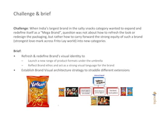
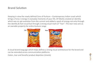
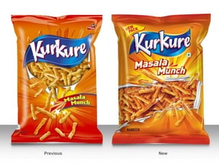
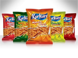
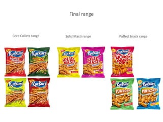


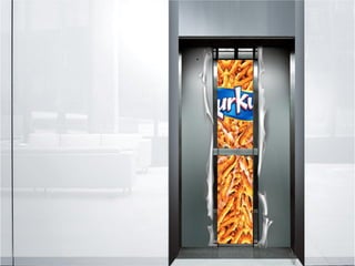
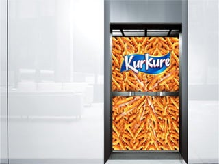

The document discusses the challenges faced by Kurkure in redefining its brand identity to expand into new product categories while maintaining its strong brand equity. It outlines the objectives of refreshing the visual identity and establishing a brand architecture strategy to support various product extensions. The proposed solution includes a new energetic visual identity characterized by a distinctive 'tear' mark, aimed at appealing to contemporary Indian consumers.


