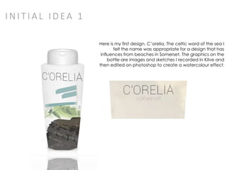
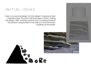
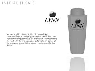
K I LV E C O U RT
S TA R K I E R E AY
W H AT I FO U N D AT K I LV E
KILVE ALLOWED ME TO GET A FIRST HAND
EXPERIENCE OF THE NORTH COAST OF
SOUTH WEST ENGLAND. WITH IT’S
EXPANSIVE BEACHES AND BIG FIELDS
KILVE IS A GREAT TO RECORD STUDIES
OF THE ENGLAND’S COUNTRY/SEASIDE.
KILVE ALSO GAVE ME A CONTRAST TO
NORMAL LIVING IN LONDON. THE
BEACHES ARE FULL OF WELL FORMED
ROCKS WHICH ALLOW FOR INTERESTING
STUDIES.
M Y C H O I C ES FO R T H E P ROJ EC T S O FA R
AFTER SELECTING THE GRAPHICS PATHWAY I
DECIDED WHAT I WAS GOING TO DO FOR THE
PROJECT. AFTER LOOKING AT A FEW POSSIBLE
OPTIONS FOR THE GRAPHICS BRIEF I DECIDED
THAT I WANTED TO DESIGN A PRODUCT THAT
HAS INFLUENCES FROM BOTH KILVE AND
SOMERSET. AFTER RESEARCHING MORE
THOROUGHLY I DECIDED THAT DESIGNING A
SHAMPOO PRODUCT’S BRANDING WOULD BE
THE BEST IDEA. THIS WOULD ALLOW ME TO USE
A VARIETY OF GRAPHIC TECHNIQUES BUT
WOULD ALSO HAVE SOME MOTIVATION WHEN
DESIGNING AND WOULDN’T LEAVE ME LOST FOR
IDEAS IN OTHER AREAS OF THE PATHWAY
M Y B R I E F
T O C R E A T E A S H A M P O O D I S P E N S E R D E S I G N U S I N G I N S P I R A T I O N F R O M T H E
R E C O R D E D R E S E A R C H I H A V E F R O M K I L V E , S O M E R S E T.
I W I L L H A V E T O D E S I G N T H E L O G O , B O T T L E D E S I G N A N D P O S T E R T O G O
W I T H I T.
I N I T I A L I D EA 1
Here is my first design. C’orelia, The celtic word of the sea I
felt the name was appropriate for a design that has
influences from beaches in Somerset. The graphics on the
bottle are images and sketches I recorded in Kilve and
then edited on photoshop to create a watercolour effect.
I N I T I A L I D EA 2
Here is my second design. For this design I’m going to take
inspiration from the rocky cliff faces seen in Kilve. Calling
this design ‘ORE’ another word for rock I’m going to brand
this product using bottles in the style of a rock formation
building up the bottle.
I N I T I A L I D EA 3
A more traditional approach, this design takes
inspiration from not only my pictures of the trip but also
from current logos already on the market. Incorporating
the text with the image above automatically connects
the image of kilve with the name I’ve come up for this
design.
CONCLUSION
Overall My second concept is my favourite.
I feel this design has the most potential as well as
having a massive branding potential. I will be
able to incorporate it into a serious of bottles,
posters with ease.
I also feel that it has more similarities with my
original inspiration ‘’Kilve’’ then any other of my
designs, which is vital if I’m creating a product
based on Somerset.

Kilve propsals

  • 1.
    K I LVE C O U RT S TA R K I E R E AY
  • 2.
    W H ATI FO U N D AT K I LV E KILVE ALLOWED ME TO GET A FIRST HAND EXPERIENCE OF THE NORTH COAST OF SOUTH WEST ENGLAND. WITH IT’S EXPANSIVE BEACHES AND BIG FIELDS KILVE IS A GREAT TO RECORD STUDIES OF THE ENGLAND’S COUNTRY/SEASIDE. KILVE ALSO GAVE ME A CONTRAST TO NORMAL LIVING IN LONDON. THE BEACHES ARE FULL OF WELL FORMED ROCKS WHICH ALLOW FOR INTERESTING STUDIES.
  • 3.
    M Y CH O I C ES FO R T H E P ROJ EC T S O FA R AFTER SELECTING THE GRAPHICS PATHWAY I DECIDED WHAT I WAS GOING TO DO FOR THE PROJECT. AFTER LOOKING AT A FEW POSSIBLE OPTIONS FOR THE GRAPHICS BRIEF I DECIDED THAT I WANTED TO DESIGN A PRODUCT THAT HAS INFLUENCES FROM BOTH KILVE AND SOMERSET. AFTER RESEARCHING MORE THOROUGHLY I DECIDED THAT DESIGNING A SHAMPOO PRODUCT’S BRANDING WOULD BE THE BEST IDEA. THIS WOULD ALLOW ME TO USE A VARIETY OF GRAPHIC TECHNIQUES BUT WOULD ALSO HAVE SOME MOTIVATION WHEN DESIGNING AND WOULDN’T LEAVE ME LOST FOR IDEAS IN OTHER AREAS OF THE PATHWAY
  • 4.
    M Y BR I E F T O C R E A T E A S H A M P O O D I S P E N S E R D E S I G N U S I N G I N S P I R A T I O N F R O M T H E R E C O R D E D R E S E A R C H I H A V E F R O M K I L V E , S O M E R S E T. I W I L L H A V E T O D E S I G N T H E L O G O , B O T T L E D E S I G N A N D P O S T E R T O G O W I T H I T.
  • 5.
    I N IT I A L I D EA 1 Here is my first design. C’orelia, The celtic word of the sea I felt the name was appropriate for a design that has influences from beaches in Somerset. The graphics on the bottle are images and sketches I recorded in Kilve and then edited on photoshop to create a watercolour effect.
  • 6.
    I N IT I A L I D EA 2 Here is my second design. For this design I’m going to take inspiration from the rocky cliff faces seen in Kilve. Calling this design ‘ORE’ another word for rock I’m going to brand this product using bottles in the style of a rock formation building up the bottle.
  • 7.
    I N IT I A L I D EA 3 A more traditional approach, this design takes inspiration from not only my pictures of the trip but also from current logos already on the market. Incorporating the text with the image above automatically connects the image of kilve with the name I’ve come up for this design.
  • 8.
    CONCLUSION Overall My secondconcept is my favourite. I feel this design has the most potential as well as having a massive branding potential. I will be able to incorporate it into a serious of bottles, posters with ease. I also feel that it has more similarities with my original inspiration ‘’Kilve’’ then any other of my designs, which is vital if I’m creating a product based on Somerset.