Download to read offline
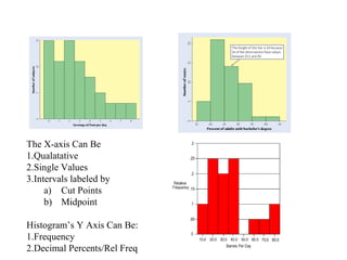
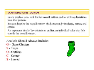
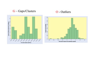
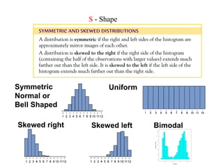
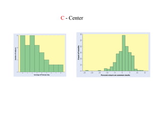
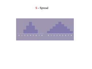
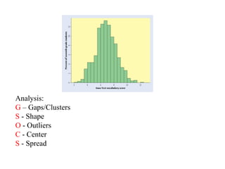
Bar graphs and histograms can be used to visualize data distributions. The x-axis of a bar graph or histogram can represent qualitative values, single data points, or intervals defined by cut points or midpoints, while the y-axis represents frequency or relative frequency. When analyzing bar graphs and histograms, one should examine the gaps/clusters in the data, the shape of the distribution, any outliers, the central tendency, and the spread or variability of the values. Common distribution shapes include uniform, normal, skewed right or left, and bimodal.


![[DSC Europe 25] Milos Belcevic - Product Professional's Journey to Full-Stack...](https://cdn.slidesharecdn.com/ss_thumbnails/1zovd6fgsycdg4wvgvls-milos-belcevic-product-professionals-journey-to-full-stack-product-developer-260123083019-d993120d-thumbnail.jpg?width=640&height=640&fit=bounds)


![[DSC Europe 25] Raul Cruz Bonilla - Harnessing GEN AI in Fashion, Luxury and ...](https://cdn.slidesharecdn.com/ss_thumbnails/me7nvup5thwqzwzblbvw-raul-cruz-harnessing-ai-en-luxury-260123083019-32ac5a43-thumbnail.jpg?width=640&height=640&fit=bounds)

![[DSC Europe 25] Josip Saban - Career building for data professionals.pptx](https://cdn.slidesharecdn.com/ss_thumbnails/zroflcttkm1vmli0txea-josip-saban-career-building-for-data-professionals-260123083019-587cdb8c-thumbnail.jpg?width=640&height=640&fit=bounds)


