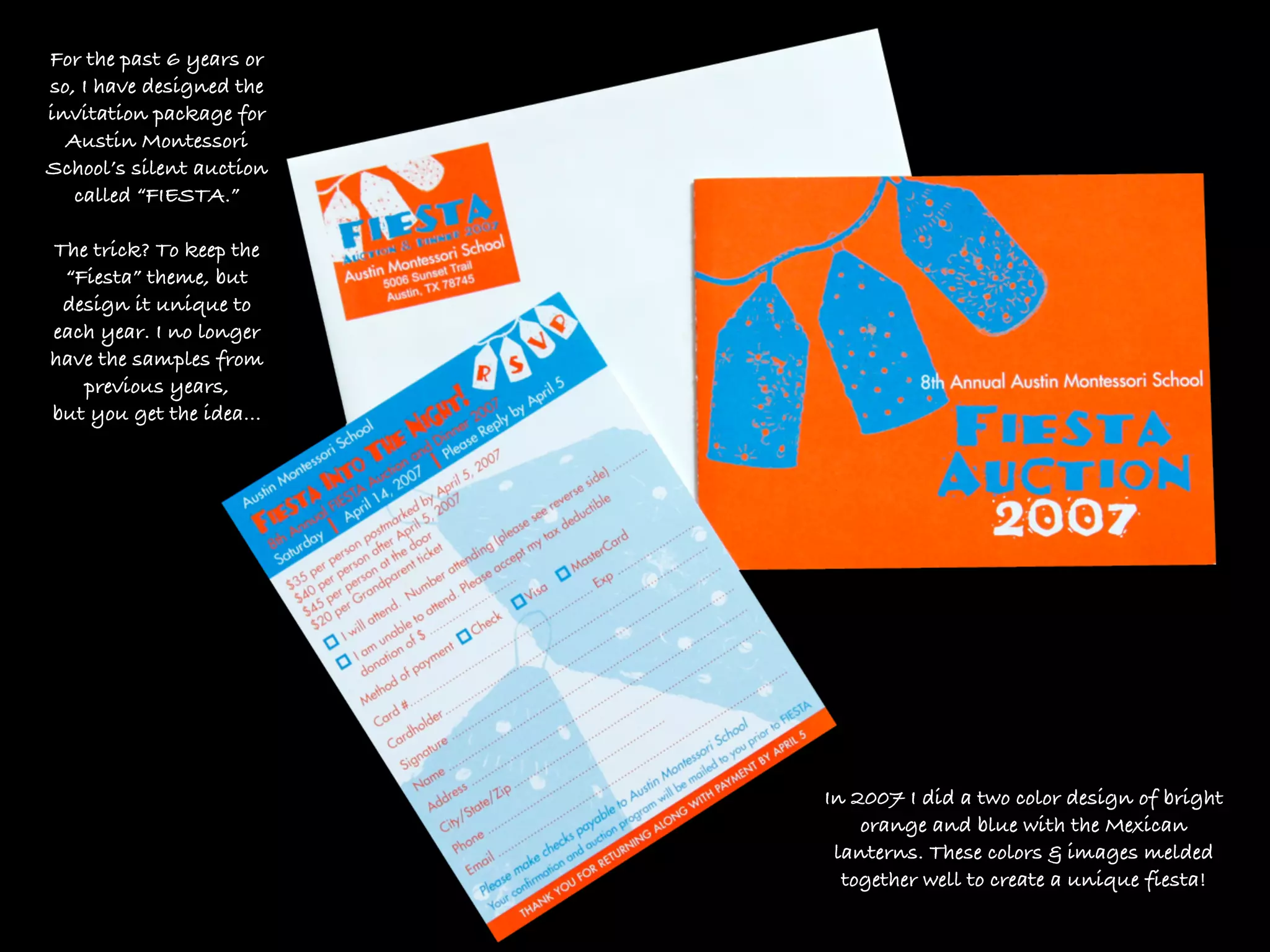
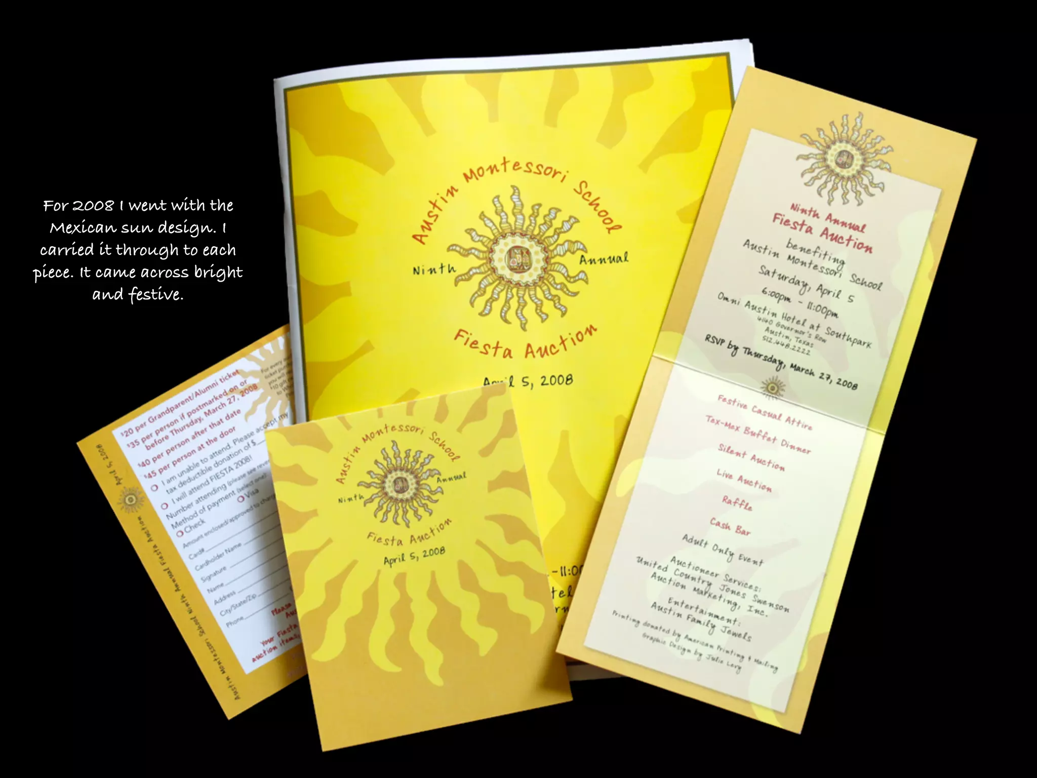
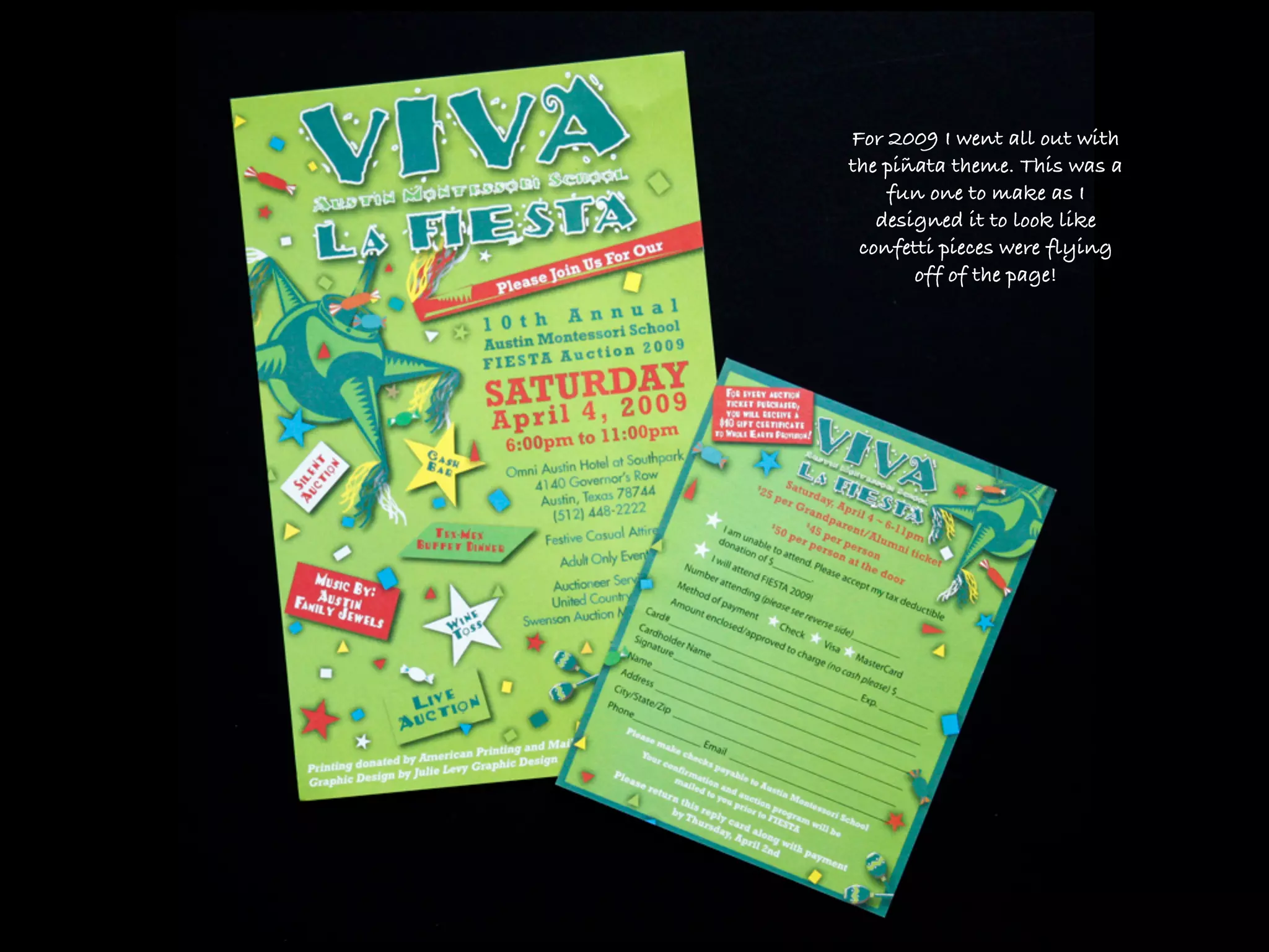
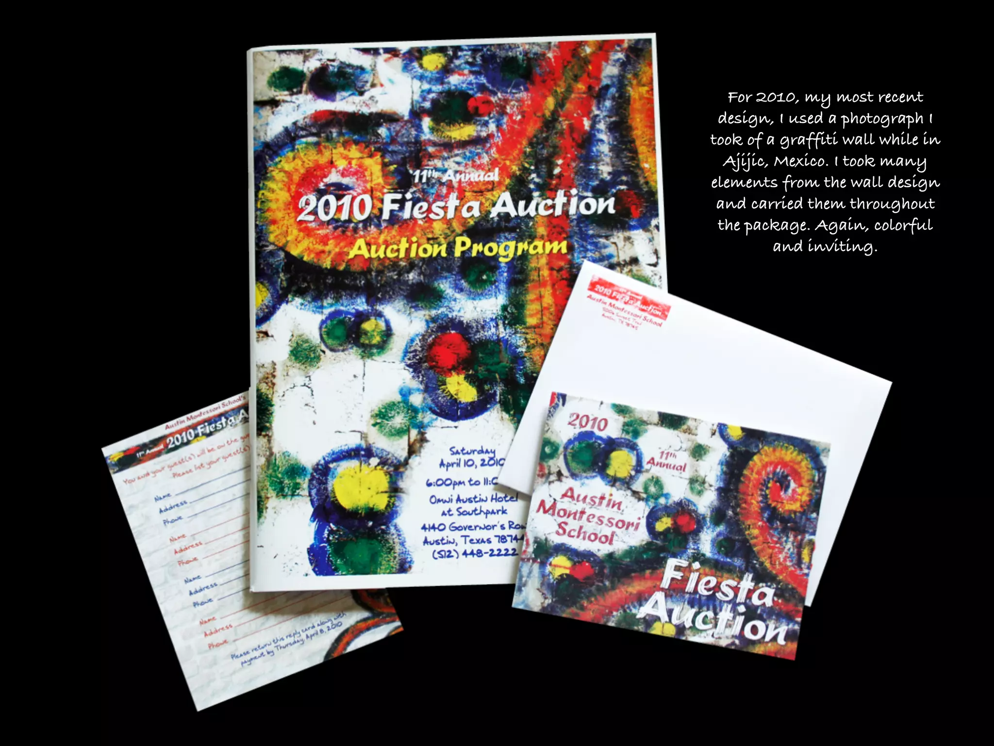
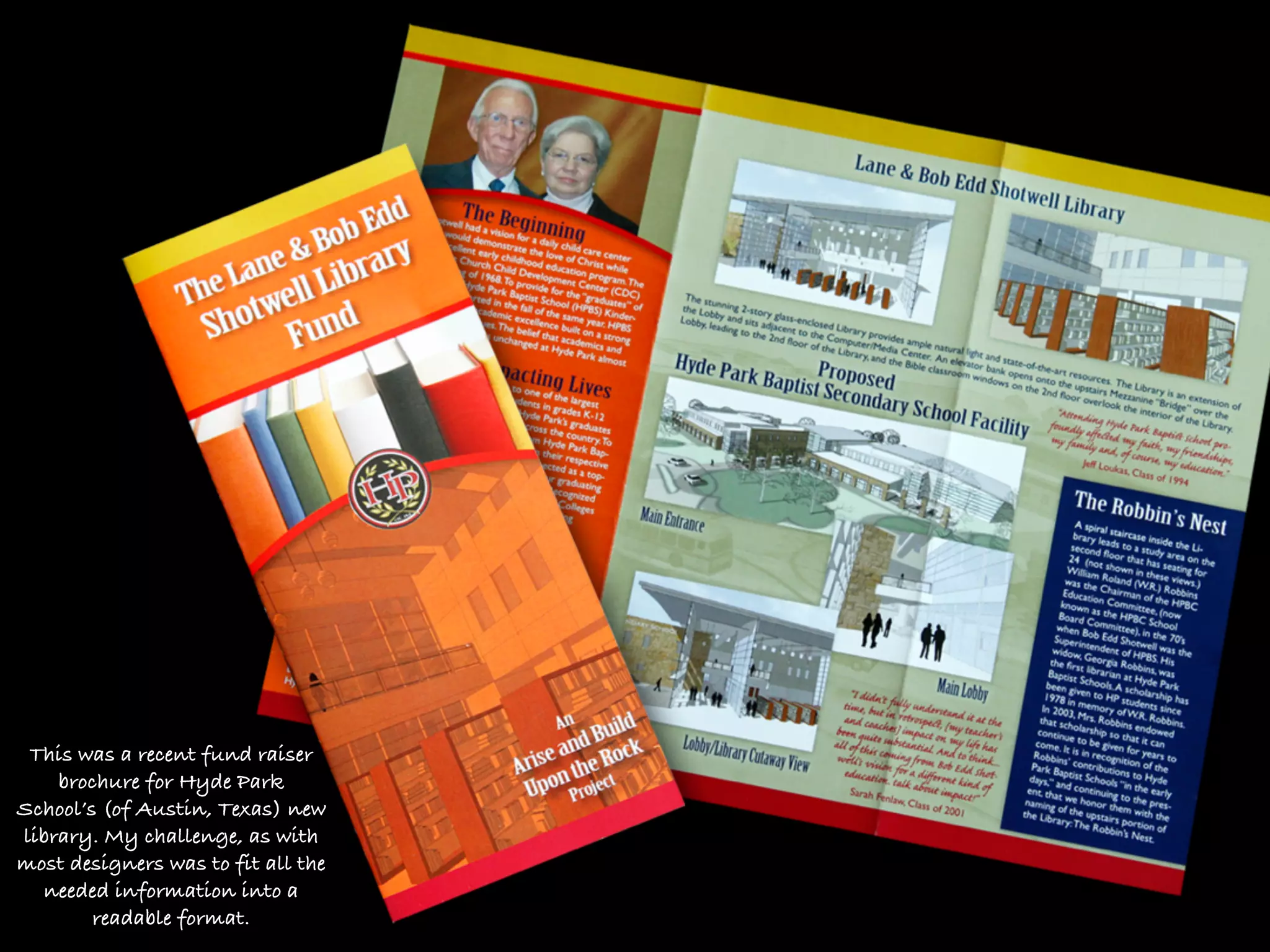
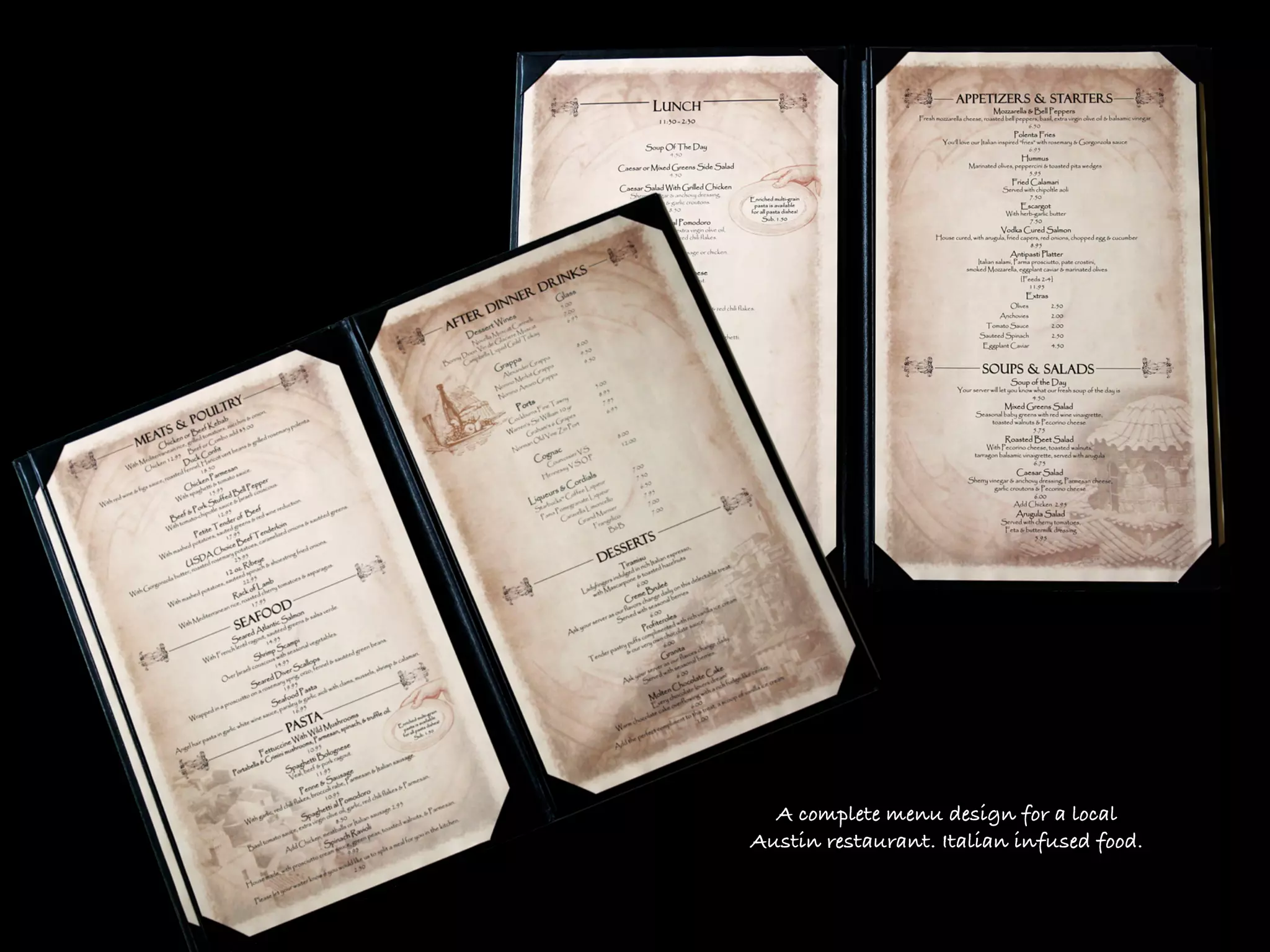
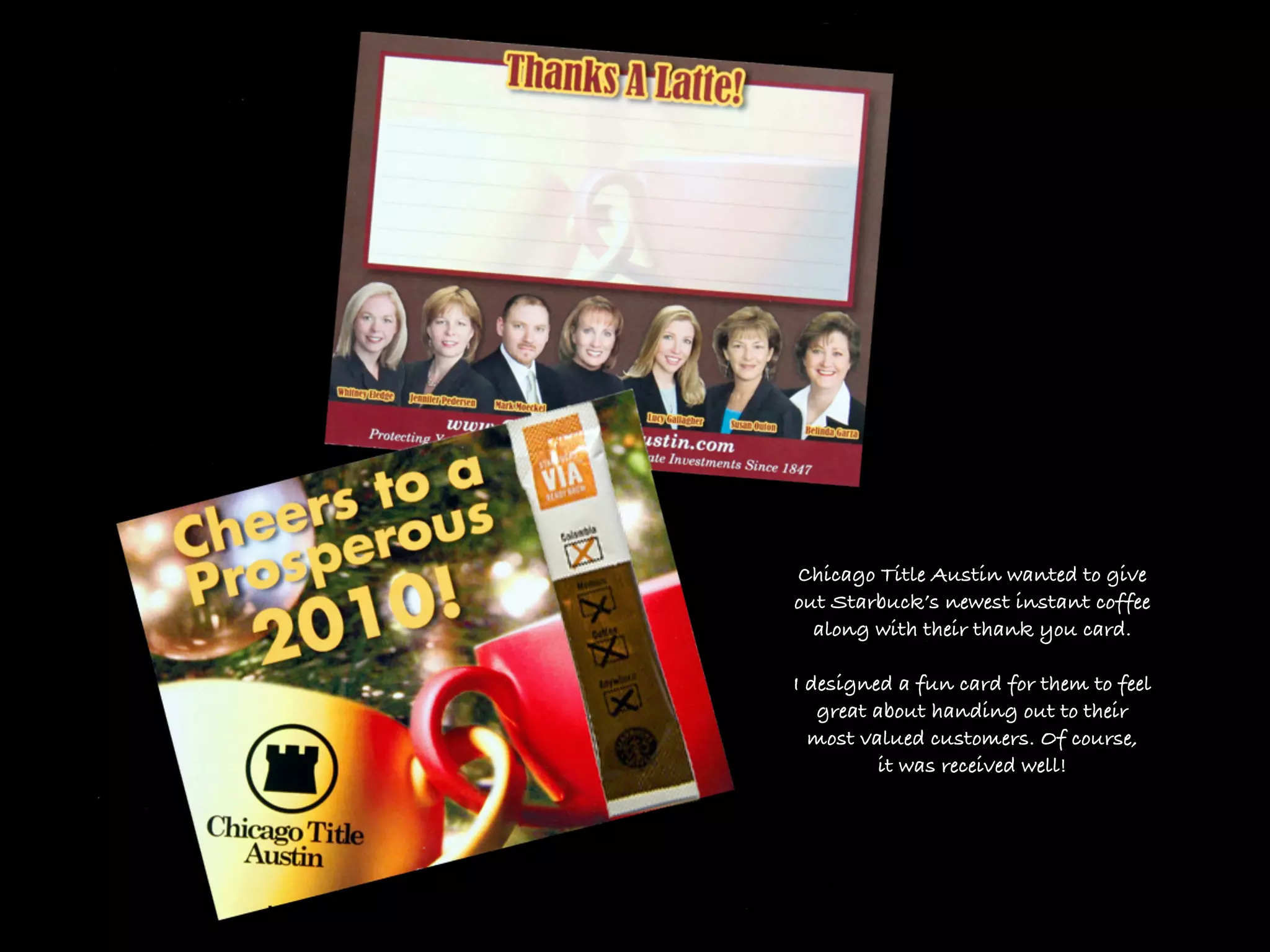
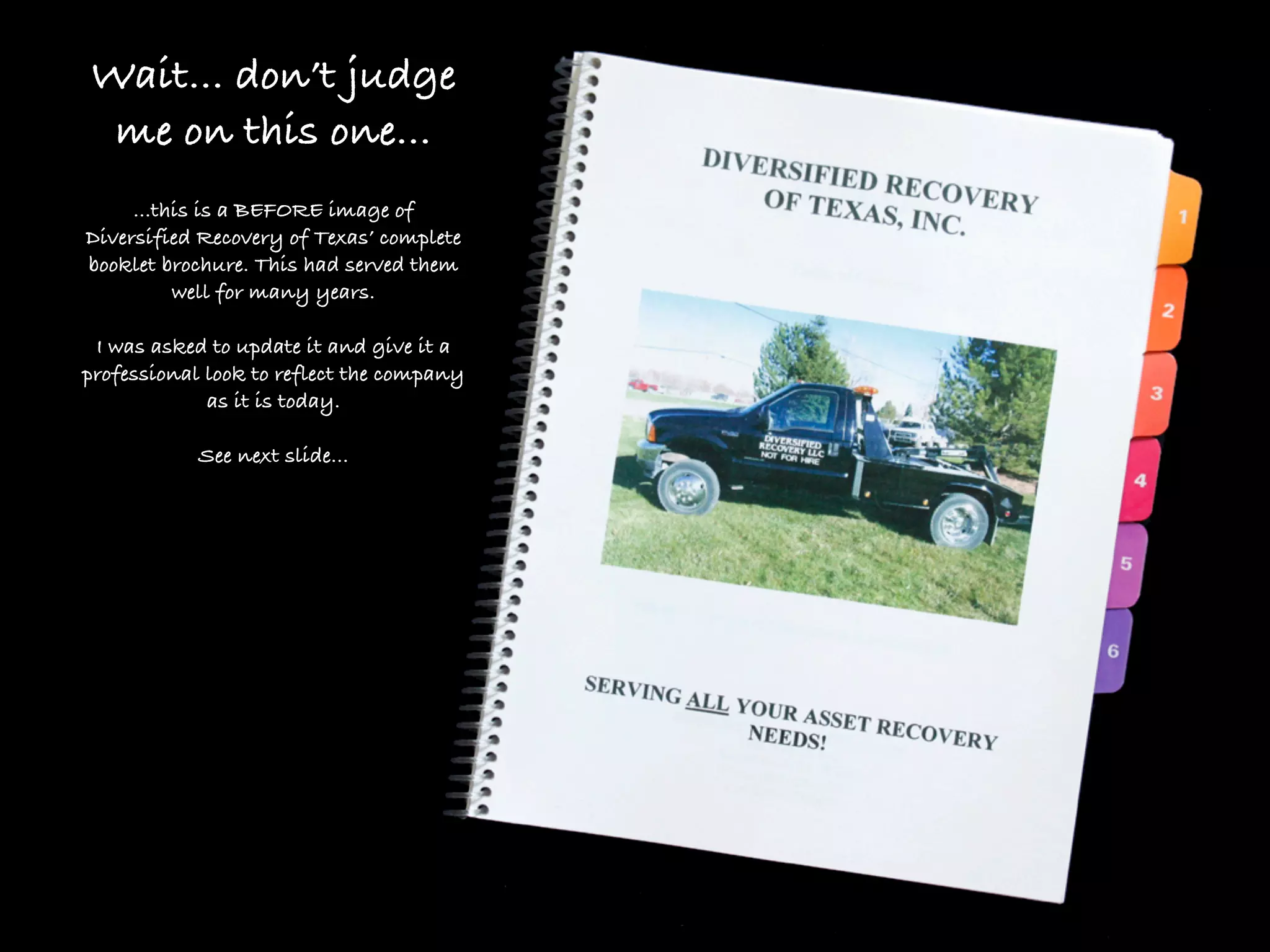
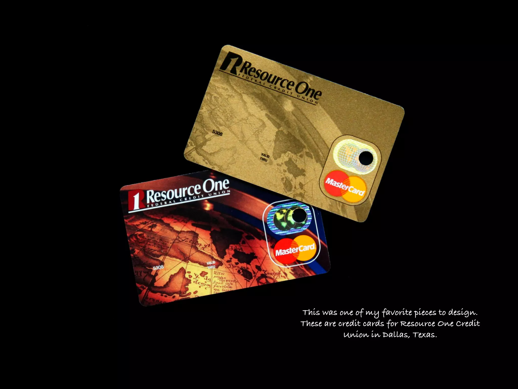
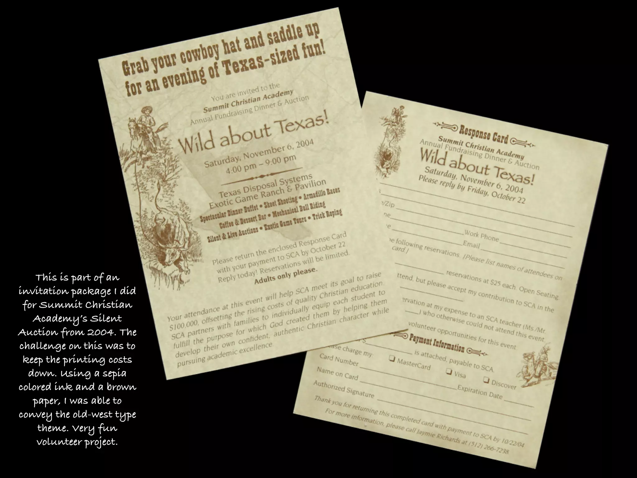
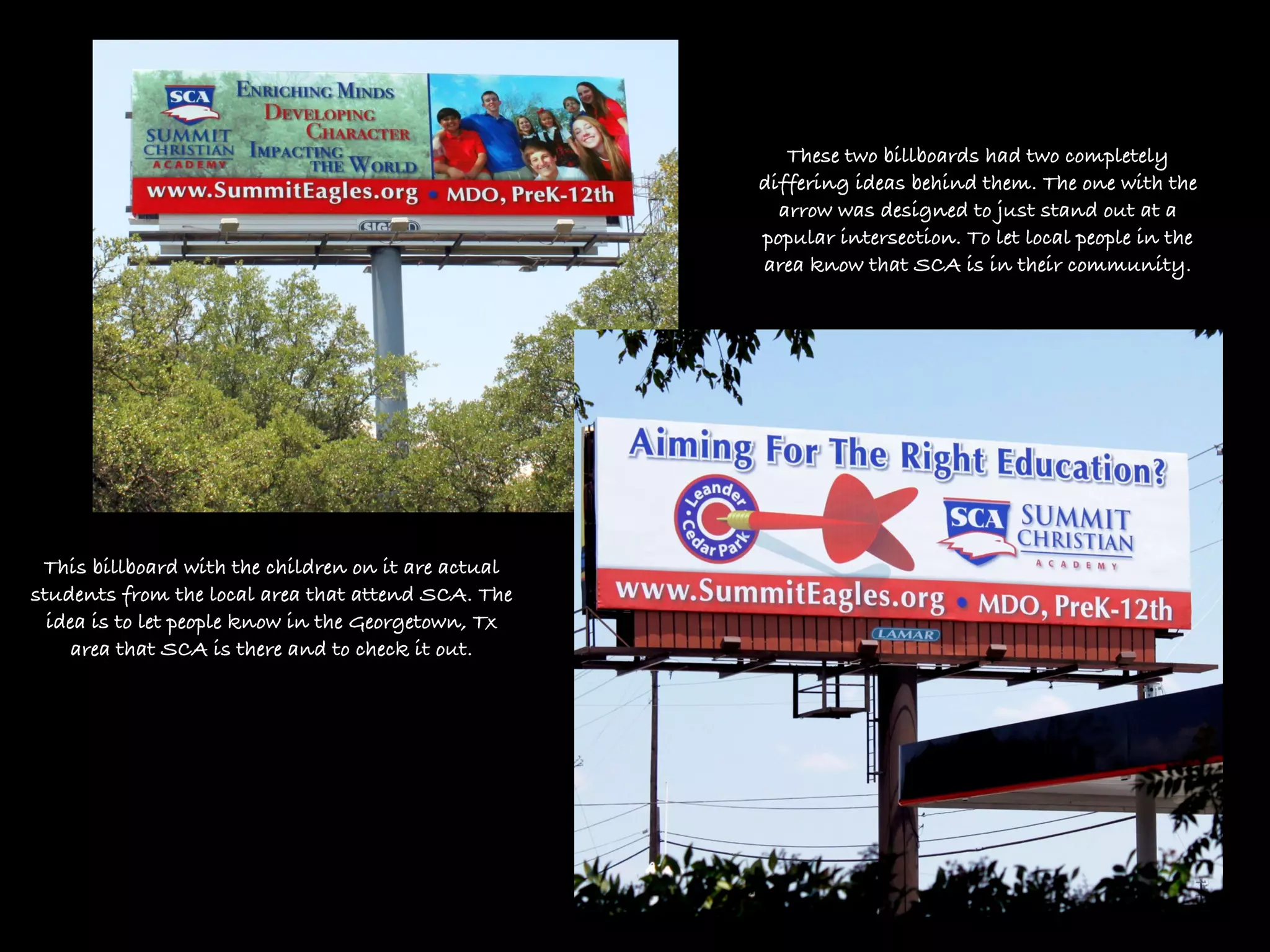
This is just a small sampling of my design work
        over the past many years. However, If I don’t start
               putting something up, I’ll never do it!
              So, please peruse through these samples.
                I will update as my schedule allows.

I’d love to meet with you to discuss any new projects you may have
  or to look at your present materials or website to look at doing a
                        “collateral makeover.”

                              Enjoy!

                            Julie Levy
                          512.785.2544
For the past 6 years or
so, I have designed the
invitation package for
  Austin Montessori
School’s silent auction
   called “FIESTA.”

The trick? To keep the
 “Fiesta” theme, but
 design it unique to
each year. I no longer
have the samples from
   previous years,
but you get the idea...


                          In 2007 I did a two color design of bright
                              orange and blue with the Mexican
                           lanterns. These colors & images melded
                            together well to create a unique fiesta!
For 2008 I went with the
  Mexican sun design. I
 carried it through to each
piece. It came across bright
         and festive.
For 2009 I went all out with
the piñata theme. This was a
    fun one to make as I
   designed it to look like
 confetti pieces were flying
       off of the page!
For 2010, my most recent
 design, I used a photograph I
took of a graffiti wall while in
  Ajijic, Mexico. I took many
elements from the wall design
 and carried them throughout
 the package. Again, colorful
          and inviting.
This was a recent fund raiser
    brochure for Hyde Park
School’s (of Austin, Texas) new
library. My challenge, as with
most designers was to fit all the
  needed information into a
        readable format.
A complete menu design for a local
Austin restaurant. Italian infused food.
Mail out campaign for Summit Christian Academy in Cedar Park Texas.

     The idea was to introduce Byron Webre, a former Austin area Chief
Meteorologist to prospective families as well as to invite them to an open house.
Chicago Title Austin wanted to give
out Starbuck’s newest instant coffee
  along with their thank you card.

I designed a fun card for them to feel
   great about handing out to their
  most valued customers. Of course,
         it was received well!
Wait... don’t judge
 me on this one...
     ...this is a BEFORE image of
Diversified Recovery of Texas’ complete
booklet brochure. This had served them
          well for many years.

 I was asked to update it and give it a
professional look to reflect the company
             as it is today.

            See next slide...
This sales book is one that goes to all kinds of potential clients. The one they really want to reach is larger
        banks who need a professional recovery service for those who have defaulted on their loans.

My solution on this one was to take the book to a horizontal book. This way, it will stick out just a bit on a
bookshelf. With a limited printing budget, I designed this to have an embossed look and feel. We had this
                printed on a small run with digital printing and it came out beautiful!
To the left:
    The previous brochure book’s inside.

                 Below:
The re-designed brochure book. We updated
   all of the photos to reflect their newest
 vehicles. By doing shorter printing runs,
I can swap out pages when new equipment
       or new certificates are secured.

I thoroughly enjoyed working on this project
    as I love doing “collateral makeovers!”
This was one of my favorite pieces to design.
These are credit cards for Resource One Credit
           Union in Dallas, Texas.
This is part of an
invitation package I did
 for Summit Christian
   Academy’s Silent
Auction from 2004. The
challenge on this was to
 keep the printing costs
  down. Using a sepia
colored ink and a brown
   paper, I was able to
convey the old-west type
    theme. Very fun
    volunteer project.
These two billboards had two completely
                                                     differing ideas behind them. The one with the
                                                       arrow was designed to just stand out at a
                                                     popular intersection. To let local people in the
                                                     area know that SCA is in their community.


 This billboard with the children on it are actual
students from the local area that attend SCA. The
  idea is to let people know in the Georgetown, Tx
     area that SCA is there and to check it out.
Thanks for looking!
More images coming soon.

       Julie Levy
     512.785.2544

J Levy Graphic Design Samples

  • 1.
    This is justa small sampling of my design work over the past many years. However, If I don’t start putting something up, I’ll never do it! So, please peruse through these samples. I will update as my schedule allows. I’d love to meet with you to discuss any new projects you may have or to look at your present materials or website to look at doing a “collateral makeover.” Enjoy! Julie Levy 512.785.2544
  • 2.
    For the past6 years or so, I have designed the invitation package for Austin Montessori School’s silent auction called “FIESTA.” The trick? To keep the “Fiesta” theme, but design it unique to each year. I no longer have the samples from previous years, but you get the idea... In 2007 I did a two color design of bright orange and blue with the Mexican lanterns. These colors & images melded together well to create a unique fiesta!
  • 3.
    For 2008 Iwent with the Mexican sun design. I carried it through to each piece. It came across bright and festive.
  • 4.
    For 2009 Iwent all out with the piñata theme. This was a fun one to make as I designed it to look like confetti pieces were flying off of the page!
  • 5.
    For 2010, mymost recent design, I used a photograph I took of a graffiti wall while in Ajijic, Mexico. I took many elements from the wall design and carried them throughout the package. Again, colorful and inviting.
  • 6.
    This was arecent fund raiser brochure for Hyde Park School’s (of Austin, Texas) new library. My challenge, as with most designers was to fit all the needed information into a readable format.
  • 7.
    A complete menudesign for a local Austin restaurant. Italian infused food.
  • 8.
    Mail out campaignfor Summit Christian Academy in Cedar Park Texas. The idea was to introduce Byron Webre, a former Austin area Chief Meteorologist to prospective families as well as to invite them to an open house.
  • 9.
    Chicago Title Austinwanted to give out Starbuck’s newest instant coffee along with their thank you card. I designed a fun card for them to feel great about handing out to their most valued customers. Of course, it was received well!
  • 10.
    Wait... don’t judge me on this one... ...this is a BEFORE image of Diversified Recovery of Texas’ complete booklet brochure. This had served them well for many years. I was asked to update it and give it a professional look to reflect the company as it is today. See next slide...
  • 11.
    This sales bookis one that goes to all kinds of potential clients. The one they really want to reach is larger banks who need a professional recovery service for those who have defaulted on their loans. My solution on this one was to take the book to a horizontal book. This way, it will stick out just a bit on a bookshelf. With a limited printing budget, I designed this to have an embossed look and feel. We had this printed on a small run with digital printing and it came out beautiful!
  • 12.
    To the left: The previous brochure book’s inside. Below: The re-designed brochure book. We updated all of the photos to reflect their newest vehicles. By doing shorter printing runs, I can swap out pages when new equipment or new certificates are secured. I thoroughly enjoyed working on this project as I love doing “collateral makeovers!”
  • 13.
    This was oneof my favorite pieces to design. These are credit cards for Resource One Credit Union in Dallas, Texas.
  • 14.
    This is partof an invitation package I did for Summit Christian Academy’s Silent Auction from 2004. The challenge on this was to keep the printing costs down. Using a sepia colored ink and a brown paper, I was able to convey the old-west type theme. Very fun volunteer project.
  • 15.
    These two billboardshad two completely differing ideas behind them. The one with the arrow was designed to just stand out at a popular intersection. To let local people in the area know that SCA is in their community. This billboard with the children on it are actual students from the local area that attend SCA. The idea is to let people know in the Georgetown, Tx area that SCA is there and to check it out.
  • 16.
    Thanks for looking! Moreimages coming soon. Julie Levy 512.785.2544