Flex Web Development.pdf
•
0 likes•2 views

Flex web development, also known as Flexbox, is a powerful and versatile CSS layout model that allows you to design responsive and dynamic web pages with ease. In this article, we will explore the concept of Flexbox, its composition, and provide a step-by-step explanation to help you master this essential web development tool.

Recommended
More Related Content
Similar to Flex Web Development.pdf
Similar to Flex Web Development.pdf (20)
More from SEO expate Bangladesh Ltd
More from SEO expate Bangladesh Ltd (20)
Recently uploaded
Recently uploaded (20)
Flex Web Development.pdf
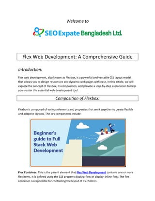
- 1. Welcome to Flex Web Development: A Comprehensive Guide Introduction: Flex web development, also known as Flexbox, is a powerful and versatile CSS layout model that allows you to design responsive and dynamic web pages with ease. In this article, we will explore the concept of Flexbox, its composition, and provide a step-by-step explanation to help you master this essential web development tool. Composition of Flexbox: Flexbox is composed of various elements and properties that work together to create flexible and adaptive layouts. The key components include: Flex Container: This is the parent element that Flex Web Development contains one or more flex items. It is defined using the CSS property display: flex; or display: inline-flex;. The flex container is responsible for controlling the layout of its children.
- 2. Flex Items: These are the child elements of the flex container. Each item can have its own set of properties, allowing you to control how they behave within the container. Main and Cross Axis: Flexbox works in two primary axes, the main axis and the cross axis. The main axis is defined by the direction of the flex container (horizontal or vertical), and the cross axis is perpendicular to it. Flex Properties: Key properties like flex-direction, justify-content, align-items, and align-self play a crucial role in defining the layout of both the container and its items. Explanation: Now, let's dive into a step-by-step explanation of how to use Flexbox in web development: Step 1: Create a Flex Container To begin, you need to create a flex container by setting the display property to either flex or inline-flex. This defines the main axis direction and sets the stage for the layout.
- 3. Step 2: Define the Main and Cross Axes Determine the main axis direction by using the flex-direction property. The default value is row, which creates a horizontal main axis, but you can also use column for a vertical main axis. Step 3: Positioning Flex Items Use properties like justify-content to control how items are distributed along the main axis and align-items to control their alignment on the cross axis. Step 4: Customize Individual Flex Items You can further fine-tune individual flex items with the align-self property. This allows specific items to override the container's alignment. Step 5: Embrace Flexibility Flexbox is known for its ability to adapt to varying content and screen sizes. As you add or remove items, the layout adjusts automatically, making it an excellent choice for responsive design.
- 4. Conclusion: Flex web development, or Flexbox, is a versatile and essential tool for creating responsive and dynamic web layouts. Understanding the composition and application of Flexbox is crucial for modern web developers. By following the step-by-step guide outlined in this article, you can harness the power of Flexbox to create flexible and visually appealing web designs. Whether you are a beginner or an experienced developer, mastering Flexbox will enhance your web development skills and allow you to build web pages that adapt seamlessly to different devices and screen sizes. Flex web development refers to the process of building websites or web applications using Flexbox, a layout model in CSS (Cascading Style Sheets). Flexbox, short for Flexible Box Layout, provides an efficient way to design and structure web content, making it responsive and adaptable to various screen sizes and devices. In this article, we'll delve into the composition, explanation, and step-by-step process of using Flexbox for web development. Composition of Flexbox Flexbox is composed of several key elements that work together to create flexible and responsive layouts for web pages. These elements include:
- 5. 1. Flex Container: A flex container is an HTML element that contains one or more flex items. It is defined by applying the display: flex or display: inline-flex property in the CSS to an element. This element becomes the parent for all its flex items. 2. Flex Items: Flex items are the child elements within a flex container. They are the elements that you want to arrange or align within the container. Each flex item can have its own set of properties to control its behavior. 3. Main Axis: The main axis is the primary axis along which flex items are aligned. By default, this axis runs horizontally. You can change its direction using the flex-direction property. 4. Cross Axis: The cross axis is perpendicular to the main axis. It's the secondary axis along which flex items can be aligned. 5. Flex Properties: Flex properties, such as flex-grow, flex-shrink, and flex-basis, allow you to control how flex items grow, shrink, and size themselves within the flex container. Explanation of Flexbox
- 6. Flexbox simplifies the process of creating complex and responsive layouts by providing a powerful set of tools for alignment and distribution of space. Here are some key concepts and properties to understand: 1. Main and Cross Axis: The main axis is determined by the flex-direction property. You can align flex items along this axis using properties like justify-content and align-content. The cross axis can be controlled with align-items and align-self. 2. Flexibility: Flex items can grow and shrink based on the available space within the flex container. The flex property allows you to specify the growth factor, shrink factor, and initial size of a flex item. 3. Ordering: The order property allows you to change the visual order of flex items within the flex container without altering the HTML structure. 4. Wrapping: You can control how flex items wrap to the next line using the flex-wrap property. This is useful for creating responsive layouts. Step-by-Step Flex Web Development Let's outline a step-by-step process for using Flexbox in web development: 1. Create HTML Structure: Start by defining the HTML structure of your webpage or web application. Identify the sections or elements that need flexible layouts. 2. Apply Flex Container: Select the parent element that will serve as the flex container and apply display: flex or display: inline-flex to it in your CSS.
- 7. 3. Define Flex Items: Identify the child elements that will be flex items within the container and specify their individual properties as needed. 4. Control Flexbox Properties: Use Flexbox properties like justify-content, align-items, and flex to control the layout and alignment of your flex items. 5. Responsive Design: Utilize media queries and adjust flex properties to create a responsive design that adapts to various screen sizes and devices. 6. Test and Refine: Continuously test your layout on different devices and browsers, making adjustments as necessary to ensure a seamless user experience. In conclusion, Flexbox is a powerful tool for web development that simplifies the creation of flexible and responsive layouts. By understanding the composition, explanation, and following a step-by-step process, you can harness the full potential of Flexbox to design visually appealing and user-friendly websites and web applications. Contact US Website: https://www.seoexpartebd.com/ Email: info@seoexpartebd.com WhatsApp: +8801758300772 Address: Head Office Shajapur Kagji para, Majhira, Shajahanpur 5801, Bogura, Banlgladesh Thank you