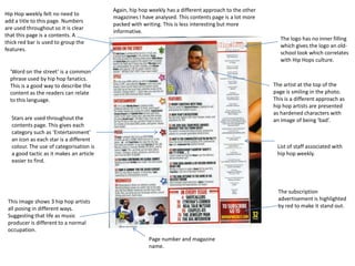
1. Hip Hop weekly felt no need to
add a title to this page. Numbers
are used throughout so it is clear
that this page is a contents. A
thick red bar is used to group the
features.
Again, hip hop weekly has a different approach to the other
magazines I have analysed. This contents page is a lot more
packed with writing. This is less interesting but more
informative.
The logo has no inner filling
which gives the logo an oldschool look which correlates
with Hip Hops culture.
‘Word on the street’ is a common
phrase used by hip hop fanatics.
This is a good way to describe the
content as the readers can relate
to this language.
The artist at the top of the
page is smiling in the photo.
This is a different approach as
hip hop artists are presented
as hardened characters with
an image of being ‘bad’.
Stars are used throughout the
contents page. This gives each
category such as ‘Entertainment’
an icon as each star is a different
colour. The use of categorisation is
a good tactic as it makes an article
easier to find.
List of staff associated with
hip hop weekly.
The subscription
advertisement is highlighted
by red to make it stand out.
This image shows 3 hip hop artists
all posing in different ways.
Suggesting that life as music
producer is different to a normal
occupation.
Page number and magazine
name.