Download to read offline

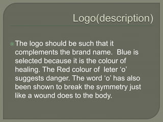
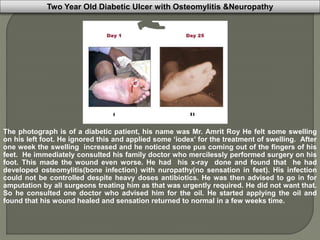
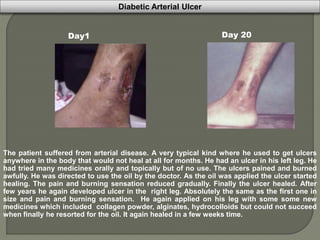

The document discusses the branding strategy for a new wound treatment product called "Healwound". Key points: - The brand name "Healwound" was chosen to clearly communicate the product's purpose of healing wounds to its target market of wound patients. - The logo features green letters with a red "o" to symbolize healing and danger, mirroring how a wound disrupts the body. - Case studies are presented showing "Healwound" effectively treating severe wounds like necrotizing gangrene and diabetic ulcers that did not respond to other treatments.


![4_5933593097194704354[1].pptx](https://cdn.slidesharecdn.com/ss_thumbnails/459335930971947043541-230123122719-1e0eaf18-thumbnail.jpg?width=640&height=640&fit=bounds)


