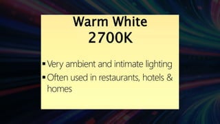
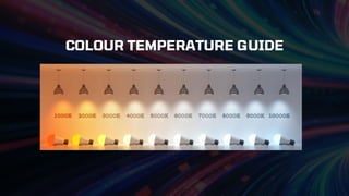
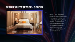
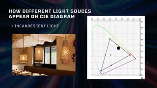
emits a soft,yellowish
glow, similar to traditional
incandescent bulbs and
candlelight. This lighting
creates a comfortable,
inviting, and intimate
atmosphere, making it
ideal for residential
spaces, hospitality, and
relaxation areas.
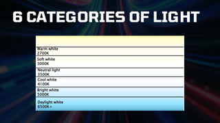
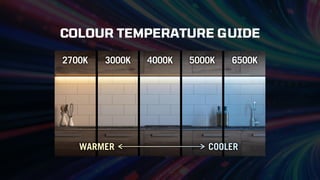
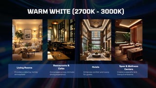
WARM WHITE (2700K - 3000K)
16.
Living Rooms Hotels
Restaurants&
Cafés
Spas & Wellness
Centers
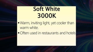
Encourages a cozy, intimate
dining experience.
Provides a relaxing, homey
atmosphere.
Creates a peaceful and
tranquil ambiance.
WARM WHITE (2700K - 3000K)
Enhances comfort and luxury
for guests.
17.
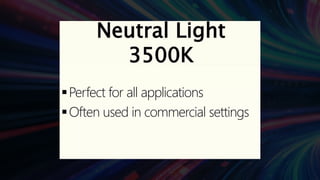
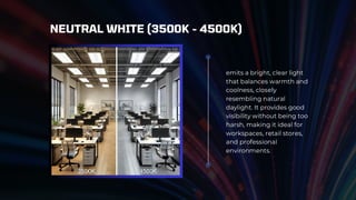
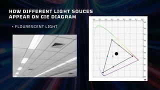
emits a bright,clear light
that balances warmth and
coolness, closely
resembling natural
daylight. It provides good
visibility without being too
harsh, making it ideal for
workspaces, retail stores,
and professional
environments.
NEUTRAL WHITE (3500K - 4500K)
18.
OFFICES & CLASSROOMSSUPERMAKETS & MALLS
Reduces eye strain and keeps people alert without
feeling too cold or clinical.
Ensures good visibility while maintaining a
pleasant shopping experience.
NEUTRAL WHITE (3500K - 4500K)
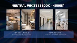
19.
KITCHENS & BATHROOMSHOSPITALS & CLINICS
Provides clear lighting for food preparation,
grooming, and cleaning.
Creates a clean yet comfortable environment for
healthcare.
NEUTRAL WHITE (3500K - 4500K)
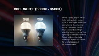
20.
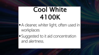
emits a crisp,bright white
light with a slight bluish
tone. It is sharper and more
stimulating than neutral
white, making it ideal for
task-oriented and high-
visibility environments. This
lighting enhances alertness,
focus, and productivity,
making it a popular choice
for workplaces and
functional areas.
COOL WHITE (5000K - 6500K)
21.
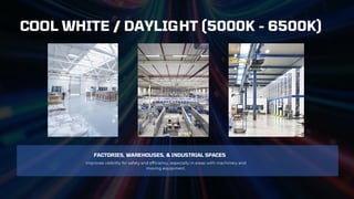
FACTORIES, WAREHOUSES, &INDUSTRIAL SPACES
Improves visibility for safety and efficiency, especially in areas with machinery and
moving equipment.
COOL WHITE / DAYLIGHT (5000K - 6500K)
22.
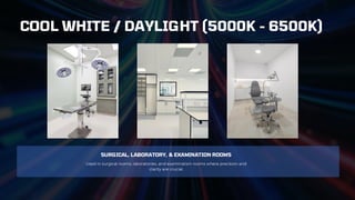
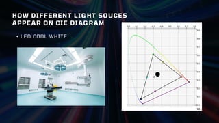
SURGICAL, LABORATORY, &EXAMINATION ROOMS
Used in surgical rooms, laboratories, and examination rooms where precision and
clarity are crucial.
COOL WHITE / DAYLIGHT (5000K - 6500K)
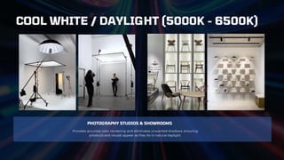
23.
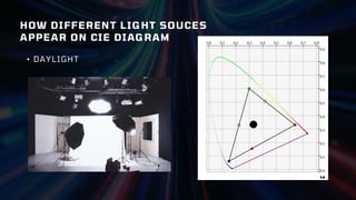
PHOTOGRAPHY STUDIOS &SHOWROOMS
Provides accurate color rendering and eliminates unwanted shadows, ensuring
products and visuals appear as they do in natural daylight.
COOL WHITE / DAYLIGHT (5000K - 6500K)
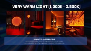
24.
DECORATIVE & MOODLIGHTING
Extreme red/orange light, similar to candle flames and sunrise/sunset. Not
commonly used for general lighting but seen in decorative and mood lighting.
VERY WARM LIGHT (1,000K - 2,500K)
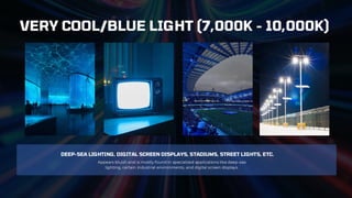
25.
DEEP-SEA LIGHTING, DIGITALSCREEN DISPLAYS, STADIUMS, STREET LIGHTS, ETC.
Appears bluish and is mostly found in specialized applications like deep-sea
lighting, certain industrial environments, and digital screen displays.
VERY COOL/BLUE LIGHT (7,000K - 10,000K)
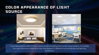
COLOR APPEARANCE OFLIGHT
SOURCE
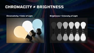
Color appearance refers to how colors are perceived by the human visual system. It involves
the way colors are coded and how they appear in different surroundings and lighting
conditions.
28.
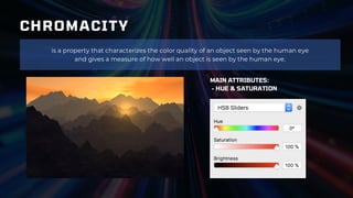
CHROMACITY
is a propertythat characterizes the color quality of an object seen by the human eye
and gives a measure of how well an object is seen by the human eye.
MAIN ATTRIBUTES:
- HUE & SATURATION
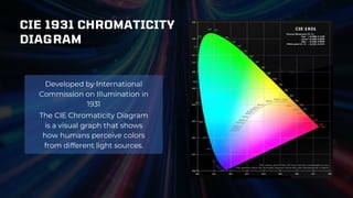
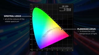
CIE 1931 CHROMATICITY
DIAGRAM
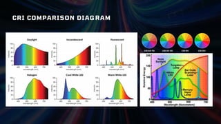
TheCIE Chromaticity Diagram
is a visual graph that shows
how humans perceive colors
from different light sources.
Developed by International
Commission on Illumination in
1931
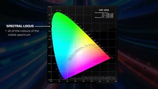
SPECTRAL LOCUS
• allof the colours of the
visible spectrum
PLANCKIAN LOCUS
• It shows the color
temperature of light.
33.
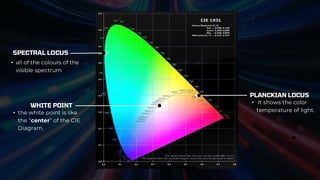
SPECTRAL LOCUS
• allof the colours of the
visible spectrum
PLANCKIAN LOCUS
• It shows the color
temperature of light.
WHITE POINT
• the white point is like
the “center” of the CIE
Diagram.
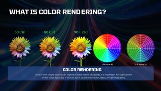
COLOR RENDERING
is howwell a light source can reproduce the colors of objects. It's important for applications
where color accuracy is crucial, such as art restoration, retail, and photography.
WHAT IS COLOR RENDERING?
40.
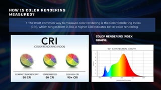
HOW IS COLORRENDERING
MEASURED?
• The most common way to measure color rendering is the Color Rendering Index
(CRI), which ranges from 0–100. A higher CRI indicates better color rendering.
COLOR RENDERING INDEX
GRAPH:
41.
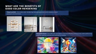
WHAT ARE THEBENEFITS OF
GOOD COLOR RENDERING
Visual comfort - Accurate color rendering reduces eye strain and creates a more
pleasant environment.
Task performance - Accurate color perception improves efficiency and accuracy when performing
tasks like reading, cooking, and working on hobbies.
42.
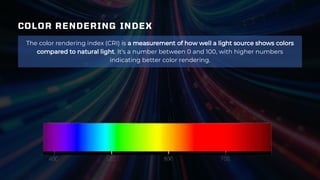
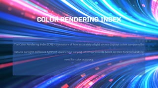
COLOR RENDERING INDEX
Thecolor rendering index (CRI) is a measurement of how well a light source shows colors
compared to natural light. It's a number between 0 and 100, with higher numbers
indicating better color rendering.
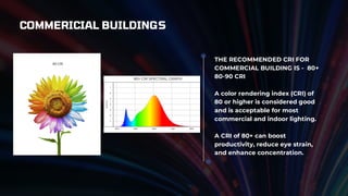
THE RECOMMENDED CRIFOR
COMMERCIAL BUILDING IS - 80+
80-90 CRI
A color rendering index (CRI) of
80 or higher is considered good
and is acceptable for most
commercial and indoor lighting.
A CRI of 80+ can boost
productivity, reduce eye strain,
and enhance concentration.
COMMERICIAL BUILDINGS
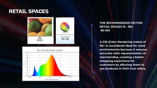
RETAIL SPACES
THE RECOMMENDEDCRI FOR
RETAIL SPACES IS - 90+
90-100
A CRI (Color Rendering Index) of
90+ is considered ideal for retail
environments because it ensures
accurate color representation of
merchandise, creating a better
shopping experience for
customers by allowing them to
see products in their true colors,
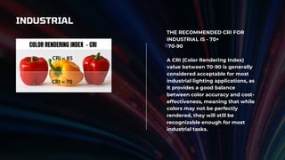
INDUSTRIAL
THE RECOMMENDED CRIFOR
INDUSTRIAL IS - 70+
70-90
A CRI (Color Rendering Index)
value between 70-90 is generally
considered acceptable for most
industrial lighting applications, as
it provides a good balance
between color accuracy and cost-
effectiveness, meaning that while
colors may not be perfectly
rendered, they will still be
recognizable enough for most
industrial tasks.
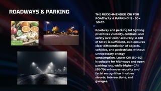
ROADWAYS & PARKINGTHE RECOMMENDED CRI FOR
ROADWAY & PARKING IS - 50+
50-70
Roadway and parking lot lighting
prioritizes visibility, contrast, and
safety over color accuracy. A CRI
of 50-70 is sufficient, as it ensures
clear differentiation of objects,
vehicles, and pedestrians without
unnecessary energy
consumption. Lower CRI (50-60)
is suitable for highways and open
parking lots, while higher CRI
(60-70) enhances security and
facial recognition in urban
streets, intersections, and
garages.
53.
LANDSCAPING
THE RECOMMENDED CRIFOR
INLANDSCAPE IS - 60+
60-80
Recommended CRI: 60-80
Landscape lighting prioritizes
ambiance, visibility, and
aesthetics, with CRI requirements
varying based on the purpose of
the lighting.
54.
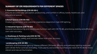
SUMMARY OF CRIREQUIREMENTS FOR DIFFERENT SPACES
1. Commercial Buildings (CRI 80-90+)
Ensures accurate color perception, productivity, and comfort in offices, hotels, healthcare, and
educational spaces.
2.Retail Spaces (CRI 90-100)
Product presentation and customer experience depend on high-CRI lighting.
3. Industrial Spaces (CRI 70-80)
General manufacturing and warehouses function well with CRI 70-80, prioritizing visibility and efficiency
over color accuracy.
4. Roadways & Parking Lots (CRI 50-70)
Focus on visibility, safety, and contrast rather than color accuracy.
Landscaping (CRI 60-80)
Aesthetic and functional lighting require different CRI levels. Security and pathway lighting work well
with CRI 60-70 for contrast and safety. Trees, plants, and architectural features need CRI 70-80 for more
vibrant and natural illumination.