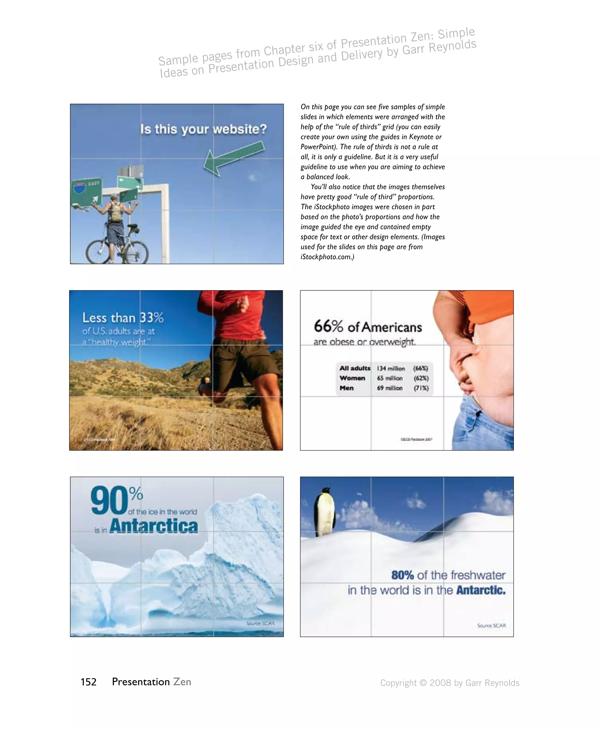
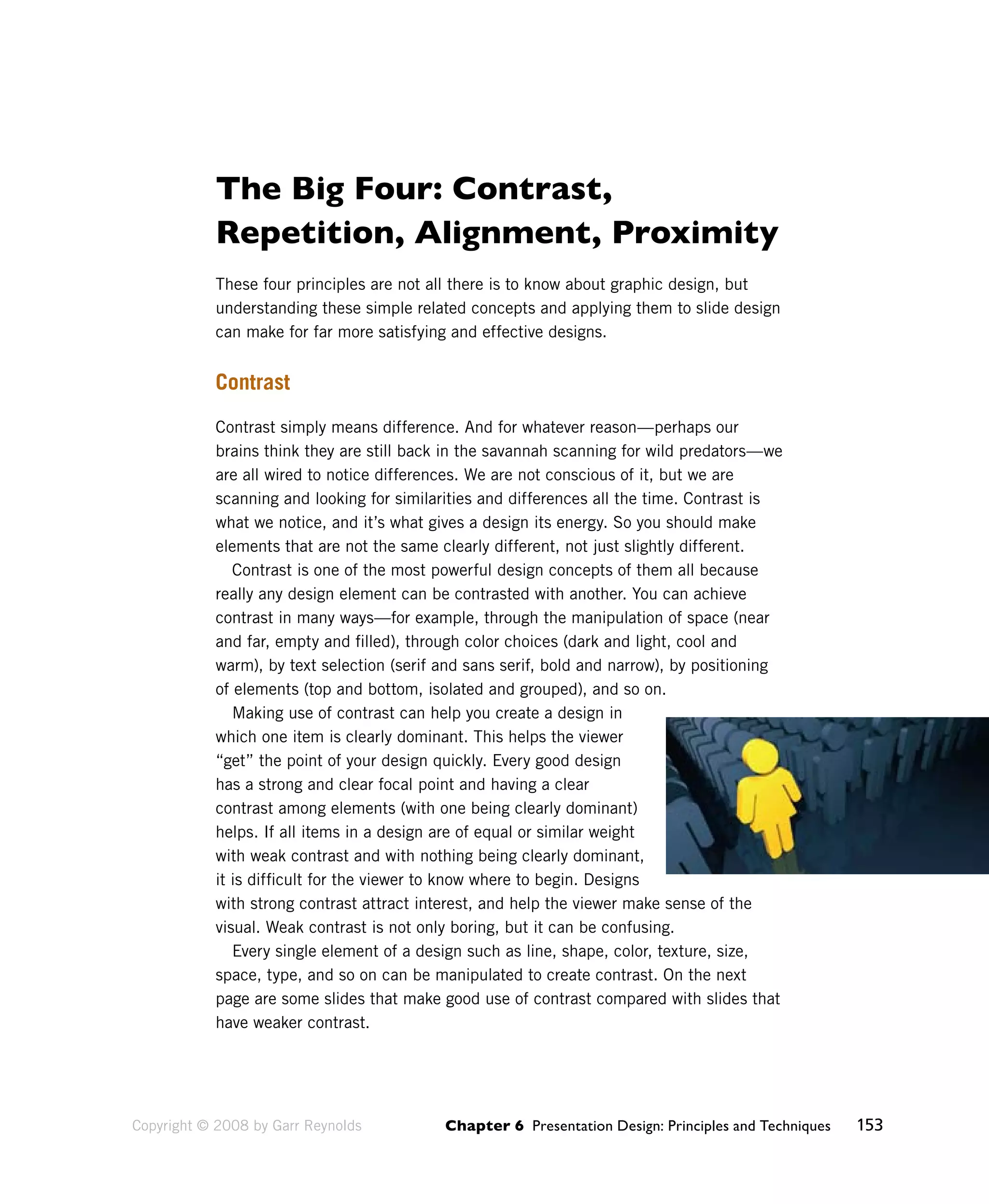
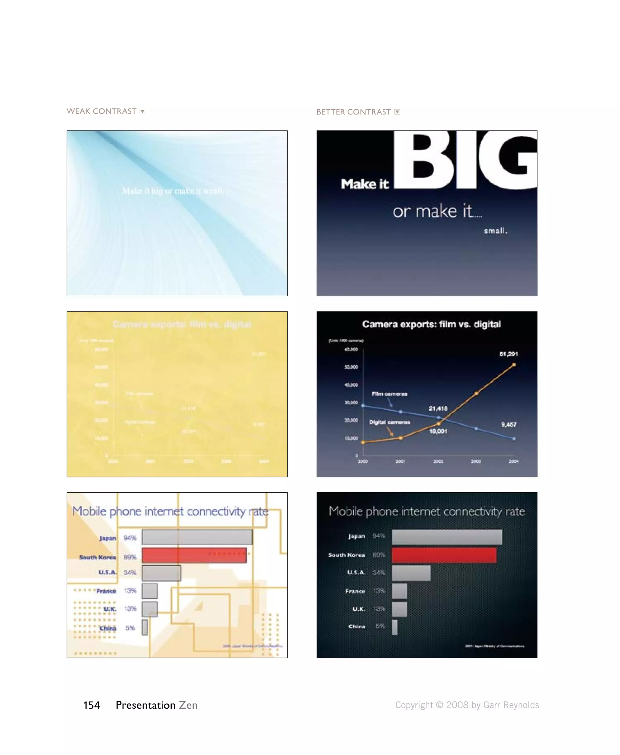
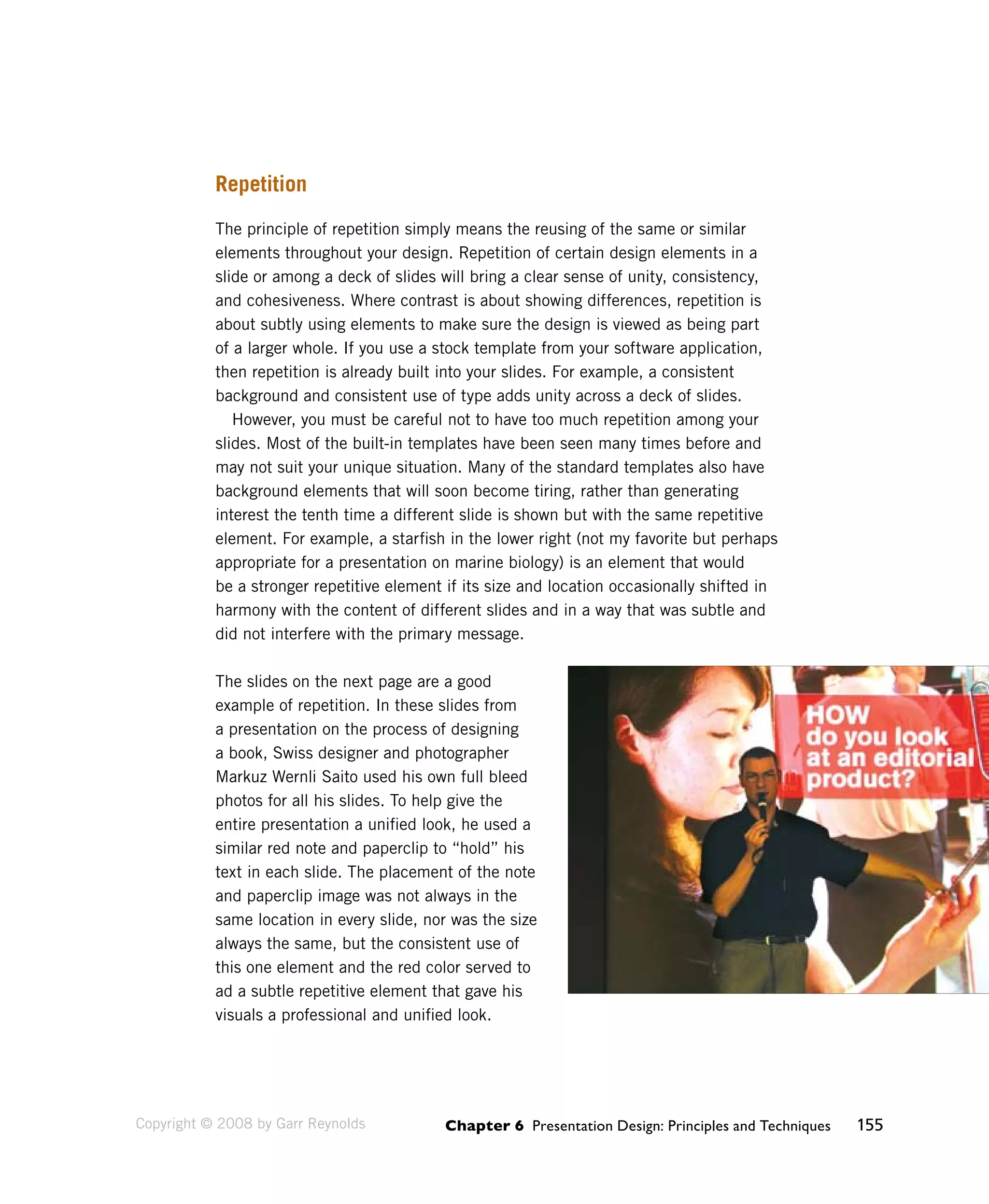
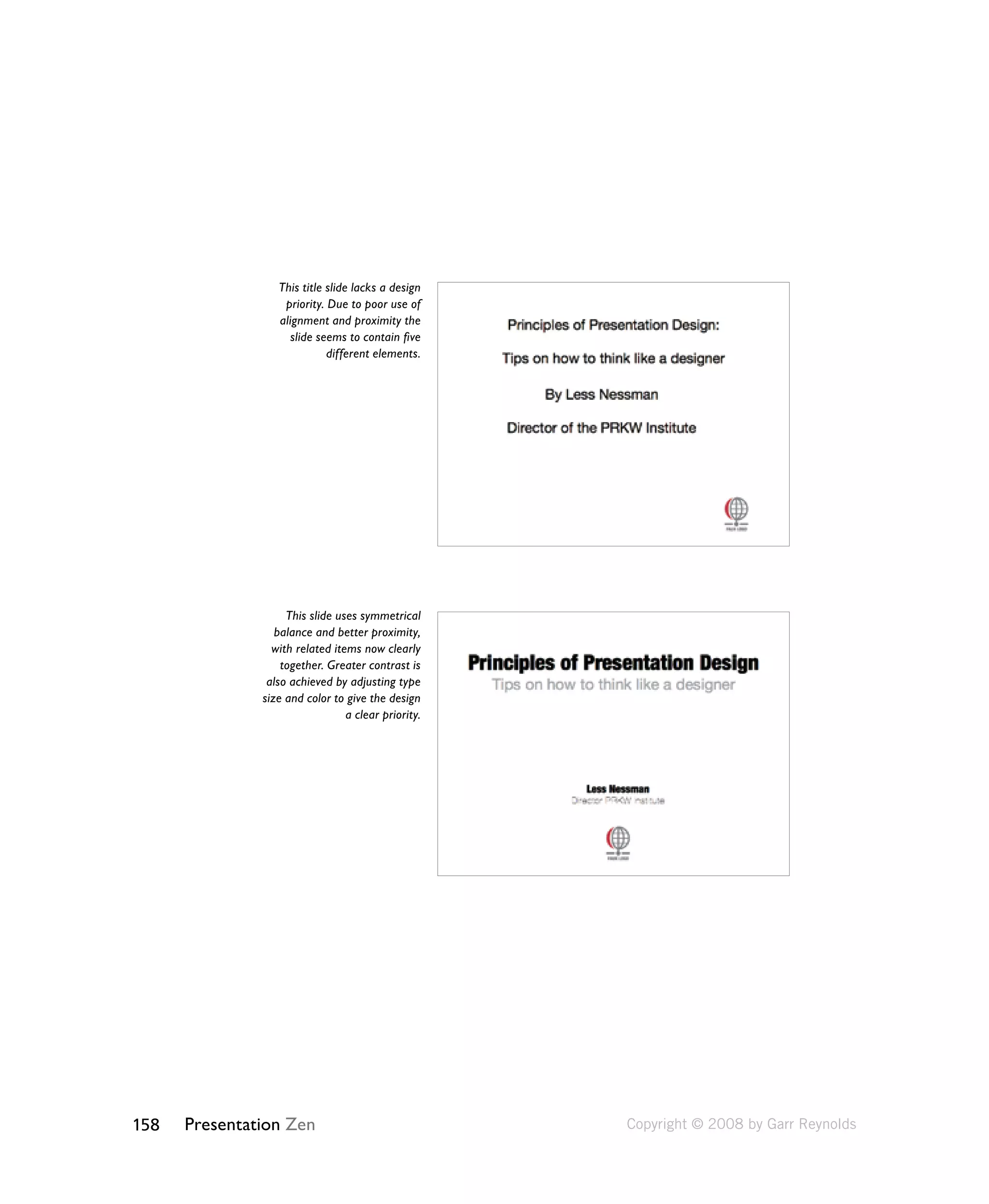
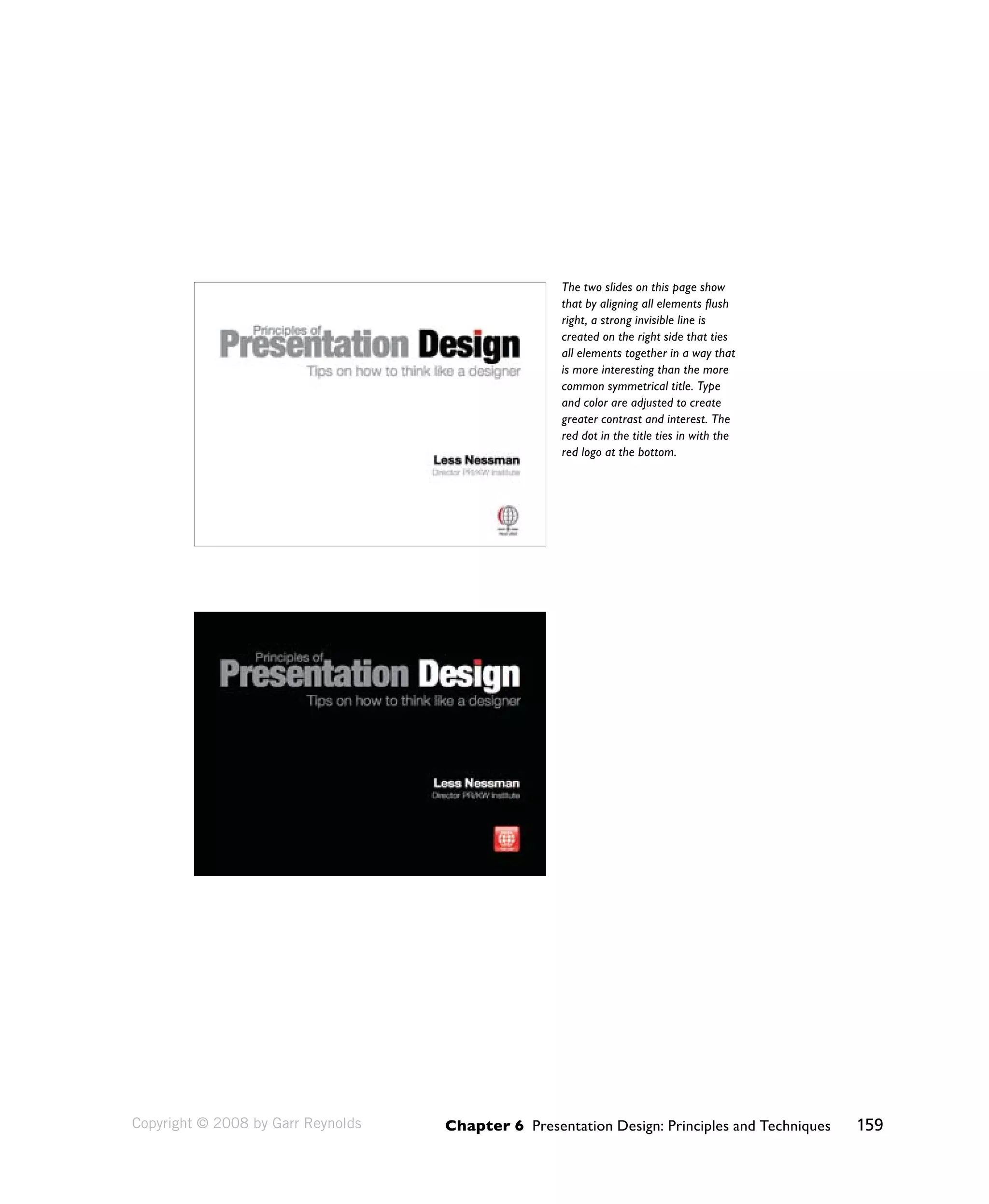
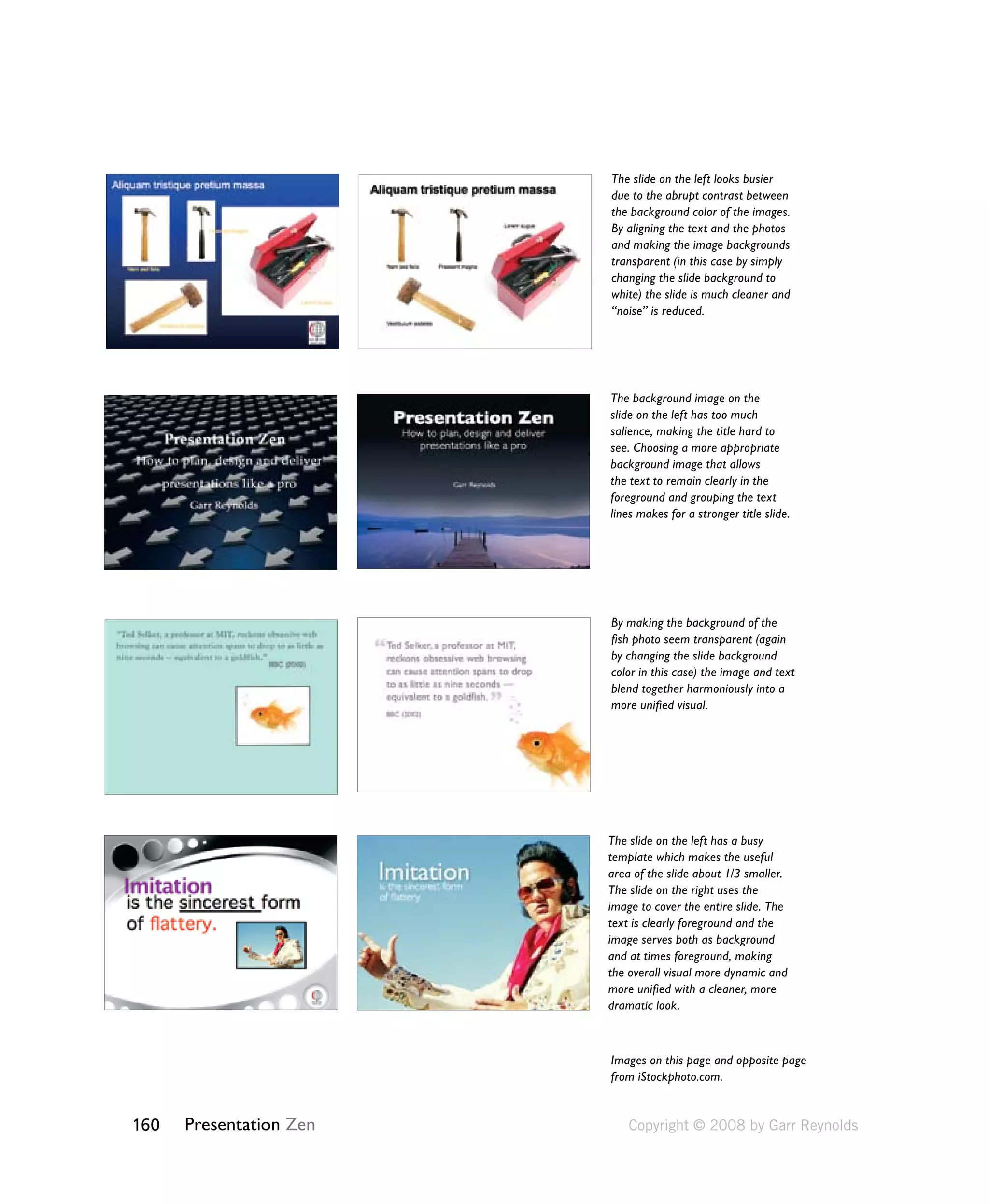
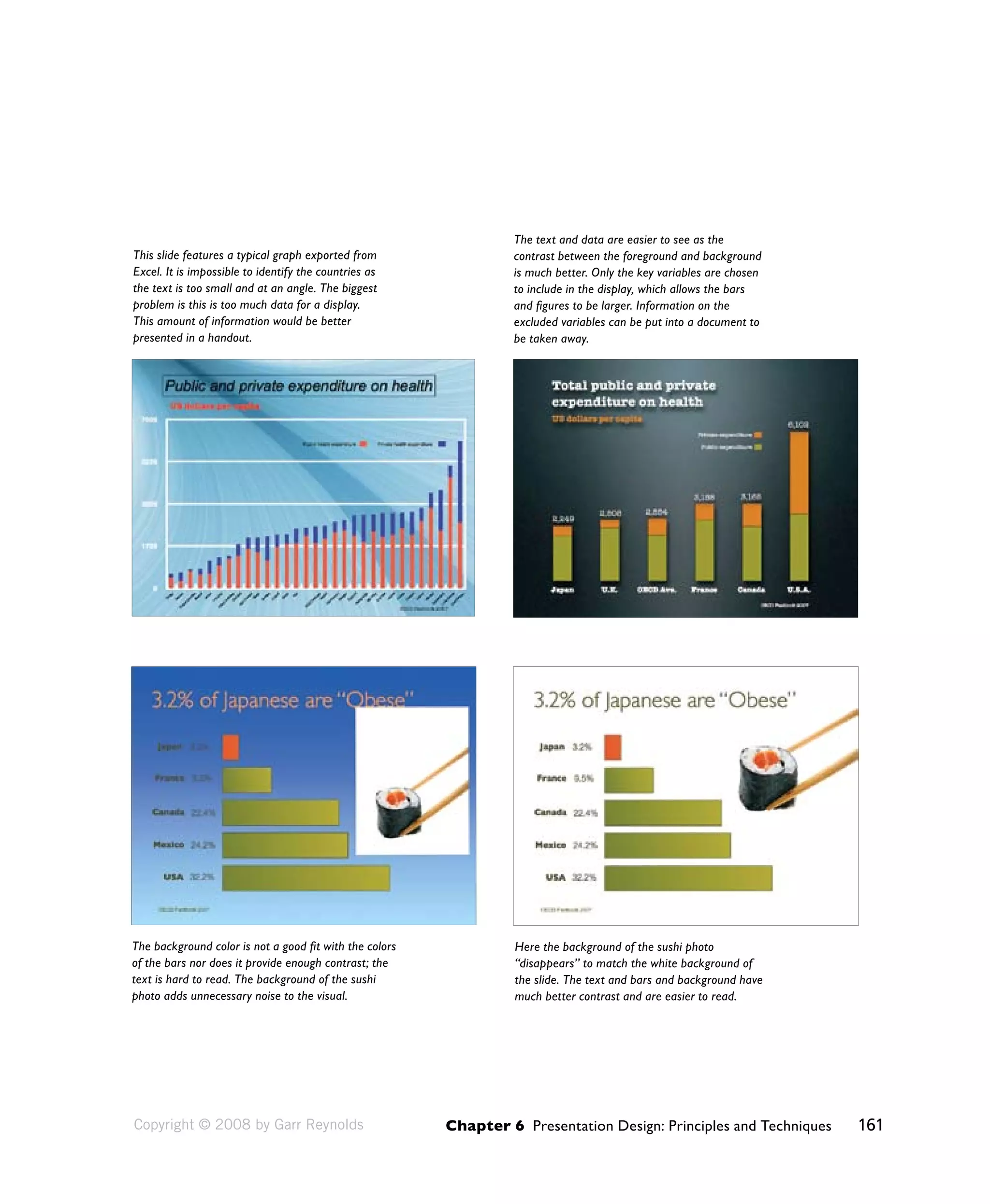
Sample pages from Chapter six of Presentation Zen: Simple 
Ideas on Presentation Design and Delivery by Garr Reynolds 
152 Presentation Zen 
On this page you can see five samples of simple 
slides in which elements were arranged with the 
help of the “rule of thirds” grid (you can easily 
create your own using the guides in Keynote or 
PowerPoint). The rule of thirds is not a rule at 
all, it is only a guideline. But it is a very useful 
guideline to use when you are aiming to achieve 
a balanced look. 
You’ll also notice that the images themselves 
have pretty good “rule of third” proportions. 
The iStockphoto images were chosen in part 
based on the photo’s proportions and how the 
image guided the eye and contained empty 
space for text or other design elements. (Images 
used for the slides on this page are from 
iStockphoto.com.) 
Copyright © 2008 by Garr Reynolds
The Big Four: Contrast, 
Repetition, Alignment, Proximity 
These four principles are not all there is to know about graphic design, but 
understanding these simple related concepts and applying them to slide design 
can make for far more satisfying and effective designs. 
Chapter 6 Presentation Design: Principles and Techniques 153 
Contrast 
Contrast simply means difference. And for whatever reason—perhaps our 
brains think they are still back in the savannah scanning for wild predators—we 
are all wired to notice differences. We are not conscious of it, but we are 
scanning and looking for similarities and differences all the time. Contrast is 
what we notice, and it’s what gives a design its energy. So you should make 
elements that are not the same clearly different, not just slightly different. 
Contrast is one of the most powerful design concepts of them all because 
really any design element can be contrasted with another. You can achieve 
contrast in many ways—for example, through the manipulation of space (near 
and far, empty and filled), through color choices (dark and light, cool and 
warm), by text selection (serif and sans serif, bold and narrow), by positioning 
of elements (top and bottom, isolated and grouped), and so on. 
Making use of contrast can help you create a design in 
which one item is clearly dominant. This helps the viewer 
“get” the point of your design quickly. Every good design 
has a strong and clear focal point and having a clear 
contrast among elements (with one being clearly dominant) 
helps. If all items in a design are of equal or similar weight 
with weak contrast and with nothing being clearly dominant, 
it is difficult for the viewer to know where to begin. Designs 
with strong contrast attract interest, and help the viewer make sense of the 
visual. Weak contrast is not only boring, but it can be confusing. 
Every single element of a design such as line, shape, color, texture, size, 
space, type, and so on can be manipulated to create contrast. On the next 
page are some slides that make good use of contrast compared with slides that 
have weaker contrast. 
Copyright © 2008 by Garr Reynolds
WEAK CONTRAST BETTER CONTRAST 
154 Presentation Zen 
Copyright © 2008 by Garr Reynolds
Chapter 6 Presentation Design: Principles and Techniques 155 
Repetition 
The principle of repetition simply means the reusing of the same or similar 
elements throughout your design. Repetition of certain design elements in a 
slide or among a deck of slides will bring a clear sense of unity, consistency, 
and cohesiveness. Where contrast is about showing differences, repetition is 
about subtly using elements to make sure the design is viewed as being part 
of a larger whole. If you use a stock template from your software application, 
then repetition is already built into your slides. For example, a consistent 
background and consistent use of type adds unity across a deck of slides. 
However, you must be careful not to have too much repetition among your 
slides. Most of the built-in templates have been seen many times before and 
may not suit your unique situation. Many of the standard templates also have 
background elements that will soon become tiring, rather than generating 
interest the tenth time a different slide is shown but with the same repetitive 
element. For example, a starfish in the lower right (not my favorite but perhaps 
appropriate for a presentation on marine biology) is an element that would 
be a stronger repetitive element if its size and location occasionally shifted in 
harmony with the content of different slides and in a way that was subtle and 
did not interfere with the primary message. 
The slides on the next page are a good 
example of repetition. In these slides from 
a presentation on the process of designing 
a book, Swiss designer and photographer 
Markuz Wernli Saito used his own full bleed 
photos for all his slides. To help give the 
entire presentation a unified look, he used a 
similar red note and paperclip to “hold” his 
text in each slide. The placement of the note 
and paperclip image was not always in the 
same location in every slide, nor was the size 
always the same, but the consistent use of 
this one element and the red color served to 
ad a subtle repetitive element that gave his 
visuals a professional and unified look. 
Copyright © 2008 by Garr Reynolds
156 Presentation Zen Copyright © 2008 by Garr Reynolds
Chapter 6 Presentation Design: Principles and Techniques 157 
Alignment 
The whole point of the alignment principle is that nothing in your slide design 
should look as if it were placed there randomly. Every element is connected 
visually via an invisible line. Where repetition is more concerned with elements 
across a deck of slides, alignment is about obtaining unity among elements 
of a single slide. Even elements that are quite far apart on a slide should have 
a visual connection, something that is easier to achieve with the use of grids. 
When you place elements on a slide, try to align them with another element. 
Many people fail to make an effort to apply the alignment principle, which 
often results in elements being almost aligned but not quite. This may not 
seem like a big deal, but these kinds of slides look less sophisticated and 
overall less professional. The audience may not be conscious of it, but slides 
that contain elements in alignment look cleaner. And assuming other principles 
are applied harmoniously as well, your slides should be easier to understand 
quickly. 
Proximity 
The principle of proximity is about moving things closer or farther apart to 
achieve a more organized look. The principle says that related items should be 
grouped together so that they will be viewed as a group, rather than as several 
unrelated elements. Audiences will assume that items that are not near each 
other in a design are not closely related. Audiences will naturally tend to group 
similar items that are near to each other into a single unit. 
People should never have to “work” at trying to figure out which caption goes 
with which graphic or whether or not a line of text is a subtitle or a line of text 
unrelated to the title. Do not make audiences think. That is, do not make them 
“think” about the wrong stuff, like trying to decipher your slide’s organization 
and design priority. A slide is not a page in a book or magazine, so you are not 
going to have more than a few elements or groups of elements. Robin Williams, 
in her best-selling book The Non-Designer’s Design Book (Peachpit Press) says 
that we must be conscious of where our eye goes first when we step back and 
look at our design. When you look at your slide, notice where your eye is drawn 
first, second, and so on. What path does your eye take? 
Copyright © 2008 by Garr Reynolds
This title slide lacks a design 
priority. Due to poor use of 
alignment and proximity the 
slide seems to contain five 
158 Presentation Zen 
different elements. 
This slide uses symmetrical 
balance and better proximity, 
with related items now clearly 
together. Greater contrast is 
also achieved by adjusting type 
size and color to give the design 
a clear priority. 
Copyright © 2008 by Garr Reynolds
The two slides on this page show 
that by aligning all elements flush 
right, a strong invisible line is 
created on the right side that ties 
all elements together in a way that 
is more interesting than the more 
common symmetrical title. Type 
and color are adjusted to create 
greater contrast and interest. The 
red dot in the title ties in with the 
red logo at the bottom. 
Chapter 6 Presentation Design: Principles and Techniques 159 
Copyright © 2008 by Garr Reynolds
160 Presentation Zen 
The slide on the left looks busier 
due to the abrupt contrast between 
the background color of the images. 
By aligning the text and the photos 
and making the image backgrounds 
transparent (in this case by simply 
changing the slide background to 
white) the slide is much cleaner and 
“noise” is reduced. 
The background image on the 
slide on the left has too much 
salience, making the title hard to 
see. Choosing a more appropriate 
background image that allows 
the text to remain clearly in the 
foreground and grouping the text 
lines makes for a stronger title slide. 
By making the background of the 
fish photo seem transparent (again 
by changing the slide background 
color in this case) the image and text 
blend together harmoniously into a 
more unified visual. 
The slide on the left has a busy 
template which makes the useful 
area of the slide about 1/3 smaller. 
The slide on the right uses the 
image to cover the entire slide. The 
text is clearly foreground and the 
image serves both as background 
and at times foreground, making 
the overall visual more dynamic and 
more unified with a cleaner, more 
dramatic look. 
Images on this page and opposite page 
from iStockphoto.com. 
Copyright © 2008 by Garr Reynolds
Chapter 6 Presentation Design: Principles and Techniques 161 
The background color is not a good fit with the colors 
of the bars nor does it provide enough contrast; the 
text is hard to read. The background of the sushi 
photo adds unnecessary noise to the visual. 
Here the background of the sushi photo 
“disappears” to match the white background of 
the slide. The text and bars and background have 
much better contrast and are easier to read. 
This slide features a typical graph exported from 
Excel. It is impossible to identify the countries as 
the text is too small and at an angle. The biggest 
problem is this is too much data for a display. 
This amount of information would be better 
presented in a handout. 
The text and data are easier to see as the 
contrast between the foreground and background 
is much better. Only the key variables are chosen 
to include in the display, which allows the bars 
and figures to be larger. Information on the 
excluded variables can be put into a document to 
be taken away. 
Copyright © 2008 by Garr Reynolds
The more strikingly visual your 
presentation is, the more people will 
remember it. And more importantly, 
they will remember you. 
162 Presentation Zen 
— Paul Arden
Chapter 6 Presentation Design: Principles and Techniques 163 
In Sum 
• Design matters. But design is not about decoration or about ornamentation. 
Design is about making communication as easy and clear for the viewer as 
possible. 
• Keep the principle of signal-versus-noise in mind to remove all nonessential 
elements. Remove visual clutter. Avoid 3-D effects. 
• People remember visuals better than bullet points. Always ask yourself how 
you can use a strong visual—including quantitative displays—to enhance 
your narrative. 
• Empty space is not nothing; it is a powerful something. Learn to see and 
manipulate empty space to give your slide designs greater organization, 
clarity, and interest. 
• Use the principle of contrast to create strong dynamic differences among 
elements that are different. If it is different, make it very different. 
• Use the principle of repetition to repeat selected elements throughout your 
slides. This can help give your slides unity and organization. 
• Use the principle of alignment to connect elements visually (through invisible 
lines) on a slide. Grids are very useful for achieving good alignment. This will 
give your slide a clean, well-organized look. 
• Use the principle of proximity to ensure that related items are grouped 
together. People will tend to interpret items together or near to each other as 
belonging to the same group. 
Copyright © 2008 by Garr Reynolds

Chapter6 pages

  • 1.
    Sample pages fromChapter six of Presentation Zen: Simple Ideas on Presentation Design and Delivery by Garr Reynolds 152 Presentation Zen On this page you can see five samples of simple slides in which elements were arranged with the help of the “rule of thirds” grid (you can easily create your own using the guides in Keynote or PowerPoint). The rule of thirds is not a rule at all, it is only a guideline. But it is a very useful guideline to use when you are aiming to achieve a balanced look. You’ll also notice that the images themselves have pretty good “rule of third” proportions. The iStockphoto images were chosen in part based on the photo’s proportions and how the image guided the eye and contained empty space for text or other design elements. (Images used for the slides on this page are from iStockphoto.com.) Copyright © 2008 by Garr Reynolds
  • 2.
    The Big Four:Contrast, Repetition, Alignment, Proximity These four principles are not all there is to know about graphic design, but understanding these simple related concepts and applying them to slide design can make for far more satisfying and effective designs. Chapter 6 Presentation Design: Principles and Techniques 153 Contrast Contrast simply means difference. And for whatever reason—perhaps our brains think they are still back in the savannah scanning for wild predators—we are all wired to notice differences. We are not conscious of it, but we are scanning and looking for similarities and differences all the time. Contrast is what we notice, and it’s what gives a design its energy. So you should make elements that are not the same clearly different, not just slightly different. Contrast is one of the most powerful design concepts of them all because really any design element can be contrasted with another. You can achieve contrast in many ways—for example, through the manipulation of space (near and far, empty and filled), through color choices (dark and light, cool and warm), by text selection (serif and sans serif, bold and narrow), by positioning of elements (top and bottom, isolated and grouped), and so on. Making use of contrast can help you create a design in which one item is clearly dominant. This helps the viewer “get” the point of your design quickly. Every good design has a strong and clear focal point and having a clear contrast among elements (with one being clearly dominant) helps. If all items in a design are of equal or similar weight with weak contrast and with nothing being clearly dominant, it is difficult for the viewer to know where to begin. Designs with strong contrast attract interest, and help the viewer make sense of the visual. Weak contrast is not only boring, but it can be confusing. Every single element of a design such as line, shape, color, texture, size, space, type, and so on can be manipulated to create contrast. On the next page are some slides that make good use of contrast compared with slides that have weaker contrast. Copyright © 2008 by Garr Reynolds
  • 3.
    WEAK CONTRAST BETTERCONTRAST 154 Presentation Zen Copyright © 2008 by Garr Reynolds
  • 4.
    Chapter 6 PresentationDesign: Principles and Techniques 155 Repetition The principle of repetition simply means the reusing of the same or similar elements throughout your design. Repetition of certain design elements in a slide or among a deck of slides will bring a clear sense of unity, consistency, and cohesiveness. Where contrast is about showing differences, repetition is about subtly using elements to make sure the design is viewed as being part of a larger whole. If you use a stock template from your software application, then repetition is already built into your slides. For example, a consistent background and consistent use of type adds unity across a deck of slides. However, you must be careful not to have too much repetition among your slides. Most of the built-in templates have been seen many times before and may not suit your unique situation. Many of the standard templates also have background elements that will soon become tiring, rather than generating interest the tenth time a different slide is shown but with the same repetitive element. For example, a starfish in the lower right (not my favorite but perhaps appropriate for a presentation on marine biology) is an element that would be a stronger repetitive element if its size and location occasionally shifted in harmony with the content of different slides and in a way that was subtle and did not interfere with the primary message. The slides on the next page are a good example of repetition. In these slides from a presentation on the process of designing a book, Swiss designer and photographer Markuz Wernli Saito used his own full bleed photos for all his slides. To help give the entire presentation a unified look, he used a similar red note and paperclip to “hold” his text in each slide. The placement of the note and paperclip image was not always in the same location in every slide, nor was the size always the same, but the consistent use of this one element and the red color served to ad a subtle repetitive element that gave his visuals a professional and unified look. Copyright © 2008 by Garr Reynolds
  • 5.
    156 Presentation ZenCopyright © 2008 by Garr Reynolds
  • 6.
    Chapter 6 PresentationDesign: Principles and Techniques 157 Alignment The whole point of the alignment principle is that nothing in your slide design should look as if it were placed there randomly. Every element is connected visually via an invisible line. Where repetition is more concerned with elements across a deck of slides, alignment is about obtaining unity among elements of a single slide. Even elements that are quite far apart on a slide should have a visual connection, something that is easier to achieve with the use of grids. When you place elements on a slide, try to align them with another element. Many people fail to make an effort to apply the alignment principle, which often results in elements being almost aligned but not quite. This may not seem like a big deal, but these kinds of slides look less sophisticated and overall less professional. The audience may not be conscious of it, but slides that contain elements in alignment look cleaner. And assuming other principles are applied harmoniously as well, your slides should be easier to understand quickly. Proximity The principle of proximity is about moving things closer or farther apart to achieve a more organized look. The principle says that related items should be grouped together so that they will be viewed as a group, rather than as several unrelated elements. Audiences will assume that items that are not near each other in a design are not closely related. Audiences will naturally tend to group similar items that are near to each other into a single unit. People should never have to “work” at trying to figure out which caption goes with which graphic or whether or not a line of text is a subtitle or a line of text unrelated to the title. Do not make audiences think. That is, do not make them “think” about the wrong stuff, like trying to decipher your slide’s organization and design priority. A slide is not a page in a book or magazine, so you are not going to have more than a few elements or groups of elements. Robin Williams, in her best-selling book The Non-Designer’s Design Book (Peachpit Press) says that we must be conscious of where our eye goes first when we step back and look at our design. When you look at your slide, notice where your eye is drawn first, second, and so on. What path does your eye take? Copyright © 2008 by Garr Reynolds
  • 7.
    This title slidelacks a design priority. Due to poor use of alignment and proximity the slide seems to contain five 158 Presentation Zen different elements. This slide uses symmetrical balance and better proximity, with related items now clearly together. Greater contrast is also achieved by adjusting type size and color to give the design a clear priority. Copyright © 2008 by Garr Reynolds
  • 8.
    The two slideson this page show that by aligning all elements flush right, a strong invisible line is created on the right side that ties all elements together in a way that is more interesting than the more common symmetrical title. Type and color are adjusted to create greater contrast and interest. The red dot in the title ties in with the red logo at the bottom. Chapter 6 Presentation Design: Principles and Techniques 159 Copyright © 2008 by Garr Reynolds
  • 9.
    160 Presentation Zen The slide on the left looks busier due to the abrupt contrast between the background color of the images. By aligning the text and the photos and making the image backgrounds transparent (in this case by simply changing the slide background to white) the slide is much cleaner and “noise” is reduced. The background image on the slide on the left has too much salience, making the title hard to see. Choosing a more appropriate background image that allows the text to remain clearly in the foreground and grouping the text lines makes for a stronger title slide. By making the background of the fish photo seem transparent (again by changing the slide background color in this case) the image and text blend together harmoniously into a more unified visual. The slide on the left has a busy template which makes the useful area of the slide about 1/3 smaller. The slide on the right uses the image to cover the entire slide. The text is clearly foreground and the image serves both as background and at times foreground, making the overall visual more dynamic and more unified with a cleaner, more dramatic look. Images on this page and opposite page from iStockphoto.com. Copyright © 2008 by Garr Reynolds
  • 10.
    Chapter 6 PresentationDesign: Principles and Techniques 161 The background color is not a good fit with the colors of the bars nor does it provide enough contrast; the text is hard to read. The background of the sushi photo adds unnecessary noise to the visual. Here the background of the sushi photo “disappears” to match the white background of the slide. The text and bars and background have much better contrast and are easier to read. This slide features a typical graph exported from Excel. It is impossible to identify the countries as the text is too small and at an angle. The biggest problem is this is too much data for a display. This amount of information would be better presented in a handout. The text and data are easier to see as the contrast between the foreground and background is much better. Only the key variables are chosen to include in the display, which allows the bars and figures to be larger. Information on the excluded variables can be put into a document to be taken away. Copyright © 2008 by Garr Reynolds
  • 11.
    The more strikinglyvisual your presentation is, the more people will remember it. And more importantly, they will remember you. 162 Presentation Zen — Paul Arden
  • 12.
    Chapter 6 PresentationDesign: Principles and Techniques 163 In Sum • Design matters. But design is not about decoration or about ornamentation. Design is about making communication as easy and clear for the viewer as possible. • Keep the principle of signal-versus-noise in mind to remove all nonessential elements. Remove visual clutter. Avoid 3-D effects. • People remember visuals better than bullet points. Always ask yourself how you can use a strong visual—including quantitative displays—to enhance your narrative. • Empty space is not nothing; it is a powerful something. Learn to see and manipulate empty space to give your slide designs greater organization, clarity, and interest. • Use the principle of contrast to create strong dynamic differences among elements that are different. If it is different, make it very different. • Use the principle of repetition to repeat selected elements throughout your slides. This can help give your slides unity and organization. • Use the principle of alignment to connect elements visually (through invisible lines) on a slide. Grids are very useful for achieving good alignment. This will give your slide a clean, well-organized look. • Use the principle of proximity to ensure that related items are grouped together. People will tend to interpret items together or near to each other as belonging to the same group. Copyright © 2008 by Garr Reynolds