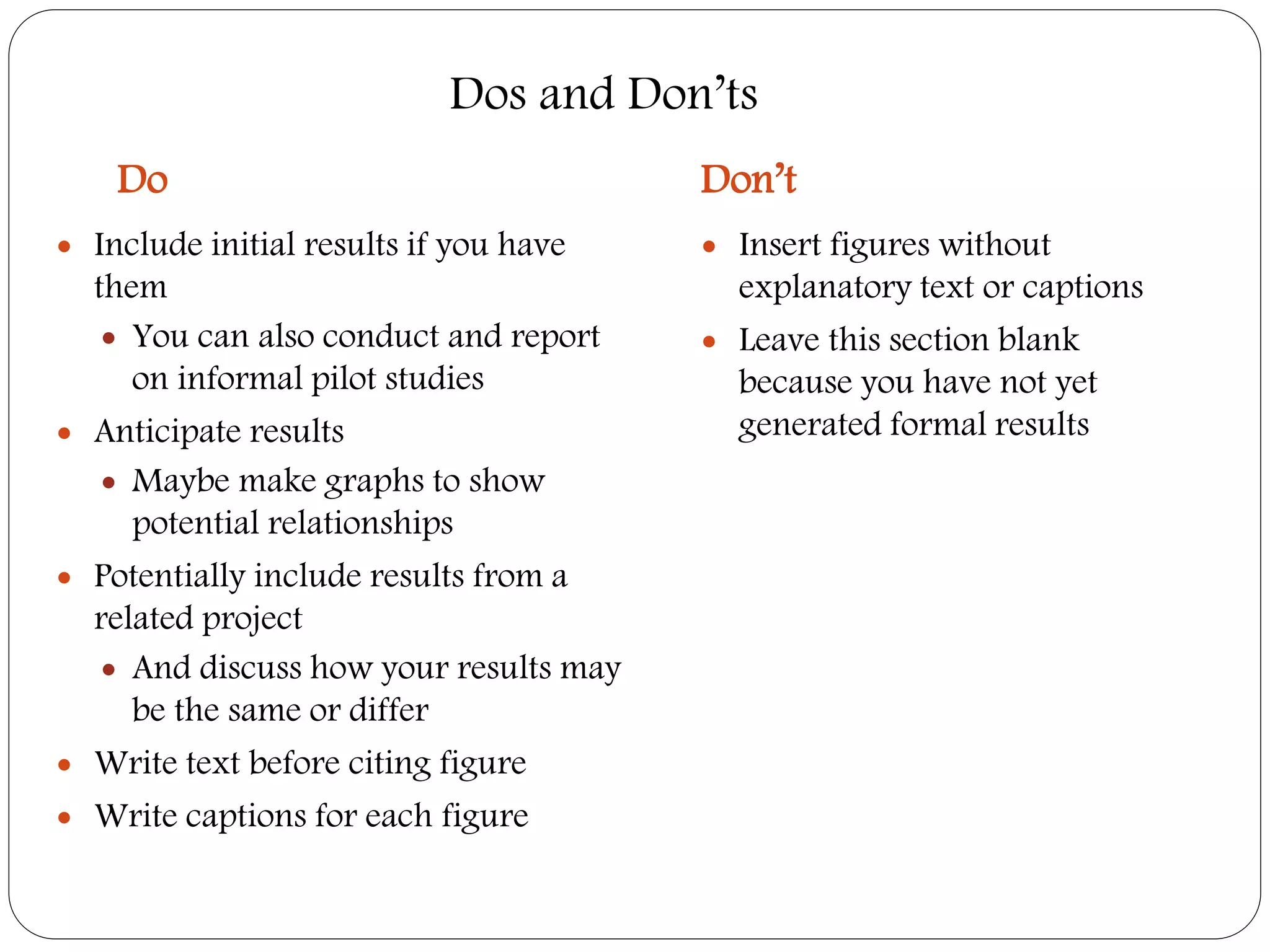
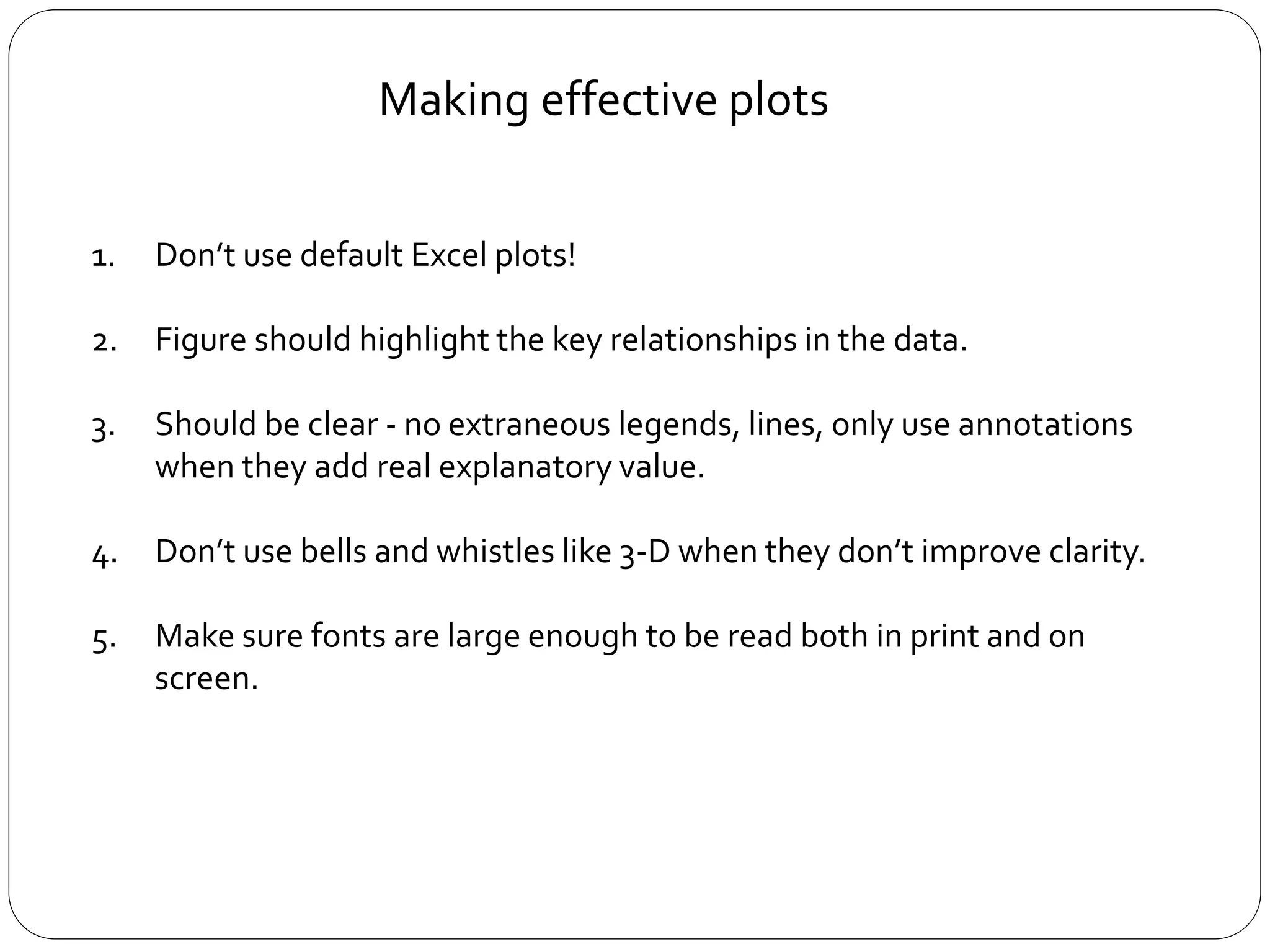
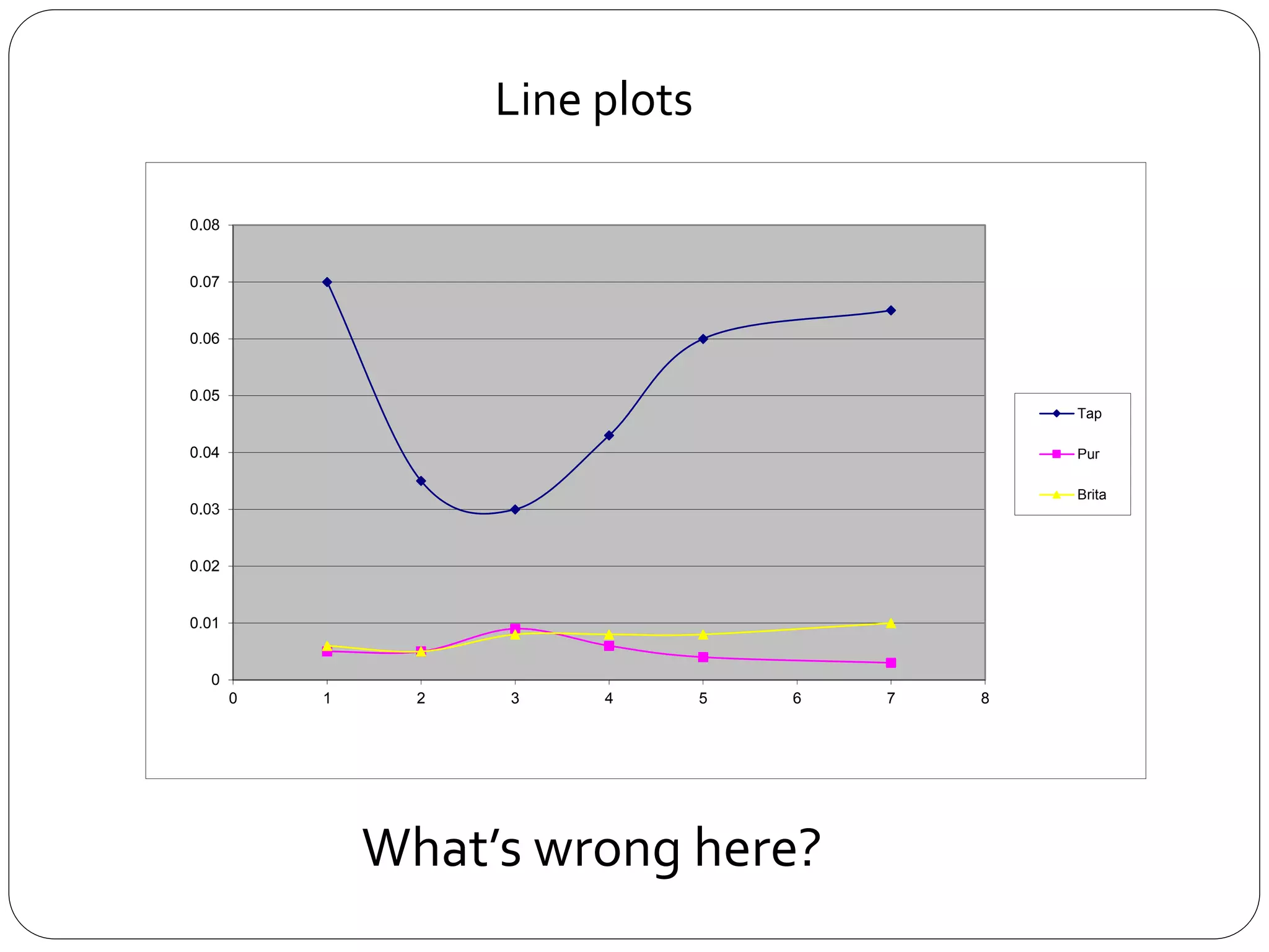
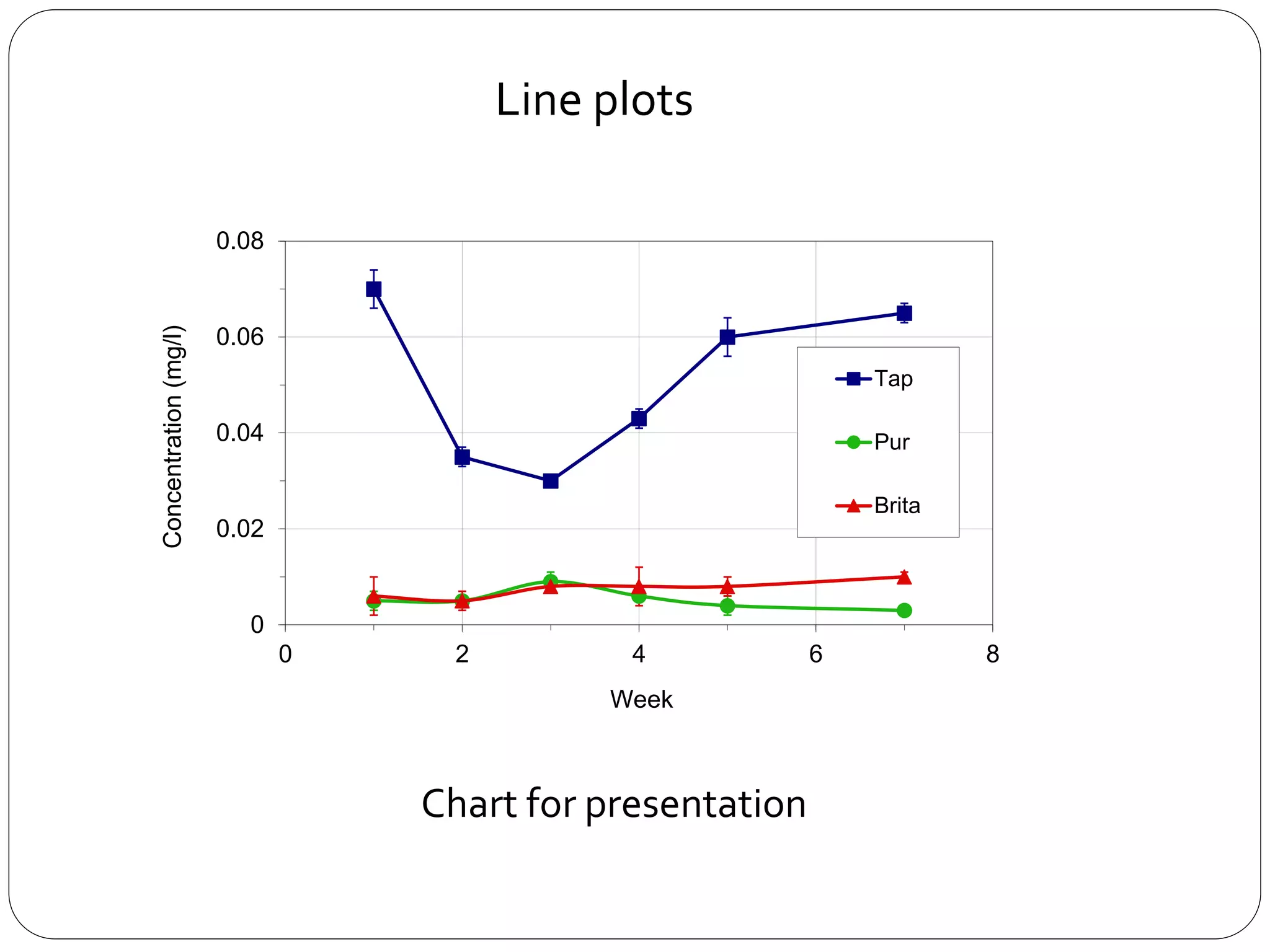
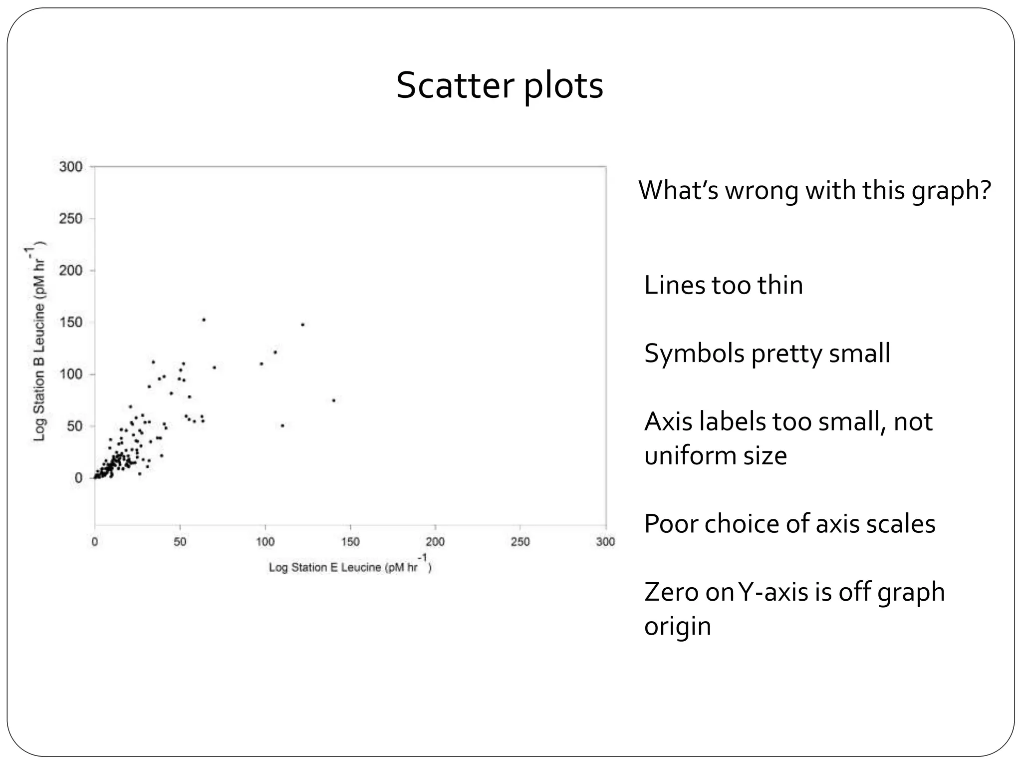
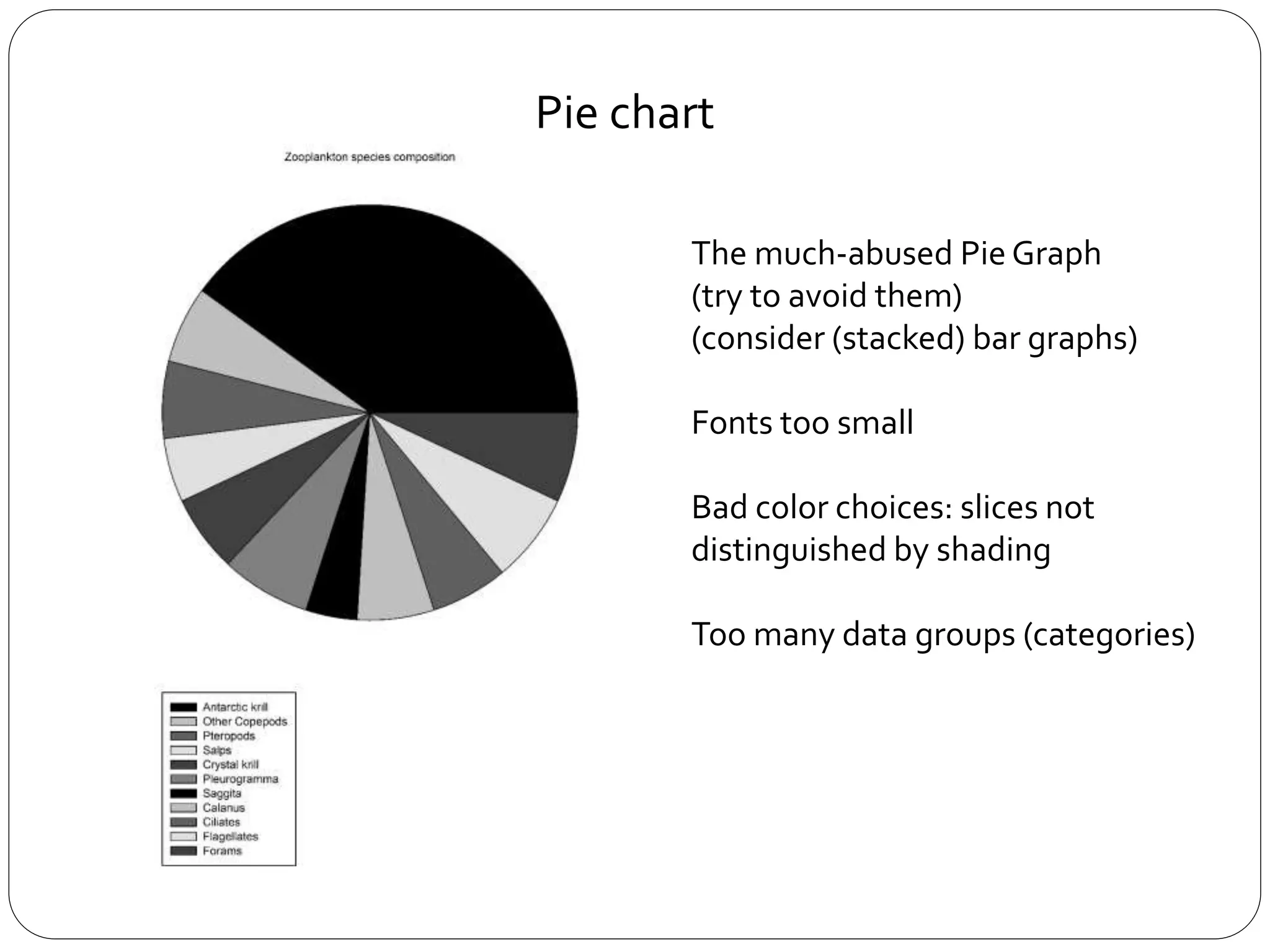
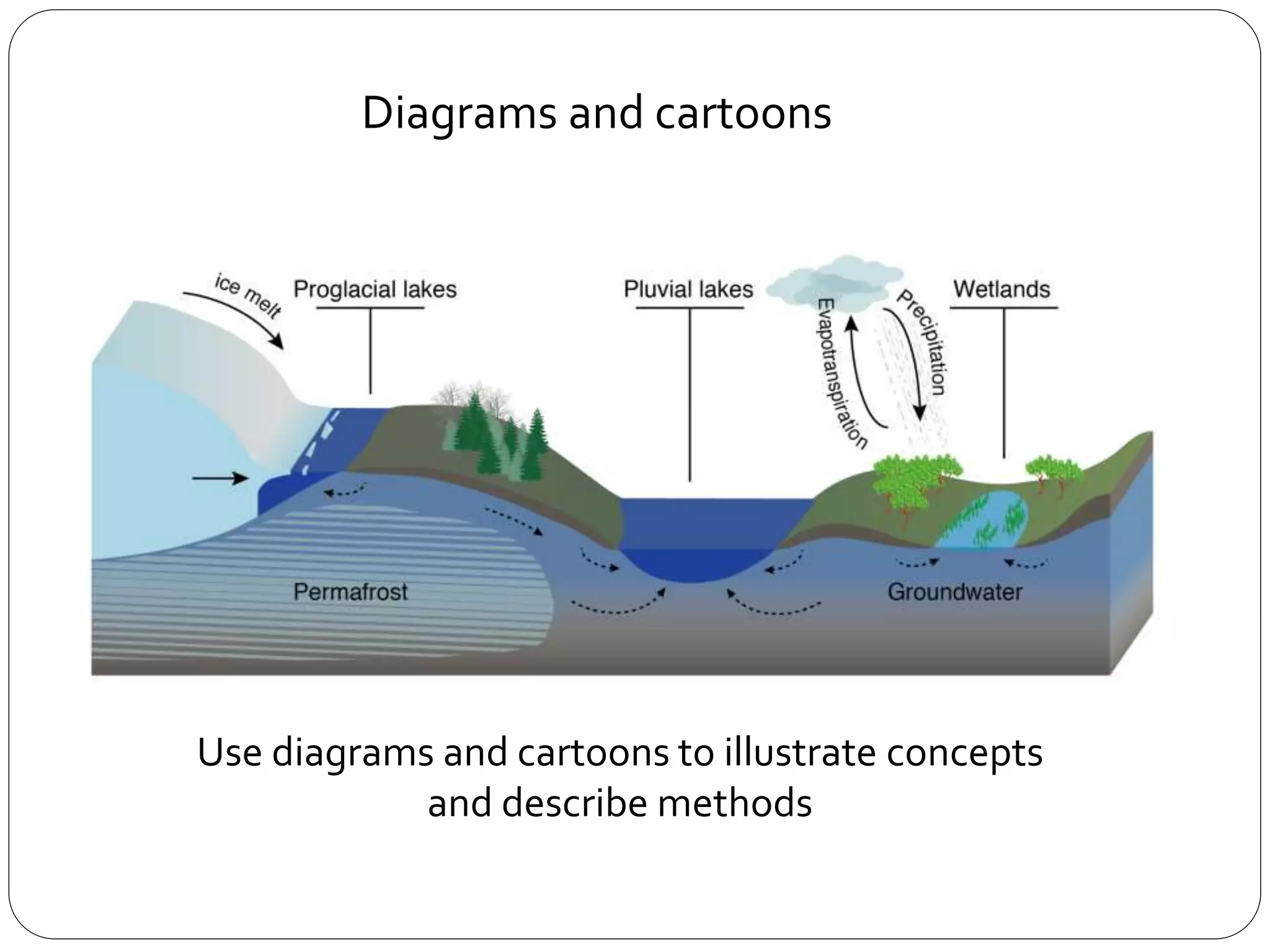
SlideShare a Scribd company logo
Proposal:
Preliminary Results and Discussion
Do Don’t
 Include initial results if you have
them
 You can also conduct and report
on informal pilot studies
 Anticipate results
 Maybe make graphs to show
potential relationships
 Potentially include results from a
related project
 And discuss how your results may
be the same or differ
 Write text before citing figure
 Write captions for each figure
 Insert figures without
explanatory text or captions
 Leave this section blank
because you have not yet
generated formal results
Dos and Don’ts
1. Don’t use default Excel plots!
2. Figure should highlight the key relationships in the data.
3. Should be clear - no extraneous legends, lines, only use annotations
when they add real explanatory value.
4. Don’t use bells and whistles like 3-D when they don’t improve clarity.
5. Make sure fonts are large enough to be read both in print and on
screen.
Making effective plots
0
0.01
0.02
0.03
0.04
0.05
0.06
0.07
0.08
0 1 2 3 4 5 6 7 8
Tap
Pur
Brita
What’s wrong here?
Line plots
0
0.02
0.04
0.06
0.08
0 2 4 6 8
Concentration
(mg/l)
Week
Tap
Pur
Brita
Chart for presentation
Line plots
0
0.02
0.04
0.06
0.08
0 1 2 3 4 5 6 7 8
Concentration
(mg/l)
Week
Tap
Pur
Brita
Line plots
Chart for a paper
For presentations, use color, make thick lines, larger fonts
Line plots
What’s wrong with this graph?
Scatter plots
What’s wrong with this graph?
Scatter plots
Lines too thin
Symbols pretty small
Axis labels too small, not
uniform size
Poor choice of axis scales
Zero onY-axis is off graph
origin
Improvements:
Lines thicker
Symbols bigger
Axis bigger font, bold,
uniform
Axis scales match data
range, changed to log
scales
Added regression line and
equation
Y = 0.97X + 0.10, R2 = 0.745, n = 145
Scatter plots
Bar plots
What’s wrong here?
0
0.5
1
1.5
2
2.5
Day1 Day 20
Tap water
New Omni Filter
Old Omni Filter
Bar plots
What’s wrong here?
- Appropriate for counts without
variation
- Emphasis on comparing means
- Error bars show some variation (if
included)
- Shows rough distribution of data,
including outliers
- Conveys much more information in
same amount of space (customizable,
but usually median, quartiles, 95%
range, outliers)
Bar plots & box plots
The much-abused Pie Graph
(try to avoid them)
(consider (stacked) bar graphs)
Fonts too small
Bad color choices: slices not
distinguished by shading
Too many data groups (categories)
Pie chart
Improvements:
Combined categories
Better shading / color scheme
Enlarged fonts
Unboxed the legend (remove
excess ink)
Pie chart
Pie chart
What’s wrong here?
What is effective from these variations?
Use diagrams and cartoons to illustrate concepts
and describe methods
Diagrams and cartoons
Use diagrams and cartoons to illustrate concepts
and describe methods
Bamber et al., 2000 National Geographic, 2002
Important information should be emphasized, but the colorscale should
not introduce artifacts into visual perception of the data
Choice of color
1. If you use colors, try to use high contrasts that are still useful if printed
in black and white
2. Be aware of how your color choices look to someone who is color blind
Normal Color Blind
Choice of color
1. Excel (don’t use the default!)
2. Computational environments: Matlab, python
(Matplotlib), R, …
3. Vector graphics: Adobe illustrator, Inkscape, …
4. Earth science specific tools: GMT, GeoMapApp, m_map
(for matlab), …
Tools to make good figures
Excel Python
Adobe Illustrator GMT

More Related Content

Similar to Good and bad graphs.pptx

Presentations tips
Presentations tipsPresentations tips
Presentations tips
Monil Sheth
 
Introducing a spreadsheet application.pptx
Introducing a spreadsheet application.pptxIntroducing a spreadsheet application.pptx
Introducing a spreadsheet application.pptx
SumandeepKaur733500
 
GC TUG Spring 2024 - Dashboard Actions.pptx
GC TUG Spring 2024 - Dashboard Actions.pptxGC TUG Spring 2024 - Dashboard Actions.pptx
GC TUG Spring 2024 - Dashboard Actions.pptx
Russ Cantrell
 
5 Golden Rules for Adding Impact to Reports
5 Golden Rules for Adding Impact to Reports5 Golden Rules for Adding Impact to Reports
5 Golden Rules for Adding Impact to Reports
Access Analytic ... providing AMAZING Power BI and Excel solutions
 
Floating column chart
Floating column chartFloating column chart
Floating column chart
Daksha Bhat
 
© PENN FOSTER, INC. 2016Graded ProjectExcel 2016.docx
© PENN FOSTER, INC. 2016Graded ProjectExcel 2016.docx© PENN FOSTER, INC. 2016Graded ProjectExcel 2016.docx
© PENN FOSTER, INC. 2016Graded ProjectExcel 2016.docx
susanschei
 
Seatug Presentation (Excel to Data Viz culture) Seattle Tableau User Group
Seatug Presentation (Excel to Data Viz culture) Seattle Tableau User GroupSeatug Presentation (Excel to Data Viz culture) Seattle Tableau User Group
Seatug Presentation (Excel to Data Viz culture) Seattle Tableau User Group
Russell Spangler
 
Ms office excel
Ms office excelMs office excel
Ms office excel
Allan Baldejo
 
Creating-Charts-and-Graphs-in-MS-Excel-A-Step-by-Step-Tutorial.pptx
Creating-Charts-and-Graphs-in-MS-Excel-A-Step-by-Step-Tutorial.pptxCreating-Charts-and-Graphs-in-MS-Excel-A-Step-by-Step-Tutorial.pptx
Creating-Charts-and-Graphs-in-MS-Excel-A-Step-by-Step-Tutorial.pptx
Attitude Tally Academy
 
Excel intermediate
Excel intermediateExcel intermediate
Excel intermediate
Kevin McLogan
 
Exel
ExelExel
Chapter.03
Chapter.03Chapter.03
MS Excel Ch 1 PPT
MS Excel Ch 1 PPTMS Excel Ch 1 PPT
MS Excel Ch 1 PPT
prsmith72
 
Cucci_-Excel_for_beginners_.pptx
Cucci_-Excel_for_beginners_.pptxCucci_-Excel_for_beginners_.pptx
Cucci_-Excel_for_beginners_.pptx
Hamid458506
 
Cucci_-Excel_for_beginners_ (1).pptx
Cucci_-Excel_for_beginners_ (1).pptxCucci_-Excel_for_beginners_ (1).pptx
Cucci_-Excel_for_beginners_ (1).pptx
kokila60
 
Excel Training.pptx
Excel Training.pptxExcel Training.pptx
Excel Training.pptx
ssuser5cc925
 
Storytelling with data and data visualization
Storytelling with data and data visualizationStorytelling with data and data visualization
Storytelling with data and data visualization
Frehiwot Mulugeta
 
Cte handout for ict2
Cte handout for ict2Cte handout for ict2
Cte handout for ict2
Omar Jacalne
 
Designstorm How-to: Dot Plots
Designstorm How-to: Dot PlotsDesignstorm How-to: Dot Plots
Designstorm How-to: Dot Plots
Amanda Makulec
 
DATA VISUALIZATION
DATA VISUALIZATIONDATA VISUALIZATION
DATA VISUALIZATION
Aabhika Samantaray
 

Similar to Good and bad graphs.pptx (20)

Presentations tips
Presentations tipsPresentations tips
Presentations tips
 
Introducing a spreadsheet application.pptx
Introducing a spreadsheet application.pptxIntroducing a spreadsheet application.pptx
Introducing a spreadsheet application.pptx
 
GC TUG Spring 2024 - Dashboard Actions.pptx
GC TUG Spring 2024 - Dashboard Actions.pptxGC TUG Spring 2024 - Dashboard Actions.pptx
GC TUG Spring 2024 - Dashboard Actions.pptx
 
5 Golden Rules for Adding Impact to Reports
5 Golden Rules for Adding Impact to Reports5 Golden Rules for Adding Impact to Reports
5 Golden Rules for Adding Impact to Reports
 
Floating column chart
Floating column chartFloating column chart
Floating column chart
 
© PENN FOSTER, INC. 2016Graded ProjectExcel 2016.docx
© PENN FOSTER, INC. 2016Graded ProjectExcel 2016.docx© PENN FOSTER, INC. 2016Graded ProjectExcel 2016.docx
© PENN FOSTER, INC. 2016Graded ProjectExcel 2016.docx
 
Seatug Presentation (Excel to Data Viz culture) Seattle Tableau User Group
Seatug Presentation (Excel to Data Viz culture) Seattle Tableau User GroupSeatug Presentation (Excel to Data Viz culture) Seattle Tableau User Group
Seatug Presentation (Excel to Data Viz culture) Seattle Tableau User Group
 
Ms office excel
Ms office excelMs office excel
Ms office excel
 
Creating-Charts-and-Graphs-in-MS-Excel-A-Step-by-Step-Tutorial.pptx
Creating-Charts-and-Graphs-in-MS-Excel-A-Step-by-Step-Tutorial.pptxCreating-Charts-and-Graphs-in-MS-Excel-A-Step-by-Step-Tutorial.pptx
Creating-Charts-and-Graphs-in-MS-Excel-A-Step-by-Step-Tutorial.pptx
 
Excel intermediate
Excel intermediateExcel intermediate
Excel intermediate
 
Exel
ExelExel
Exel
 
Chapter.03
Chapter.03Chapter.03
Chapter.03
 
MS Excel Ch 1 PPT
MS Excel Ch 1 PPTMS Excel Ch 1 PPT
MS Excel Ch 1 PPT
 
Cucci_-Excel_for_beginners_.pptx
Cucci_-Excel_for_beginners_.pptxCucci_-Excel_for_beginners_.pptx
Cucci_-Excel_for_beginners_.pptx
 
Cucci_-Excel_for_beginners_ (1).pptx
Cucci_-Excel_for_beginners_ (1).pptxCucci_-Excel_for_beginners_ (1).pptx
Cucci_-Excel_for_beginners_ (1).pptx
 
Excel Training.pptx
Excel Training.pptxExcel Training.pptx
Excel Training.pptx
 
Storytelling with data and data visualization
Storytelling with data and data visualizationStorytelling with data and data visualization
Storytelling with data and data visualization
 
Cte handout for ict2
Cte handout for ict2Cte handout for ict2
Cte handout for ict2
 
Designstorm How-to: Dot Plots
Designstorm How-to: Dot PlotsDesignstorm How-to: Dot Plots
Designstorm How-to: Dot Plots
 
DATA VISUALIZATION
DATA VISUALIZATIONDATA VISUALIZATION
DATA VISUALIZATION
 

Recently uploaded

一比一原版美国新罕布什尔大学(unh)毕业证学历认证真实可查
一比一原版美国新罕布什尔大学(unh)毕业证学历认证真实可查一比一原版美国新罕布什尔大学(unh)毕业证学历认证真实可查
一比一原版美国新罕布什尔大学(unh)毕业证学历认证真实可查
taqyea
 
Seeman_Fiintouch_LLP_Newsletter_Jun_2024.pdf
Seeman_Fiintouch_LLP_Newsletter_Jun_2024.pdfSeeman_Fiintouch_LLP_Newsletter_Jun_2024.pdf
Seeman_Fiintouch_LLP_Newsletter_Jun_2024.pdf
Ashis Kumar Dey
 
Unlock-the-Power-of-UAN-Your-Key-to-Secure-Retirement.pptx
Unlock-the-Power-of-UAN-Your-Key-to-Secure-Retirement.pptxUnlock-the-Power-of-UAN-Your-Key-to-Secure-Retirement.pptx
Unlock-the-Power-of-UAN-Your-Key-to-Secure-Retirement.pptx
cosmo-soil
 
在线办理(UMASS毕业证书)马萨诸塞大学阿默斯特分校毕业证完成信一模一样
在线办理(UMASS毕业证书)马萨诸塞大学阿默斯特分校毕业证完成信一模一样在线办理(UMASS毕业证书)马萨诸塞大学阿默斯特分校毕业证完成信一模一样
在线办理(UMASS毕业证书)马萨诸塞大学阿默斯特分校毕业证完成信一模一样
5spllj1l
 
South Dakota State University degree offer diploma Transcript
South Dakota State University degree offer diploma TranscriptSouth Dakota State University degree offer diploma Transcript
South Dakota State University degree offer diploma Transcript
ynfqplhm
 
Tdasx: In-Depth Analysis of Cryptocurrency Giveaway Scams and Security Strate...
Tdasx: In-Depth Analysis of Cryptocurrency Giveaway Scams and Security Strate...Tdasx: In-Depth Analysis of Cryptocurrency Giveaway Scams and Security Strate...
Tdasx: In-Depth Analysis of Cryptocurrency Giveaway Scams and Security Strate...
nimaruinazawa258
 
在线办理(TAMU毕业证书)美国德州农工大学毕业证PDF成绩单一模一样
在线办理(TAMU毕业证书)美国德州农工大学毕业证PDF成绩单一模一样在线办理(TAMU毕业证书)美国德州农工大学毕业证PDF成绩单一模一样
在线办理(TAMU毕业证书)美国德州农工大学毕业证PDF成绩单一模一样
5spllj1l
 
falcon-invoice-discounting-a-premier-investment-platform-for-superior-returns...
falcon-invoice-discounting-a-premier-investment-platform-for-superior-returns...falcon-invoice-discounting-a-premier-investment-platform-for-superior-returns...
falcon-invoice-discounting-a-premier-investment-platform-for-superior-returns...
Falcon Invoice Discounting
 
Money20/20 and EU Networking Event of 20/24!
Money20/20 and EU Networking Event of 20/24!Money20/20 and EU Networking Event of 20/24!
Money20/20 and EU Networking Event of 20/24!
FinTech Belgium
 
RMIT University degree offer diploma Transcript
RMIT University degree offer diploma TranscriptRMIT University degree offer diploma Transcript
RMIT University degree offer diploma Transcript
cahyrnui
 
Governor Olli Rehn: Inflation down and recovery supported by interest rate cu...
Governor Olli Rehn: Inflation down and recovery supported by interest rate cu...Governor Olli Rehn: Inflation down and recovery supported by interest rate cu...
Governor Olli Rehn: Inflation down and recovery supported by interest rate cu...
Suomen Pankki
 
Bridging the gap: Online job postings, survey data and the assessment of job ...
Bridging the gap: Online job postings, survey data and the assessment of job ...Bridging the gap: Online job postings, survey data and the assessment of job ...
Bridging the gap: Online job postings, survey data and the assessment of job ...
Labour Market Information Council | Conseil de l’information sur le marché du travail
 
Does teamwork really matter? Looking beyond the job posting to understand lab...
Does teamwork really matter? Looking beyond the job posting to understand lab...Does teamwork really matter? Looking beyond the job posting to understand lab...
Does teamwork really matter? Looking beyond the job posting to understand lab...
Labour Market Information Council | Conseil de l’information sur le marché du travail
 
OAT_RI_Ep20 WeighingTheRisks_May24_Trade Wars.pptx
OAT_RI_Ep20 WeighingTheRisks_May24_Trade Wars.pptxOAT_RI_Ep20 WeighingTheRisks_May24_Trade Wars.pptx
OAT_RI_Ep20 WeighingTheRisks_May24_Trade Wars.pptx
hiddenlevers
 
一比一原版(RMIT毕业证)皇家墨尔本理工大学毕业证如何办理
一比一原版(RMIT毕业证)皇家墨尔本理工大学毕业证如何办理一比一原版(RMIT毕业证)皇家墨尔本理工大学毕业证如何办理
一比一原版(RMIT毕业证)皇家墨尔本理工大学毕业证如何办理
k4ncd0z
 
真实可查(nwu毕业证书)美国西北大学毕业证学位证书范本原版一模一样
真实可查(nwu毕业证书)美国西北大学毕业证学位证书范本原版一模一样真实可查(nwu毕业证书)美国西北大学毕业证学位证书范本原版一模一样
真实可查(nwu毕业证书)美国西北大学毕业证学位证书范本原版一模一样
28xo7hf
 
Optimizing Net Interest Margin (NIM) in the Financial Sector (With Examples).pdf
Optimizing Net Interest Margin (NIM) in the Financial Sector (With Examples).pdfOptimizing Net Interest Margin (NIM) in the Financial Sector (With Examples).pdf
Optimizing Net Interest Margin (NIM) in the Financial Sector (With Examples).pdf
shruti1menon2
 
1比1复刻(ksu毕业证书)美国堪萨斯州立大学毕业证本科文凭证书原版一模一样
1比1复刻(ksu毕业证书)美国堪萨斯州立大学毕业证本科文凭证书原版一模一样1比1复刻(ksu毕业证书)美国堪萨斯州立大学毕业证本科文凭证书原版一模一样
1比1复刻(ksu毕业证书)美国堪萨斯州立大学毕业证本科文凭证书原版一模一样
28xo7hf
 
Tdasx: Unveiling the Trillion-Dollar Potential of Bitcoin DeFi
Tdasx: Unveiling the Trillion-Dollar Potential of Bitcoin DeFiTdasx: Unveiling the Trillion-Dollar Potential of Bitcoin DeFi
Tdasx: Unveiling the Trillion-Dollar Potential of Bitcoin DeFi
nimaruinazawa258
 
Independent Study - College of Wooster Research (2023-2024) FDI, Culture, Glo...
Independent Study - College of Wooster Research (2023-2024) FDI, Culture, Glo...Independent Study - College of Wooster Research (2023-2024) FDI, Culture, Glo...
Independent Study - College of Wooster Research (2023-2024) FDI, Culture, Glo...
AntoniaOwensDetwiler
 

Recently uploaded (20)

一比一原版美国新罕布什尔大学(unh)毕业证学历认证真实可查
一比一原版美国新罕布什尔大学(unh)毕业证学历认证真实可查一比一原版美国新罕布什尔大学(unh)毕业证学历认证真实可查
一比一原版美国新罕布什尔大学(unh)毕业证学历认证真实可查
 
Seeman_Fiintouch_LLP_Newsletter_Jun_2024.pdf
Seeman_Fiintouch_LLP_Newsletter_Jun_2024.pdfSeeman_Fiintouch_LLP_Newsletter_Jun_2024.pdf
Seeman_Fiintouch_LLP_Newsletter_Jun_2024.pdf
 
Unlock-the-Power-of-UAN-Your-Key-to-Secure-Retirement.pptx
Unlock-the-Power-of-UAN-Your-Key-to-Secure-Retirement.pptxUnlock-the-Power-of-UAN-Your-Key-to-Secure-Retirement.pptx
Unlock-the-Power-of-UAN-Your-Key-to-Secure-Retirement.pptx
 
在线办理(UMASS毕业证书)马萨诸塞大学阿默斯特分校毕业证完成信一模一样
在线办理(UMASS毕业证书)马萨诸塞大学阿默斯特分校毕业证完成信一模一样在线办理(UMASS毕业证书)马萨诸塞大学阿默斯特分校毕业证完成信一模一样
在线办理(UMASS毕业证书)马萨诸塞大学阿默斯特分校毕业证完成信一模一样
 
South Dakota State University degree offer diploma Transcript
South Dakota State University degree offer diploma TranscriptSouth Dakota State University degree offer diploma Transcript
South Dakota State University degree offer diploma Transcript
 
Tdasx: In-Depth Analysis of Cryptocurrency Giveaway Scams and Security Strate...
Tdasx: In-Depth Analysis of Cryptocurrency Giveaway Scams and Security Strate...Tdasx: In-Depth Analysis of Cryptocurrency Giveaway Scams and Security Strate...
Tdasx: In-Depth Analysis of Cryptocurrency Giveaway Scams and Security Strate...
 
在线办理(TAMU毕业证书)美国德州农工大学毕业证PDF成绩单一模一样
在线办理(TAMU毕业证书)美国德州农工大学毕业证PDF成绩单一模一样在线办理(TAMU毕业证书)美国德州农工大学毕业证PDF成绩单一模一样
在线办理(TAMU毕业证书)美国德州农工大学毕业证PDF成绩单一模一样
 
falcon-invoice-discounting-a-premier-investment-platform-for-superior-returns...
falcon-invoice-discounting-a-premier-investment-platform-for-superior-returns...falcon-invoice-discounting-a-premier-investment-platform-for-superior-returns...
falcon-invoice-discounting-a-premier-investment-platform-for-superior-returns...
 
Money20/20 and EU Networking Event of 20/24!
Money20/20 and EU Networking Event of 20/24!Money20/20 and EU Networking Event of 20/24!
Money20/20 and EU Networking Event of 20/24!
 
RMIT University degree offer diploma Transcript
RMIT University degree offer diploma TranscriptRMIT University degree offer diploma Transcript
RMIT University degree offer diploma Transcript
 
Governor Olli Rehn: Inflation down and recovery supported by interest rate cu...
Governor Olli Rehn: Inflation down and recovery supported by interest rate cu...Governor Olli Rehn: Inflation down and recovery supported by interest rate cu...
Governor Olli Rehn: Inflation down and recovery supported by interest rate cu...
 
Bridging the gap: Online job postings, survey data and the assessment of job ...
Bridging the gap: Online job postings, survey data and the assessment of job ...Bridging the gap: Online job postings, survey data and the assessment of job ...
Bridging the gap: Online job postings, survey data and the assessment of job ...
 
Does teamwork really matter? Looking beyond the job posting to understand lab...
Does teamwork really matter? Looking beyond the job posting to understand lab...Does teamwork really matter? Looking beyond the job posting to understand lab...
Does teamwork really matter? Looking beyond the job posting to understand lab...
 
OAT_RI_Ep20 WeighingTheRisks_May24_Trade Wars.pptx
OAT_RI_Ep20 WeighingTheRisks_May24_Trade Wars.pptxOAT_RI_Ep20 WeighingTheRisks_May24_Trade Wars.pptx
OAT_RI_Ep20 WeighingTheRisks_May24_Trade Wars.pptx
 
一比一原版(RMIT毕业证)皇家墨尔本理工大学毕业证如何办理
一比一原版(RMIT毕业证)皇家墨尔本理工大学毕业证如何办理一比一原版(RMIT毕业证)皇家墨尔本理工大学毕业证如何办理
一比一原版(RMIT毕业证)皇家墨尔本理工大学毕业证如何办理
 
真实可查(nwu毕业证书)美国西北大学毕业证学位证书范本原版一模一样
真实可查(nwu毕业证书)美国西北大学毕业证学位证书范本原版一模一样真实可查(nwu毕业证书)美国西北大学毕业证学位证书范本原版一模一样
真实可查(nwu毕业证书)美国西北大学毕业证学位证书范本原版一模一样
 
Optimizing Net Interest Margin (NIM) in the Financial Sector (With Examples).pdf
Optimizing Net Interest Margin (NIM) in the Financial Sector (With Examples).pdfOptimizing Net Interest Margin (NIM) in the Financial Sector (With Examples).pdf
Optimizing Net Interest Margin (NIM) in the Financial Sector (With Examples).pdf
 
1比1复刻(ksu毕业证书)美国堪萨斯州立大学毕业证本科文凭证书原版一模一样
1比1复刻(ksu毕业证书)美国堪萨斯州立大学毕业证本科文凭证书原版一模一样1比1复刻(ksu毕业证书)美国堪萨斯州立大学毕业证本科文凭证书原版一模一样
1比1复刻(ksu毕业证书)美国堪萨斯州立大学毕业证本科文凭证书原版一模一样
 
Tdasx: Unveiling the Trillion-Dollar Potential of Bitcoin DeFi
Tdasx: Unveiling the Trillion-Dollar Potential of Bitcoin DeFiTdasx: Unveiling the Trillion-Dollar Potential of Bitcoin DeFi
Tdasx: Unveiling the Trillion-Dollar Potential of Bitcoin DeFi
 
Independent Study - College of Wooster Research (2023-2024) FDI, Culture, Glo...
Independent Study - College of Wooster Research (2023-2024) FDI, Culture, Glo...Independent Study - College of Wooster Research (2023-2024) FDI, Culture, Glo...
Independent Study - College of Wooster Research (2023-2024) FDI, Culture, Glo...
 

Good and bad graphs.pptx

  • 2. Do Don’t  Include initial results if you have them  You can also conduct and report on informal pilot studies  Anticipate results  Maybe make graphs to show potential relationships  Potentially include results from a related project  And discuss how your results may be the same or differ  Write text before citing figure  Write captions for each figure  Insert figures without explanatory text or captions  Leave this section blank because you have not yet generated formal results Dos and Don’ts
  • 3. 1. Don’t use default Excel plots! 2. Figure should highlight the key relationships in the data. 3. Should be clear - no extraneous legends, lines, only use annotations when they add real explanatory value. 4. Don’t use bells and whistles like 3-D when they don’t improve clarity. 5. Make sure fonts are large enough to be read both in print and on screen. Making effective plots
  • 4. 0 0.01 0.02 0.03 0.04 0.05 0.06 0.07 0.08 0 1 2 3 4 5 6 7 8 Tap Pur Brita What’s wrong here? Line plots
  • 5. 0 0.02 0.04 0.06 0.08 0 2 4 6 8 Concentration (mg/l) Week Tap Pur Brita Chart for presentation Line plots
  • 6. 0 0.02 0.04 0.06 0.08 0 1 2 3 4 5 6 7 8 Concentration (mg/l) Week Tap Pur Brita Line plots Chart for a paper
  • 7. For presentations, use color, make thick lines, larger fonts Line plots
  • 8. What’s wrong with this graph? Scatter plots
  • 9. What’s wrong with this graph? Scatter plots Lines too thin Symbols pretty small Axis labels too small, not uniform size Poor choice of axis scales Zero onY-axis is off graph origin
  • 10. Improvements: Lines thicker Symbols bigger Axis bigger font, bold, uniform Axis scales match data range, changed to log scales Added regression line and equation Y = 0.97X + 0.10, R2 = 0.745, n = 145 Scatter plots
  • 12. 0 0.5 1 1.5 2 2.5 Day1 Day 20 Tap water New Omni Filter Old Omni Filter Bar plots What’s wrong here?
  • 13. - Appropriate for counts without variation - Emphasis on comparing means - Error bars show some variation (if included) - Shows rough distribution of data, including outliers - Conveys much more information in same amount of space (customizable, but usually median, quartiles, 95% range, outliers) Bar plots & box plots
  • 14. The much-abused Pie Graph (try to avoid them) (consider (stacked) bar graphs) Fonts too small Bad color choices: slices not distinguished by shading Too many data groups (categories) Pie chart
  • 15. Improvements: Combined categories Better shading / color scheme Enlarged fonts Unboxed the legend (remove excess ink) Pie chart
  • 17. What is effective from these variations?
  • 18. Use diagrams and cartoons to illustrate concepts and describe methods Diagrams and cartoons
  • 19. Diagrams and cartoons Use diagrams and cartoons to illustrate concepts and describe methods
  • 20. Bamber et al., 2000 National Geographic, 2002 Important information should be emphasized, but the colorscale should not introduce artifacts into visual perception of the data Choice of color
  • 21. 1. If you use colors, try to use high contrasts that are still useful if printed in black and white 2. Be aware of how your color choices look to someone who is color blind Normal Color Blind Choice of color
  • 22. 1. Excel (don’t use the default!) 2. Computational environments: Matlab, python (Matplotlib), R, … 3. Vector graphics: Adobe illustrator, Inkscape, … 4. Earth science specific tools: GMT, GeoMapApp, m_map (for matlab), … Tools to make good figures

Editor's Notes

  1. JA 2018
  2. Grey background No axis label Markers too small, no errorbars Vertical lines might help orient
  3. Y-axis scaling is misleading. By having minimum value of $2000, the relationship between early and later years is exaggerated. The fake 3-D on the bar charts obscure the true height of the bar, and the height of the bar is the most important part The y-axis labels could be simpler. For example, it could be in units of “Thousands of $US” with values from 0 to 4.2.
  4. Using 3-D for a pie chart is an especially bad idea. The illusion of depth actually obscures the relationships in the data. In the figure on the right, the slices are the same size but the fact that the white slice is in the front makes it look bigger than the others. Both the angle and the amount of the plot area are out of proportion with the underlying data.
  5. Pie chart – shows composition of categories for one sample, but this is hard to compare to other samples (not shown here) Stacked bar chart – allows comparison of the composition of multiple samples (called items here). This also allows you to compare the totals across samples easily. Layered bar charts – facilitate comparison of each category, but makes it harder to compare the individual samples (for example, it’s essentially impossible to see which item has the largest sum from this variant) Grouped bar charts – This takes a bit more time to process visually, but conveys information about both the distribution of categories within a sample and comparison of categories across samples. As in the layered bar chart, you can’t really see how totals compare across samples.
  6. Colors should be clearly distinguishable Colormaps should highlight the important information If you use colors, try to use high contrasts that are still useful if printed in black and white