Motion Charts, White Flight
and Ethnic Cliffs? Ethno
demographic change in the
2011 Census
Richard Harris
University of Bristol
Abstract
•  The aim of this presentation is to investigate
claims of decreased segregation yet also of
‘white flight’ from English cities during the
period from 2001 to 2011.
•  To supplement a traditional measure of
segregation, the dissimilarity index, with
measures comparing differences between
adjoining small areas.
•  Look at whether the neighbouring small areas
with greatest differences become more or less
dissimilar by 2011, and how so.
•  Motion charts also are presented stressing the
individual trajectories of different local authorities.
Overview
•  Provide the context (the debate about ‘white
flight’).
•  Argue that a decrease in a traditional segregation
index is not, in itself, evidence of decreasing
segregation.
•  Provide an example of a spatial index (though it
does not resolve the above).
•  Consider some different scenarios.
•  Provide some qualitative evidence (not
necessarily reliable) to caution against dismissing
a ‘white flight’ partial explanation for demographic
change.
CONTEXT
Motion Charts, White Flight and Ethnic Cliffs?
Residential Geographies (2011)
Bangladeshi
Distribution of ethnic group by boroughs, counties and unitary authorities
●
●●●●
●●
●● ●
●
●●
●
●
● ●
●
●
●
●
●
●
●
●
●
●
●●
●
●
●
●●
●●● ●
●●
●
●
●
●
●
●
●
●
●●
●
●
●
●
●
●
●
●
●
●●
●
●
●
●
●
●●
●●
●
● ●
●●
●●
●
●●
● ●●
●
●
●●
●
● ●
●
●
● ●
●
●
●
●
●
●
●
●
●
●
●
●●
●●
●
●
●
●
● ●●
●
●
●
●
●
●
●
●
●
●
●
● ●
●
●
●
● ●
● ●
●
●
●
● ●
●
●
●
●
●
● ●
●
●
●
● ●
●
●●
●
●
●
●
●
●
●
●
●
●
●
●
●
●
●
●
●
●
● ●●
●
●
●
●
●
●
% Bangladeshi
< 0.1
< 0.2
< 0.5
< 0.6
< 2.9
< 32
Asian/Asian British:
Bangladeshi
●
●
Greatest percentage in Tower Hamlets
Greatest contrast between
Hackney and Tower Hamlets
(c) Creative Commons Licence, Rich Harris
Indian
Distribution of ethnic group by boroughs, counties and unitary authorities
●
●●●●
●●
●● ●
●
●●
●
●
● ●
●
●
●
●
●
●
●
●
●
●
●●
●
●
●
●●
●●● ●
●●
●
●
●
●
●
●
●
●
●●
●
●
●
●
●
●
●
●
●
●●
●
●
●
●
●
●●
●●
●
● ●
●●
●●
●
●●
● ●●
●
●
●●
●
● ●
●
●
● ●
●
●
●
●
●
●
●
●
●
●
●
●●
●●
●
●
●
●
● ●●
●
●
●
●
●
●
●
●
●
●
●
● ●
●
●
●
● ●
● ●
●
●
●
● ●
●
●
●
●
●
● ●
●
●
●
● ●
●
●●
●
●
●
●
●
●
●
●
●
●
●
●
●
●
●
●
●
●
●●●
●
●
●
●
●
●
% Indian
< 0.4
< 1
< 2.3
< 2.8
< 13.4
< 28.3
Asian/Asian British:
Indian
●
●
Greatest percentage in Leicester
Greatest contrast between
Leicester and Leicestershire
(c) Creative Commons Licence, Rich Harris
Pakistani
Distribution of ethnic group by boroughs, counties and unitary authorities
●
●●●●
●●
●● ●
●
●●
●
●
● ●
●
●
●
●
●
●
●
●
●
●
●●
●
●
●
●●
●●● ●
●●
●
●
●
●
●
●
●
●
●●
●
●
●
●
●
●
●
●
●
●●
●
●
●
●
●
●●
●●
●
● ●
●●
●●
●
●●
● ●●
●
●
●●
●
● ●
●
●
● ●
●
●
●
●
●
●
●
●
●
●
●
●●
●●
●
●
●
●
● ●●
●
●
●
●
●
●
●
●
●
●
●
● ●
●
●
●
● ●
● ●
●
●
●
● ●
●
●
●
●
●
● ●
●
●
●
● ●
●
●●
●
●
●
●
●
●
●
●
●
●
●
●
●
●
●
●
●
●
●
●
●
●
●
●
●
●
●
% Pakistani
< 0.1
< 0.5
< 1.6
< 2.2
< 9.9
< 20.4
Asian/Asian British:
Pakistani
●
●
Greatest percentage in Bradford
Greatest contrast between
Bradford and North Yorkshire
(c) Creative Commons Licence, Rich Harris
Chinese
Distribution of ethnic group by boroughs, counties and unitary authorities
●
●●●●
●●
●● ●
●
●●
●
●
● ●
●
●
●
●
●
●
●
●
●
●
●●
●
●
●
●●
●●● ●
●●
●
●
●
●
●
●
●
●
●●
●
●
●
●
●
●
●
●
●
●●
●
●
●
●
●
●●
●●
●
● ●
●●
●●
●
●●
● ●●
●
●
●●
●
● ●
●
●
● ●
●
●
●
●
●
●
●
●
●
●
●
●●
●●
●
●
●
●
● ●●
●
●
●
●
●
●
●
●
●
●
●
● ●
●
●
●
● ●
● ●
●
●
●
● ●
●
●
●
●
●
● ●
●
●
●
● ●
●
●●
●
●
●
●
●
●
●
●
●
●
●
●
●
●
●
●
●
●
●
●
●
●
●
●
●
●
●
% Chinese
< 0.3
< 0.5
< 0.9
< 1
< 2.2
< 3.6
Asian/Asian British:
Chinese
●
●
Greatest percentage in City of London
Greatest contrast between
Cheshire East and Manchester
(c) Creative Commons Licence, Rich Harris
Black African
Distribution of ethnic group by boroughs, counties and unitary authorities
●
●●●●
●●
●● ●
●
●●
●
●
● ●
●
●
●
●
●
●
●
●
●
●
●●
●
●
●
●●
●●● ●
●●
●
●
●
●
●
●
●
●
●●
●
●
●
●
●
●
●
●
●
●●
●
●
●
●
●
●●
●●
●
● ●
●●
●●
●
●●
● ●●
●
●
●●
●
● ●
●
●
● ●
●
●
●
●
●
●
●
●
●
●
●
●●
●●
●
●
●
●
● ●●
●
●
●
●
●
●
●
●
●
●
●
● ●
●
●
●
● ●
● ●
●
●
●
● ●
●
●
●
●
●
● ●
●
●
●
● ●
●
●●
●
●
●
●
●
●
●
●
●
●
●
●
●
●
●
●
●
●
●
●●
●
●
●
●
●
●
% Black African
< 0.2
< 0.6
< 1.5
< 1.8
< 8
< 16.4
Black/African/Caribbean/
Black British:
African
●
●
Greatest percentage in Southwark
Greatest contrast between
Bromley and Southwark
(c) Creative Commons Licence, Rich Harris
Black Caribbean
Distribution of ethnic group by boroughs, counties and unitary authorities
●
●●●●
●●
●● ●
●
●●
●
●
● ●
●
●
●
●
●
●
●
●
●
●
●●
●
●
●
●●
●●● ●
●●
●
●
●
●
●
●
●
●
●●
●
●
●
●
●
●
●
●
●
●●
●
●
●
●
●
●●
●●
●
● ●
●●
●●
●
●●
● ●●
●
●
●●
●
● ●
●
●
● ●
●
●
●
●
●
●
●
●
●
●
●
●●
●●
●
●
●
●
● ●●
●
●
●
●
●
●
●
●
●
●
●
● ●
●
●
●
● ●
● ●
●
●
●
● ●
●
●
●
●
●
● ●
●
●
●
● ●
●
●●
●
●
●
●
●
●
●
●
●
●
●
●
●
●
●
●
●
●
●
●●
●
●
●
●
●
●
% Black Caribbean
< 0.1
< 0.3
< 0.8
< 1
< 4.9
< 11.2
Black/African/Caribbean/
Black British:
Caribbean
●
●
Greatest percentage in Lewisham
Greatest contrast between
Bromley and Lewisham
(c) Creative Commons Licence, Rich Harris
Of particular interest…
White British
Distribution of ethnic group by boroughs, counties and unitary authorities
●
●●●●
●●
●● ●
●
●●
●
●
● ●
●
●
●
●
●
●
●
●
●
●
●●
●
●
●
●●
●●● ●
●●
●
●
●
●
●
●
●
●
●●
●
●
●
●
●
●
●
●
●
●●
●
●
●
●
●
●●
●●
●
● ●
●●
●●
●
●●
● ●●
●
●
●●
●
● ●
●
●
● ●
●
●
●
●
●
●
●
●
●
●
●
●●
●●
●
●
●
●
● ●●
●
●
●
●
●
●
●
●
●
●
●
● ●
●
●
●
● ●
● ●
●
●
●
● ●
●
●
●
●
●
● ●
●
●
●
● ●
●
●●
●
●
●
●
●
●
●
●
●
●
●
●
●
●
●
●
●
●
●
●
●
●
●
●
●
●
●
% White
< 71.5
< 88.5
< 93.6
< 94.4
< 96.6
< 97.6
White: English/Welsh/
Scottish/Northern
Irish/British
●
●
Greatest percentage in Redcar and Cleveland
Greatest contrast between
Redbridge and Essex
(c) Creative Commons Licence, Rich Harris
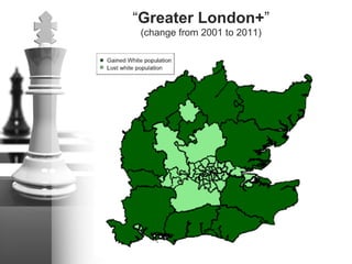
“Greater London+”
(change from 2001 to 2011)
Proportion of the population not White British in 2001
ProportionalchangeIntheWhiteBrit.Pop2001to2011
“Ethnic Cliffs”Distribution of ethnic group by boroughs, counties and unitary authorities
●
●●●●
●●
●● ●
●
●●
●
●
● ●
●
●
●
●
●
●
●
●
●
●
●●
●
●
●
●●
●●● ●
●●
●
●
●
●
●
●
●
●
●●
●
●
●
●
●
●
●
●
●
●●
●
●
●
●
●
●●
●●
●
● ●
●●
●●
●
●●
● ●●
●
●
●●
●
● ●
●
●
● ●
●
●
●
●
●
●
●
●
●
●
●
●●
●●
●
●
●
●
● ●●
●
●
●
●
●
●
●
●
●
●
●
● ●
●
●
●
● ●
● ●
●
●
●
● ●
●
●
●
●
●
● ●
●
●
●
● ●
●
●●
●
●
●
●
●
●
●
●
●
●
●
●
●
●
●
●
●
●
●
●
●
●
●
●
●
●
●
% White
< 71.5
< 88.5
< 93.6
< 94.4
< 96.6
< 97.6
White: English/Welsh/
Scottish/Northern
Irish/British
●
●
Greatest percentage in Redcar and Cleveland
Greatest contrast between
Redbridge and Essex
(c) Creative Commons Licence, Rich Harris
The Sunday Times (Jan 27, 2013)
The Daily Mail online (Jan 27, 2013)
And yet…
•  Ethnic segregation is falling in England (Catney,
2013)
•  A lower proportion of the White British population
now living in majority White neighbourhoods than
they did in 2001 – a finding that is as true of
London alone as for the whole of England
(Johnston et al., 2013).
•  “Academics cannot agree about whether [Britain]
is becoming more integrated or more segregated
in the wake of the unprecedented immigrant
inflows of the past 15 years” (Goodhart, 2013a,
p.47).
Different authorities, different trajectories
(Asian – White British)
P(Asian)
Different authorities, different trajectories
(Asian – White British)
P(Asian)
MEASURING SEGREGATION
Motion Charts, White Flight and Ethnic Cliffs?
Measures of Segregation
•  Typically,
•  The index of dissimilarity,
I ∝ Oi − Eii=1
n
∑
D =
1
2
xi
X
−
yi
Yi=1
n
∑
X = xii=1
n
∑
Y = yii=1
n
∑
Criticisms of such indices
•  Not easy to interpret over time
•  It assumes a ‘closed system’ and can lead
to false conclusions:
Dt1 − Dt0 f Δ xi X[ ],Δ yi Y[ ]( )
t0 t1 Assume D1 < D0
Is it decreased seg.?
Criticisms of such indices
•  Have no measure of statistical
significance
•  But then what is the benchmark to
compare against? (Who expects
populations to be randomly distributed?)
Criticisms of such indices
•  Segregation is usually regarded as an
outcome or cause of spatial processes of
separation.
•  But the index is largely blind to
geography.
•  All the following produce ‘total
segregation’ (D = 1)
Local Measure of Dissimilarity
•  Take the parts
•  Add a spatial weights matrix
•  Creates a spatially smoothed D
D = d1 + d2 + d3 +...+ dn
d1 =
x1
X
−
y1
Y
, etc.
Di
*
∝ wijj=1
n
∑ dj
A slight alternative
•  A weighted comparison of neighbours
–  Local Index of Spatial Association (LISA)
•  Replace:
•  With:
•  For example, O is the proportion of the
population White British and w is a
contiguity matrix…
Ii
*
∝ wij Oj − Ejj=1
n
∑
Ii
*
∝ wij Oi −Ojj=1
n−1
∑
Most dissimilar (% residents White British)
A measure of discontinuity
•  Example
–  There is a census small area in Tower
Hamlets where 142 of its 258 residents
classified themselves as White British in the
2011 Census, and a further three as
Bangladeshi.
–  Meanwhile, in a neighbouring area, 23 of the
211 residents are White British, and 142
Bangladeshi.
•  The discontinuity can be calculated by
direct analogy to the dissimilarity index:
| 142/165 – 3/145 | = 0.840
Local Measure of (Max) Discontinuity
•  In principle:
–  For each small area, i, find the neighbour that
gives the maximum dissimilarity value, given a
minimum joint population threshold
X = xi + xj
Y = yi + yj
if X ≥ 30, Y ≥ 30 & wij =1,
dij = wij
xi
X
−
yi
Y
else
dij = NA
Dci
*
= max dij( )
Dc =
1
n
Dci
*
i=1
n
∑ ∀Dci
*
∉ NA{ }
But… spatial ‘double counting’
I will get:
I would prefer:
The algorithm
1.  Pairs each small area (i) to a neighbour (j) that
is within 100 metres of its border, choosing that
neighbour which gives the maximum value of di.
A table is created with each i and its initial
pairing, j.
2.  Searches through the table to identify and to
remove those rows containing duplicated values
of j, retaining only the maximum cases.
3.  For those areas (i) expunged by Step 2,
searches again for a new pair from a list of
unmatched js, still using maximum value and
neighbour criteria.
4.  Cycles through Steps 2 and 3 until no further
pairings are possible.
A by-product
•  To count the cases that are omitted by the
population threshold and express them as
a proportion of the total pairings. This will
give a simple measure of how much the
population groups cluster within the study
region: the greater the number, the more
often one of the population groups is
found in neither of the neighbouring small
areas (or in low numbers within them).
Asian – White British
Oldham (2011)
Tower Hamlets (2011)
APPLICATION
Motion Charts, White Flight and Ethnic Cliffs?
Task
•  Identify those neighbours with the
greatest (Asian – White British)
discontinuity scores in 2001
•  See if those differences have increased or
decreased to 2011
•  Explanation for the change
1.0
3.5
7.5
14.0
23.5
41.0
Count
Greatest Asian – White British discontinuity
Top 590
(in 2001)
1.0
15.0
45.5
97.5
205.0
333.0
Count
Greatest Asian – White British discontinuity
Top 5490
(in 2001)
What happened next?
•  Of the 590 in 2001, 500 can be matched
to Census small areas in 2011 and, of
those, 71% have a decreased
discontinuity score.
•  Of the 5490 in 2001, 5000 can be
matched and, of those, 74% have a
decreased score.
For the matched 500
•  In 39% of cases
–  The number of Asians residing in the area
with the lower proportion of Asians in 2001
had increased. The number in the neighbour
with the higher proportion of Asians had
decreased.
•  In 49% of cases
–  There are now more Asians living in both the
neighbours.
•  In 69% of cases
–  The number of White British in both areas had
decreased.
For the matched 5000
•  In 32% of cases
–  The number of Asians residing in the area
with the lower proportion of Asians in 2001
had increased. The number in the neighbour
with the higher proportion of Asians had
decreased.
•  In 51% of cases
–  There are now more Asians living in both the
neighbours.
•  In 69% of cases
–  The number of White British in both areas had
decreased.
•  Finney and Simpson (2009) remind us, it
is a myth that minority groups want to live
in segregated neighbourhoods.
•  More evidence…
Source:
CourtesyofJohnston,PoulsenandForrest,
London’sChangingEthnicLandscape
2001-2011:ACartographicEvaluation
Source:
CourtesyofJohnston,PoulsenandForrest,
London’sChangingEthnicLandscape
2001-2011:ACartographicEvaluation
Source:
CourtesyofJohnston,PoulsenandForrest,
London’sChangingEthnicLandscape
2001-2011:ACartographicEvaluation
But what about ‘White Flight’?
•  Are apparent falls in segregation driven
more by the White British population
leaving areas rather than increased
mixing?
Source:
CourtesyofJohnston,PoulsenandForrest,
London’sChangingEthnicLandscape
2001-2011:ACartographicEvaluation
http://www.bbc.co.uk/news/uk-21511904
Wordle of the highest rated comments
on the Mark Easton article
In response to a Mark Easton article
•  Why have the White British left London?
–  “Some of the Areas have become very Asian
oriented with shops that cater more for Asian
people Halal Butchers, Bangladeshi Bakers,
Mosques and Temples, local shops that are
dominated by Asian foods and spices, and
that cater very little for non Asian tastes. Is it
any wonder the White people move out?
People feel like strangers in the town where
they were born.”
In response to the Mark Easton article
•  Why have the White British left London?
–  “They have left because they've been pushed
out by migrants. A few weeks ago we heard of
some Islamic "men" castigating a man for not
being Muslim, asking if he was gay, and telling
him to "get out, this is a Muslim area”. Their
exact words were played on the radio so there
was no doubt over it. Time for the govt. to do
something about such migrants”
CONCLUSIONS
Motion Charts, White Flight and Ethnic Cliffs?

Motion Charts, White Flight and Ethnic Cliffs?

  • 1.
    Motion Charts, WhiteFlight and Ethnic Cliffs? Ethno demographic change in the 2011 Census Richard Harris University of Bristol
  • 2.
    Abstract •  The aimof this presentation is to investigate claims of decreased segregation yet also of ‘white flight’ from English cities during the period from 2001 to 2011. •  To supplement a traditional measure of segregation, the dissimilarity index, with measures comparing differences between adjoining small areas. •  Look at whether the neighbouring small areas with greatest differences become more or less dissimilar by 2011, and how so. •  Motion charts also are presented stressing the individual trajectories of different local authorities.
  • 3.
    Overview •  Provide thecontext (the debate about ‘white flight’). •  Argue that a decrease in a traditional segregation index is not, in itself, evidence of decreasing segregation. •  Provide an example of a spatial index (though it does not resolve the above). •  Consider some different scenarios. •  Provide some qualitative evidence (not necessarily reliable) to caution against dismissing a ‘white flight’ partial explanation for demographic change.
  • 4.
    CONTEXT Motion Charts, WhiteFlight and Ethnic Cliffs?
  • 5.
    Residential Geographies (2011) Bangladeshi Distributionof ethnic group by boroughs, counties and unitary authorities ● ●●●● ●● ●● ● ● ●● ● ● ● ● ● ● ● ● ● ● ● ● ● ● ●● ● ● ● ●● ●●● ● ●● ● ● ● ● ● ● ● ● ●● ● ● ● ● ● ● ● ● ● ●● ● ● ● ● ● ●● ●● ● ● ● ●● ●● ● ●● ● ●● ● ● ●● ● ● ● ● ● ● ● ● ● ● ● ● ● ● ● ● ● ● ●● ●● ● ● ● ● ● ●● ● ● ● ● ● ● ● ● ● ● ● ● ● ● ● ● ● ● ● ● ● ● ● ● ● ● ● ● ● ● ● ● ● ● ● ● ● ● ●● ● ● ● ● ● ● ● ● ● ● ● ● ● ● ● ● ● ● ● ●● ● ● ● ● ● ● % Bangladeshi < 0.1 < 0.2 < 0.5 < 0.6 < 2.9 < 32 Asian/Asian British: Bangladeshi ● ● Greatest percentage in Tower Hamlets Greatest contrast between Hackney and Tower Hamlets (c) Creative Commons Licence, Rich Harris Indian Distribution of ethnic group by boroughs, counties and unitary authorities ● ●●●● ●● ●● ● ● ●● ● ● ● ● ● ● ● ● ● ● ● ● ● ● ●● ● ● ● ●● ●●● ● ●● ● ● ● ● ● ● ● ● ●● ● ● ● ● ● ● ● ● ● ●● ● ● ● ● ● ●● ●● ● ● ● ●● ●● ● ●● ● ●● ● ● ●● ● ● ● ● ● ● ● ● ● ● ● ● ● ● ● ● ● ● ●● ●● ● ● ● ● ● ●● ● ● ● ● ● ● ● ● ● ● ● ● ● ● ● ● ● ● ● ● ● ● ● ● ● ● ● ● ● ● ● ● ● ● ● ● ● ● ●● ● ● ● ● ● ● ● ● ● ● ● ● ● ● ● ● ● ● ●●● ● ● ● ● ● ● % Indian < 0.4 < 1 < 2.3 < 2.8 < 13.4 < 28.3 Asian/Asian British: Indian ● ● Greatest percentage in Leicester Greatest contrast between Leicester and Leicestershire (c) Creative Commons Licence, Rich Harris
  • 6.
    Pakistani Distribution of ethnicgroup by boroughs, counties and unitary authorities ● ●●●● ●● ●● ● ● ●● ● ● ● ● ● ● ● ● ● ● ● ● ● ● ●● ● ● ● ●● ●●● ● ●● ● ● ● ● ● ● ● ● ●● ● ● ● ● ● ● ● ● ● ●● ● ● ● ● ● ●● ●● ● ● ● ●● ●● ● ●● ● ●● ● ● ●● ● ● ● ● ● ● ● ● ● ● ● ● ● ● ● ● ● ● ●● ●● ● ● ● ● ● ●● ● ● ● ● ● ● ● ● ● ● ● ● ● ● ● ● ● ● ● ● ● ● ● ● ● ● ● ● ● ● ● ● ● ● ● ● ● ● ●● ● ● ● ● ● ● ● ● ● ● ● ● ● ● ● ● ● ● ● ● ● ● ● ● ● ● ● % Pakistani < 0.1 < 0.5 < 1.6 < 2.2 < 9.9 < 20.4 Asian/Asian British: Pakistani ● ● Greatest percentage in Bradford Greatest contrast between Bradford and North Yorkshire (c) Creative Commons Licence, Rich Harris Chinese Distribution of ethnic group by boroughs, counties and unitary authorities ● ●●●● ●● ●● ● ● ●● ● ● ● ● ● ● ● ● ● ● ● ● ● ● ●● ● ● ● ●● ●●● ● ●● ● ● ● ● ● ● ● ● ●● ● ● ● ● ● ● ● ● ● ●● ● ● ● ● ● ●● ●● ● ● ● ●● ●● ● ●● ● ●● ● ● ●● ● ● ● ● ● ● ● ● ● ● ● ● ● ● ● ● ● ● ●● ●● ● ● ● ● ● ●● ● ● ● ● ● ● ● ● ● ● ● ● ● ● ● ● ● ● ● ● ● ● ● ● ● ● ● ● ● ● ● ● ● ● ● ● ● ● ●● ● ● ● ● ● ● ● ● ● ● ● ● ● ● ● ● ● ● ● ● ● ● ● ● ● ● ● % Chinese < 0.3 < 0.5 < 0.9 < 1 < 2.2 < 3.6 Asian/Asian British: Chinese ● ● Greatest percentage in City of London Greatest contrast between Cheshire East and Manchester (c) Creative Commons Licence, Rich Harris
  • 7.
    Black African Distribution ofethnic group by boroughs, counties and unitary authorities ● ●●●● ●● ●● ● ● ●● ● ● ● ● ● ● ● ● ● ● ● ● ● ● ●● ● ● ● ●● ●●● ● ●● ● ● ● ● ● ● ● ● ●● ● ● ● ● ● ● ● ● ● ●● ● ● ● ● ● ●● ●● ● ● ● ●● ●● ● ●● ● ●● ● ● ●● ● ● ● ● ● ● ● ● ● ● ● ● ● ● ● ● ● ● ●● ●● ● ● ● ● ● ●● ● ● ● ● ● ● ● ● ● ● ● ● ● ● ● ● ● ● ● ● ● ● ● ● ● ● ● ● ● ● ● ● ● ● ● ● ● ● ●● ● ● ● ● ● ● ● ● ● ● ● ● ● ● ● ● ● ● ● ●● ● ● ● ● ● ● % Black African < 0.2 < 0.6 < 1.5 < 1.8 < 8 < 16.4 Black/African/Caribbean/ Black British: African ● ● Greatest percentage in Southwark Greatest contrast between Bromley and Southwark (c) Creative Commons Licence, Rich Harris Black Caribbean Distribution of ethnic group by boroughs, counties and unitary authorities ● ●●●● ●● ●● ● ● ●● ● ● ● ● ● ● ● ● ● ● ● ● ● ● ●● ● ● ● ●● ●●● ● ●● ● ● ● ● ● ● ● ● ●● ● ● ● ● ● ● ● ● ● ●● ● ● ● ● ● ●● ●● ● ● ● ●● ●● ● ●● ● ●● ● ● ●● ● ● ● ● ● ● ● ● ● ● ● ● ● ● ● ● ● ● ●● ●● ● ● ● ● ● ●● ● ● ● ● ● ● ● ● ● ● ● ● ● ● ● ● ● ● ● ● ● ● ● ● ● ● ● ● ● ● ● ● ● ● ● ● ● ● ●● ● ● ● ● ● ● ● ● ● ● ● ● ● ● ● ● ● ● ● ●● ● ● ● ● ● ● % Black Caribbean < 0.1 < 0.3 < 0.8 < 1 < 4.9 < 11.2 Black/African/Caribbean/ Black British: Caribbean ● ● Greatest percentage in Lewisham Greatest contrast between Bromley and Lewisham (c) Creative Commons Licence, Rich Harris
  • 8.
    Of particular interest… WhiteBritish Distribution of ethnic group by boroughs, counties and unitary authorities ● ●●●● ●● ●● ● ● ●● ● ● ● ● ● ● ● ● ● ● ● ● ● ● ●● ● ● ● ●● ●●● ● ●● ● ● ● ● ● ● ● ● ●● ● ● ● ● ● ● ● ● ● ●● ● ● ● ● ● ●● ●● ● ● ● ●● ●● ● ●● ● ●● ● ● ●● ● ● ● ● ● ● ● ● ● ● ● ● ● ● ● ● ● ● ●● ●● ● ● ● ● ● ●● ● ● ● ● ● ● ● ● ● ● ● ● ● ● ● ● ● ● ● ● ● ● ● ● ● ● ● ● ● ● ● ● ● ● ● ● ● ● ●● ● ● ● ● ● ● ● ● ● ● ● ● ● ● ● ● ● ● ● ● ● ● ● ● ● ● ● % White < 71.5 < 88.5 < 93.6 < 94.4 < 96.6 < 97.6 White: English/Welsh/ Scottish/Northern Irish/British ● ● Greatest percentage in Redcar and Cleveland Greatest contrast between Redbridge and Essex (c) Creative Commons Licence, Rich Harris
  • 9.
  • 10.
    Proportion of thepopulation not White British in 2001 ProportionalchangeIntheWhiteBrit.Pop2001to2011
  • 11.
    “Ethnic Cliffs”Distribution ofethnic group by boroughs, counties and unitary authorities ● ●●●● ●● ●● ● ● ●● ● ● ● ● ● ● ● ● ● ● ● ● ● ● ●● ● ● ● ●● ●●● ● ●● ● ● ● ● ● ● ● ● ●● ● ● ● ● ● ● ● ● ● ●● ● ● ● ● ● ●● ●● ● ● ● ●● ●● ● ●● ● ●● ● ● ●● ● ● ● ● ● ● ● ● ● ● ● ● ● ● ● ● ● ● ●● ●● ● ● ● ● ● ●● ● ● ● ● ● ● ● ● ● ● ● ● ● ● ● ● ● ● ● ● ● ● ● ● ● ● ● ● ● ● ● ● ● ● ● ● ● ● ●● ● ● ● ● ● ● ● ● ● ● ● ● ● ● ● ● ● ● ● ● ● ● ● ● ● ● ● % White < 71.5 < 88.5 < 93.6 < 94.4 < 96.6 < 97.6 White: English/Welsh/ Scottish/Northern Irish/British ● ● Greatest percentage in Redcar and Cleveland Greatest contrast between Redbridge and Essex (c) Creative Commons Licence, Rich Harris
  • 12.
    The Sunday Times(Jan 27, 2013)
  • 13.
    The Daily Mailonline (Jan 27, 2013)
  • 14.
    And yet… •  Ethnicsegregation is falling in England (Catney, 2013) •  A lower proportion of the White British population now living in majority White neighbourhoods than they did in 2001 – a finding that is as true of London alone as for the whole of England (Johnston et al., 2013). •  “Academics cannot agree about whether [Britain] is becoming more integrated or more segregated in the wake of the unprecedented immigrant inflows of the past 15 years” (Goodhart, 2013a, p.47).
  • 15.
    Different authorities, differenttrajectories (Asian – White British) P(Asian)
  • 16.
    Different authorities, differenttrajectories (Asian – White British) P(Asian)
  • 17.
    MEASURING SEGREGATION Motion Charts,White Flight and Ethnic Cliffs?
  • 18.
    Measures of Segregation • Typically, •  The index of dissimilarity, I ∝ Oi − Eii=1 n ∑ D = 1 2 xi X − yi Yi=1 n ∑ X = xii=1 n ∑ Y = yii=1 n ∑
  • 19.
    Criticisms of suchindices •  Not easy to interpret over time •  It assumes a ‘closed system’ and can lead to false conclusions: Dt1 − Dt0 f Δ xi X[ ],Δ yi Y[ ]( ) t0 t1 Assume D1 < D0 Is it decreased seg.?
  • 20.
    Criticisms of suchindices •  Have no measure of statistical significance •  But then what is the benchmark to compare against? (Who expects populations to be randomly distributed?)
  • 21.
    Criticisms of suchindices •  Segregation is usually regarded as an outcome or cause of spatial processes of separation. •  But the index is largely blind to geography. •  All the following produce ‘total segregation’ (D = 1)
  • 22.
    Local Measure ofDissimilarity •  Take the parts •  Add a spatial weights matrix •  Creates a spatially smoothed D D = d1 + d2 + d3 +...+ dn d1 = x1 X − y1 Y , etc. Di * ∝ wijj=1 n ∑ dj
  • 23.
    A slight alternative • A weighted comparison of neighbours –  Local Index of Spatial Association (LISA) •  Replace: •  With: •  For example, O is the proportion of the population White British and w is a contiguity matrix… Ii * ∝ wij Oj − Ejj=1 n ∑ Ii * ∝ wij Oi −Ojj=1 n−1 ∑
  • 24.
    Most dissimilar (%residents White British)
  • 25.
    A measure ofdiscontinuity •  Example –  There is a census small area in Tower Hamlets where 142 of its 258 residents classified themselves as White British in the 2011 Census, and a further three as Bangladeshi. –  Meanwhile, in a neighbouring area, 23 of the 211 residents are White British, and 142 Bangladeshi. •  The discontinuity can be calculated by direct analogy to the dissimilarity index: | 142/165 – 3/145 | = 0.840
  • 26.
    Local Measure of(Max) Discontinuity •  In principle: –  For each small area, i, find the neighbour that gives the maximum dissimilarity value, given a minimum joint population threshold X = xi + xj Y = yi + yj if X ≥ 30, Y ≥ 30 & wij =1, dij = wij xi X − yi Y else dij = NA Dci * = max dij( ) Dc = 1 n Dci * i=1 n ∑ ∀Dci * ∉ NA{ }
  • 27.
    But… spatial ‘doublecounting’ I will get: I would prefer:
  • 28.
    The algorithm 1.  Pairseach small area (i) to a neighbour (j) that is within 100 metres of its border, choosing that neighbour which gives the maximum value of di. A table is created with each i and its initial pairing, j. 2.  Searches through the table to identify and to remove those rows containing duplicated values of j, retaining only the maximum cases. 3.  For those areas (i) expunged by Step 2, searches again for a new pair from a list of unmatched js, still using maximum value and neighbour criteria. 4.  Cycles through Steps 2 and 3 until no further pairings are possible.
  • 29.
    A by-product •  Tocount the cases that are omitted by the population threshold and express them as a proportion of the total pairings. This will give a simple measure of how much the population groups cluster within the study region: the greater the number, the more often one of the population groups is found in neither of the neighbouring small areas (or in low numbers within them).
  • 30.
  • 33.
  • 34.
  • 35.
    APPLICATION Motion Charts, WhiteFlight and Ethnic Cliffs?
  • 36.
    Task •  Identify thoseneighbours with the greatest (Asian – White British) discontinuity scores in 2001 •  See if those differences have increased or decreased to 2011 •  Explanation for the change
  • 37.
    1.0 3.5 7.5 14.0 23.5 41.0 Count Greatest Asian –White British discontinuity Top 590 (in 2001)
  • 38.
    1.0 15.0 45.5 97.5 205.0 333.0 Count Greatest Asian –White British discontinuity Top 5490 (in 2001)
  • 39.
    What happened next? • Of the 590 in 2001, 500 can be matched to Census small areas in 2011 and, of those, 71% have a decreased discontinuity score. •  Of the 5490 in 2001, 5000 can be matched and, of those, 74% have a decreased score.
  • 40.
    For the matched500 •  In 39% of cases –  The number of Asians residing in the area with the lower proportion of Asians in 2001 had increased. The number in the neighbour with the higher proportion of Asians had decreased. •  In 49% of cases –  There are now more Asians living in both the neighbours. •  In 69% of cases –  The number of White British in both areas had decreased.
  • 41.
    For the matched5000 •  In 32% of cases –  The number of Asians residing in the area with the lower proportion of Asians in 2001 had increased. The number in the neighbour with the higher proportion of Asians had decreased. •  In 51% of cases –  There are now more Asians living in both the neighbours. •  In 69% of cases –  The number of White British in both areas had decreased.
  • 42.
    •  Finney andSimpson (2009) remind us, it is a myth that minority groups want to live in segregated neighbourhoods. •  More evidence…
  • 43.
  • 44.
  • 45.
  • 46.
    But what about‘White Flight’? •  Are apparent falls in segregation driven more by the White British population leaving areas rather than increased mixing?
  • 47.
  • 48.
  • 49.
    Wordle of thehighest rated comments on the Mark Easton article
  • 50.
    In response toa Mark Easton article •  Why have the White British left London? –  “Some of the Areas have become very Asian oriented with shops that cater more for Asian people Halal Butchers, Bangladeshi Bakers, Mosques and Temples, local shops that are dominated by Asian foods and spices, and that cater very little for non Asian tastes. Is it any wonder the White people move out? People feel like strangers in the town where they were born.”
  • 51.
    In response tothe Mark Easton article •  Why have the White British left London? –  “They have left because they've been pushed out by migrants. A few weeks ago we heard of some Islamic "men" castigating a man for not being Muslim, asking if he was gay, and telling him to "get out, this is a Muslim area”. Their exact words were played on the radio so there was no doubt over it. Time for the govt. to do something about such migrants”
  • 53.
    CONCLUSIONS Motion Charts, WhiteFlight and Ethnic Cliffs?