Design thinking isan iterative, non-linear process which focuses on a collaboration between
designers and users.
It brings innovative solutions to life based on how real users think, feel and behave.
This human-centered design process consists of five core stages
Empathize, - Define, - Ideate, --Prototype ---and --Test.
It’s important to note that these stages are a guide.
The iterative, non-linear nature of design thinking means you can carry these stages out
simultaneously, repeat them and even circle back to previous stages at any point in the design
thinking process.
Design thinking isa term used to represent a set of cognitive, strategic, and practical processes by
which design concepts (proposals for products, buildings, machines, communications, etc.) are
developed.
Many key concepts and aspects of design thinking have been identified through studies across
different design domains of design cognition and design activity in both laboratory and natural
contexts.
Design thinking is also associated with prescriptions for the innovation of products and services within
business and social contexts.
Some of these prescriptions have been criticized for oversimplifying the design process and trivializing
the role of technical knowledge and skills.
7.
Exploring the GestaltPrinciples of Design
Gestalt principles are an important set of ideas for any designer to learn and their implementation
can greatly improve the aesthetics of a design as well as its functionality and user-friendliness
The human brain is exceptionally good at filling in the blanks in an image and creating a whole that is
greater than the sum of its parts. It’s why we see faces in things like tree leaves or sidewalk cracks.
8.
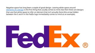
Negative space haslong been a staple of good design. Leaving white space around
elements of a design is the first thing that usually comes to mind. But then there are designs
that use that white space to infer an element that isn’t actually there (the arrow hidden
between the E and X in the FedEx logo immediately comes to mind as an example).
9.
In the simplestterms, gestalt theory is based on the idea that the human brain
will attempt to simplify and organize complex images or designs that consist of
many elements,
by subconsciously arranging the parts into an organized system that creates a
whole, rather than just a series of disparate elements.
Our brains are built to see structure and patterns in order for us to better
understand the environment that we’re living in.
10.
here are sixindividual principles commonly associated with
gestalt theory:
similarity, continuation, closure, proximity, figure/ground,
and symmetry & order
There are also some additional, newer principles sometimes
associated with gestalt, such as common fate.
11.
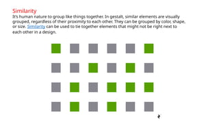
Similarity
It’s human natureto group like things together. In gestalt, similar elements are visually
grouped, regardless of their proximity to each other. They can be grouped by color, shape,
or size. Similarity can be used to tie together elements that might not be right next to
each other in a design.
12.
Continuation
The law ofcontinuity posits that the human eye will follow the
smoothest path when viewing lines, regardless of how the lines were
actually drawn
13.
Closure
Closure is oneof the coolest gestalt design principles and one I already touched
on at the beginning of this piece. It’s the idea that your brain will fill in the missing
parts of a design or image to create a whole.
Closure is quite often used in logo design, with other
examples including those for the USA Network, NBC,
Sun Microsystems, and even Adobe.
14.
Proximity
Proximity refers tohow close elements are to one another. The strongest
proximity relationships are those between overlapping subjects, but just
grouping objects into a single area can also have a strong proximity effect.
15.
Figure/Ground
The figure/ground principleis similar to the closure principle in that it takes advantage of the
way the brain processes negative space
. You’ve probably seen examples of this principle floating around in memes on social media, or
as part of logos (like the FedEx logo already mentioned).
17.
Symmetry and Order
Thelaw of symmetry and order is also known as prägnanz,
the German word for “good figure.” What this principle says is that your brain
will perceive ambiguous shapes in as simple a manner as possible
. For example, a monochrome version of the Olympic logo is seen as a series of
overlapping circles rather than a collection of curved lines.