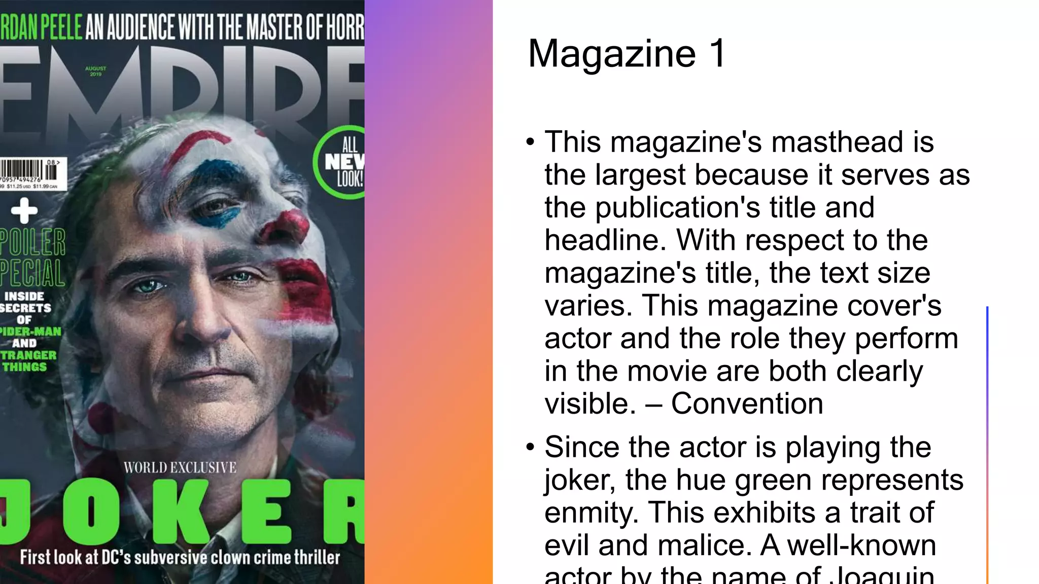
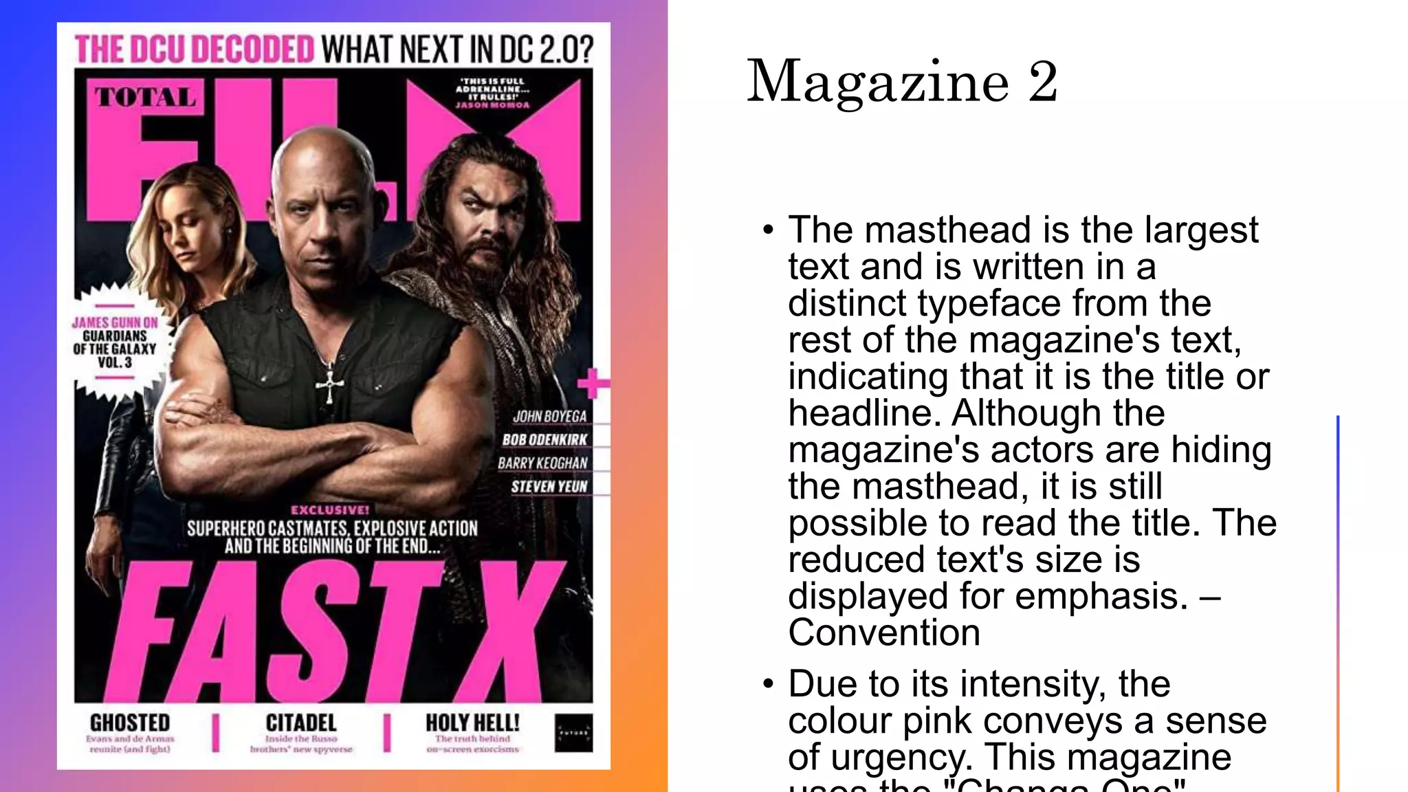
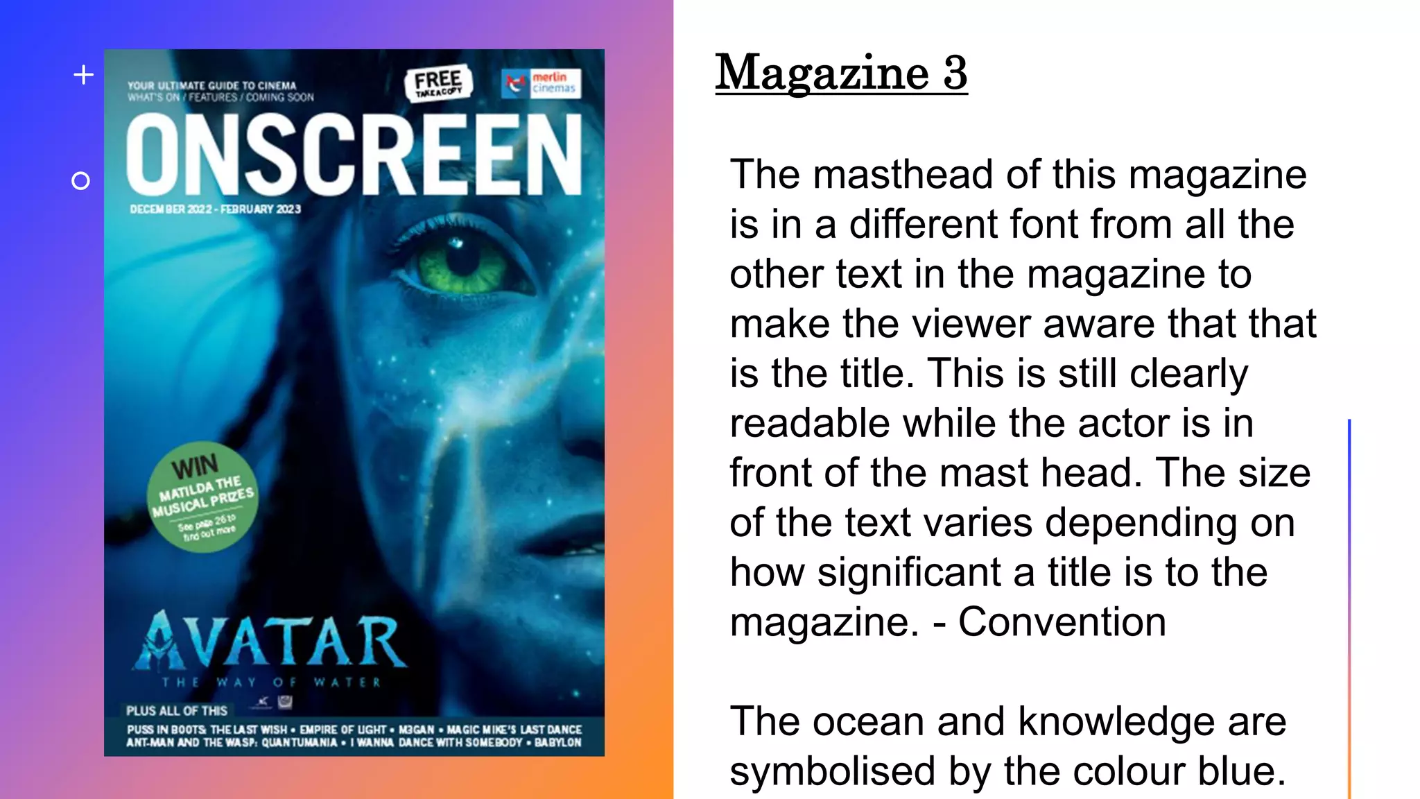
This document discusses conventions used in magazine covers. It analyzes three magazine covers and identifies the conventions used for each. Magazine 1 has the largest masthead to serve as the title and uses varying text sizes. It clearly shows the actor and role. Magazine 2 has a distinct masthead typeface even when actors hide it. The reduced text emphasizes other elements. Magazine 3 varies text size based on significance and uses blue to symbolize the ocean and knowledge.