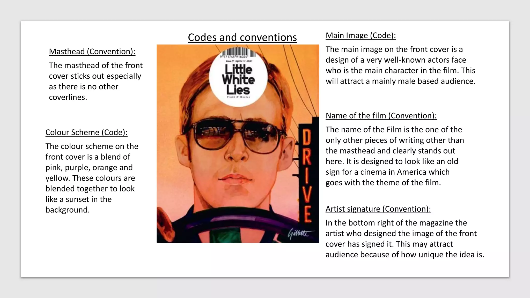
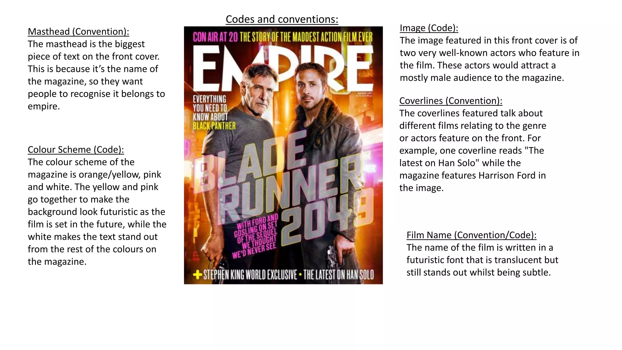
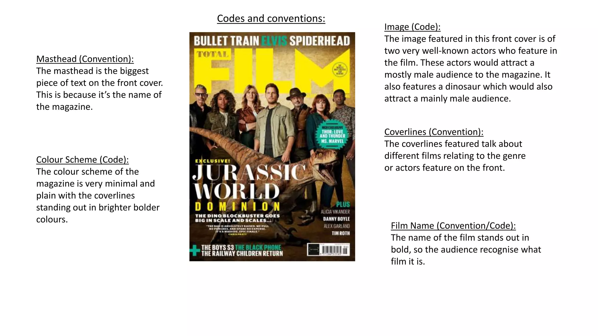
Research task 2
Codes and conventions
Masthead (Convention):
The masthead of the front
cover sticks out especially
as there is no other
coverlines.
Name of the film (Convention):
The name of the Film is the one of the
only other pieces of writing other than
the masthead and clearly stands out
here. It is designed to look like an old
sign for a cinema in America which
goes with the theme of the film.
Colour Scheme (Code):
The colour scheme on the
front cover is a blend of
pink, purple, orange and
yellow. These colours are
blended together to look
like a sunset in the
background.
Main Image (Code):
The main image on the front cover is a
design of a very well-known actors face
who is the main character in the film. This
will attract a mainly male based audience.
Artist signature (Convention):
In the bottom right of the magazine the
artist who designed the image of the front
cover has signed it. This may attract
audience because of how unique the idea is.
Codes and conventions:
Masthead (Convention):
The masthead is the biggest
piece of text on the front cover.
This is because it’s the name of
the magazine, so they want
people to recognise it belongs to
empire.
Colour Scheme (Code):
The colour scheme of the
magazine is orange/yellow, pink
and white. The yellow and pink
go together to make the
background look futuristic as the
film is set in the future, while the
white makes the text stand out
from the rest of the colours on
the magazine.
Image (Code):
The image featured in this front cover is of
two very well-known actors who feature in
the film. These actors would attract a
mostly male audience to the magazine.
Coverlines (Convention):
The coverlines featured talk about
different films relating to the genre
or actors feature on the front. For
example, one coverline reads "The
latest on Han Solo" while the
magazine features Harrison Ford in
the image.
Film Name (Convention/Code):
The name of the film is written in a
futuristic font that is translucent but
still stands out whilst being subtle.
Codes and conventions:
Masthead (Convention):
The masthead is the biggest
piece of text on the front cover.
This is because it’s the name of
the magazine.
Colour Scheme (Code):
The colour scheme of the
magazine is very minimal and
plain with the coverlines
standing out in brighter bolder
colours.
Image (Code):
The image featured in this front cover is of
two very well-known actors who feature in
the film. These actors would attract a
mostly male audience to the magazine. It
also features a dinosaur which would also
attract a mainly male audience.
Coverlines (Convention):
The coverlines featured talk about
different films relating to the genre
or actors feature on the front.
Film Name (Convention/Code):
The name of the film stands out in
bold, so the audience recognise what
film it is.

Research task 2.pptx

  • 1.
  • 2.
    Codes and conventions Masthead(Convention): The masthead of the front cover sticks out especially as there is no other coverlines. Name of the film (Convention): The name of the Film is the one of the only other pieces of writing other than the masthead and clearly stands out here. It is designed to look like an old sign for a cinema in America which goes with the theme of the film. Colour Scheme (Code): The colour scheme on the front cover is a blend of pink, purple, orange and yellow. These colours are blended together to look like a sunset in the background. Main Image (Code): The main image on the front cover is a design of a very well-known actors face who is the main character in the film. This will attract a mainly male based audience. Artist signature (Convention): In the bottom right of the magazine the artist who designed the image of the front cover has signed it. This may attract audience because of how unique the idea is.
  • 3.
    Codes and conventions: Masthead(Convention): The masthead is the biggest piece of text on the front cover. This is because it’s the name of the magazine, so they want people to recognise it belongs to empire. Colour Scheme (Code): The colour scheme of the magazine is orange/yellow, pink and white. The yellow and pink go together to make the background look futuristic as the film is set in the future, while the white makes the text stand out from the rest of the colours on the magazine. Image (Code): The image featured in this front cover is of two very well-known actors who feature in the film. These actors would attract a mostly male audience to the magazine. Coverlines (Convention): The coverlines featured talk about different films relating to the genre or actors feature on the front. For example, one coverline reads "The latest on Han Solo" while the magazine features Harrison Ford in the image. Film Name (Convention/Code): The name of the film is written in a futuristic font that is translucent but still stands out whilst being subtle.
  • 4.
    Codes and conventions: Masthead(Convention): The masthead is the biggest piece of text on the front cover. This is because it’s the name of the magazine. Colour Scheme (Code): The colour scheme of the magazine is very minimal and plain with the coverlines standing out in brighter bolder colours. Image (Code): The image featured in this front cover is of two very well-known actors who feature in the film. These actors would attract a mostly male audience to the magazine. It also features a dinosaur which would also attract a mainly male audience. Coverlines (Convention): The coverlines featured talk about different films relating to the genre or actors feature on the front. Film Name (Convention/Code): The name of the film stands out in bold, so the audience recognise what film it is.