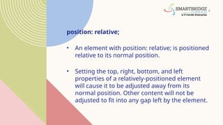
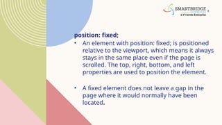
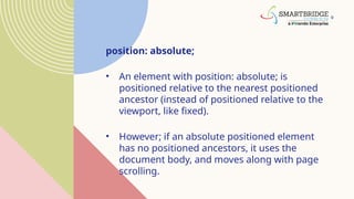
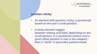
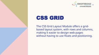
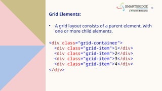
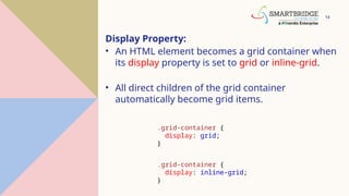
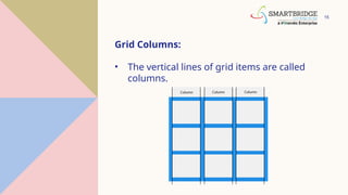
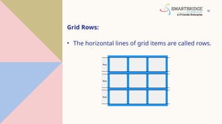
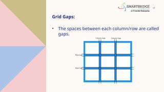
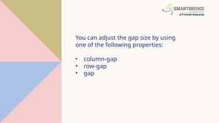
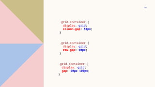
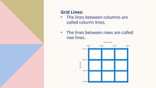
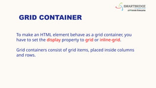
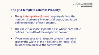
FULL STACK
DEVELOPMENT
AGENDA
1. CSS Layouts
2. CSS Grid
3. CSS Flexbox
3
CSS LAYOUT
4
The position Property:
The position property specifies the type of
positioning method used for an element.
There are five different position values:
•static
•relative
•fixed
•absolute
•sticky
5
• Elements are then positioned using the top,
bottom, left, and right properties. However, these
properties will not work unless
the position property is set first. They also work
differently depending on the position value.
6
position: static;
• HTML elements are positioned static by
default.
• Static positioned elements are not affected by
the top, bottom, left, and right properties.
7
position: relative;
• An element with position: relative; is positioned
relative to its normal position.
• Setting the top, right, bottom, and left
properties of a relatively-positioned element
will cause it to be adjusted away from its
normal position. Other content will not be
adjusted to fit into any gap left by the element.
8
position: fixed;
• An element with position: fixed; is positioned
relative to the viewport, which means it always
stays in the same place even if the page is
scrolled. The top, right, bottom, and left
properties are used to position the element.
• A fixed element does not leave a gap in the
page where it would normally have been
located.
9
position: absolute;
• An element with position: absolute; is
positioned relative to the nearest positioned
ancestor (instead of positioned relative to the
viewport, like fixed).
• However; if an absolute positioned element
has no positioned ancestors, it uses the
document body, and moves along with page
scrolling.
10
position: sticky;
• An element with position: sticky; is positioned
based on the user's scroll position.
• A sticky element toggles
between relative and fixed, depending on the
scroll position. It is positioned relative until a
given offset position is met in the viewport -
then it "sticks" in place (like position:fixed).
CSS GRID
12
CSS GRID
The CSS Grid Layout Module offers a grid-
based layout system, with rows and columns,
making it easier to design web pages
without having to use floats and positioning.
13
Grid Elements:
• A grid layout consists of a parent element, with
one or more child elements.
<div class="grid-container">
<div class="grid-item">1</div>
<div class="grid-item">2</div>
<div class="grid-item">3</div>
<div class="grid-item">4</div>
</div>
14
Display Property:
• An HTML element becomes a grid container when
its display property is set to grid or inline-grid.
• All direct children of the grid container
automatically become grid items.
.grid-container {
display: grid;
}
.grid-container {
display: inline-grid;
}
15
Grid Columns:
• The vertical lines of grid items are called
columns.
16
Grid Rows:
• The horizontal lines of grid items are called rows.
17
Grid Gaps:
• The spaces between each column/row are called
gaps.
You can adjust the gap size by using
one of the following properties:
• column-gap
• row-gap
• gap
19
.grid-container {
display: grid;
column-gap: 50px;
}
.grid-container {
display: grid;
row-gap: 50px;
}
.grid-container {
display: grid;
gap: 50px 100px;
}
Grid Lines:
• The lines between columns are
called column lines.
• The lines between rows are called
row lines.
GRID CONTAINER
To make an HTML element behave as a grid container, you
have to set the display property to grid or inline-grid.
Grid containers consist of grid items, placed inside columns
and rows.
The grid-template-columns Property:
• The grid-template-columns property defines the
number of columns in your grid layout, and it can
define the width of each column.
• The value is a space-separated-list, where each value
defines the width of the respective column.
• If you want your grid layout to contain 4 columns,
specify the width of the 4 columns, or "auto" if all
columns should have the same width.
The grid-template-rows Property:
• The grid-template-rows property defines the height
of each row.
• The value is a space-separated-list, where each value
defines the height of the respective row.
The justify-content Property:
• The justify-content property is used to align the
whole grid inside the container.
The align-content Property:
• The align-content property is used to vertically align
the whole grid inside the container.
GRID ITEMS (child elements):
• A grid container contains grid items.
• By default, a container has one grid item for each column, in
each row, but you can style the grid items so that they will span
multiple columns and/or rows.
The grid-column Property:
• The grid-column property defines on which column(s) to
place an item.
• You define where the item will start, and where the item
will end.
The grid-row Property:
• The grid-row property defines on which row to place an item.
• You define where the item will start, and where the item will end.
The grid-area Property:
• The grid-area property can be used as a shorthand property
for the grid-row-start, grid-column-start, grid-row-end and
the grid-column-end properties
30
CSS FLEXBOX
CSS Flexbox Layout Module:
Before the Flexbox Layout module, there were four layout
modes:
•Block, for sections in a webpage
•Inline, for text
•Table, for two-dimensional table data
•Positioned, for explicit position of an element
The Flexible Box Layout Module, makes it easier to design
flexible responsive layout structure without using float or
positioning.
Flexbox Elements:
• To start using the Flexbox model, you need to first define a
flex container.
The flex-direction Property:
• The flex-direction property defines in which direction the
container wants to stack the flex items.
CSS Flex Container:
• The flex container becomes flexible by setting
the display property to flex
The flex-wrap Property:
• The flex-wrap property specifies whether the flex items
should wrap or not.
• The examples below have 12 flex items, to better
demonstrate the flex-wrap property.
CSS Flex Responsive:
• You learned from the CSS Media Queries chapter that you
can use media queries to create different layouts for
different screen sizes and devices.
THANK YOU

Full Stack Development CSS_Layouts,Grid,FlexboxPPT.pptx

  • 1.
  • 2.
    AGENDA 1. CSS Layouts 2.CSS Grid 3. CSS Flexbox
  • 3.
  • 4.
    4 The position Property: Theposition property specifies the type of positioning method used for an element. There are five different position values: •static •relative •fixed •absolute •sticky
  • 5.
    5 • Elements arethen positioned using the top, bottom, left, and right properties. However, these properties will not work unless the position property is set first. They also work differently depending on the position value.
  • 6.
    6 position: static; • HTMLelements are positioned static by default. • Static positioned elements are not affected by the top, bottom, left, and right properties.
  • 7.
    7 position: relative; • Anelement with position: relative; is positioned relative to its normal position. • Setting the top, right, bottom, and left properties of a relatively-positioned element will cause it to be adjusted away from its normal position. Other content will not be adjusted to fit into any gap left by the element.
  • 8.
    8 position: fixed; • Anelement with position: fixed; is positioned relative to the viewport, which means it always stays in the same place even if the page is scrolled. The top, right, bottom, and left properties are used to position the element. • A fixed element does not leave a gap in the page where it would normally have been located.
  • 9.
    9 position: absolute; • Anelement with position: absolute; is positioned relative to the nearest positioned ancestor (instead of positioned relative to the viewport, like fixed). • However; if an absolute positioned element has no positioned ancestors, it uses the document body, and moves along with page scrolling.
  • 10.
    10 position: sticky; • Anelement with position: sticky; is positioned based on the user's scroll position. • A sticky element toggles between relative and fixed, depending on the scroll position. It is positioned relative until a given offset position is met in the viewport - then it "sticks" in place (like position:fixed).
  • 11.
  • 12.
    12 CSS GRID The CSSGrid Layout Module offers a grid- based layout system, with rows and columns, making it easier to design web pages without having to use floats and positioning.
  • 13.
    13 Grid Elements: • Agrid layout consists of a parent element, with one or more child elements. <div class="grid-container"> <div class="grid-item">1</div> <div class="grid-item">2</div> <div class="grid-item">3</div> <div class="grid-item">4</div> </div>
  • 14.
    14 Display Property: • AnHTML element becomes a grid container when its display property is set to grid or inline-grid. • All direct children of the grid container automatically become grid items. .grid-container { display: grid; } .grid-container { display: inline-grid; }
  • 15.
    15 Grid Columns: • Thevertical lines of grid items are called columns.
  • 16.
    16 Grid Rows: • Thehorizontal lines of grid items are called rows.
  • 17.
    17 Grid Gaps: • Thespaces between each column/row are called gaps.
  • 18.
    You can adjustthe gap size by using one of the following properties: • column-gap • row-gap • gap
  • 19.
    19 .grid-container { display: grid; column-gap:50px; } .grid-container { display: grid; row-gap: 50px; } .grid-container { display: grid; gap: 50px 100px; }
  • 20.
    Grid Lines: • Thelines between columns are called column lines. • The lines between rows are called row lines.
  • 21.
    GRID CONTAINER To makean HTML element behave as a grid container, you have to set the display property to grid or inline-grid. Grid containers consist of grid items, placed inside columns and rows.
  • 22.
    The grid-template-columns Property: •The grid-template-columns property defines the number of columns in your grid layout, and it can define the width of each column. • The value is a space-separated-list, where each value defines the width of the respective column. • If you want your grid layout to contain 4 columns, specify the width of the 4 columns, or "auto" if all columns should have the same width.
  • 23.
    The grid-template-rows Property: •The grid-template-rows property defines the height of each row. • The value is a space-separated-list, where each value defines the height of the respective row.
  • 24.
    The justify-content Property: •The justify-content property is used to align the whole grid inside the container.
  • 25.
    The align-content Property: •The align-content property is used to vertically align the whole grid inside the container.
  • 26.
    GRID ITEMS (childelements): • A grid container contains grid items. • By default, a container has one grid item for each column, in each row, but you can style the grid items so that they will span multiple columns and/or rows.
  • 27.
    The grid-column Property: •The grid-column property defines on which column(s) to place an item. • You define where the item will start, and where the item will end.
  • 28.
    The grid-row Property: •The grid-row property defines on which row to place an item. • You define where the item will start, and where the item will end.
  • 29.
    The grid-area Property: •The grid-area property can be used as a shorthand property for the grid-row-start, grid-column-start, grid-row-end and the grid-column-end properties
  • 30.
  • 31.
    CSS Flexbox LayoutModule: Before the Flexbox Layout module, there were four layout modes: •Block, for sections in a webpage •Inline, for text •Table, for two-dimensional table data •Positioned, for explicit position of an element The Flexible Box Layout Module, makes it easier to design flexible responsive layout structure without using float or positioning.
  • 32.
    Flexbox Elements: • Tostart using the Flexbox model, you need to first define a flex container.
  • 33.
    The flex-direction Property: •The flex-direction property defines in which direction the container wants to stack the flex items.
  • 34.
    CSS Flex Container: •The flex container becomes flexible by setting the display property to flex
  • 35.
    The flex-wrap Property: •The flex-wrap property specifies whether the flex items should wrap or not. • The examples below have 12 flex items, to better demonstrate the flex-wrap property.
  • 36.
    CSS Flex Responsive: •You learned from the CSS Media Queries chapter that you can use media queries to create different layouts for different screen sizes and devices.
  • 37.