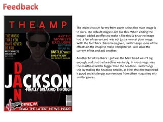
The main criticism for my front cover is that the main image is
to dark. The default image is not like this. When editing the
image I added an effect to make it like this so that the image
had a feel of secrecy and was not just a normal plain image.
With the feed back I have been given, I will change some of the
effects on the image to make it brighter or I will scrap the
current effect and add another.

Another bit of feedback I got was the Mast head wasn’t big
enough, and that the headline was to big. In most magazines
the masthead will be bigger than the headline. I will change
this by making the headline smaller, as I feel that the masthead
is good and challenges conventions from other magazines with
similar genres.

Frontcover feedback

  • 1.
    The main criticismfor my front cover is that the main image is to dark. The default image is not like this. When editing the image I added an effect to make it like this so that the image had a feel of secrecy and was not just a normal plain image. With the feed back I have been given, I will change some of the effects on the image to make it brighter or I will scrap the current effect and add another. Another bit of feedback I got was the Mast head wasn’t big enough, and that the headline was to big. In most magazines the masthead will be bigger than the headline. I will change this by making the headline smaller, as I feel that the masthead is good and challenges conventions from other magazines with similar genres.