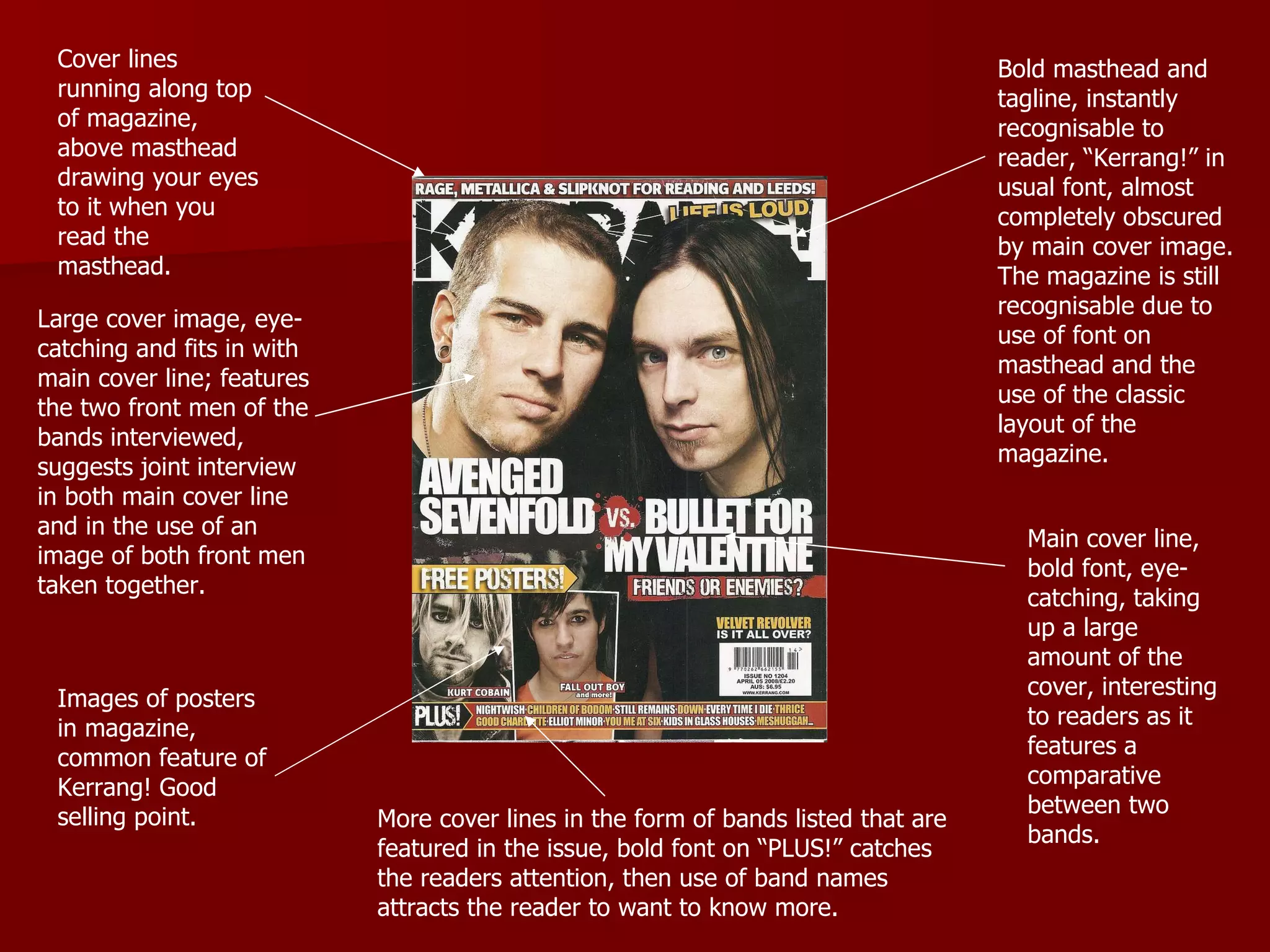
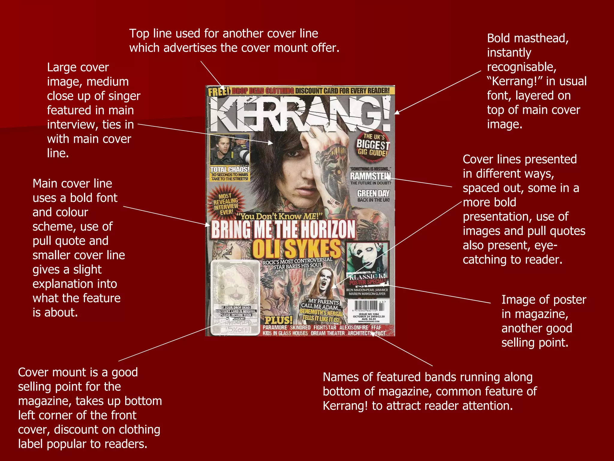
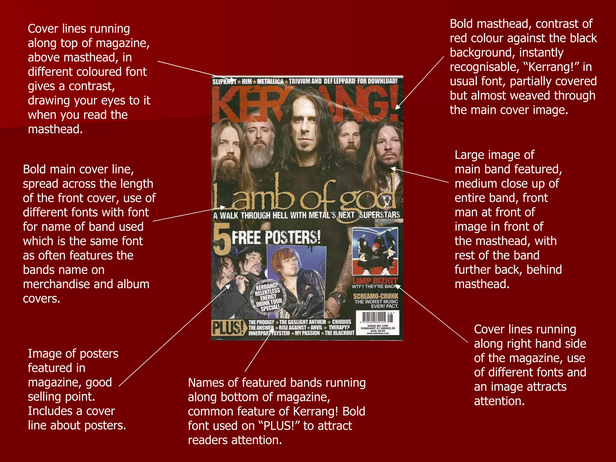
The document analyzes three issues of the Kerrang! magazine to inform the design of their own magazine cover. Some key aspects noticed include the use of a bold masthead in a recognizable font, large eye-catching cover images relating to the main cover story, and cover lines advertising additional articles and features to attract readers. Overall, the Kerrang! covers maintain a structured yet chaotic layout that stands out while still feeling familiar to their audience.