Download to read offline

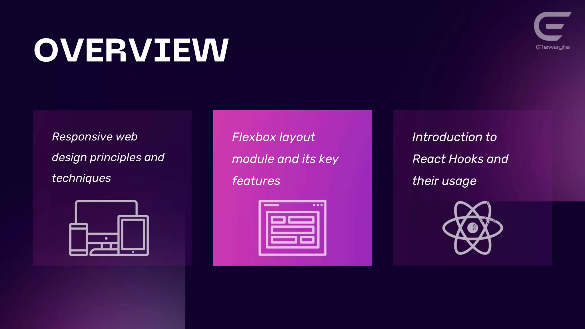
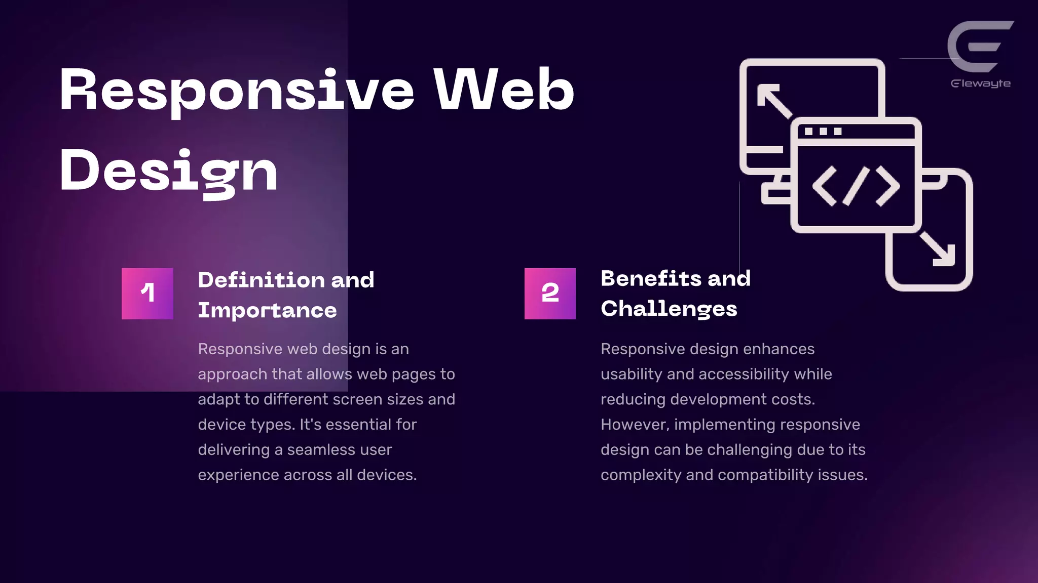
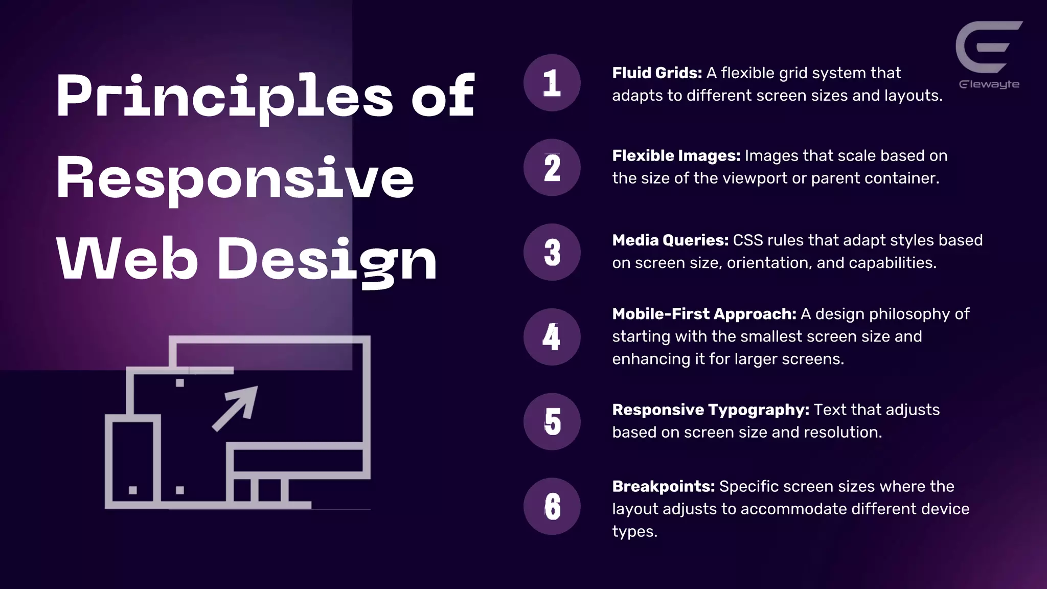
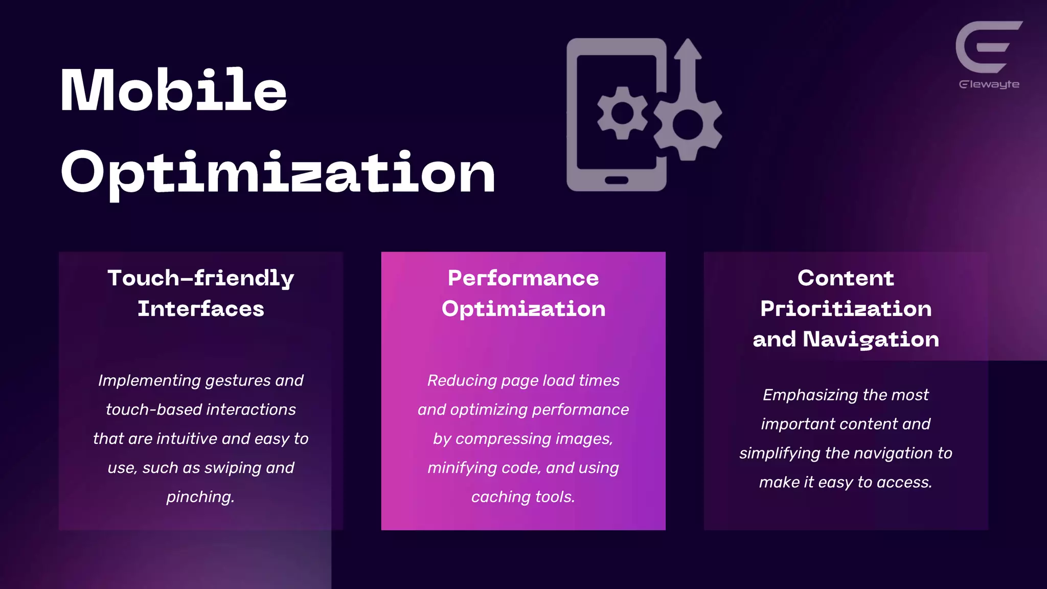
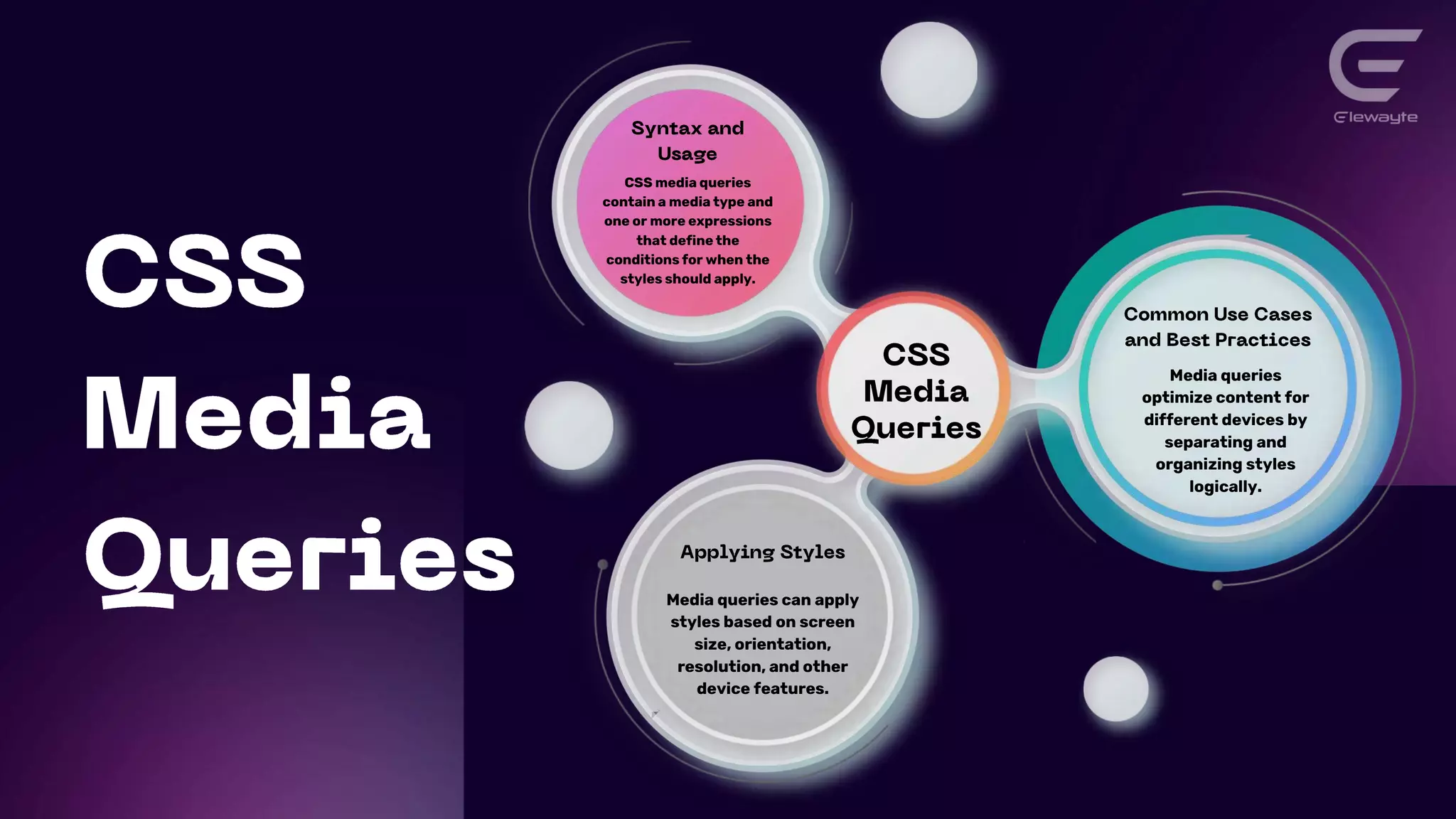
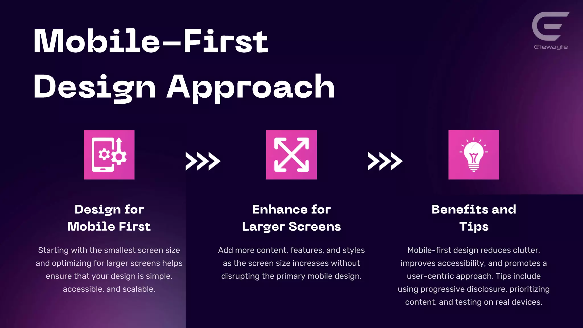
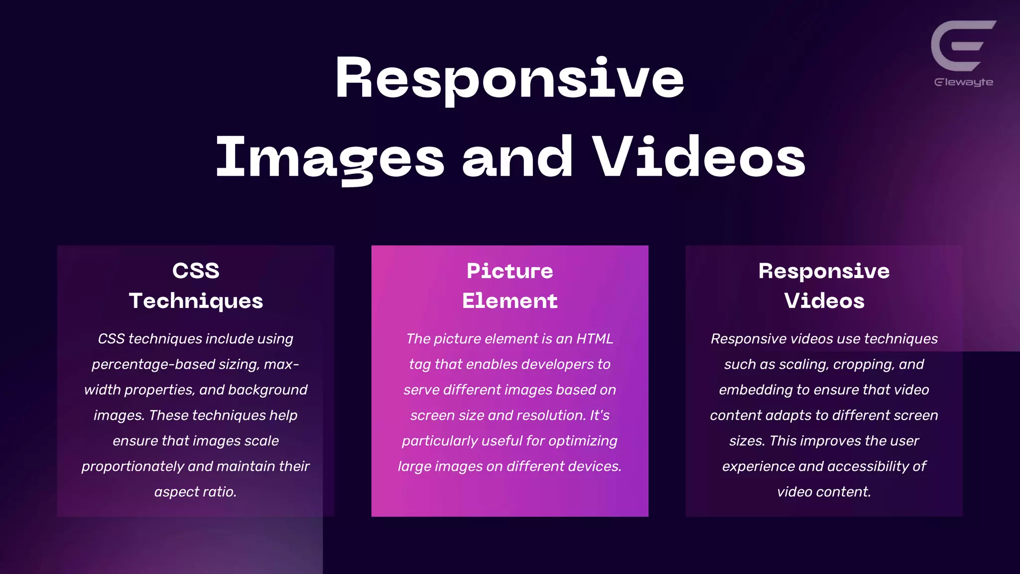
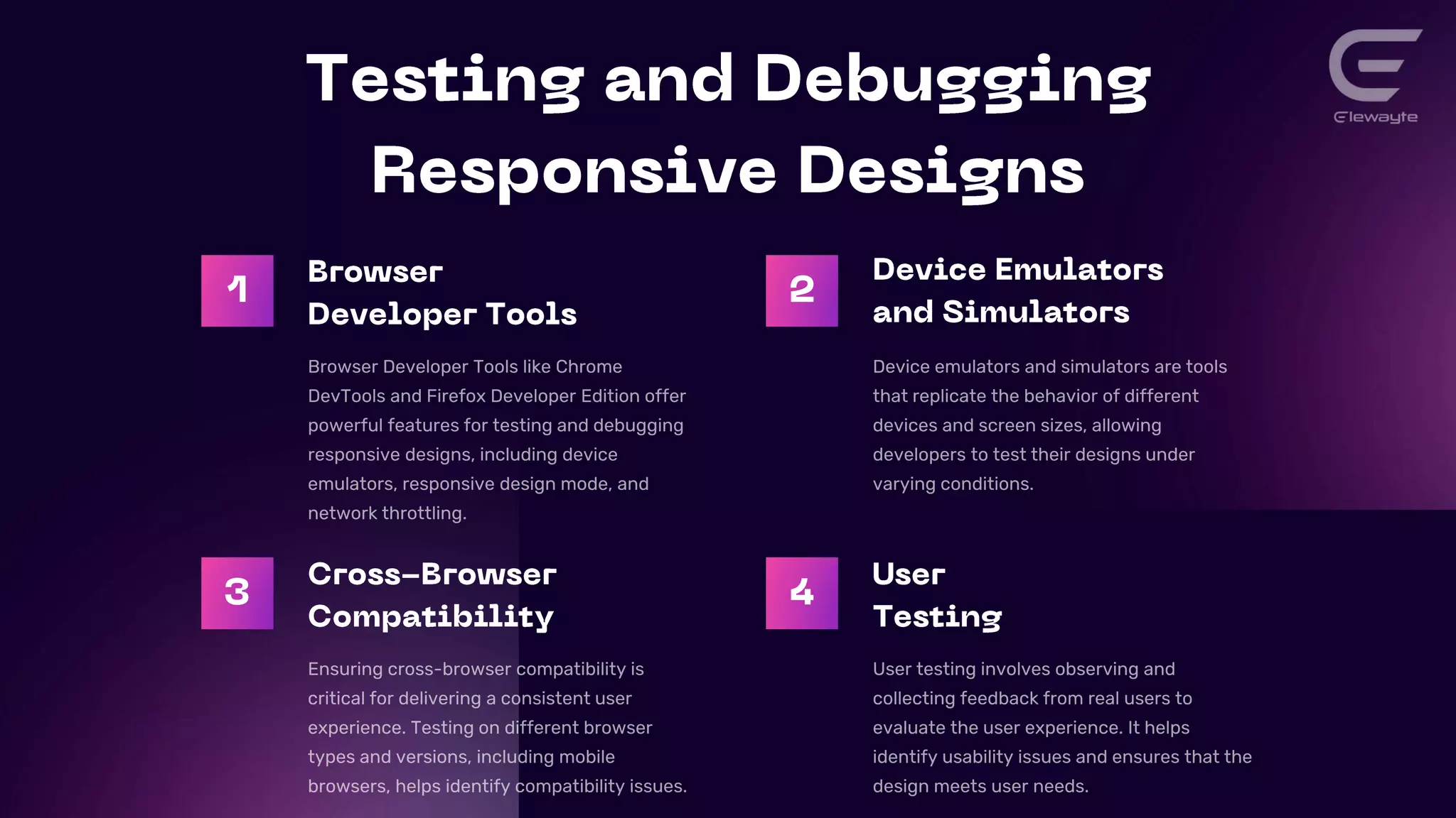
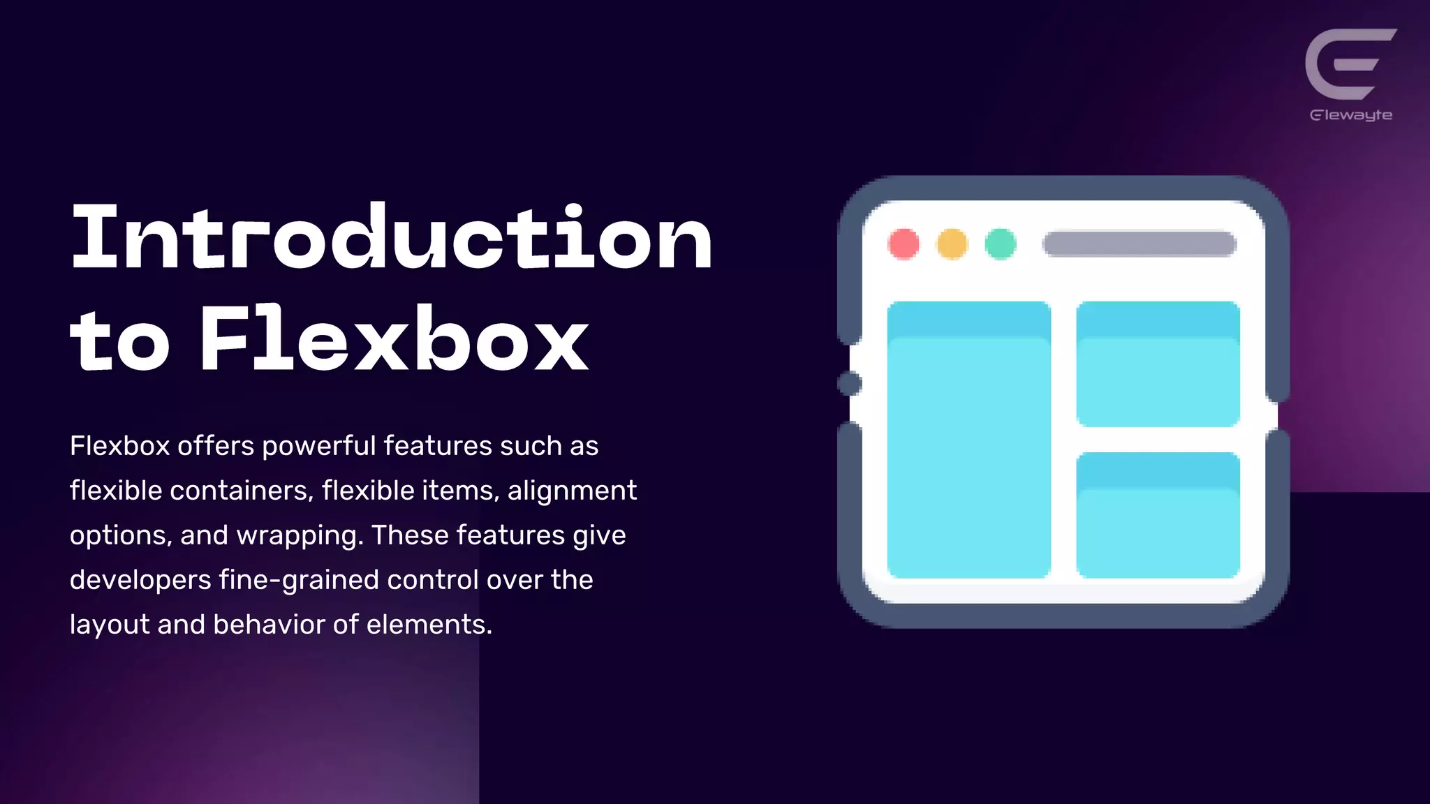
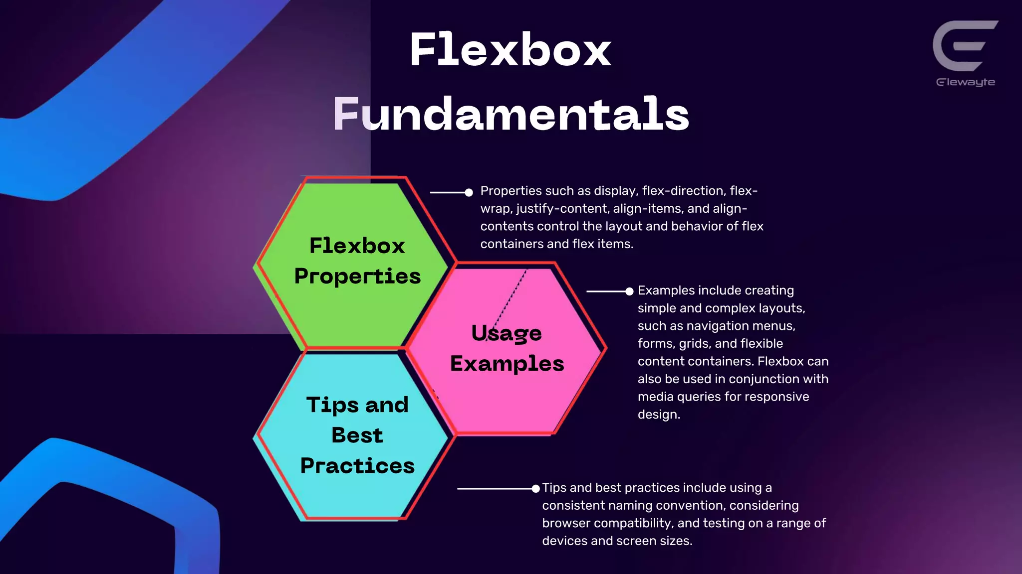
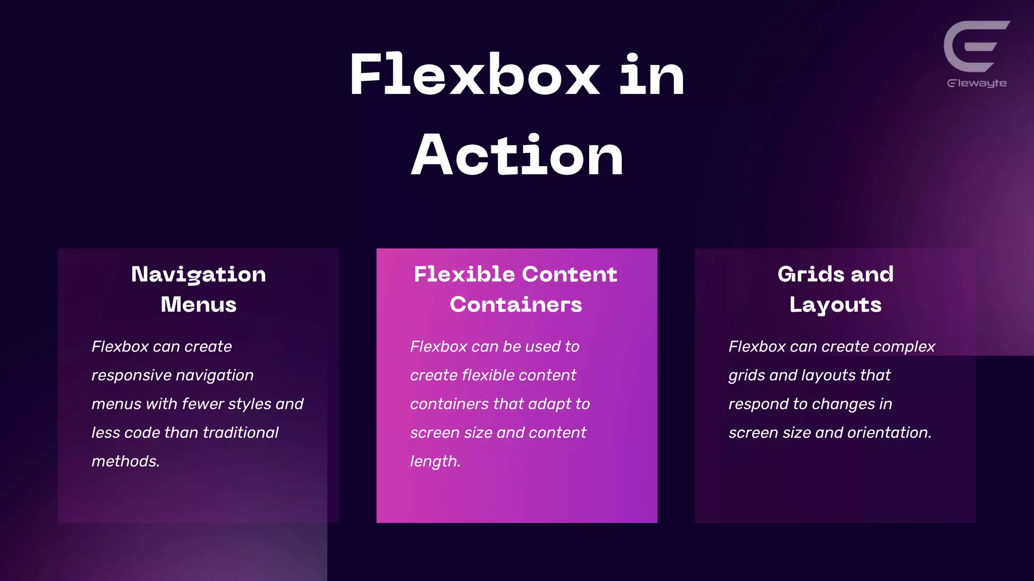

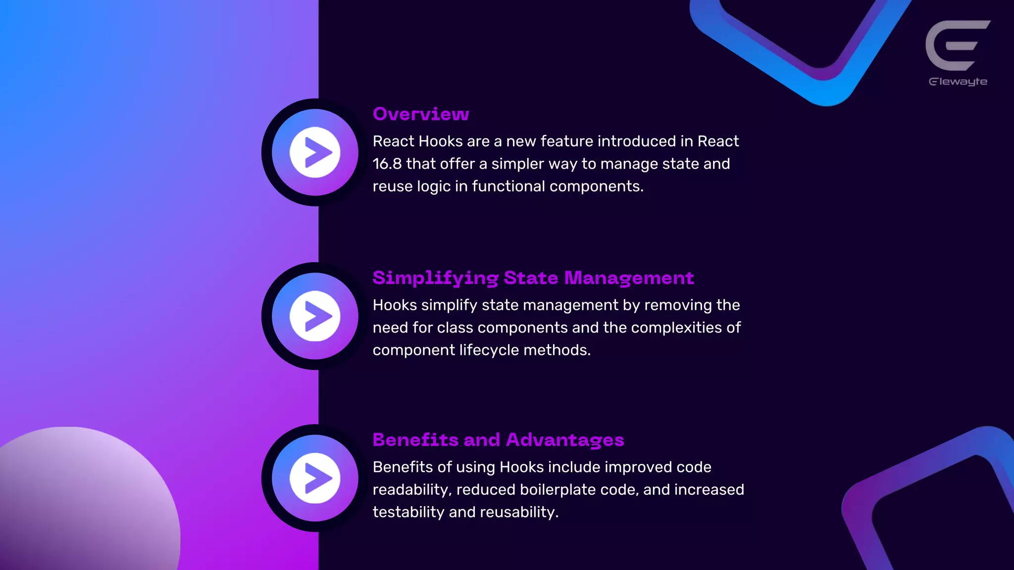

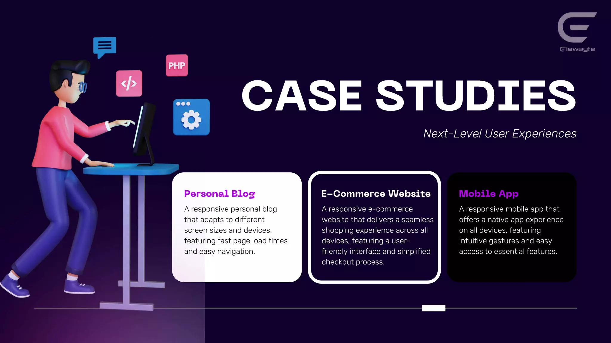
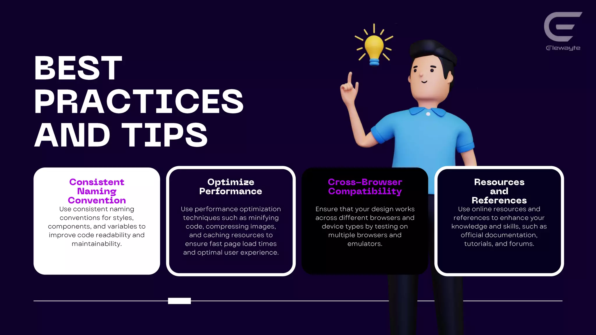

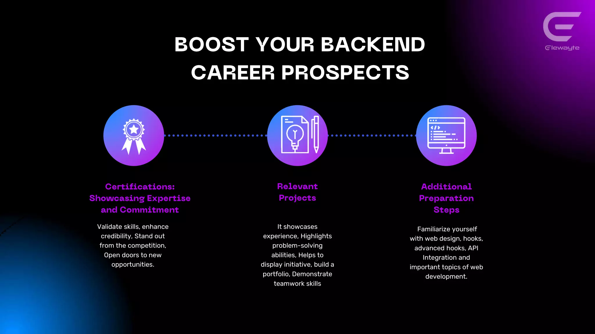


This document discusses responsive web design principles and techniques for creating next-level user experiences. It covers fluid grids, flexible images, media queries, and responsive typography. It also discusses optimizing performance, emphasizing important content, and simplifying navigation. Flexbox layout and React Hooks are introduced as tools for building responsive interfaces. Examples of using these techniques to create responsive blogs, ecommerce sites, and mobile apps are provided.


![[BDD 2025 - Mobile Development] Exploring Apple’s On-Device FoundationModels](https://cdn.slidesharecdn.com/ss_thumbnails/md-exploringappleson-devicefoundationmodels-251124030840-d690542c-thumbnail.jpg?width=640&height=640&fit=bounds)


![[BDD 2025 - Full-Stack Development] PHP in AI Age: The Laravel Way. (Rizqy Hi...](https://cdn.slidesharecdn.com/ss_thumbnails/fs-phpinaiagethelaravelway-251125012602-ef9d330e-thumbnail.jpg?width=640&height=640&fit=bounds)


![[BDD 2025 - Mobile Development] Crafting Immersive UI with E2E and AGSL Shade...](https://cdn.slidesharecdn.com/ss_thumbnails/md-craftingimmersiveuiwithe2eandagslshaderveronicaputrianggraini-251124030840-0c677f44-thumbnail.jpg?width=640&height=640&fit=bounds)


