Mattingly "AI & Prompt Design: The Basics of Prompt Design"
Font and colour testing
1. Font and Colour Testing
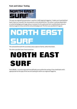
Thiswas my original FontandcolourI usedfora draftregional magazine.Imade sure itwasboldbut
keptit basicas it wouldn’tbe necessaryforamore detailedfont.The colourIusedwasdependant
on whatthe backgroundimage coloursinvolved.ForthisparticularfontIusedthe black colourto
standout againsta blue and white colouredbackground.The fontuseswasBoltsSFregular.
The selectedfontwiththe secondarycolouroptionof white,ratherthanblack.
The other possible fontsIhave testedare:
FolioXBd Bt – A similarstyle withlessdefinedcurveswithinthe writing.Ithasa boldstyle andis
appropriate forthe type of font we are lookingforwithinourregional magazine.
2. Font and Colour Testing
Impact (font) –This fontisanotherpossibilityforourregional magazine.Itislike the otherfonts
withitsboldand basicstyle buthas a more stand outlookto it withclose anddefinedstyle.This
fontwouldbe well suitedtoourregional magazine asitiseye catchingandeasilyrecognisable.
fontmeme.com‘santacalra’ - Thisisanotherpossible fontthathasbeendownloadedfromthe
internet.Itisreminiscentof the classicSantaCruz Skateboardsfont.Thiswouldworkwellasa logo
for our regional magazine asitiseasilyrecognisablewiththe topicof regional magazine we are
creating,whichwill include skateboardingandsurfing.Itsbasicbutindependentstyle of fontcreates
an impressionof stayingawayfromthe mainstreammagazinetype stylesbutstill keepingitbasic
and easyto read.The white andblack colourscheme puttogetheralsomakesitslightlymore
detailedthanthe restof the fontsI have testedandwouldtherefore be apriorityfontforour
regional magazine.The twocolourscanbe swappedaroundif itis necessarytofitwith the
backgroundimage.
Regardingourcontent,article andinside storiesfonts,we feelitisnecessarytokeepthe fontbasic
and easyto read.Thiswouldrevolve aroundafontsuchas Arial orCalibri.
The side articlesonour front coverwill still be standout,but
mostlikelybe inthe same fontas our logo.Thiswill
standoutto the readerand grab theirattention.The reason
for keepingthe same fontwouldbe becausewe donot
wantto use over 3 fontsto make it lookmessy.
Anyquotesonthe frontcoverhowever,willhave anArial
fontas it will be ina smallersize,andbe alot of text
together.Thereforeitmustbe clearand basicto read,and
alsocontrast withthe mainheaders.