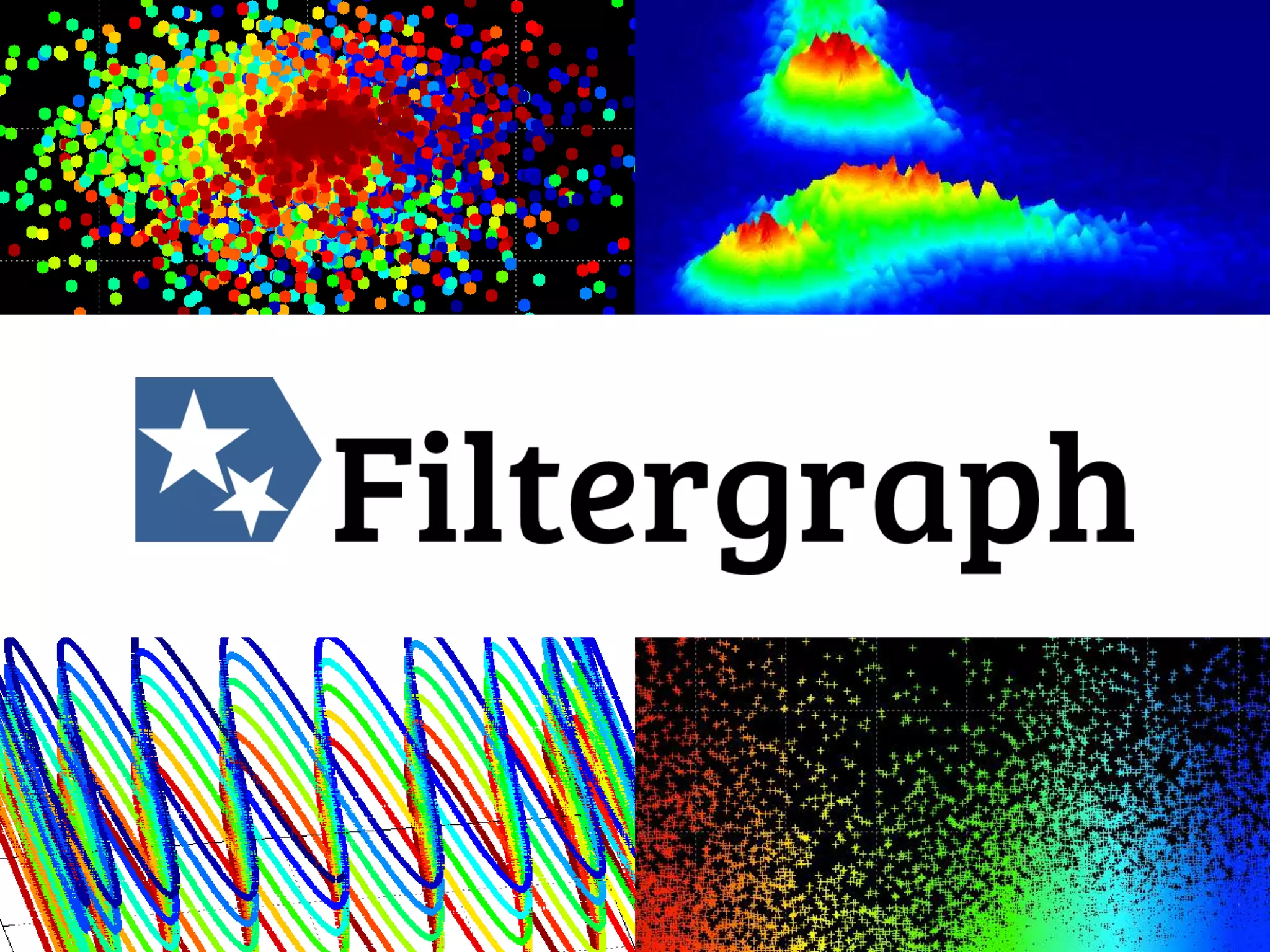
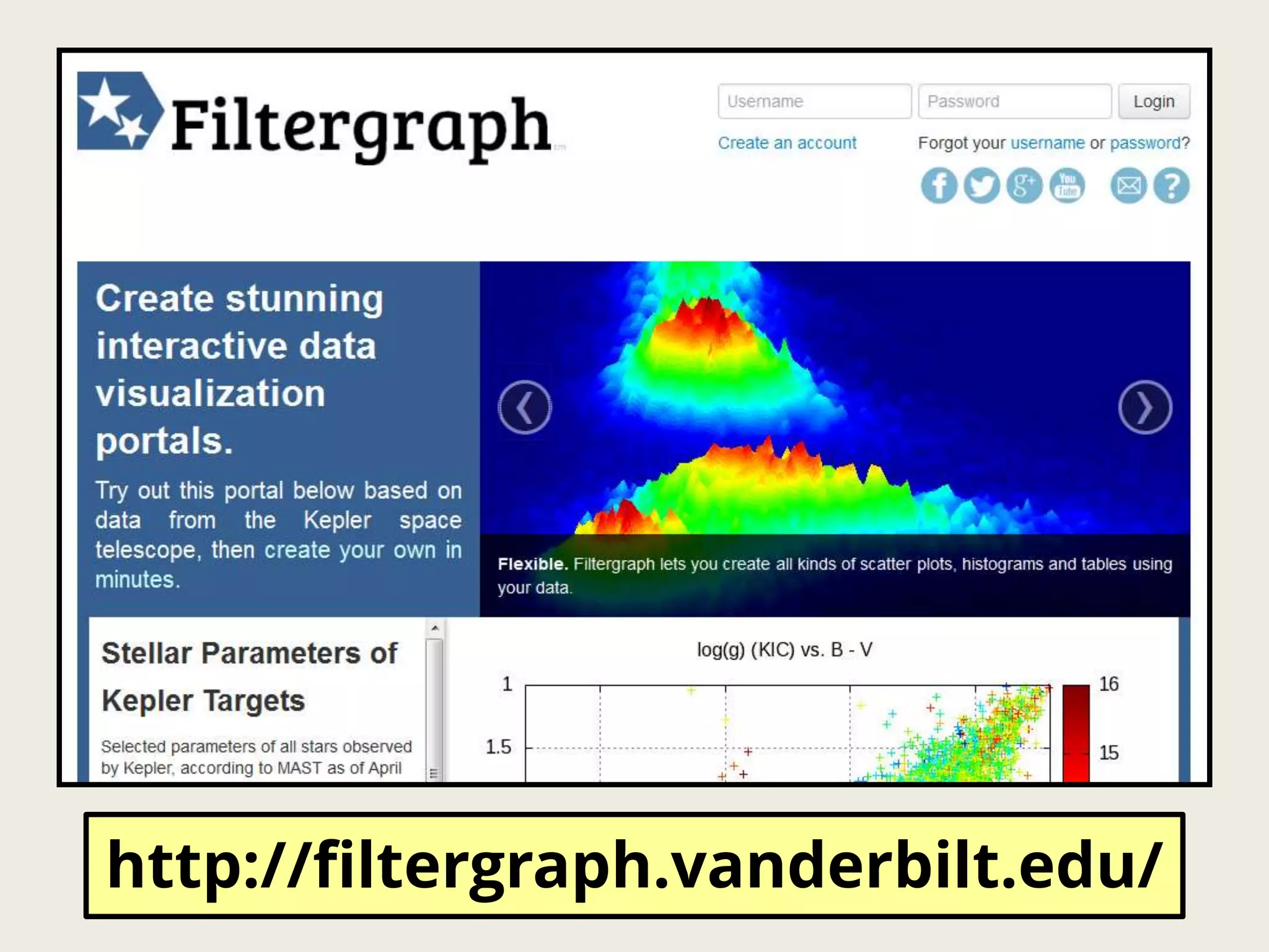
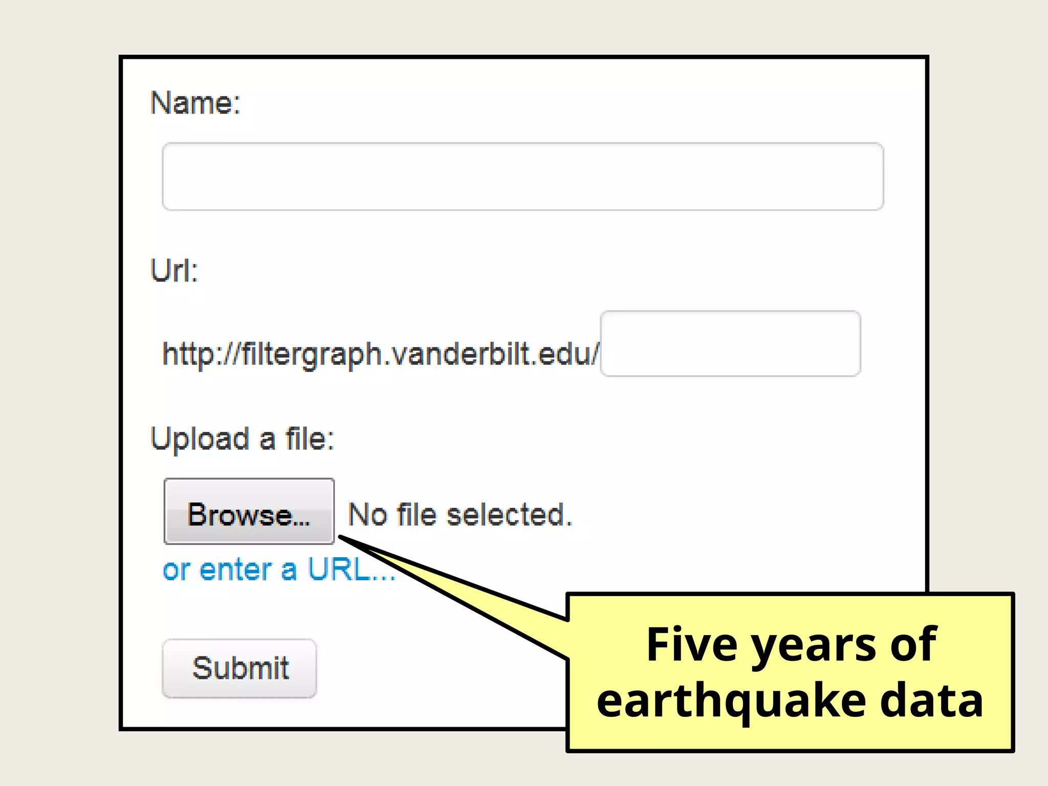
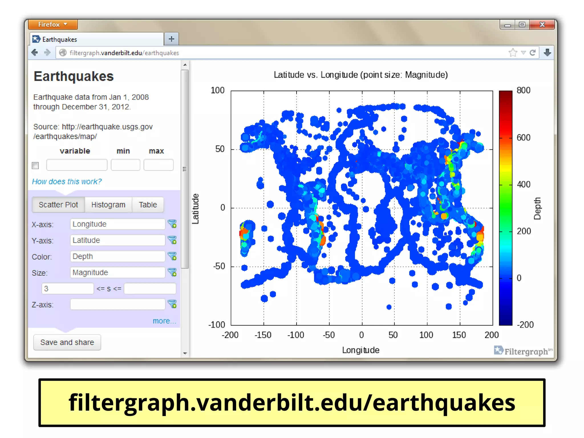
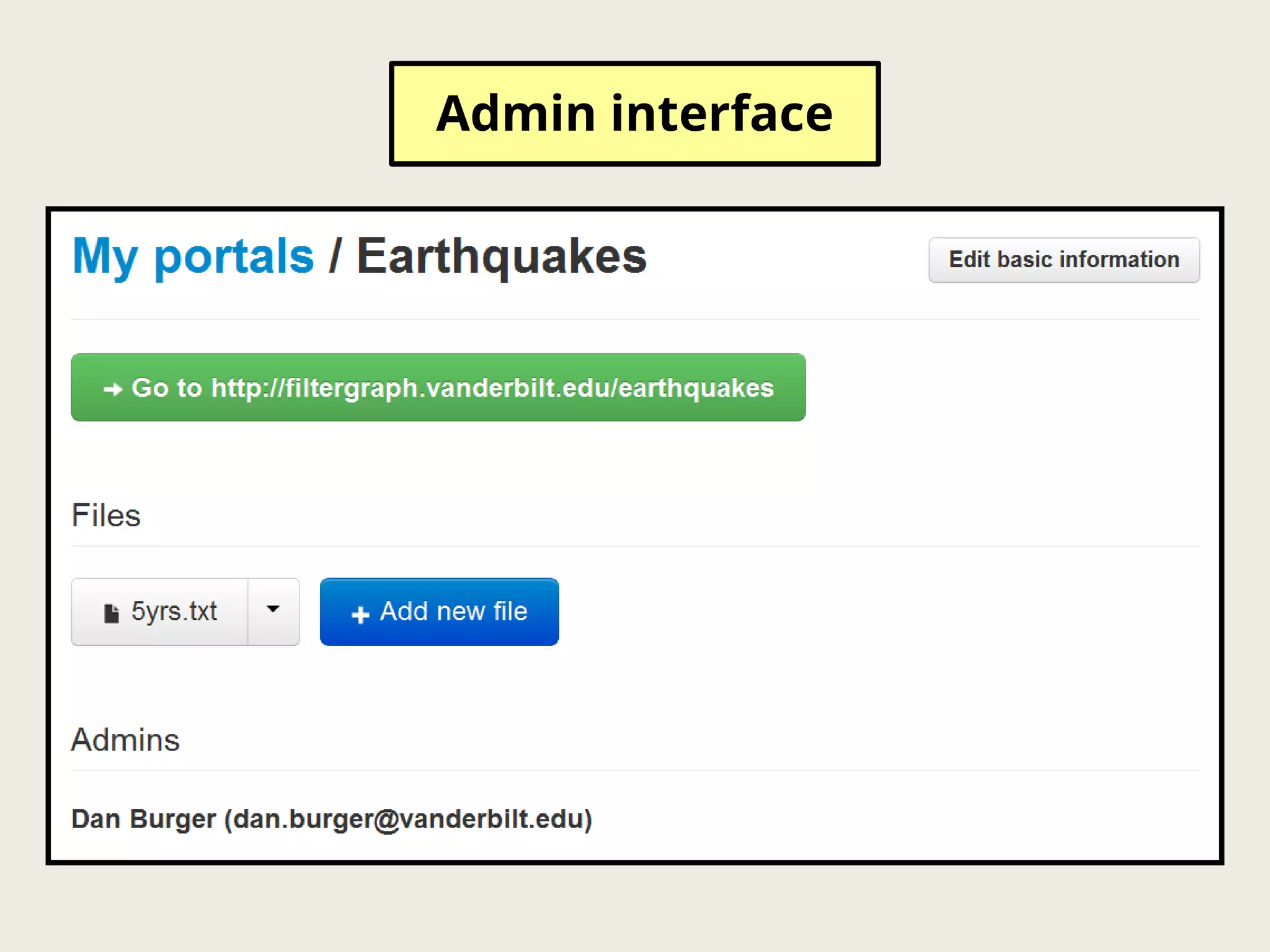
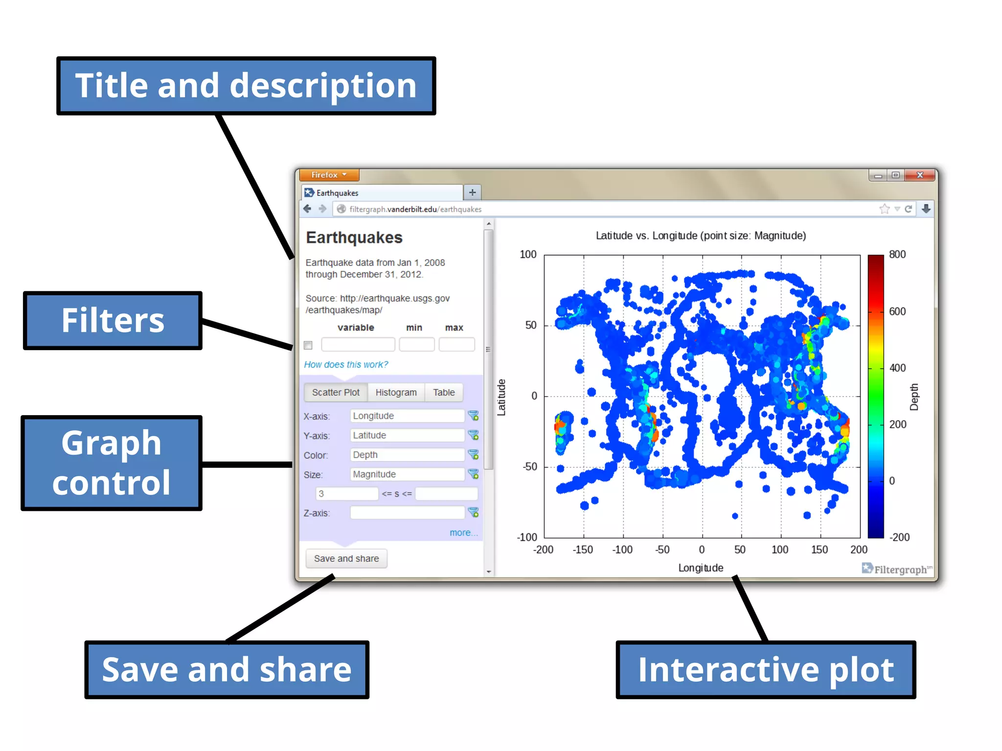
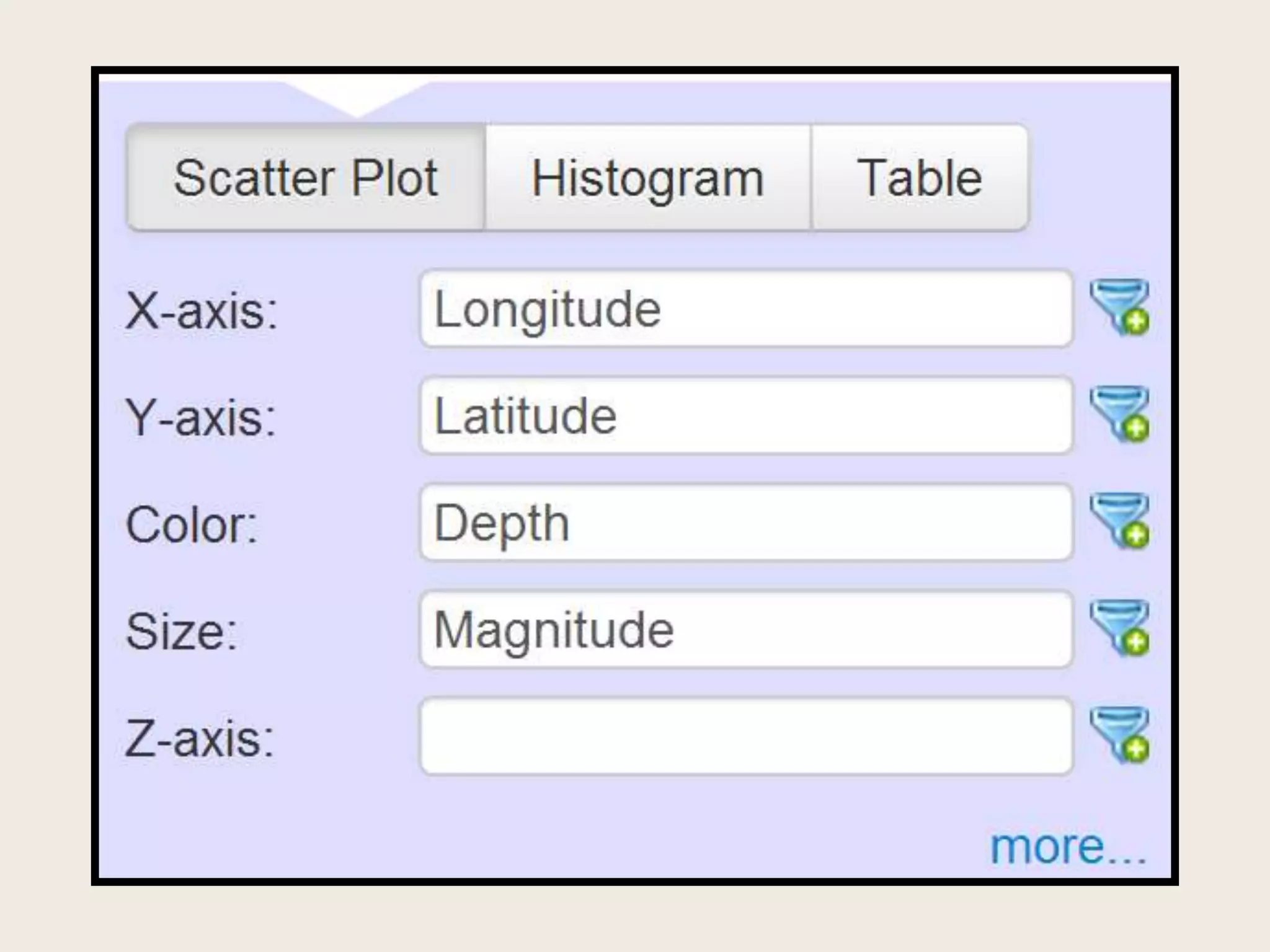
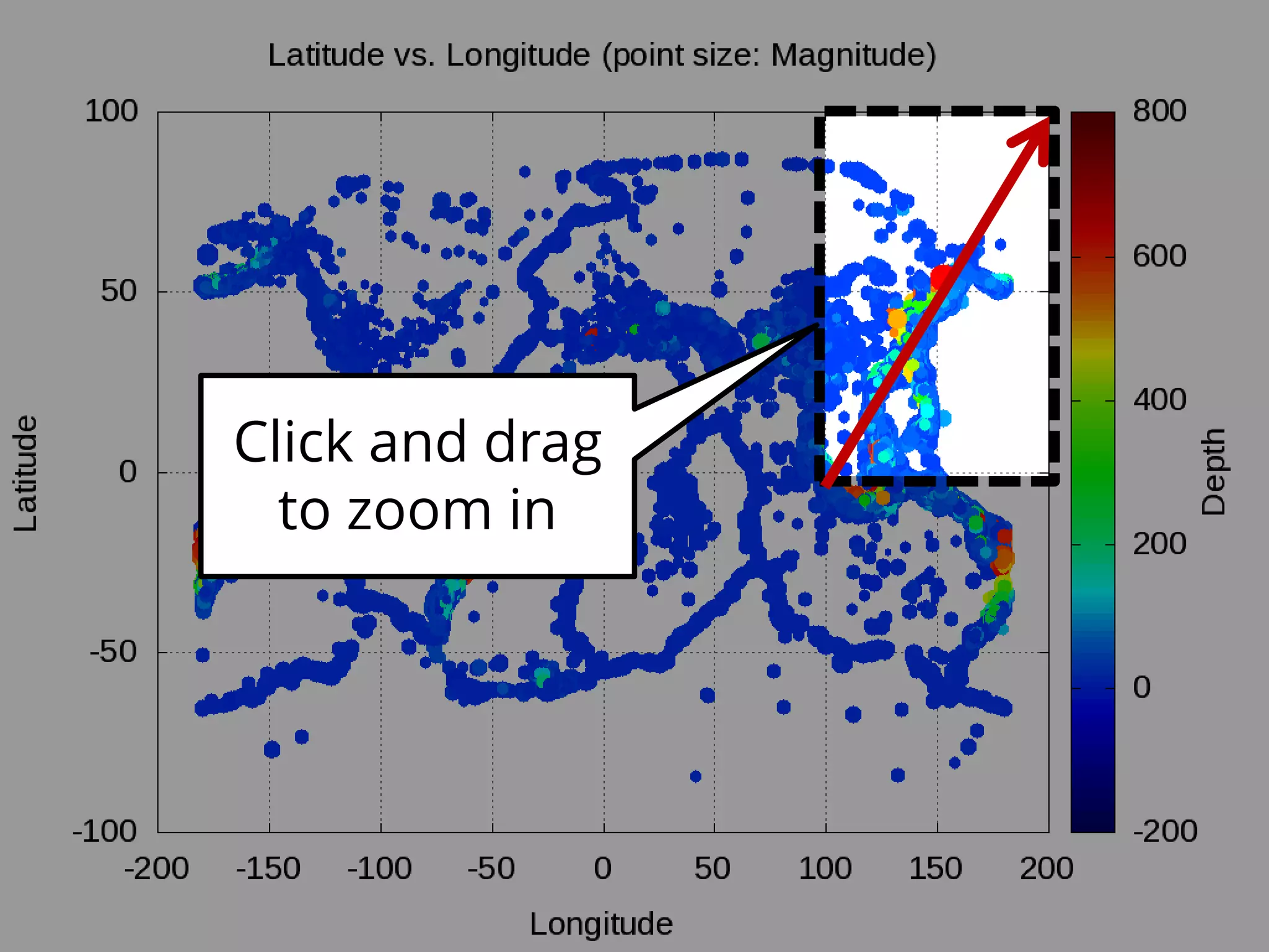
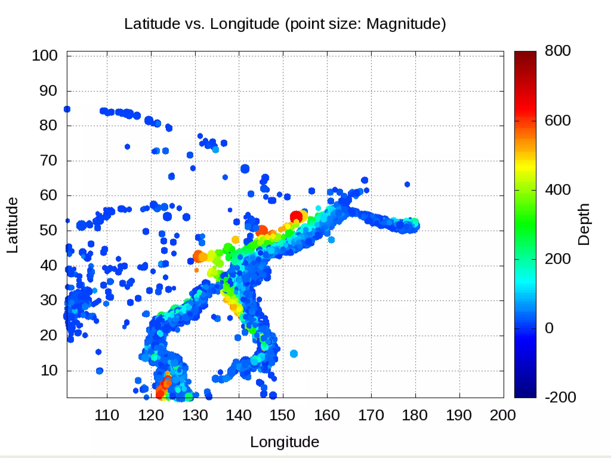
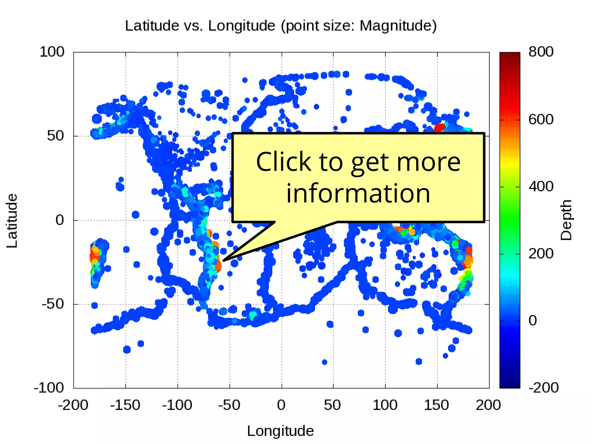
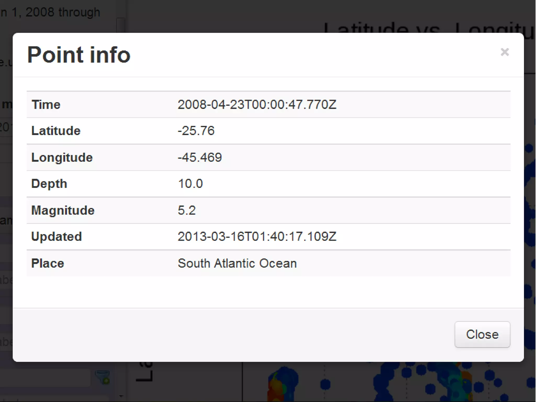
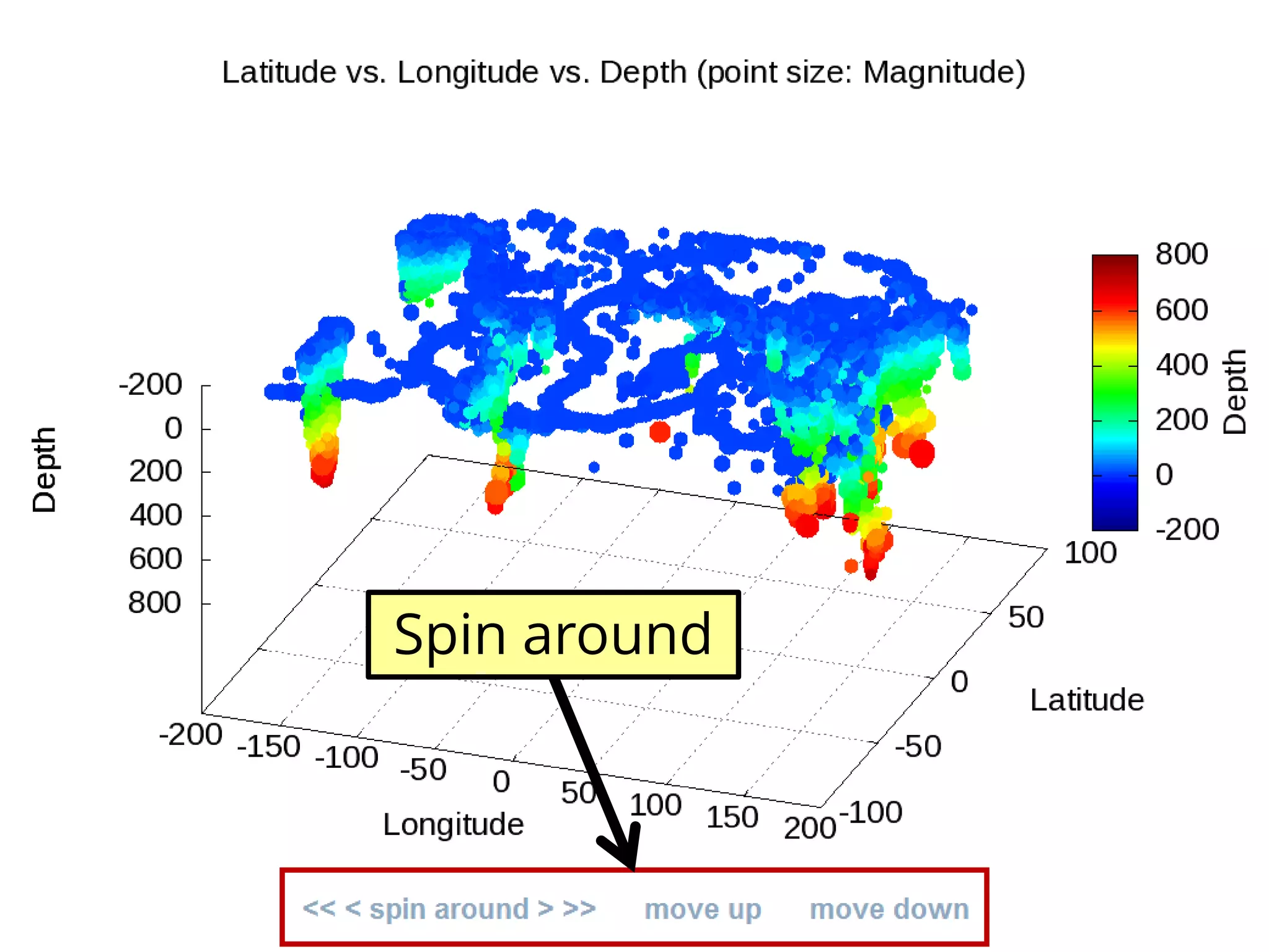
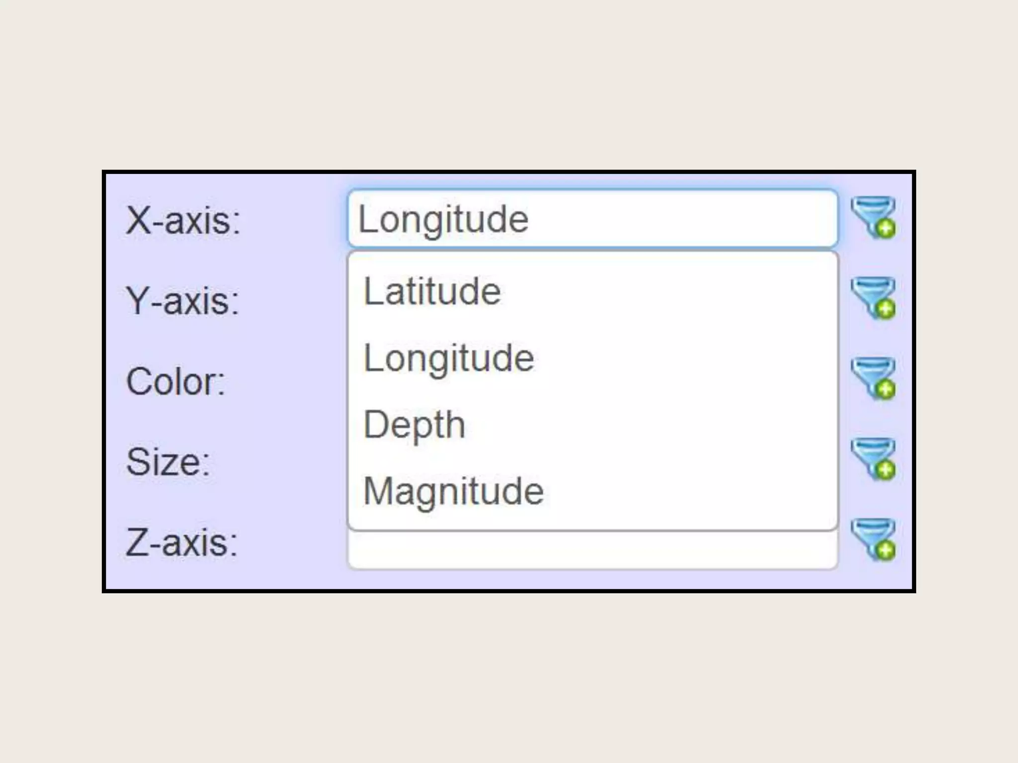
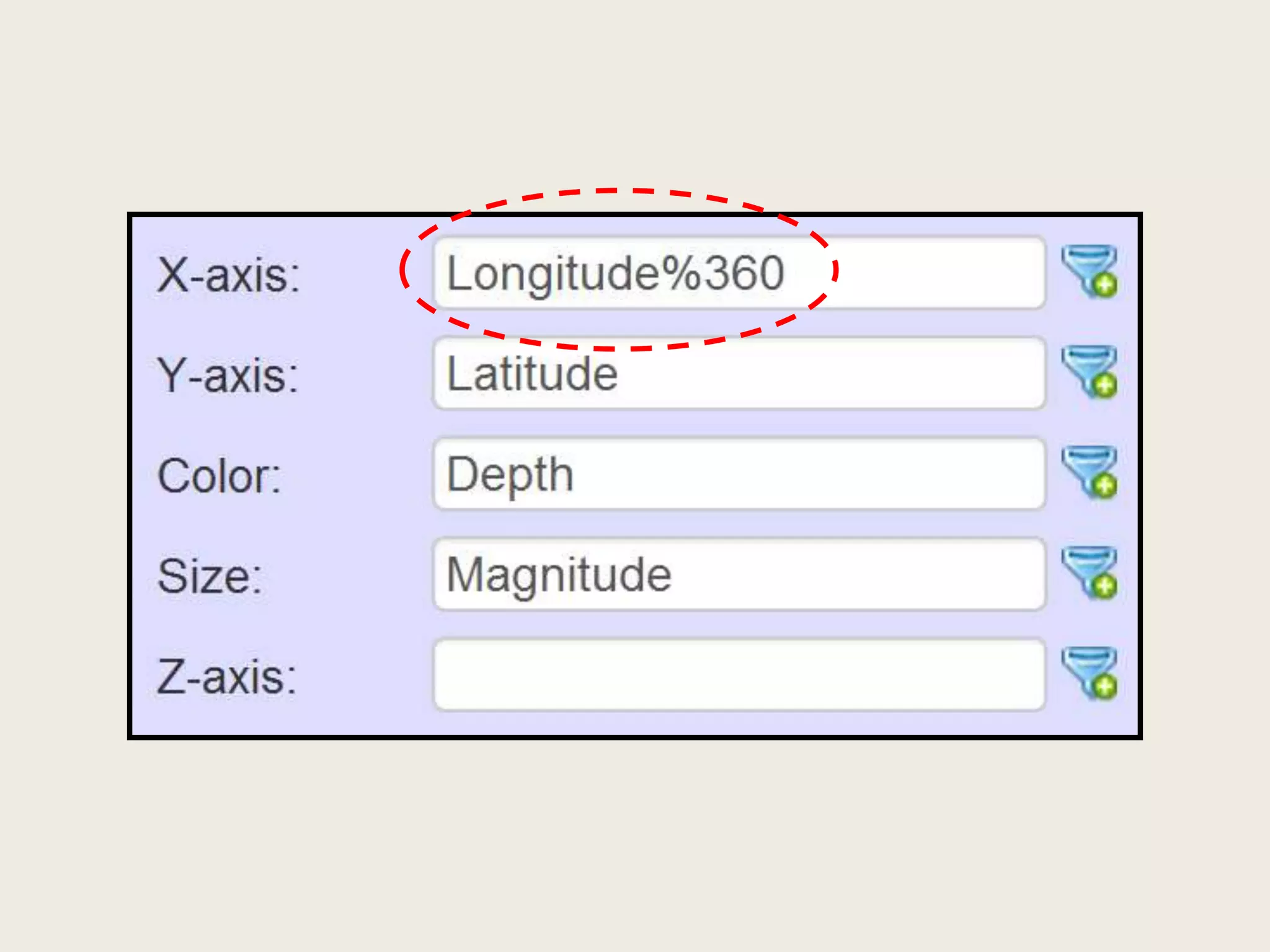
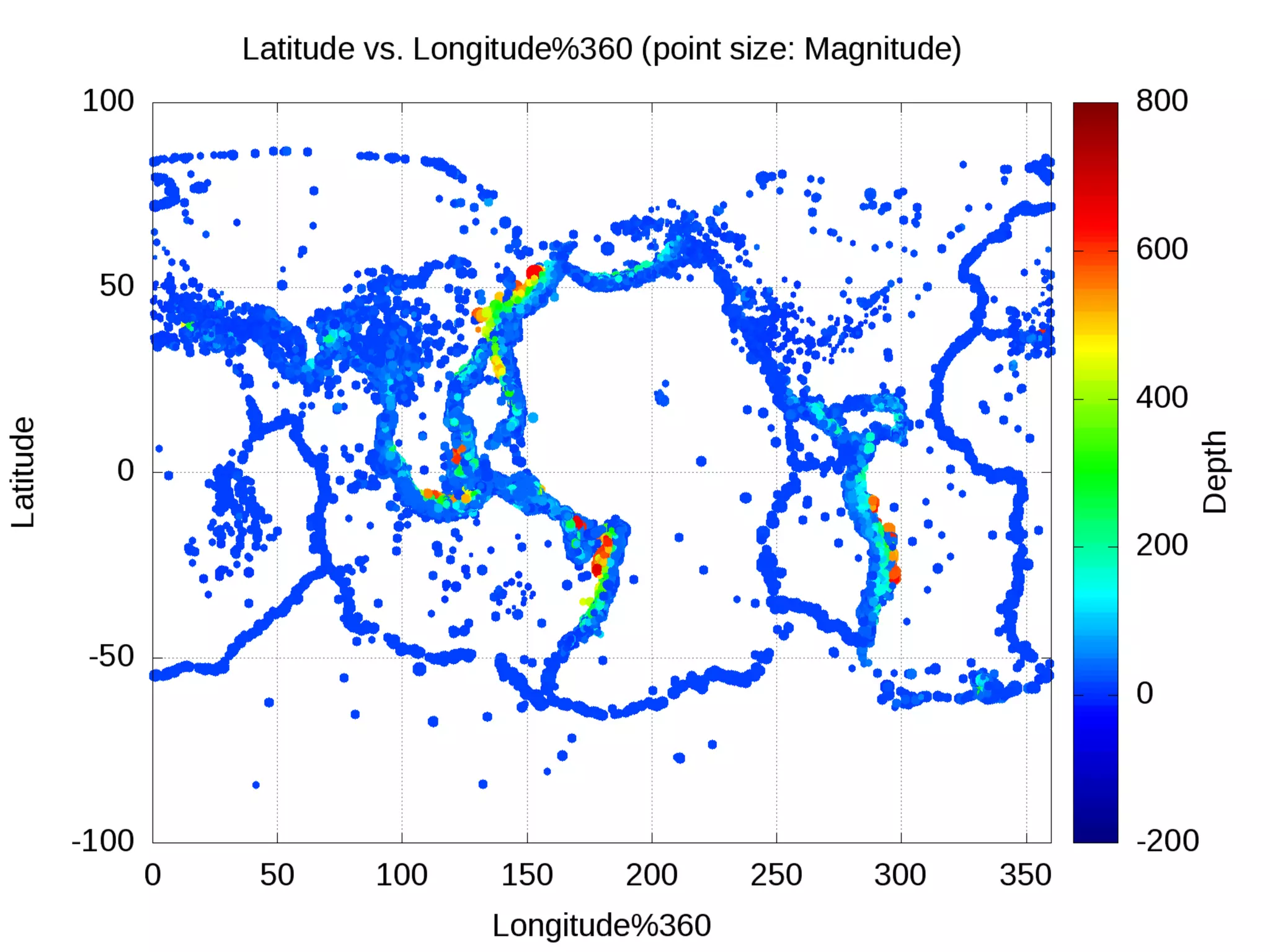
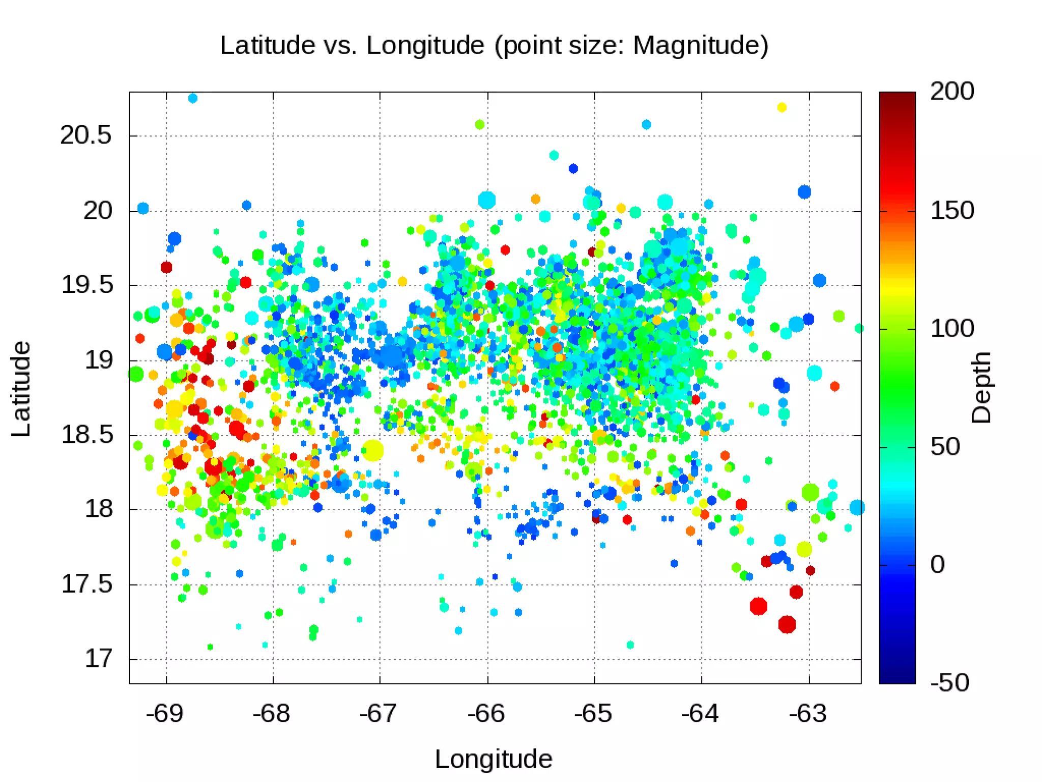
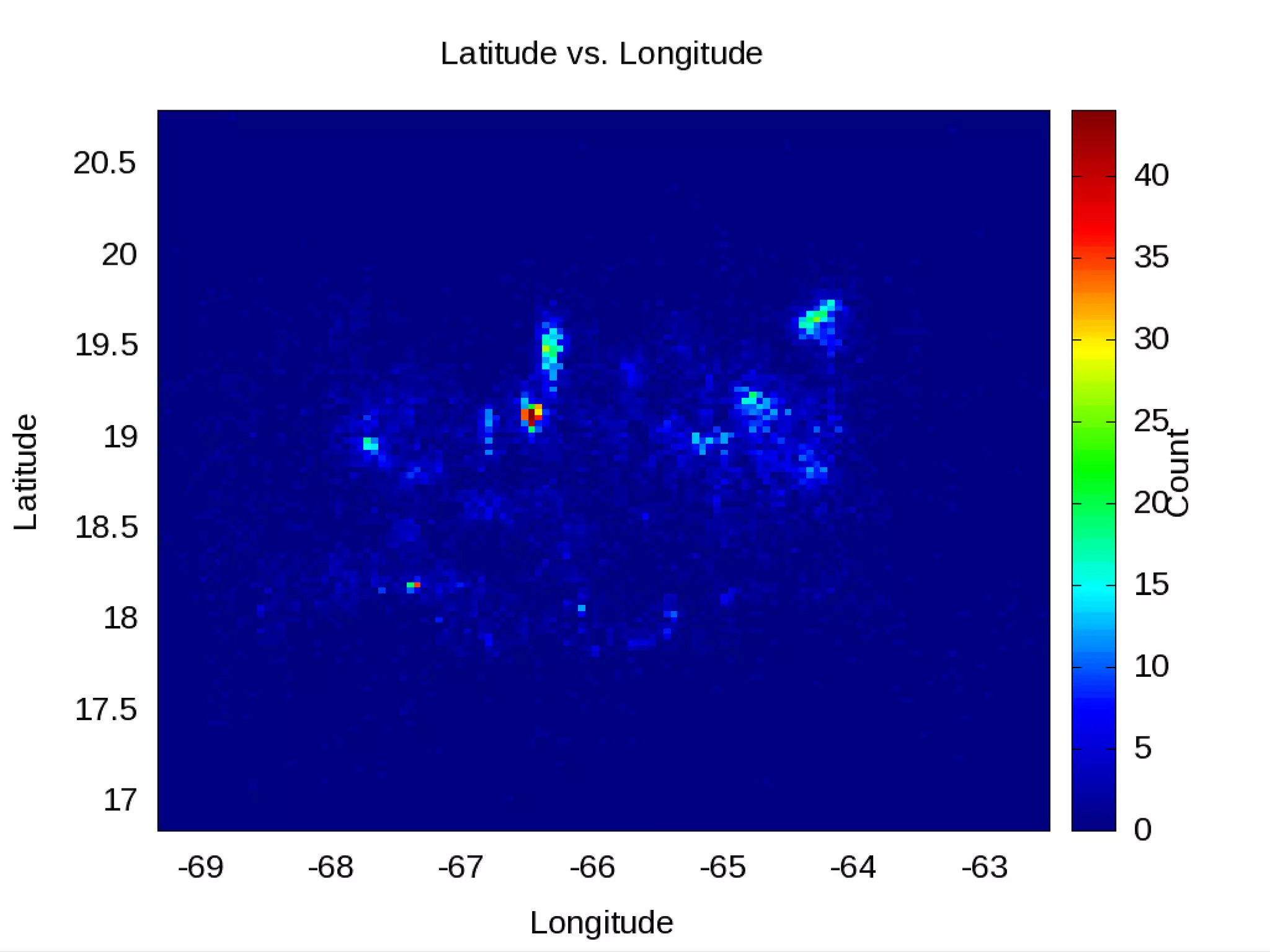
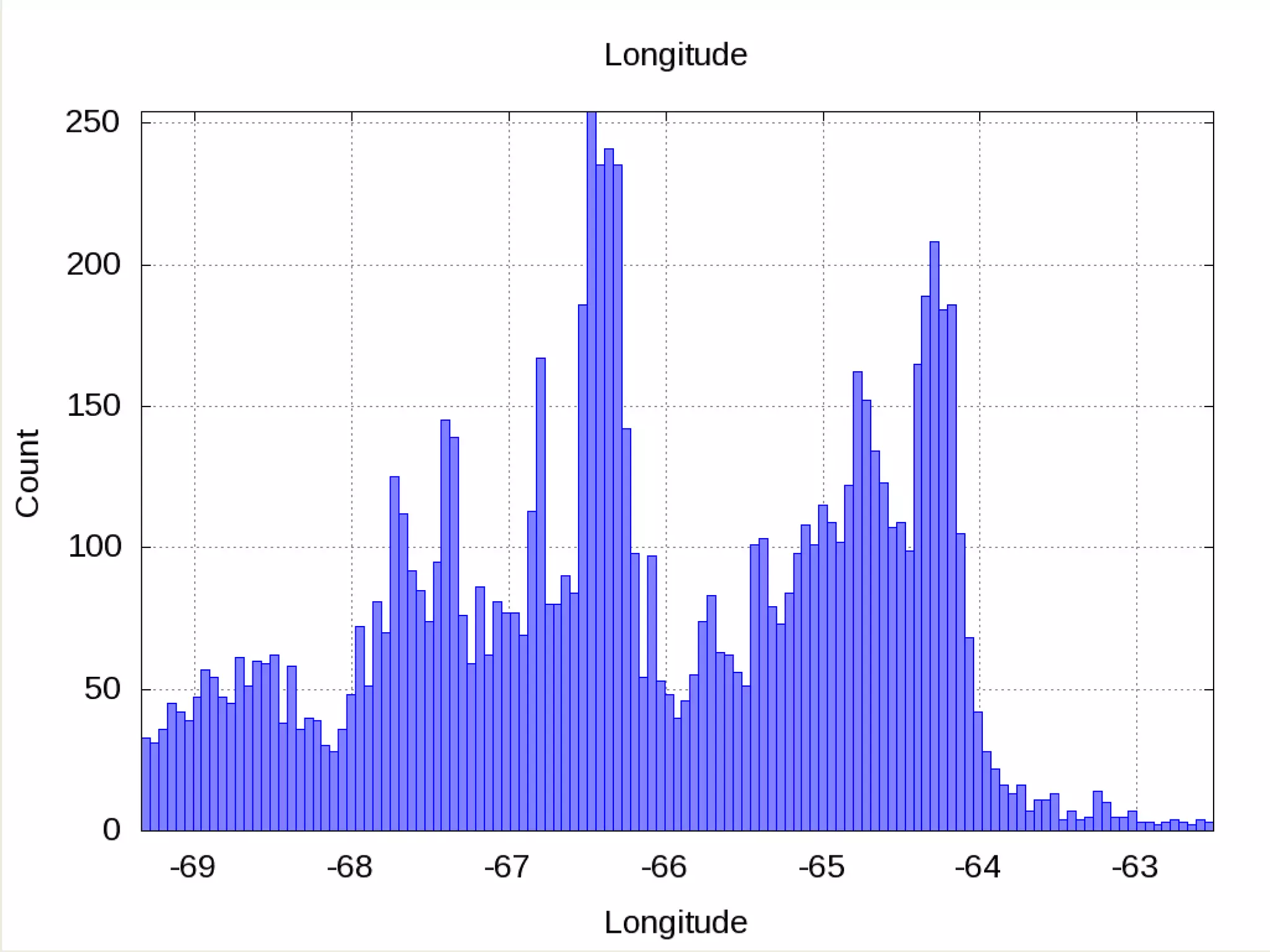
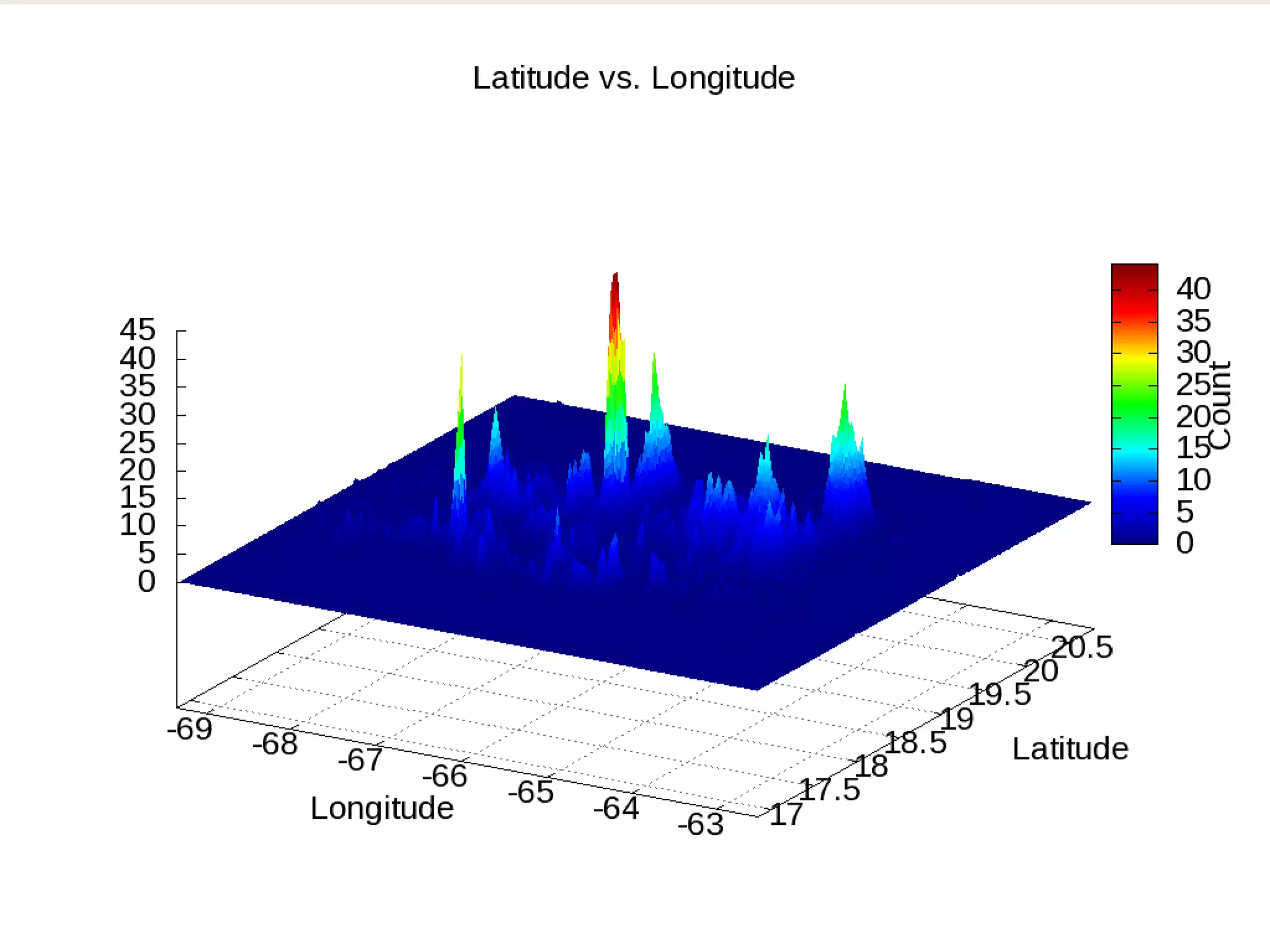
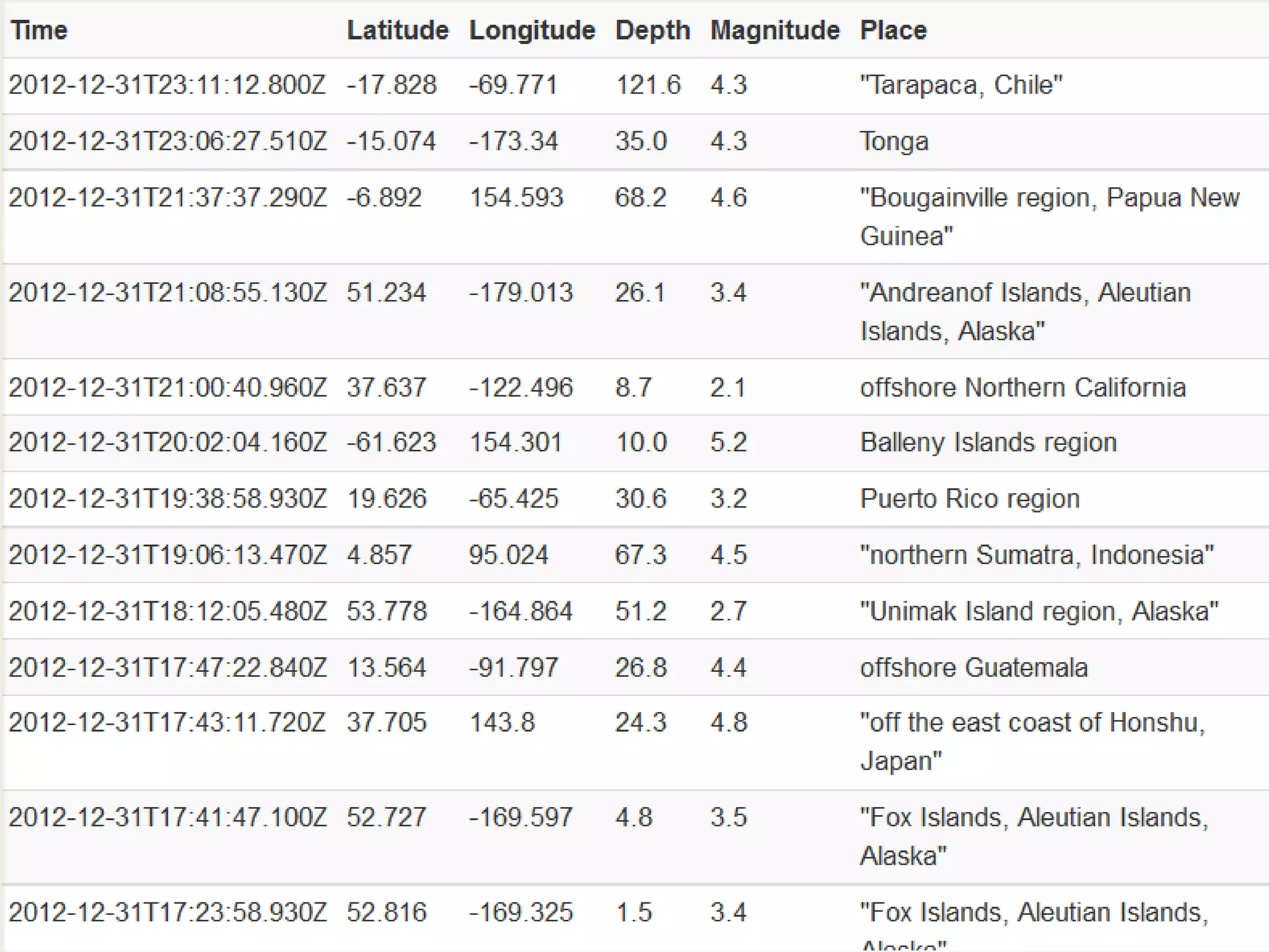
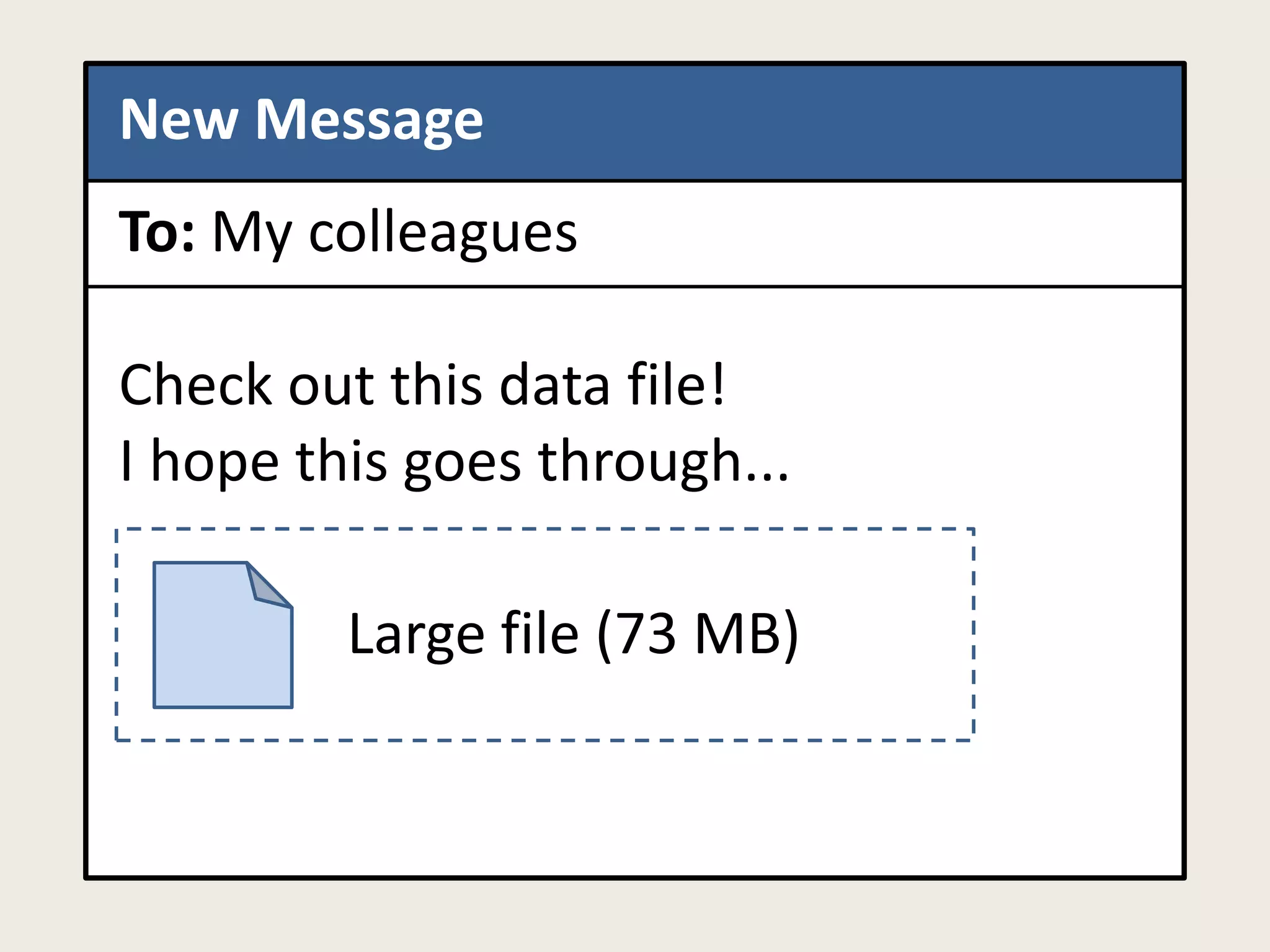
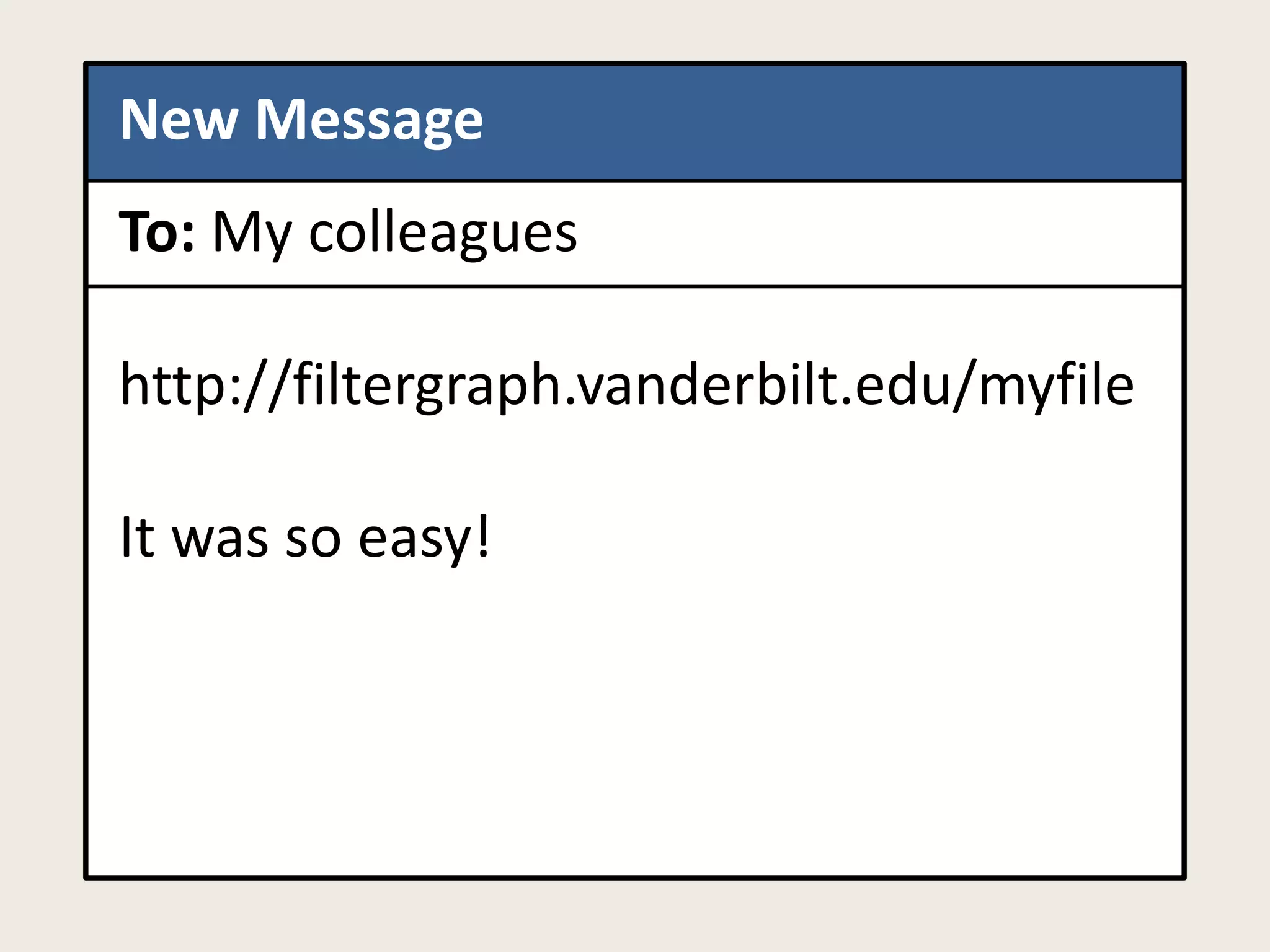
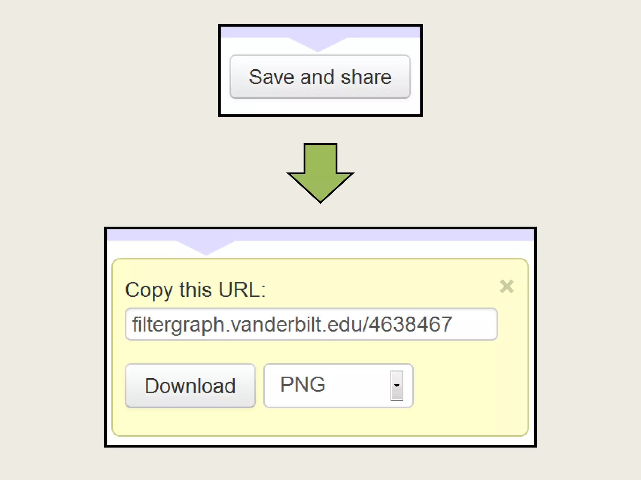
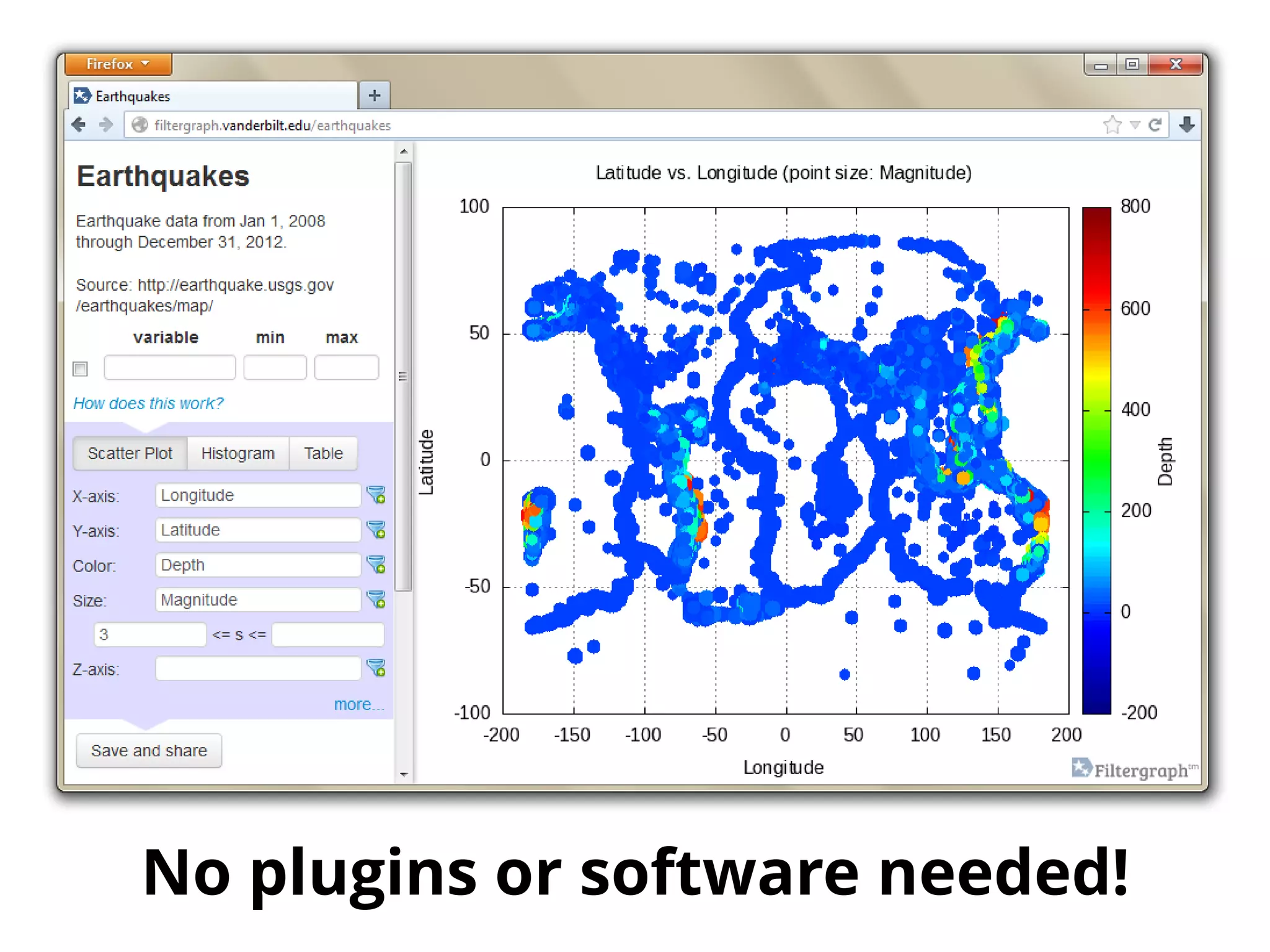
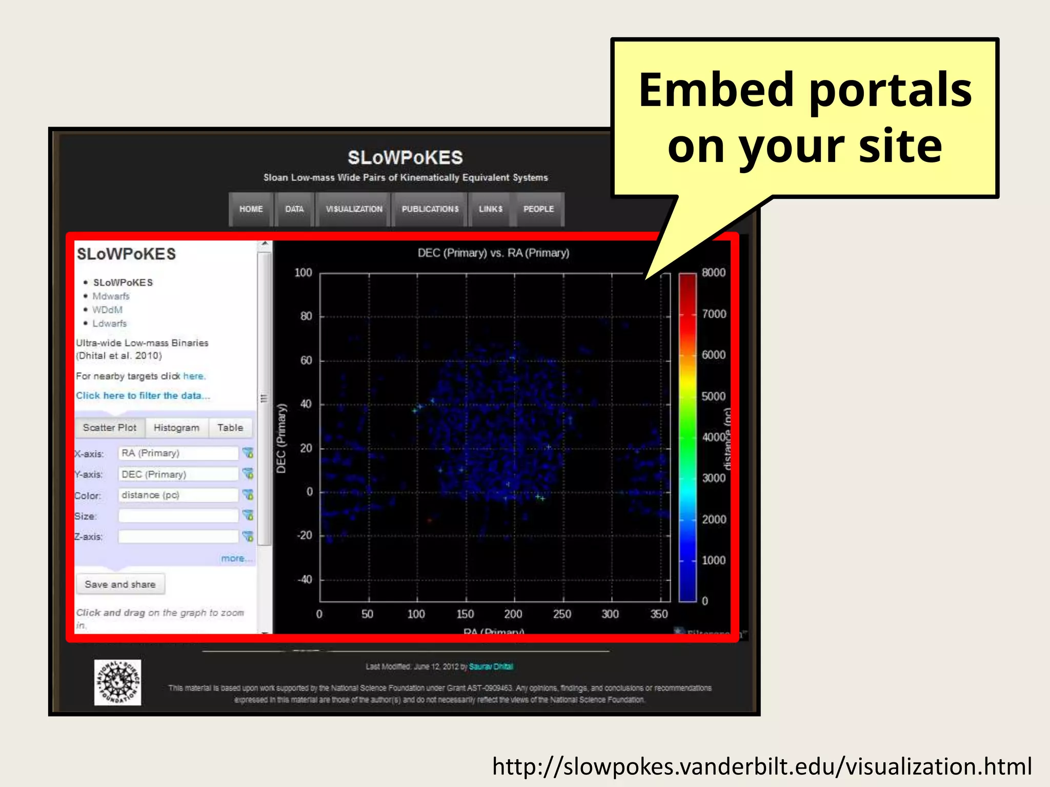
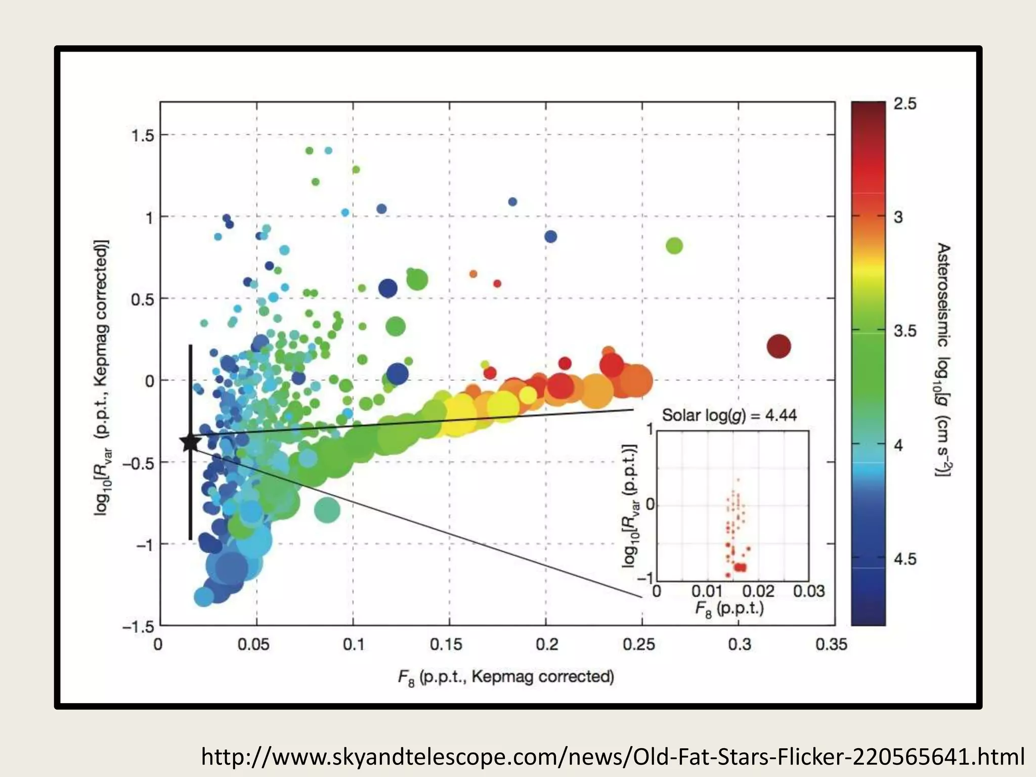
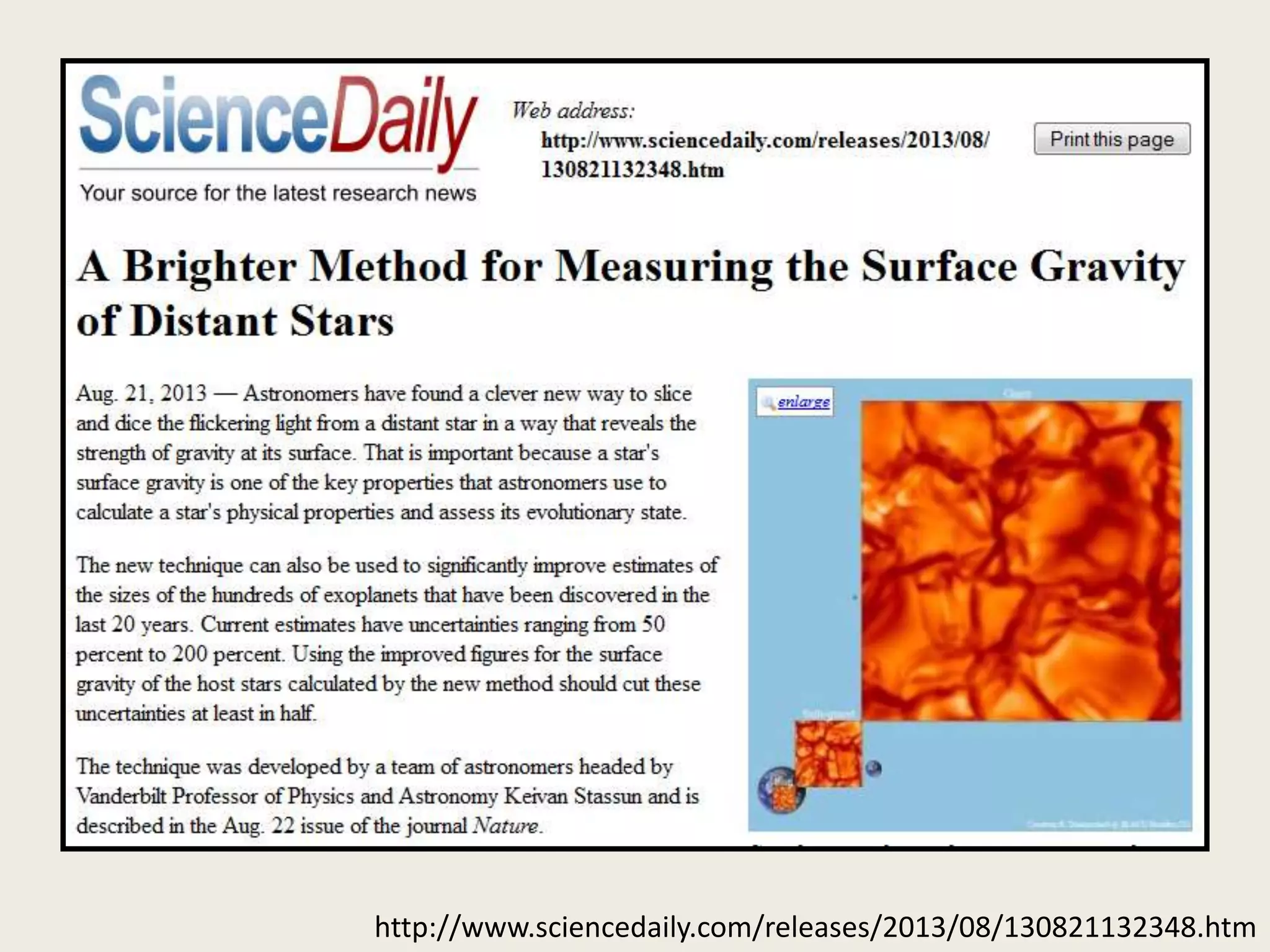
A fast, flexible and sharable service
for visualization in big data science
Dan Burger
Web Application Developer
Vanderbilt University, Nashville, TN USA
Twitter: @danburger
dan.burger@vanderbilt.edu
my.vanderbilt.edu/keltsouth, web.mit.edu/newsoffice/2011/tess-nasa-award.html
KELT
TESS
Transiting
Exoplanet
Survey Satellite
Kilodegree Extremely
Little Telescope
• Large amounts of data
– Tens of columns
– Millions of rows
• Need for exploratory data analysis
– Bad data, missing data, categories,
biases, relationships, patterns
http://filtergraph.vanderbilt.edu/
Five years of
earthquake data
filtergraph.vanderbilt.edu/earthquakes
Admin interface
Title and description
Filters
Graph
control
Save and share Interactive plot
Click and drag
to zoom in
Click to get more
information
Spin around
filtergraph.vanderbilt.edu/tess
New Message
To: My colleagues
Check out this data file!
I hope this goes through...
Large file (73 MB)
New Message
To: My colleagues
http://filtergraph.vanderbilt.edu/myfile
It was so easy!
No plugins or software needed!
http://slowpokes.vanderbilt.edu/visualization.html
Embed portals
on your site
gnuplot
and more...
web2py.com, numpy.org, gnuplot.info, graphicsmagic.org
http://www.skyandtelescope.com/news/Old-Fat-Stars-Flicker-220565641.html
http://www.sciencedaily.com/releases/2013/08/130821132348.htm
http://nashvillepublicradio.org/blog/2013/08/27/star-gravity-discovery-at-vandy-boosts-search-
for-distant-planets-like-earth/
http://www.nbcnews.com/science/stars-twinkling-light-can-reveal-strength-gravitational-pull-6C10972389
Thanks to:
Keivan Stassun
Rob Siverd
Joshua Pepper
Rachel-Chloe Gibbs
Nathan Meyer
Manodeep Sinha
Martin Paegert
Nathan De Lee
Phillip Cargile
Alyce Dobyns-Ladd
Vanderbilt Initiative in Data-intensive Astrophysics
NASA ADAP grant
Images on slide 4 from Hipparcos data:
http://filtergraph.vanderbilt.edu/hiptest
http://filtergraph.vanderbilt.edu
Dan Burger
Twitter: @danburger
dan.burger@vanderbilt.edu

Filtergraph: A fast, flexible and sharable service for visualization in big data science (Data Visualization Summit Boston 2013)

Editor's Notes

  • #2 Good afternoon, my name is Dan Burger and I am a web application developer with the department of physics and astronomy at Vanderbilt University. Today I am going to talk about Filtergraph, a fast, flexible and sharable service for visualization in big data science. I started on this project as part of my master’s thesis research and now I manage it as a full-time staff member.
  • #3 For centuries people have looked into the skies and wondered if there are worlds out there similar to our own. In recent years we have built the technology to detect planets outside of our solar system, and I work with various collaborations that help find them.On the left is TESS, a collaboration between NASA and MIT with funding from Google that will launch into space around 2017 and look for exoplanets throughout the night sky.On the right is KELT South, a telescope owned by Vanderbilt and operated in South Africa. It has a twin, KELT North, which is owned by Ohio State and operated in Arizona. These telescopes are also designed to scout out for exoplanets.
  • #11 Filtergraph can produce three types of output: scatter plots, histograms and tables. The three variables shown here are the X-axis, Y-axis and color axis for the scatter plot. If I wanted to, I could add a fourth axis for the size of each point and a fifth axis to produce three-dimensional scatter plots.What if I wanted to only display some of the data? Well first, I could click on the green section here and enter in some criteria. The points will only show up if it meets the criteria. Another way is that I could click here and set the minimum and maximum bounds for the axis. The third way is perhaps the most fun...
  • #12 I can click and drag on the graph to zoom in.
  • #14 On that note I can also click on a point to get more information about that particular point.
  • #16 Here is a three dimensional scatter plot. For clarity I set the color and the z-axis to the same variable. With these controls I can spin it around.
  • #17 Setting the axis can be done with an editable combo box. As I start typing, some of these labels will disappear, leaving only the ones that match what I typed. These labels can also include a description.
  • #18 Setting the axis can be done with an editable combo box. As I start typing, some of these labels will disappear, leaving only the ones that match what I typed. These labels can also include a description.
  • #19 Setting the axis can be done with an editable combo box. As I start typing, some of these labels will disappear, leaving only the ones that match what I typed. These labels can also include a description.
  • #20 Here is a scatter plot of earthquakes in the Caribbean. With so many points it is hard to tell where they overlap.
  • #21 This is where the histogram views become useful. Here we can see that
  • #22 Filtergraph can also produce various types of histograms. Here is a one-dimensional histogram. The y-axis is the frequency of each bin.
  • #23 We can transform this to a surface map. This can be viewed from different angles as well.
  • #24 Finally, here is a table. The table can be sorted and exported to various file formats.
  • #30 Filtergraph also provides code so that you can easily embed portals on a web page.