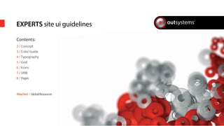
EXPERTS site ui guidelines 
Contents: 
2 / Concept 
3 / Color Guide 
4 / Typography 
5 / Grid 
6 / Icons 
7 / UI Kit 
8 / Pages 
Attached / Global Resources
page 2 / OutSystems® Brand Guidelines 
Concept 
The Experts Platform is a project 
management platform used both internally 
and client-side 
Uses OS brand guidelines 
Note all specic styles in orther to mantain a 
clear UI.
Color is crucial to our visual identity. 
It brings visual interest to our 
communications and helps to 
maintain a consistent look and feel. 
Always make sure you’re using the 
right HEX code for each color 
Main Colors 
Complementary Colors 
Gradients 
Greys 
OutSystems Red 
#F00 
Dark Red 
#AC1E01 
page 2 / OutSystems® Brand Guidelines 
Color Guide 
Blue 
#69C 
Yellow 
#FFB414 
Green 
#8CC83C 
OutSystems Black 
#300 
Dark Grey 
#333 
Medium Grey #1 
#808080 
Medium Grey #2 
#CCC 
Light Grey 
#E6E6E6 
Washed Grey 
#CCC / 20% opacity 
Black/Grey GRAD 
B #300 
T #4D4D4D 
Blue GRAD 
B #226EC4 
T #72a5D2 
White/Grey GRAD 
B #F0F0F0 
T #FFF 
Green GRAD 
B #79C843 
T #5D9343
Myriad Font 
[alt] Helvetica, Arial, Sans-serif 
H3 / Services 
H1 / Experts 
24px / Regular 
#F00 
H3 / Accesia 12/2012 
P-OUT-FFMS-408-2011_A 
MENU ITEM 
ACTIVE 
Search... 
Input text 
Selected link 
regular link 
AA extra feedback, deploy demo5d c zxcev, clo ud discussion,ploy demo5dev, cloud di scussion, autocomplete 
@SergioRodrigues , cdiscua utocn, autocomplete y demoutoco #BES 
21 Oct 
3.5 H 2.5 D 2.5 D 
H2 / Files 
H4 / FFMS (AUD)011 - 2011/201 
P-OUT-FFMS-408-2011_A 
H4 / FFMS (AUD) 09/2011 - 2012 
P-OUT-FFMS-408-2011_A 
h5 /Can have 
Multi-line 
page 2 / OutSystems® Brand Guidelines 
Typography 
Headings (Single Line) 
Headings 
with Slug 
Small Headings / Menu Items / Links 
text 
h3 + p 
19px Line Height 
15px / SemiBold / #69C 
19px Line Height 
15px / SemiBold / #FFF 
19px Line Height 
12px / Regular / #69C 
12px / Regular / #808080 
Underlined [Links] 
14px / Regular / 23px Line-Height 
14px / Regular / #300 
17px line-height 
18px/24px / Regular 
#300 / #808080 
superscript 
16px / Regular / #808080 
16px / SemiBold / #300 
12px / Italic 
#E6E6E6 
24px / Regular 
#F00 
24px / SemiBold 
#69C
page 2 / OutSystems® Brand Guidelines 
Grid 
Always make a right use of the grid 
in order to have a solid look and feel 
of the website 
The Website uses the normal OS grid 
(12 x 56px column spacing 28px) 
Also, uses 4 to 5 rows to display data 
TOP 
MENU 
MIDDLE BAR (optional) 
MAIN CONTENT 
FOOTER 
1 
2 
3 
4 
5 
HR File: grid.jpg
page 2 / OutSystems® Brand Guidelines 
Icons 
The website is losing some icons of 
the awesom font 
Here it’s shown the list of icons and FA 
code to use 
 http://fortawesome.github.io/ 
 
FASTAR 
 
FAGROUP 
 
FACOG 
 
FASIGNOUT 
 
FAGOOGLEPLUSSQUARE 
 
FAENVELOPEO 
 
FALIST 
 
FASEARCH 
 
FAEXTERNALLINK 
 
FADESKTOP 
 
FATWITTERSQUARE 
 
FADOWNLOAD 
 
FALINKEDINSQUARE 
 
FAFACEBOOKSQUARE 
 
FAUSER 
 
FAUNLOCK 
 
FALOCK 
 
FAUPLOAD 
 
FAINBOX 
 
FACHECK 
 
FATIMES 
 
FACLOCKO
page 2 / OutSystems® Brand Guidelines 
UI KIT 
Key Elements 
Top Elements 
2 
3 
List style 
Checkboxes 
Search Widget (blue) 
Conrmation Button (Green) 
Activity Comment Widget (left) 
Activity Timers (Top Right) 
E-mail Widget (Bottom Right) 
File Widget 
Tooltip (left) 
Service Thumbnail (right) 
40px 
2 col 3 col 
30px 
70px 
115px 
15px 
15px 
20px 
25px 
15px 
70 px 30 px 30 px 30 px 30 px 30 px 
100 px 2 col 6 col 
20px 15px 15px 
15px 
25px 
15px 
15px 
230px 
15px 
4col 
40px 
30px 
40px 
80 px 
80 px 80 px 120 px 
120px
page 2 / OutSystems® Brand Guidelines 
PAGES 
All Projects 
A good Example of the full structure 
- Top Bar 
- Navigation 
- Search 
- Content 
- Footer 
On the Content the rows are displayed 
like shown and there is a lter widget on 
the left (check checkboxes layout on UI 
kit) 
Activity 
This page has a shorter search bar like 
shown ( 3 col ) 
Check UI Kit for sizes. 
My Projects 
This Page uses elements already used on 
All Projects page. 
The 3 graphics represent the time left, 
size and eort of the project. 
The box has 4 col width and as a border 
and dropshadow: 
.box { 
border: 1px solid #ccc; 
box-shadow: 0px 1px 4px 
rgba0,0,0,0.2); 
} 
Services 
Similar to “my Projects” scheme, this 
layout has a black Grad Mask on bottom 
of the thumbnailso the Title can be read. 
.thumb-mask { 
background: ; 
} 
Team 
This page uses a background creative 
with a tooltip for each region

Experts4you present

  • 1.
    EXPERTS site uiguidelines Contents: 2 / Concept 3 / Color Guide 4 / Typography 5 / Grid 6 / Icons 7 / UI Kit 8 / Pages Attached / Global Resources
  • 2.
    page 2 /OutSystems® Brand Guidelines Concept The Experts Platform is a project management platform used both internally and client-side Uses OS brand guidelines Note all specic styles in orther to mantain a clear UI.
  • 3.
    Color is crucialto our visual identity. It brings visual interest to our communications and helps to maintain a consistent look and feel. Always make sure you’re using the right HEX code for each color Main Colors Complementary Colors Gradients Greys OutSystems Red #F00 Dark Red #AC1E01 page 2 / OutSystems® Brand Guidelines Color Guide Blue #69C Yellow #FFB414 Green #8CC83C OutSystems Black #300 Dark Grey #333 Medium Grey #1 #808080 Medium Grey #2 #CCC Light Grey #E6E6E6 Washed Grey #CCC / 20% opacity Black/Grey GRAD B #300 T #4D4D4D Blue GRAD B #226EC4 T #72a5D2 White/Grey GRAD B #F0F0F0 T #FFF Green GRAD B #79C843 T #5D9343
  • 4.
    Myriad Font [alt]Helvetica, Arial, Sans-serif H3 / Services H1 / Experts 24px / Regular #F00 H3 / Accesia 12/2012 P-OUT-FFMS-408-2011_A MENU ITEM ACTIVE Search... Input text Selected link regular link AA extra feedback, deploy demo5d c zxcev, clo ud discussion,ploy demo5dev, cloud di scussion, autocomplete @SergioRodrigues , cdiscua utocn, autocomplete y demoutoco #BES 21 Oct 3.5 H 2.5 D 2.5 D H2 / Files H4 / FFMS (AUD)011 - 2011/201 P-OUT-FFMS-408-2011_A H4 / FFMS (AUD) 09/2011 - 2012 P-OUT-FFMS-408-2011_A h5 /Can have Multi-line page 2 / OutSystems® Brand Guidelines Typography Headings (Single Line) Headings with Slug Small Headings / Menu Items / Links text h3 + p 19px Line Height 15px / SemiBold / #69C 19px Line Height 15px / SemiBold / #FFF 19px Line Height 12px / Regular / #69C 12px / Regular / #808080 Underlined [Links] 14px / Regular / 23px Line-Height 14px / Regular / #300 17px line-height 18px/24px / Regular #300 / #808080 superscript 16px / Regular / #808080 16px / SemiBold / #300 12px / Italic #E6E6E6 24px / Regular #F00 24px / SemiBold #69C
  • 5.
    page 2 /OutSystems® Brand Guidelines Grid Always make a right use of the grid in order to have a solid look and feel of the website The Website uses the normal OS grid (12 x 56px column spacing 28px) Also, uses 4 to 5 rows to display data TOP MENU MIDDLE BAR (optional) MAIN CONTENT FOOTER 1 2 3 4 5 HR File: grid.jpg
  • 6.
    page 2 /OutSystems® Brand Guidelines Icons The website is losing some icons of the awesom font Here it’s shown the list of icons and FA code to use http://fortawesome.github.io/  FASTAR  FAGROUP  FACOG  FASIGNOUT  FAGOOGLEPLUSSQUARE  FAENVELOPEO  FALIST  FASEARCH  FAEXTERNALLINK  FADESKTOP  FATWITTERSQUARE  FADOWNLOAD  FALINKEDINSQUARE  FAFACEBOOKSQUARE  FAUSER  FAUNLOCK  FALOCK  FAUPLOAD  FAINBOX  FACHECK  FATIMES  FACLOCKO
  • 7.
    page 2 /OutSystems® Brand Guidelines UI KIT Key Elements Top Elements 2 3 List style Checkboxes Search Widget (blue) Conrmation Button (Green) Activity Comment Widget (left) Activity Timers (Top Right) E-mail Widget (Bottom Right) File Widget Tooltip (left) Service Thumbnail (right) 40px 2 col 3 col 30px 70px 115px 15px 15px 20px 25px 15px 70 px 30 px 30 px 30 px 30 px 30 px 100 px 2 col 6 col 20px 15px 15px 15px 25px 15px 15px 230px 15px 4col 40px 30px 40px 80 px 80 px 80 px 120 px 120px
  • 8.
    page 2 /OutSystems® Brand Guidelines PAGES All Projects A good Example of the full structure - Top Bar - Navigation - Search - Content - Footer On the Content the rows are displayed like shown and there is a lter widget on the left (check checkboxes layout on UI kit) Activity This page has a shorter search bar like shown ( 3 col ) Check UI Kit for sizes. My Projects This Page uses elements already used on All Projects page. The 3 graphics represent the time left, size and eort of the project. The box has 4 col width and as a border and dropshadow: .box { border: 1px solid #ccc; box-shadow: 0px 1px 4px rgba0,0,0,0.2); } Services Similar to “my Projects” scheme, this layout has a black Grad Mask on bottom of the thumbnailso the Title can be read. .thumb-mask { background: ; } Team This page uses a background creative with a tooltip for each region