
Recommended
More Related Content
Similar to Evaluation question 7
Similar to Evaluation question 7 (20)
More from Charis Creber
More from Charis Creber (20)
Evaluation question 7
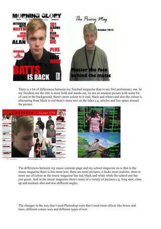
- 1. There is a lot of differences between my finished magazine than to my first preliminary one. In my finished one the title is more bold and stands out, its not an amateur picture with some bit of card in the background, there's more colour to it (red, black and white) and also the colour is alternating from black to red there's more text on the sides e.g. articles and less space around the picture. The differences between my music contents page and my school magazine on is that in the music magazine there is lots more text, there are more pictures, it looks more realistic, there is more use of colour as the music magazine has red, black and white while the school one has just green. And in the music magazine there's more of a variety of pictures e.g. long shot, close up and medium shot and also different angles. The changes in the way that I used Photoshop were that I used more effects like boxes and lines, different colour uses and different types of text.